New design website anyway.com
Most likely, you use the online booking service of airline tickets and hotels on any airline.com , otherwise it would not be ranked fourth in terms of capitalization in the ranking of Russian Internet companies in 2011 and would not be the first among competitors.
The design of the service was initially good, however, it remained unchanged for a long time. And it's his time! We present to your attention the result of long works.
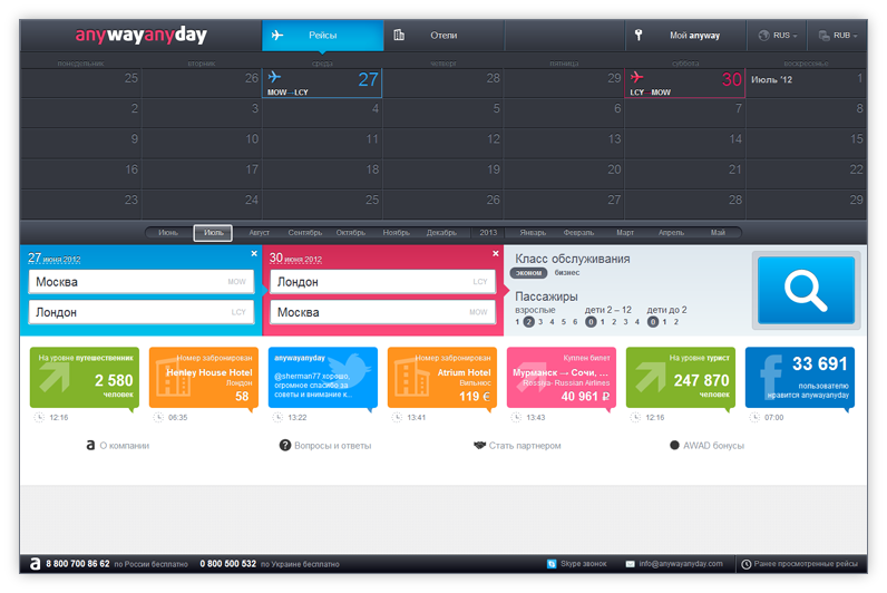
The main page did not undergo major changes, but was only slightly improved. Now it is easy to select the desired month, specify the direction of flight and other information. The whole procedure takes just a couple of minutes. Also, you can go to the main hotel booking. To start the selection, it is enough to indicate where you are going and how much. At the bottom of the page there are multi-colored notifiers, from which you can find interesting service statistics.

')
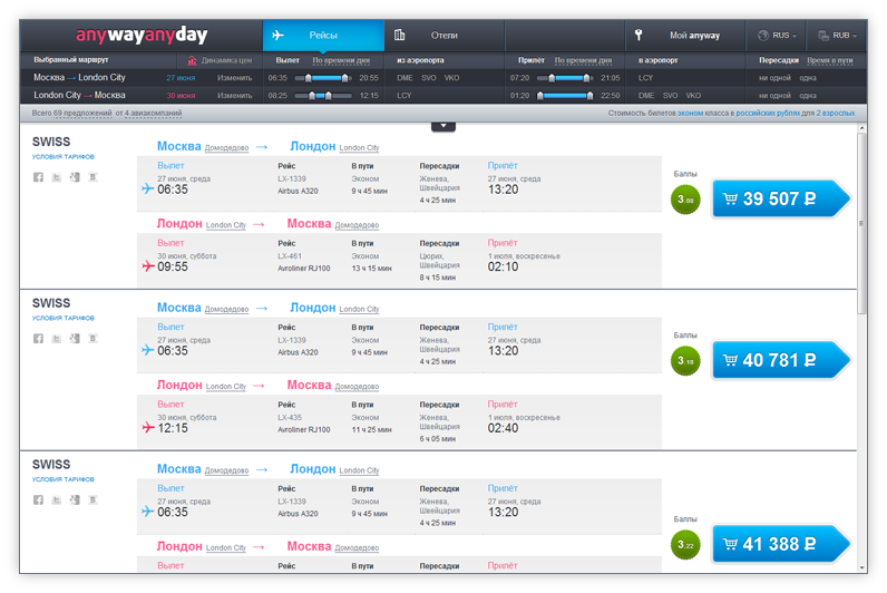
Pages with search results have changed a lot. In terms of flight selection, a table remained with filtering flights by airline and ticket price. All options found are listed below. The user can select a flight by scrolling or, in the old manner, by clicking on the price of a particular airline that you like. The resulting list of results can be narrowed down by specifying the desired time of departure and arrival, travel time and airport.
As for the page with the search result of hotels - the information is divided into two columns with independent vertical navigation and fits into the frame of the browser window. Hotels can be selected by location on the map. In addition, the list of proposals can be narrowed down by specifying the desired parameters in the right window (type of accommodation, accommodation and so on). You can also see reviews, descriptions and add an offer to your favorites.

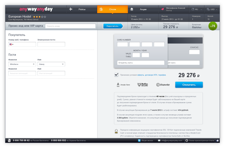
Special attention should be paid to the design of the payment page. Data about the buyer are filled in the questionnaire, issued in the form of a bank card. This design was implemented in the framework of the project on any airlines in 2008 and is still one of the most convenient, in our opinion, format.
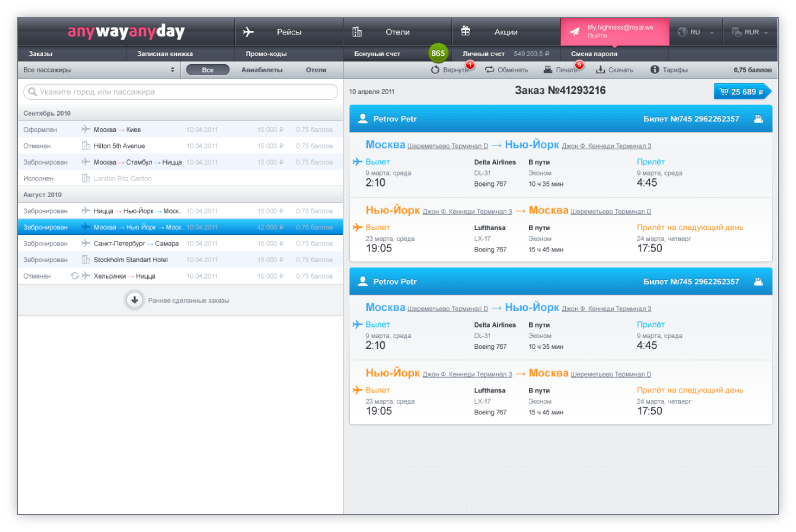
All information on your flights and bookings is in your personal account. The entrance to it moved to the upper right corner, and the office itself has changed a lot. On the left side of the screen are a list of orders that can be filtered by category. The right side displays detailed information about the selected order / reservation, as well as the available actions: exchange, return and so on. In addition, there was a “Notebook” where you can enter data about the passenger to further simplify filling in the fields when ordering a hotel or airline ticket.
We tried to make any service on the world more friendly and beautiful. We welcome your feedback and suggestions for further redesign!
The design of the service was initially good, however, it remained unchanged for a long time. And it's his time! We present to your attention the result of long works.
Home page
The main page did not undergo major changes, but was only slightly improved. Now it is easy to select the desired month, specify the direction of flight and other information. The whole procedure takes just a couple of minutes. Also, you can go to the main hotel booking. To start the selection, it is enough to indicate where you are going and how much. At the bottom of the page there are multi-colored notifiers, from which you can find interesting service statistics.
')
Choosing a ticket and hotel
Pages with search results have changed a lot. In terms of flight selection, a table remained with filtering flights by airline and ticket price. All options found are listed below. The user can select a flight by scrolling or, in the old manner, by clicking on the price of a particular airline that you like. The resulting list of results can be narrowed down by specifying the desired time of departure and arrival, travel time and airport.
As for the page with the search result of hotels - the information is divided into two columns with independent vertical navigation and fits into the frame of the browser window. Hotels can be selected by location on the map. In addition, the list of proposals can be narrowed down by specifying the desired parameters in the right window (type of accommodation, accommodation and so on). You can also see reviews, descriptions and add an offer to your favorites.
Payment page
Special attention should be paid to the design of the payment page. Data about the buyer are filled in the questionnaire, issued in the form of a bank card. This design was implemented in the framework of the project on any airlines in 2008 and is still one of the most convenient, in our opinion, format.
Personal Area
All information on your flights and bookings is in your personal account. The entrance to it moved to the upper right corner, and the office itself has changed a lot. On the left side of the screen are a list of orders that can be filtered by category. The right side displays detailed information about the selected order / reservation, as well as the available actions: exchange, return and so on. In addition, there was a “Notebook” where you can enter data about the passenger to further simplify filling in the fields when ordering a hotel or airline ticket.
We tried to make any service on the world more friendly and beautiful. We welcome your feedback and suggestions for further redesign!
Source: https://habr.com/ru/post/145568/
All Articles