Responsive typography: Basics
When we create websites, we usually start by defining the text of the document. The definition of the main text sets the width of the main column on the page; everything else should happen by itself. It should . Until recently, the screen resolution was more or less the same. Today we are dealing with a huge number of screens of different resolutions and sizes. It makes things much more difficult.
During the restart of our site, I wrote a short post about responsive typography, focusing exclusively on our latest experiment: responsive fonts. Without knowing the history of iA, you will miss some key aspects of responsive typography and design on our new website. Instead of mixing all our articles on this topic, I decided to start from scratch and tell you about responsive typography step by step. This is the first step.
')
To avoid developing layouts for every screen size, many developers have adopted the concept of Responsive Web Design. The idea is that your layout automatically adapts to the current screen size. There are several definitions of this concept. But I would like to say this:
- Adaptive layouts: change the layout step by step a certain number of times
- Rubber layouts: continuous change of layouts to various sizes
Although both have their advantages and disadvantages, we believe that an adaptive layout with several options of sizes is more acceptable, since readability is more important than a layout that always fits perfectly with the screen size. This is a rather controversial opinion, but the achievement of optimal readability requires some control over the size (column width) of the text, and in this case, the rubber layout creates more problems than it solves.
Note: Responsive Web Design has a number of macro-typographic problems (font size, line spacing, column widths). Thus, RWD already includes responsive typography. What we focused on in our first post about responsive typography was mainly about using graduated fonts. Next, I would like to talk about gradation and delve into the basics of responsive typography on displays.
Font selection
Correct tone
Sooner or later you will have to decide which font you want to use. Font selection is basically a matter of tone, but since each font has its own qualities and requirements (or limitations), choosing a font has many visual and technical implications. Thanks to web-fonts you have a huge selection of fonts, which makes this process even more difficult.
We created our own font for this site to experiment with gradation. We chose a serif because it matches our tone and perfectly reflects the sophistication of the content (at least it seems so to us). For iA Writer, we chose a monospaced font. Since the main goal of our application is to help you work quickly and easily, we specifically chose Nitty - a font that looks strong and neat at the same time. The decision to use a monospaced font also came from the fact that the OS of the first iPad does not support automatic kerning of proportional fonts. Instead of using poorly drawn proportional fonts, we immediately decided to use a monospaced font.
Serif or sans serif?
Usually the choice falls between serif (romance) and sans serif (grotesque). In fact, this is a difficult task, but there is a simple rule that can help you: the Romanesque font is a priest, the grotesque is a hacker . One is not better than the other, but for various reasons authoritarianism is felt in the romance fonts, while the grotesque gives up democracy. Five thousand years of typography history are described in two lines, so do not take it too seriously.
Many people think that for screen typography the question “romance or grotesque?” Answers itself. In fact, not so simple. Despite the general belief, both types of fonts look good on screen at a size larger than 12px. A roman font of less than 12px looks blurry, but (and this brings us to the second point) on modern 12px monitors is definitely too small.
What size?
The size of the text on the page does not depend on your personal preferences. It depends on how far the reader is from the screen. Since the screens of the desktop monitors are farther from the reader’s eyes than the book, the metric size of the text on the screen must be larger than its size in the book.
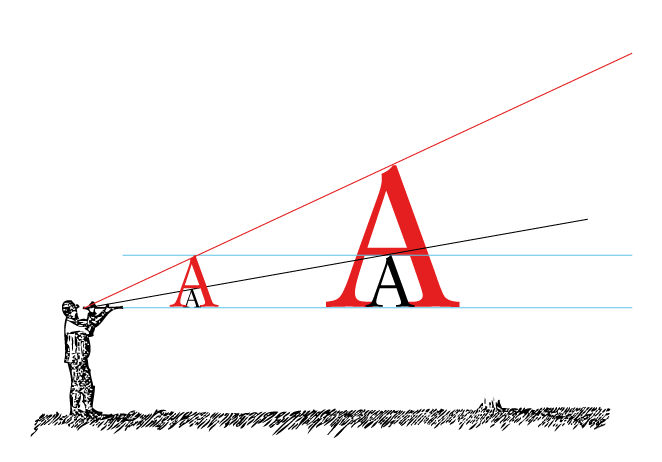
The figure below shows that the farther the text is from you, the larger should be its size. Two black and two red letters have the same metric size. But since the right pair of letters is located further, their perceived size is smaller. The red letter A on the right is perceived as equal in size to the black A on the left:
The farther from you is the text, the less it seems visually. Increasing the distance you need to increase the size of the text to compensate for the greater distance from the reader's eyes to the text. How much more should be the size of the text itself is a science. If you do not have experience in this, for comparison, try holding a book to look at the text on the screen at a convenient reading distance before your eyes.
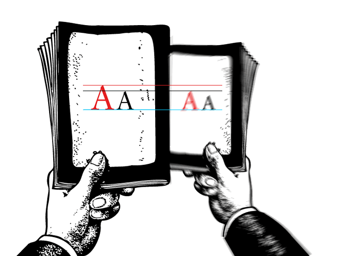
Graphic designers without experience in web design are extremely surprised by the large size of text on web pages compared to text in books. Keep in mind, the text is great only if the book and the monitor screen are in the same plane, in the future everything will be different.
If, after increasing the size of the text on the page, it initially annoys you, do not worry, this is normal. When you get used to it, you no longer want to return to the “standard” smaller size.
We have been promoting these “prospectively proportional” text sizes since 2006. At first, our assertion that Georgia 16px is a good guide for the size of the main text on the page caused a lot of anger and even laughter, but now it is a more or less common standard. With the increase in screen resolution, these standards are gradually becoming obsolete. But more about that later.
Line spacing and contrast
While text size can be estimated using a trick with perspective, line spacing requires some adjustment. With increasing distance and (as we call it) blur of pixels, it is advisable to give the text on the screen a little more space by increasing the line spacing. 140% is the best practice, but of course it all depends on the font used.
You need to be sure that the contrast between the text and the background is not too weak (gray text on a light gray background) or not too bright (pink on yellow). Since the fonts were created to be displayed in black on a white background, using a black background can be difficult, but it can work if done correctly. In modern high-contrast monitors, it is preferable to choose either a dark gray color for the text or a light gray for the background instead of the standard pure black on a pure white background.
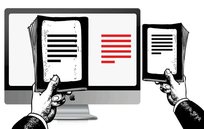
iPhone vs iPad
Much of what we learned about responsive typography came to us while working to achieve the best typographic effect for our application. When we designed iA Writer for iPad, we spent weeks for achieving this effect. The high resolution of the iPad's display has become a daunting task for us, we have spent a lot of time to understand how it works. When Apple introduced the new Retina display for the iPhone and later for the new iPad, everything changed again. We could write a whole book to explain how we got the famous type of font in iA Writer, but we still have so much to tell you about the basics of typography, so let's continue.
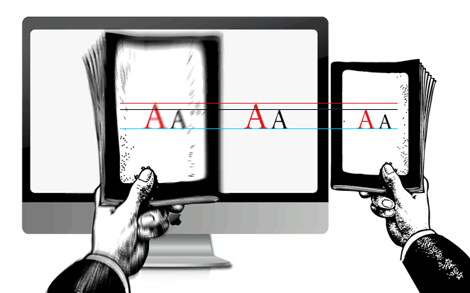
If you compare the current version of iA Writer for the iPhone and the version for the iPad, you will certainly notice the difference in font sizes.
Why did we set a different font size for the iPhone and iPad? If you carefully read the explanation above, you probably already guessed it.
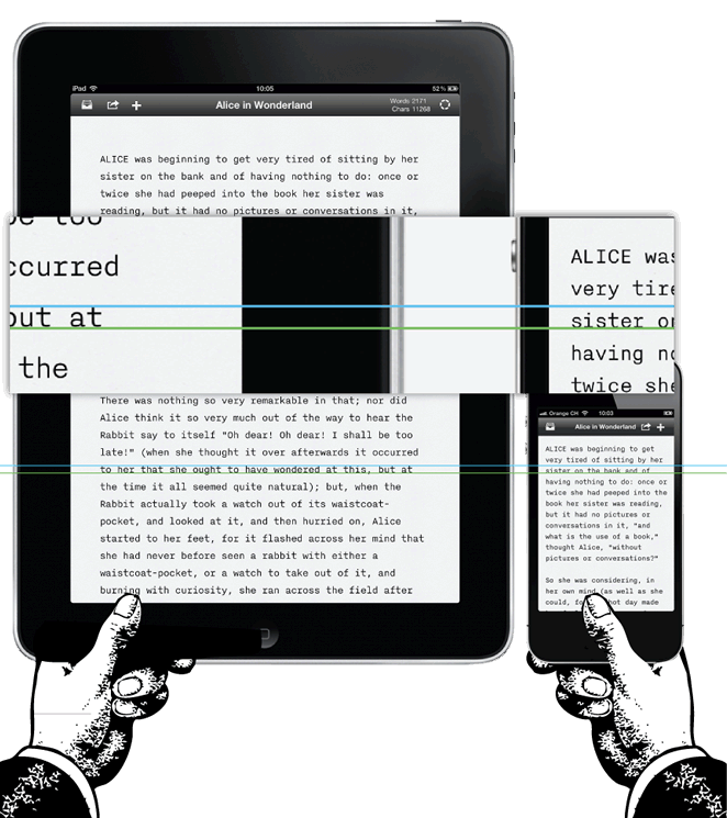
- The distance to the screen of a mobile device is not always the same; if you hold an iPad in your hands, it will be a bit further than the iPhone. If you use your iPad at the table, put it on your lap while sitting on the couch or keep it close to your face while lying in bed, the distance to the screen will be slightly different in each case. It was another challenge for us, since the distance on desktops and laptops does not vary as much as on mobile devices. To achieve optimal readability of the text, we chose the font size based on the maximum possible distance to the screen of the mobile device. This size is a little larger than the one you are used to reading text in bed, but working with text in such conditions is not always convenient and in general no one uses the application to work with text while lying in bed.
- There is much less space on the iPhone screen, so we have to make adjustments.
Fortunately, the iPhone is often held closer to the face than the tablets, so we used a smaller font size, which is great for a smaller screen. From an average reading distance on both the iPhone and the iPad, the text is visually perceived in approximately the same way.
Since the iPhone is closer, the line spacing can also be slightly smaller, which again is a necessary adjustment for the device’s small screen:

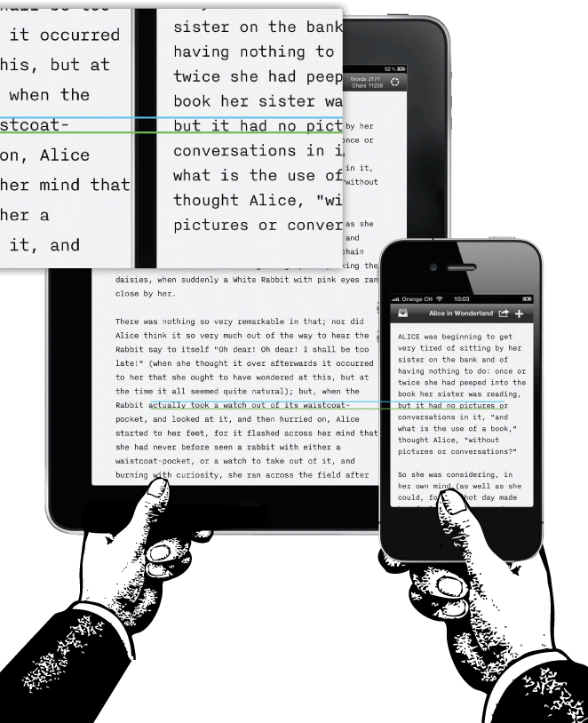
Not everything goes in your favor when you design for screens. Interactive design is a matter of technology: it is not about finding the perfect design, but about achieving the best compromise. In our case, we had to reduce the line spacing, indent and spacing between letters:

The adjustment is so delicate that if you do not know about these changes, you will not notice them at all. Why we simply did not get rid of the indent? Indenting is not a matter of aesthetics, it allows the text to breathe and allows the eye to move easily from line to line. If you think that all this sounds esoterically: no, so far we have just considered the basics.
What about desktop computers?
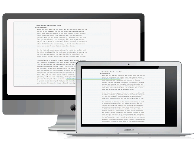
Some complain about large font sizes in Writer for Mac. Just like with the iPad, we needed to choose the largest minimum font size, which we did for the Mac. We tested this size on a 24 ”Mac and visually the text is more or less similar in size to the text on other devices.
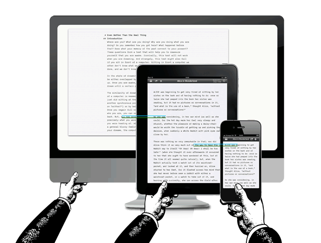
Having a finite number of Mac computers with iA Writer installed, we reviewed all possible options and made sure that the previously set font size is the best option for all devices.
You might ask: “Why not let users choose the font size?” Choosing the font size is not a matter of taste, everything depends on achieving the optimal distance for reading the text. Since most websites have a relatively small font size, new users will set the size to which they are accustomed: basically, this is a rather small size, at which you will never get the proper comfort from working with text. The main reason for this is not the fact that we want to force users to adopt a new look, but that when working with our application you do not have to adjust it. All you need to do is open the editor and start working. This is the secret to the success of iA Writer. (We only need to more carefully work out the convenience and comfort of using the application for people with vision problems).
Well, why not just change the font size automatically to the current screen size? Is this not what is called responsive typography? That's right, and we are working on it. Now, regarding the automatic resizing, you also have to select the most comfortable saturation of the text to be sure that the font looks readable at any size and screen resolution. With changing the font size and resolution, the optical perception of the text changes. That is why iA Writer for Mac, iPad1 / 2 and for the new iPad have different font sizes. To explain the full logic of the gradation of digital fonts I need a little more time. Therefore, stay tuned, the second part is coming!
Source: https://habr.com/ru/post/145535/
All Articles