100 programs on a smartphone or operating system logic?
Inspired by the post about the "organization" of programs on the smartphone. I could not keep silent:
Back in 2007, I already wrote that working on a computer is inconvenient because it is built according to the principles of how a computer works, and not how convenient and familiar the user is. At that time, I saw the solution in a good document search. Now in the operating systems, the search has appeared and it became clear that this is not enough.
The main idea : to cancel files and programs, to introduce the concept of projects at the operating system level.

The concept of files is actively supplanted in Apple products (iTunes, iPhoto, etc.), where the user works with data libraries. On the desktop, you can quickly find the corresponding file using the file manager. The iPhone has made this feature less accessible and I think it is right.
')
But at the same time, in the iPhone and later in all devices that were made similarly, the applications came to the fore, unlike a computer, where there is a structural unit “Document”.
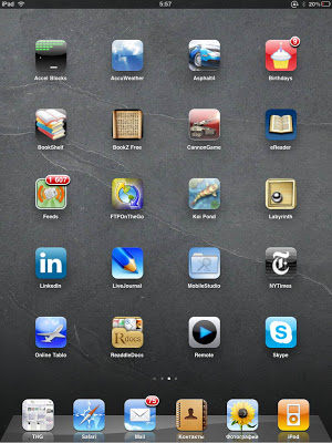
In this regard, Android is somewhat nicer in the sense that the main screen is not only a dump of applications, but also widgets containing information.
But Apple has always been drawn to work with programs, against previous versions of Windows, where there were hints of working with documents.

At the moment I am building my work on the computer as follows: I have created 4 desktops placed horizontally.
What would you like to see in the ideal? One medium to manage all the information. Moving from the project structure to their details (image editing, mindmaps drawing, etc.) can be done in different ways:
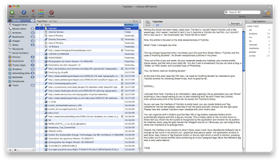
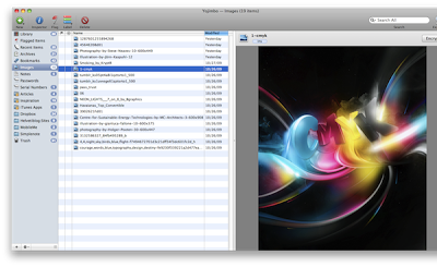
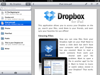
1. Miller Columns . As an example, a similar structure in the Yojimbo and Dropbox apps on the iPad.
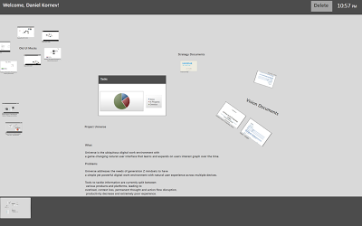
2. Semantic Zoom . Screenshots of the project Danila Kornev .
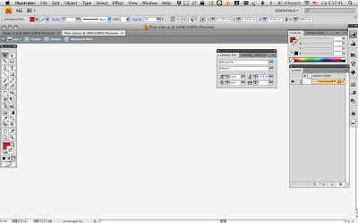
3. Fullscreen mode showing the path. A similar system is used when grouping objects in Adobe products.

It is clear that there are various options for combining and the use of additional controls. For example, tabs (tabs).
If you think which of the existing market players is closest to this concept, then you should pay attention to Chrome OS. Now it uses the same mountain of icons as in other operating systems, but the interface described, it seems to me, is easy to create in the browser:
In conclusion, it can be noted that, unfortunately, manufacturers of operating systems are moving rather in the opposite direction from the described concept - possibly without files, with libraries, but with the main structural unit - the application.
Related information :
Articles :
Organizing Files: The Librarian Syndrome
Untitled Document Syndrome
Yojimbo, and The Case for Anything Buckets
The Case Against Everything Buckets [Alex Payne]
An In-Depth Look At Yojimbo: Hacks, Applescripts and Sync Services
Programs :
iDocument
Yojimbo
EagleFiler
Together
UPD1 : The idea of METRO UI is very interesting from the position that it allows you to make devices with a full-fledged operating system portable - 2 in 1.
Back in 2007, I already wrote that working on a computer is inconvenient because it is built according to the principles of how a computer works, and not how convenient and familiar the user is. At that time, I saw the solution in a good document search. Now in the operating systems, the search has appeared and it became clear that this is not enough.
The main idea : to cancel files and programs, to introduce the concept of projects at the operating system level.
The concept of files is actively supplanted in Apple products (iTunes, iPhoto, etc.), where the user works with data libraries. On the desktop, you can quickly find the corresponding file using the file manager. The iPhone has made this feature less accessible and I think it is right.
')
But at the same time, in the iPhone and later in all devices that were made similarly, the applications came to the fore, unlike a computer, where there is a structural unit “Document”.
In this regard, Android is somewhat nicer in the sense that the main screen is not only a dump of applications, but also widgets containing information.
But Apple has always been drawn to work with programs, against previous versions of Windows, where there were hints of working with documents.
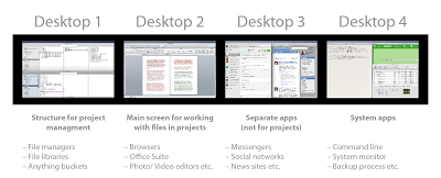
At the moment I am building my work on the computer as follows: I have created 4 desktops placed horizontally.
- Screen for navigating through projects using a file manager or programs for organizing information (Evernote, EagleFiler, Together, etc.). I save all browser bookmarks as reference files on my computer.
- The main screen for working with project files . Desktops are set up so that when opening files on the first desktop, office applications, image processing applications, HTML editors, etc., automatically open on the second.
- Screen for tasks that are not related to projects - instant messengers, reading books, subscriptions, etc.
- Screen for service and background tasks: backups, synchronization, system monitors, etc.
What would you like to see in the ideal? One medium to manage all the information. Moving from the project structure to their details (image editing, mindmaps drawing, etc.) can be done in different ways:
1. Miller Columns . As an example, a similar structure in the Yojimbo and Dropbox apps on the iPad.
2. Semantic Zoom . Screenshots of the project Danila Kornev .
3. Fullscreen mode showing the path. A similar system is used when grouping objects in Adobe products.
It is clear that there are various options for combining and the use of additional controls. For example, tabs (tabs).
If you think which of the existing market players is closest to this concept, then you should pay attention to Chrome OS. Now it uses the same mountain of icons as in other operating systems, but the interface described, it seems to me, is easy to create in the browser:
- Homepage - web-manager of multimedia documents - projects.
- Additional information is added via links (both to files on computers and posted on the Internet)
- Editing opens in new tabs using appropriate web applications.
In conclusion, it can be noted that, unfortunately, manufacturers of operating systems are moving rather in the opposite direction from the described concept - possibly without files, with libraries, but with the main structural unit - the application.
Related information :
Articles :
Organizing Files: The Librarian Syndrome
Untitled Document Syndrome
Yojimbo, and The Case for Anything Buckets
The Case Against Everything Buckets [Alex Payne]
An In-Depth Look At Yojimbo: Hacks, Applescripts and Sync Services
Programs :
iDocument
Yojimbo
EagleFiler
Together
UPD1 : The idea of METRO UI is very interesting from the position that it allows you to make devices with a full-fledged operating system portable - 2 in 1.
Source: https://habr.com/ru/post/145431/
All Articles