Tables in accounting systems
Once upon a time, I managed to get into the world of accounting systems, and not just accounting systems, but working through the Web. Much water has flowed since then, many systems were born, some of them have already died. This is a very dynamic world. In this world, many systems, from the brutal, sophisticated gray hair 1C , to very young Acumatica . There are glamorous Elbe with FinoBox , there is also a cool Megaplan , there is my favorite, stern, but pretty Oreodor . In all of them there are very clever forms, even cleverer (than user) navigation, well, and tables! Let's get even closer.
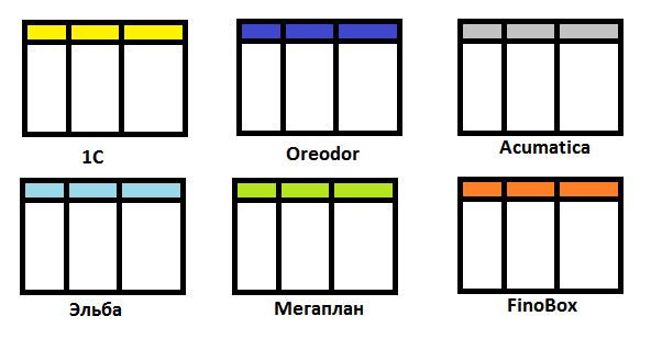
All this is Web, everything works, everything is functional, and there is a lot of functionality.
Not so long ago, on duty, I did a review of various platforms and ERP systems. My task was to understand the features of the implementation of interfaces, to understand why it was done this way and not otherwise. The review was useful for work, now I boldly poke them at my colleagues when they want to spoil something. Without hesitation, I decided to adapt my review to the article, add, trim and share with you, dear Khabrovchane.
As a rule, it is implemented by clicking on the column header, as, for example, in 1C, Megaplan or Oreodor. A pointer to the sorting direction appears on the column. Sometimes the option is duplicated in the column menu, if there is one (as in Oreodor). However, in some systems (for example, FinoBox), the sorting is natural - according to expenditure dates, there are no controls, and it is not necessary.

By the way, most systems provide the ability to set the sorting from the interface by only one column at a time. Convenient management of multiple sorting, alas, the task is not trivial, and no one mastered it. If you sort multiple and you can, then this is set from the list settings, as in 1C.
')
The three most common ways are:
Double-click opening (this is standard). Do not confuse a double click with the opening link, because links, as a rule, open to the value of the cell, as in Oreodor, Megaplan, Elba.
In some systems there is a selection, including a plurality. There are two approaches in the interface - checkboxes and selection. Not as important as it is done, it is important why. Multiple selection allows you to implement group operations on specified records, for example, the simultaneous posting of multiple documents.
The selection of Megaplan, Oreodor, 1C is implemented similarly to that in desktop applications (with Ctrl clamped, the records are marked):
FinoBox is on the way ticks. In general, this is more obvious, but a little less convenient with a large number of columns (horizontal scrolling is undesirable):

In some systems, such as Elbe, there is no entry selection at all. This is not a minus, but rather a feature, because the functionality of the Elbe does not suffer from this. Not a few forces have been spent by analysts and developers to bring the business process to such a state that it is not necessary to single out the elements.
In general, there are two types of ERP systems on the Web — those that try to be browser-based, and those that try to behave like desktop ones. The context menu is a native browser control, to intercept it boldly, but many of these sin, for example, 1C and Oreodor.

This imposes certain problems with copying, pasting, and the like, but it allows you to implement actions in the context of the element on which the menu was invoked. The standard of expanding the browser context menu has not yet been settled; this solution has obvious drawbacks, but in the future this will cease to be a problem.
Most (for example, Megaplan, Elba and FinoBox) systems still do not intercept the context menu, leaving it in the power of the browser.

The heart of any list that drives data in the veins is filtering, well, and searching. These things are not trivial by themselves. The fact is that there are two contradictions on the filters - functionality and simplicity. Simplicity is convenience, functionality is an opportunity to get what you need. In some systems, as such, there are no user filters. I mean, not at all. In them, the list opens already filtered by some sign, let's say active accounts, or passive accounts, the list is called “My assets”, “My liabilities”, or the mode switch somewhere in the list “Show documents”, “Show acts” . On the one hand, it is a white flag, capitulation in the face of a knowingly unsolvable task of an easy-to-use and functional filter. On the other hand, this is a well-honed business process, which, due to minimization, has allowed abandoning arbitrary filters in principle. A good example of a good realization of this is the Elbe.
Those who decided to make filters, and this is FinoBox, 1C, Oreodor, Megaplan, divided into two groups - filters through the form and filters through the menu.
The filter is set on the form, somewhere near the list. The form is complicated. A clinical case of the development of an idea is the use of a form with a tabular part for a full-fledged tree of expressions that terrifies a humanitarian and economic mindset. But even the form (with the exception of the form with the expression tree) does not make it difficult to combine the conditions for combining filters. And the main problem - this form takes a lot of space. The space allocated for it is directly proportional to the capabilities of the filters from the interface and the complexity of the installed filter. This approach is most beautifully and elegantly implemented in Megaplan; they managed to make a full-fledged dynamic form with a good response. A bit more brutal made in FinoBox. Picture for comparison:

This is an attempt to solve the problem elegantly at the cost of functionality. As a rule, they sacrifice the conditions of combining filters by combining all filters through “AND”. At the same time, it is possible to filter from different places, because the filter controls are also simplified. For example, the filter can be embedded in the menu of the column, or the context menu of the cell. Here is how it looks in Oreodor:

The rejection of the merge conditions entails moving this logic into the filter itself, i.e. Some data types, for example, multi-links, can be combined via OR, although all other filters via I.
Almost all systems allow you to save pre-configured filters, and some also share them with colleagues in the system. Especially well done in Atlassian JIRA, although this is another topic, but a great example to follow.
A typical task is to select an entry in the list in color. This may be an emphasis on a new record, highlighting canceled, etc. As a rule, this is a selection of a document on that or another status. The opportunity is quite common and is found wherever it may be needed. When colors are not enough, they use an icon, which is intended to symbolize the mental state of the line at the current time. Examples of this in different systems:

Some systems additionally use different fonts, pins andDECOR . Anything that can make any table unreadable, or kill epilepsy. However, with moderate use, this is an indispensable feature for highlighting a record among her friends.
What could be nicer to the accountant of the “Total” line? And if also with red digits “- 0 rubles. 17 kop. ”... This string of emotions causes a storm of sensual, beautiful ladies of debit and credit. Most ERP systems can build a summary line with various aggregation functions. An important feature is its dynamic rebuild by filter. Here’s how it looks in Elba:

Perhaps Elba here all tucked into his belt for convenience and meaningfulness. In FinoBox, everything is much more severe:

Well, and Oreodor absolutely severely:

About grouping is difficult to say something new. Grouping goes hand in hand with filtering and sorting. It can also be emulated by a hierarchy (about it a bit later), but, of course, it is better when it is a list feature, and not something else.
It is interesting to see the density of the displayed data per square centimeter of the screen in different systems:
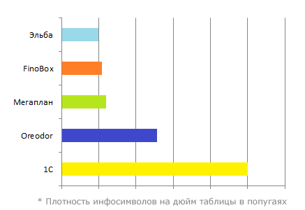
The clear separation of the two camps is noticeable - those who try to show as much as possible ( more, more, MORE DATA !!! ), and those who try to showas little as possible more clearly. In general, not all data is perceived by the user, so there is not much point in showing everything at once, much more important is how much information will be acquired.
A logical continuation of this trend will be the development of data display variations. Beautiful rendering for money types, beautiful for dates, for images and icons. Megaplan is especially good at this, but FinoBox is not inferior. In Oreodor there is a nod to this side. But Acumatica and 1C in this regard are heavily compressed (in the truest sense of the word). To show something beautifully and deployed there is problematic.
The special display of data in the table is the first step towards the editableness of this table. I will explain that in order to beautifully display something, sooner or later it will be necessary to separate the data from their presentation. And when we separate the data from the presentation - we have the opportunity to work with the data in different ways, because they are no longer in themselves a representation of this data. Those. now we are not transmitting a date string, beautifully designed, but a date object with which you can do something for yourself. The editable table is generally a very complex thing, full of constraints, crutches and conventions. The simpler the system, the easier it is given and more realized. For example in FinoBox it looks like this:

It is curious how the cells that are available for editing are highlighted. Very beautiful effect. But in Oreodor everything is quite austere (the red notches mark not yet saved changes):

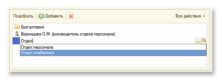
In 1C, too, there are editable tables, but their capabilities are somewhat limited:
In essence, a table is just one of the options for presenting a dataset. Imposing on the data some kind of interface, contract, we can display them in a different form. For example, having a date range in a set, we can represent a set in the form of a calendar, and having a reference to the parent element - in the hierarchy. These two types are the most common, although the list can be shown on the map, and in general in full 3D, with a graph with green spots on the background (which also mean something).

All this is Web, everything works, everything is functional, and there is a lot of functionality.
Not so long ago, on duty, I did a review of various platforms and ERP systems. My task was to understand the features of the implementation of interfaces, to understand why it was done this way and not otherwise. The review was useful for work, now I boldly poke them at my colleagues when they want to spoil something. Without hesitation, I decided to adapt my review to the article, add, trim and share with you, dear Khabrovchane.
Sorting
As a rule, it is implemented by clicking on the column header, as, for example, in 1C, Megaplan or Oreodor. A pointer to the sorting direction appears on the column. Sometimes the option is duplicated in the column menu, if there is one (as in Oreodor). However, in some systems (for example, FinoBox), the sorting is natural - according to expenditure dates, there are no controls, and it is not necessary.

By the way, most systems provide the ability to set the sorting from the interface by only one column at a time. Convenient management of multiple sorting, alas, the task is not trivial, and no one mastered it. If you sort multiple and you can, then this is set from the list settings, as in 1C.
')
List Navigation
The three most common ways are:
- Paging (paging). Such a way in Acumatica and Oreodor. The main advantage of paging is the ability to quickly move to the desired position in the list.
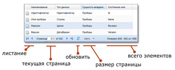
All data is divided into pages, the total number of records is known, and the browser is known. So classic that there is nothing to add, except that the viewing window can be calculated dynamically, according to the size of the list display area. This allows you to get rid of vertical scrolling at all. - Infinity Scroll (Infinity Scroll) - this is when the data is loaded and displayed in the scrolling process. Those. in fact, the starting position (skip) of the sample is determined by the current position of the shell, and the sample size (limit) is determined by the size of the display area, like this. Seen in 1C. The thing is extremely cool, it allows you to save traffic, unload the browser DOM, and so on. But, alas, it requires a lot of effort for good implementation. And because of its infinity, it causes problems of transition to a specific position in the list (this disadvantage is compensated by filtering).

The method is good if there is not a lot of data (2-3 viewing windows), or a lot, but they are either filtered in the process of viewing up to two or three viewing windows, or each record itself is not so important, but general information, the trend tasks in the bugtracker for example).
In general, the essence of this method is to facilitate the DOM by reducing the simultaneously displayed elements on the page. At one point in time, only entries in the window are rendered, which allows you to create the illusion of a one-time display of a huge amount of data due to the scroll bar and a quick response to its movement.
The same way is beneficial for caching, heuristics and server optimization. - Native browser scrolling is the path of those who do not argue with the browser. This is when we scroll not specifically this list, but the whole page. There may be some kind of implementation of Infinity Scroll. This option is used in FinoBox, Elba, Megaplan. If the layout and organization of the system allows you to get rid of horizontal scrolling, or if horizontal scrolling does not bring problems with orientation in the system - this is the best choice. It is obvious, transparent and fast. The disadvantage of the method is that you can actively scroll only one list, and in general, one panel (form, menu, table).
Unfortunately, a really large amount of data at a time is difficult to display in a browser, if only because of a very heavy DOM, which grows in proportion to the convenience of presenting information (many possibilities - many elements per cell).
Quick open and highlight
Double-click opening (this is standard). Do not confuse a double click with the opening link, because links, as a rule, open to the value of the cell, as in Oreodor, Megaplan, Elba.
In some systems there is a selection, including a plurality. There are two approaches in the interface - checkboxes and selection. Not as important as it is done, it is important why. Multiple selection allows you to implement group operations on specified records, for example, the simultaneous posting of multiple documents.
The selection of Megaplan, Oreodor, 1C is implemented similarly to that in desktop applications (with Ctrl clamped, the records are marked):

FinoBox is on the way ticks. In general, this is more obvious, but a little less convenient with a large number of columns (horizontal scrolling is undesirable):

In some systems, such as Elbe, there is no entry selection at all. This is not a minus, but rather a feature, because the functionality of the Elbe does not suffer from this. Not a few forces have been spent by analysts and developers to bring the business process to such a state that it is not necessary to single out the elements.
Context menu
In general, there are two types of ERP systems on the Web — those that try to be browser-based, and those that try to behave like desktop ones. The context menu is a native browser control, to intercept it boldly, but many of these sin, for example, 1C and Oreodor.

This imposes certain problems with copying, pasting, and the like, but it allows you to implement actions in the context of the element on which the menu was invoked. The standard of expanding the browser context menu has not yet been settled; this solution has obvious drawbacks, but in the future this will cease to be a problem.
Most (for example, Megaplan, Elba and FinoBox) systems still do not intercept the context menu, leaving it in the power of the browser.
Filtering and searching

The heart of any list that drives data in the veins is filtering, well, and searching. These things are not trivial by themselves. The fact is that there are two contradictions on the filters - functionality and simplicity. Simplicity is convenience, functionality is an opportunity to get what you need. In some systems, as such, there are no user filters. I mean, not at all. In them, the list opens already filtered by some sign, let's say active accounts, or passive accounts, the list is called “My assets”, “My liabilities”, or the mode switch somewhere in the list “Show documents”, “Show acts” . On the one hand, it is a white flag, capitulation in the face of a knowingly unsolvable task of an easy-to-use and functional filter. On the other hand, this is a well-honed business process, which, due to minimization, has allowed abandoning arbitrary filters in principle. A good example of a good realization of this is the Elbe.
Those who decided to make filters, and this is FinoBox, 1C, Oreodor, Megaplan, divided into two groups - filters through the form and filters through the menu.
Filters through the form
The filter is set on the form, somewhere near the list. The form is complicated. A clinical case of the development of an idea is the use of a form with a tabular part for a full-fledged tree of expressions that terrifies a humanitarian and economic mindset. But even the form (with the exception of the form with the expression tree) does not make it difficult to combine the conditions for combining filters. And the main problem - this form takes a lot of space. The space allocated for it is directly proportional to the capabilities of the filters from the interface and the complexity of the installed filter. This approach is most beautifully and elegantly implemented in Megaplan; they managed to make a full-fledged dynamic form with a good response. A bit more brutal made in FinoBox. Picture for comparison:

Filters through the menu
This is an attempt to solve the problem elegantly at the cost of functionality. As a rule, they sacrifice the conditions of combining filters by combining all filters through “AND”. At the same time, it is possible to filter from different places, because the filter controls are also simplified. For example, the filter can be embedded in the menu of the column, or the context menu of the cell. Here is how it looks in Oreodor:

The rejection of the merge conditions entails moving this logic into the filter itself, i.e. Some data types, for example, multi-links, can be combined via OR, although all other filters via I.
Almost all systems allow you to save pre-configured filters, and some also share them with colleagues in the system. Especially well done in Atlassian JIRA, although this is another topic, but a great example to follow.
Colors, icons, highlights
A typical task is to select an entry in the list in color. This may be an emphasis on a new record, highlighting canceled, etc. As a rule, this is a selection of a document on that or another status. The opportunity is quite common and is found wherever it may be needed. When colors are not enough, they use an icon, which is intended to symbolize the mental state of the line at the current time. Examples of this in different systems:

Some systems additionally use different fonts, pins and
Aggregations and groupings
What could be nicer to the accountant of the “Total” line? And if also with red digits “- 0 rubles. 17 kop. ”... This string of emotions causes a storm of sensual, beautiful ladies of debit and credit. Most ERP systems can build a summary line with various aggregation functions. An important feature is its dynamic rebuild by filter. Here’s how it looks in Elba:

Perhaps Elba here all tucked into his belt for convenience and meaningfulness. In FinoBox, everything is much more severe:

Well, and Oreodor absolutely severely:

About grouping is difficult to say something new. Grouping goes hand in hand with filtering and sorting. It can also be emulated by a hierarchy (about it a bit later), but, of course, it is better when it is a list feature, and not something else.
Data display
It is interesting to see the density of the displayed data per square centimeter of the screen in different systems:

The clear separation of the two camps is noticeable - those who try to show as much as possible ( more, more, MORE DATA !!! ), and those who try to show
A logical continuation of this trend will be the development of data display variations. Beautiful rendering for money types, beautiful for dates, for images and icons. Megaplan is especially good at this, but FinoBox is not inferior. In Oreodor there is a nod to this side. But Acumatica and 1C in this regard are heavily compressed (in the truest sense of the word). To show something beautifully and deployed there is problematic.
The special display of data in the table is the first step towards the editableness of this table. I will explain that in order to beautifully display something, sooner or later it will be necessary to separate the data from their presentation. And when we separate the data from the presentation - we have the opportunity to work with the data in different ways, because they are no longer in themselves a representation of this data. Those. now we are not transmitting a date string, beautifully designed, but a date object with which you can do something for yourself. The editable table is generally a very complex thing, full of constraints, crutches and conventions. The simpler the system, the easier it is given and more realized. For example in FinoBox it looks like this:

It is curious how the cells that are available for editing are highlighted. Very beautiful effect. But in Oreodor everything is quite austere (the red notches mark not yet saved changes):

In 1C, too, there are editable tables, but their capabilities are somewhat limited:

Not a single table lives list
In essence, a table is just one of the options for presenting a dataset. Imposing on the data some kind of interface, contract, we can display them in a different form. For example, having a date range in a set, we can represent a set in the form of a calendar, and having a reference to the parent element - in the hierarchy. These two types are the most common, although the list can be shown on the map, and in general in full 3D, with a graph with green spots on the background (which also mean something).
Source: https://habr.com/ru/post/145383/
All Articles