Mobile web trends and two approaches to building mobile applications

One of the strongest trends of the modern web is the mobile web - a special presentation of sites for the whole variety of mobile devices, smartphones, tablets and so on.
This article discusses the current trends of the mobile web. How fast is the mobile web growing? What to expect from a mobile web in a couple of years? How does mobile presentation of sites affect business and online shopping? How are things going with mobile sites today?
')
The purpose of the article is also to answer the question about how to create mobile sites. I will look at two main directions in the process of creating mobile sites and how effective tools of Visual Studio 2012 and ASP.NET MVC will allow you to accomplish any tasks facing the mobile presentation of sites.
Mobile Web Trends
First of all, before moving on to the practical part, let's look at the current trends of the mobile web. Try to answer the question "how quickly did the mobile web grow in two years?". The correct answer may come as no surprise: from 2009 to 2011, the use of mobile devices for browsing websites increased by 1000% or 10 times (Figure 1).
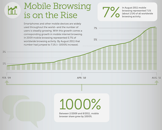
Fig.1. Mobile web trend (s)
At the same time, in August 2011, the mobile web already accounted for 7% of the total number of visits to the web by users. By the time of this writing, this figure is likely to be much higher.
If we look to the future and consider the forecasts of various analysts, we will be able to find out that by 2014 the mobile web will exceed the usual access to the web from desktops (Figure 2).

Fig.2. Mobile web will bypass desktop in 2014 (c)
Very well, these forecasts do not differ much from what we observe in practice: smartphones and tablets are becoming more accessible and more and more popular. In some countries, for example in Egypt, there was a situation when the main part of users missed the desktop Internet, they did not have computers (or not now) and they started using the Internet right away on mobile devices.
In connection with such a strong trend of the mobile web, it becomes interesting to assess how the mobile presentation affects the business or just the attendance of websites.
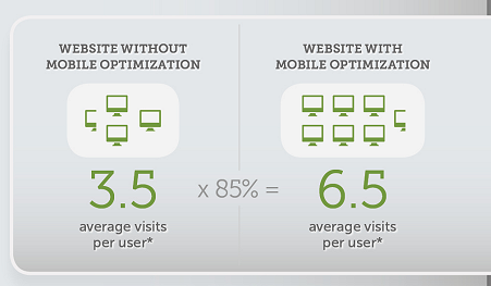
Fig.3. The growth of attendance for sites with a mobile version (s)
It turns out that the mere presence of a mobile version for a site can significantly increase the traffic to the pages of your resource. According to some data, this increase can be up to 85% (Figure 3).
At the same time, the sites that offer users access to the store via mobile devices have increased sales to 51% (Figure 4)!
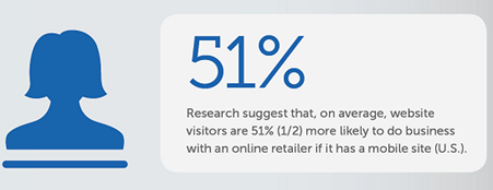
Fig.4. Growth of sales of sites with a mobile version (c)
It would seem that there is a steady trend of mobile devices and the mobile web. Studies show strong benefits from the introduction of mobile views and mobile device support sites and online stores. But how are things in practice? Have all the sites rushed to support the mobile web?
Not. According to research in 2010, only slightly more than 20% of sites from the 500 largest list offered support for mobile presentation (Figure 5).

Fig.5. Support by mobile web sites (c)
And only about 5% of e-commerce sites supported mobile users! (Figure 6)
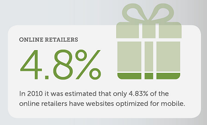
Fig.6. Optimization of Internet sites for mobile presentation (c)
Of course, the situation is gradually improving, but it remains clear that the business and the web just does not keep up with the development of the mobile web.
And here the question arises, how should the business owners solve this problem? How to build a mobile site?
Mobile Web: two approaches
In this article, I highlight two main approaches to building a mobile web. The first approach: a single site for all types of screens and a second approach: a separate version of the site for mobile devices.
Each approach has its own advantages and disadvantages. Let's look at them in order.
Approach: one site for all devices
If we try to switch to the largest news resource of the Lenta.ru web on a mobile device, we can see the following picture (Figure 7).

Fig.7. Lenta.ru in a mobile browser
The picture is not encouraging; to view the necessary information, we need to bring the text closer with gestures on the touch screen (Figure 8).

Fig.8. Approximate text Lenta.ru
Here is the idea behind which we came to the site, in this form we can read the information.
The solution to the problem of displaying information from one site on different devices lies in the web standards. For example, look at the default templates that ship with ASP.NET MVC4 in Visual Studio 2012 (Figure 9).
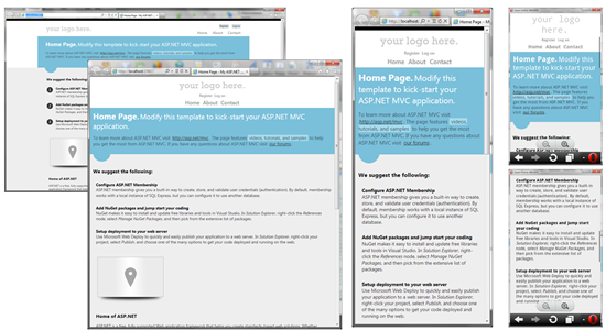
Fig.10. Scaling the site on different screens.
Having a site oriented on large screens of desktop computers, we nevertheless do not lose in readability when the screen is reduced when displayed on other devices.
On the contrary, thanks to the support of web standards, our site adapts to the screen resolution and, if necessary, changes the page layout, the position of elements on the page, or even deletes some of them if they prevent us from making the presentation convenient on a mobile device.
In Figure 10, for example, when reducing the size, you can note a change in the layout of the page header, deletion of the design elements of the list (black circles). In the end, even on the smallest resolution, our page remains readable, offering convenient access to the main content the user needs.
This mechanism is achieved, as I said, using web standards (CSS3 Media Queries), which will be discussed in the technical part of the article.
Approach: the site has a separate "mobile" version
Consider the second approach in building a mobile view - a separate mobile site. For example, take the well-known social networking site Facebook (Figure 11).

Fig.11. Desktop and mobile version of Facebook
As you can see, Facebook offers two completely different versions of the site for the desktop user and the mobile user. Without discussing the convenience of the mobile version of Facebook, it should be noted that this approach allows you to effectively solve the problem.
To support this approach, special mobile site templates have been added to Visual Studio 2012, which allow you to build a separate mobile site based on ASP.NET MVC and jQuery UI in a short time (Figure 12).
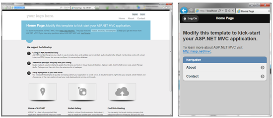
Fig.12. Desktop and mobile versions of ASP.NET sites
Now that we are familiar with the approaches to building mobile sites, let's look at the technical details of their construction and what tools Visual Studio 2012 and ASP.NET MVC4 offer for effective development.
Effective mobile site development with ASP.NET MVC 4
Consider the development of mobile sites in the manner described approaches: first, the approach "one site for all screens", and then "a separate site."
Creating a single site for all screens
As I wrote earlier, the mechanism that allows you to adapt the content of your web application to different devices is called CSS3 Media Queries. I think this web standard is well known to web developers. ASP.NET MVC offers its use by default.
If you create an MVC4 application in Visual Studio 2012, you can find the Site.css style definition file in the Content folder. This file contains the very use of CSS3 Media Queries, which allows the content of the pages to adapt to the resolution (Figure 13).
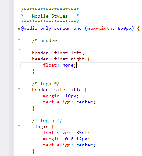
Fig.13. Using CSS3 Media Queries
CSS3 Media Queries allows you to define a set of CSS styles that will be used only under certain conditions, for example, at a specific screen width.
ASP.NET MVC 4 uses this mechanism to make the mobile presentation the default. Figure 13 presents a set of rules that will be applied only when the screen width is less than 850 pixels.
You can use and expand this mechanism with your own rules, making your site even more flexible and adaptable to user devices.
Another important mechanism that should be used for each of the pages of the site is the "viewport" meta tag:
<meta name = "viewport" content = "width = device-width" />
This definition prompts the mobile device to adjust the text and content of the pages to fit your screen. In the ASP.NET MVC4 template, this definition is added to the _Layout.cshtml layout file, which applies to all pages.
Create different views for different devices or conditions.
Even with one site for desktop and mobile users, it is often necessary to create different views (designs) for different devices. Imagine an option when you make one design for desktop users, another for mobile users, and a third for iPhone users.
A simple task, but how to implement it using common business logic in a single project? ASP.NET MVC 4 offers for this very simple tools that allow you to solve a problem in minutes.
Using the wizard, add a new view to the Views / Home folder called Index.Mobile
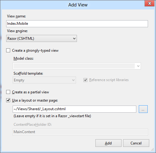
Fig.14. Adding a new view
After that, change the markup of this view to:
<h2> Hello, mobile user! </ h2>
And run the application for execution. As a desktop user, you will see a standard page (Figure 15).
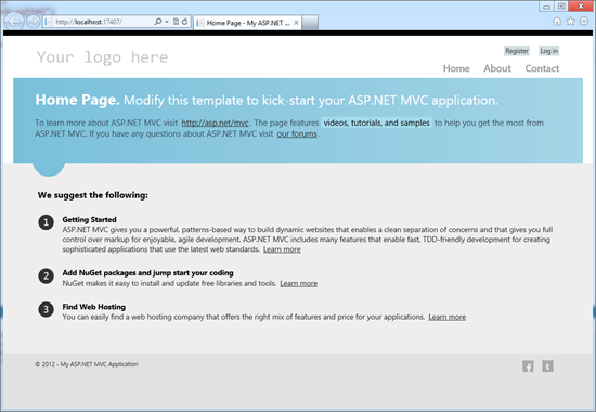
Fig.15. Desktop view of the application
Now, without closing the application, go to the same address in the mobile client. I use for this Opera Mobile Emulator . You can see that the mobile view for the same address has changed to a new one (Figure 16):

Fig.16. Mobile view of the application
As you can see, to create two different designs within the same application, we did not have to write a single line of code — this feature is supported by MVC4 out of the box.
Ok, half the work is done, but what about the third submission, especially for the iPhone? Let's add another new view called Index.iPhone, just like we’ve done before. And change the markup with the following code:
<h2> Hello, iPhone user! </ h2>
If we now introduce ourselves using the Developer Tool in IE as an iPhone and turn to the page, we’ll get not exactly the result we expected (Figure 17).
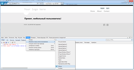
Fig.17. Go to page disguised as iPhone
That's right, MVC4 supports out of the box work with mobile devices in general, but to determine a specific device, we need to make a hint framework.
This is done in three lines of code. Add the following code to Application_Start () in the Global.asax file:
DisplayModeProvider.Instance.Modes.Insert(0, new DefaultDisplayMode("iPhone") { ContextCondition = (context => context.GetOverriddenUserAgent().IndexOf ("iPhone", StringComparison.OrdinalIgnoreCase) >= 0) }); Run the application and go to it under the guise of iPhone, you will get the desired result (Figure 18):
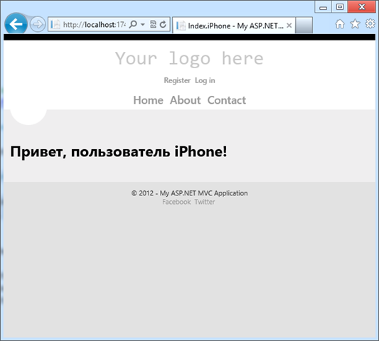
Fig.18. Type of application specifically for the iPhone
So, using the ASP.NET MVC4 mechanisms and three lines of code, we managed to create an application with three different views for different types of devices: desktop, mobile devices in general, specifically for iPhone (Figure 19).
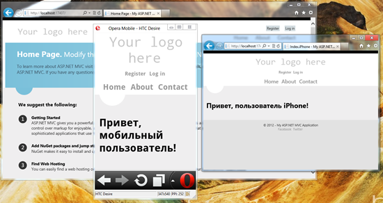
Fig.19. Three views per page
Thanks to these capabilities, you can create a variety of ideas not just for different devices, but generally on the basis of any conditions - you set this up yourself.
Creating a separate site for the mobile view
The second way to create a mobile view is to create a separate site with a special interface sharpened for mobile specifics - the interface, finger control and gestures.
Visual Studio 2012 and ASP.NET MVC4 fully support this scenario and offer a solution in the form of special templates based on the popular jQuery UI solution (Figure 20).
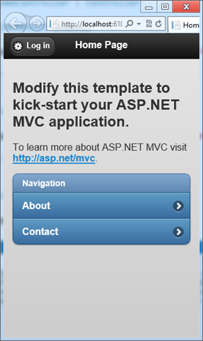
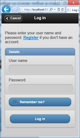
Fig.20. Mobile view of a separate site
Using these templates and the standard jQuery UI and jQuery Mobile components, you can create separate sites for mobile clients.
The choice between two approaches
Before you can get a choice of the necessary approach: to make one website for all screens and devices, or to allocate a separate website for mobile devices. The choice is entirely yours and depends on the specifics of your site and your tasks.
The approach of one site makes sense when a project works on a single team, when the site does not contain complex layout, and when the pages of the site do not contain critical design elements that cannot be sacrificed.
The approach of a separate mobile site makes sense when it is engaged in a separate team or an outsourcing, when the main site contains a complex layout with a large number of functional blocks.
Whichever way you choose, Visual Studio 2012 and ASP.NET MVC4 will fully realize all your ideas and desires.
Conclusion
In this article, we have reviewed the current trends of the mobile web, where and with what speed the mobile web is moving. We reviewed data on the impact of mobile presentation support on business and site success. We learned about the importance of having a mobile submission site today.
I told about two approaches to solving the problem of supporting mobile users: one site for all devices and a separate site for mobile users. Each of these approaches is effectively supported in Visual Studio 2012 and ASP.NET MVC 4. In just a few lines of code, you can make unique views for any type of mobile user.
I hope this material was useful to you. Let's make the web convenient for all users!
Source: https://habr.com/ru/post/145341/
All Articles