[Translation] CSS Filters
 CSS Filters were created to produce various visual effects when applied to DOM elements. In this article we will talk about the history of filters, what they do and how to apply them. Also consider their impact on performance on desktops and mobile devices.
 Past, present and future of filters
')
Filters were created as part of the SVG specification. Their task was to apply pixel-based effects to vector graphics. Over time, Internet browsers were endowed with SVG support and the usefulness of filters became apparent. Robert O'Callahan from Mozilla described the idea of applying SVG filters to DOM elements using their description in CSS. He created an example in which he showed how much easier it can be to apply SVG effects in combination with CSS. CSS and SVG workgroups merged and created a new CSS filter property. Documentation for this specification is here .
New life property "filter"
Sometimes looking through the CSS code of any page on the Internet you often come across this property. But in most cases, this property is written for older versions of Internet Explorer, it controls some of the effects implemented in the browser. This property has been omitted in favor of the standard, which is already part of the CSS3 specification.
How filters work
What do the filters do? You can imagine that this is a kind of post-process that works wonders with elements on the page after they have been drawn.
When loading a web page, the browser creates its layout, applies styles, and at the final stage renders it. Filters are applied after all these operations, but before the rendered page gets on the screen. They process the page pixel-by-pixel applying the specified effects and draw the result over the original. Thus, applying several filters one can achieve various effects, they seem to overlap each other. The more filters, the more time it takes for the browser to render the page.
Filtering with SVG and CSS
There are several ways to describe and apply filters. SVG itself is an element in which filters are described using XML syntax. Description of filters using CSS styles gives the same result, but thanks to CSS syntax this method is much simpler.
Most standard CSS filters can be described using SVG, as well as CSS allows you to refer to filters described in the SVG format. Here we will talk only about the filters available in CSS.
How to use CSS Filters
Filters can be applied to any visible element on the page.
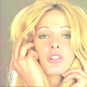
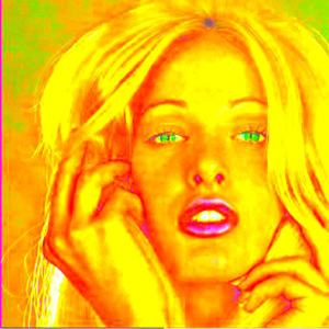
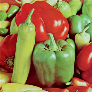
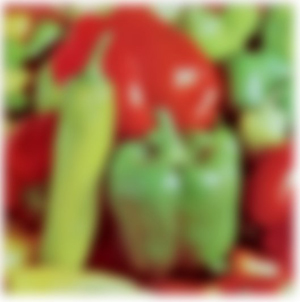
div { filter: grayscale(100%); }This example will change the color of the content inside the tag to b / w.


Each filter has a parameter that allows you to change the strength of the filter.
div { filter: grayscale(50%); }
You can apply multiple filters at the same time.
div { filter: grayscale(100%) sepia(100%); }
What filters are available for use in CSS
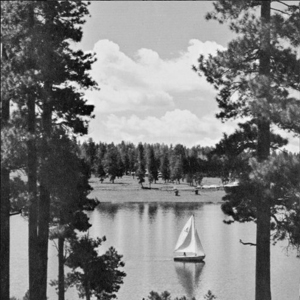
grayscale (value)
Converts colors to b / w. The value is set both in percentage (0% - 100%) and in decimal fractions (0 - 1).

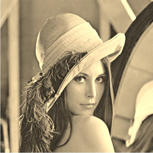
sepia (value)
Creates a sepia effect. The value is set both in percentage (0% - 100%) and in decimal fractions (0 - 1).
saturate (value)
Controls color saturation. The value is set both in percentage (0% - 100%) and in decimal fractions (0 - 1).
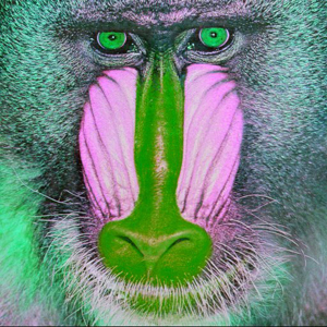
hue-rotate (angle)
Changes the color of the image depending on the specified angle. The angle of rotation determines how much a given color in a color wheel will change from red to violet. The value is set in degrees (0deg - 360deg).

invert (value)
Inverts the colors. The value is set both in percentage (0% - 100%) and in decimal fractions (0 - 1).


opacity (value)
Sets the transparency of the item. The value is set both in percentage (0% - 100%) and in decimal fractions (0 - 1).
This filter works just like the CSS opacity property. The only difference is that the filter supports hardware acceleration, but the property does not. Thus, the use of the filter will give greater performance.
brightness (value)
Changes the brightness of the image. The value is set both in percentage (0% and more) and in decimal fractions (0 and more).
contrast (value)
Changes the contrast of the image. The value is set both in percentage (0% and more) and in decimal fractions (0 and more).

blur (radius)
Creates a blur effect. The value is set in pixels (px).
drop-shadow (x, y, radius, color)
It creates a shadow similar to the CSS box-shadow property, but only the filter has hardware acceleration support. Values are set similarly to analog CSS values.
drop-shadow(16px 16px 20px black);
filter: drop-shadow(inset 0 0 2rm blue);
url (link to SVG filter)
You can create your own filters using the SVG filter element and link to them from CSS. Each filter has its own id .
SVG:
<filter id = ”foo”> ... </ filter>
CSS:
div { filter: url(#foo); }custom (coming soon)
In the near future, it will be possible to create your own filters using CSS Shaders .
Performance
CSS Filters provide excellent visual effects, but at the same time have a negative impact on the performance of your website. It is important to understand what they do and how it affects performance.
Most filters work pretty quickly on any device that supports them. However, the blur and drop-shadow filters that use the blur effect work much slower than others. How exactly do they work?
When you apply a blur filter, it mixes the colors of the pixels around each pixel, thus creating a blur effect. For example, if a radius of 2px is specified , the filter will select two pixels in all directions and mix their colors for each pixel. The larger the radius, the more time is needed to calculate the effect. Since the filter selects pixels in all directions, then as the blur radius increases by 2 times, the number of pixels increases by 4 times. This means that the time required for the calculation will be exactly 4 times longer. The drop-shadow filter contains a blur filter.
You can safely use these filters on platforms that provide hardware acceleration, but not every browser supports it. In this case, it is worth experimenting and having achieved the desired result, try to reduce the blur radius as much as possible without critical damage to the visual effect.
When using custom SVG filters, make sure that they do not contain effects that can adversely affect performance.
Compatibility
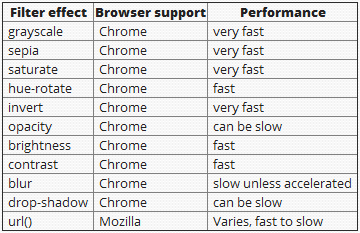
Most CSS filters are now available for use in the FireFox browser and browsers on the WebKit engine. Soon we hope to see support in the Opera and IE10 browsers. Since the specification is still in development, vendor prefixes have to be used. For WebKit -webkit-filter , no prefix is required for FireFox.
Below is a table of filter compatibility with browsers.
useful links
Draw with CSS filters.
Move the sliders to see what happened.
Tutorial with examples.
Official W3C Filter Effects 1.0 specification documentation
An example of a UI created using filters.
Original article: UNDERSTANDING CSS FILTER EFFECTS
PS
- In Chrome 19, the drop-shadow filter does not blur the edges of the shadow.
- The brightness filter does not really understand the value greater than 1 (100%). The original article states that the value of 1 (100%) is the value of the normal brightness, and with an increase it can increase the strength of the filter. In fact, a value of 1 (100%) gives an increase in brightness to the limit, and a negative -1 (-100%) decreases brightness.
- Example with all filters - link .
- An example of using filters with CSS3 Transitions on the state: hover - link .
- Animated mosaic using the blur () filter. See for yourself how this filter eats up your processor (hardware acceleration must be disabled) - link .
Source: https://habr.com/ru/post/144852/
All Articles