UI-Ai: Draw an interface in Adobe Illustrator
At the presentation of Adobe CS6 in Samara, I gave a talk on how we at Parcsis use Adobe Illustrator to create web and mobile interfaces. I want to share this report with you in the form of slides with comments.
When you show your work, often beginner designers ask the question “What is it painted in?” Experienced designers ask less often because they understand that the same thing can be done with different graphic editors. Nevertheless, I will tell my story ...
')

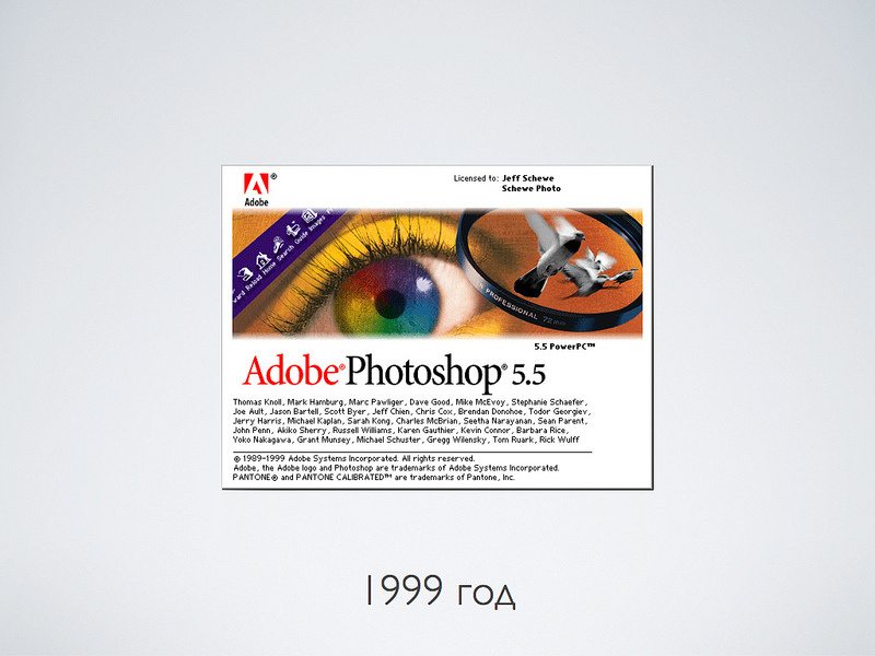
Somewhere in the year 99 I came to realize that I was a designer and, probably, I would draw something for a while. Then the photoshop of the fifth version just came out, where the most powerful features for the web design were so astounding:
- Text layers. Just think - text as text, not a raster!
- Tiered Undo! Previously, you could only cancel the last action.
Then an even more powerful Photoshop version 5.5 came out, where Save for Web appeared - a very important thing for web design ...
Years went by, Photoshop versions replaced each other. But I drew websites and interfaces in Photoshop. Yes, there were some amenities, even vector objects. But the base was raster, and the main tool was layers.

But about a year ago, it so happened that our entire design team that deals with interfaces switched to Adobe Illustrator. Being a conservative person, at first I suffered a lot. Everything was very uncomfortable and unusual. But then gradually I began to realize that there were some advantages.
In fact, I keep back a little bit. For quite some time now, we used Illustrator to draw icons. Therefore, I already experienced most of the stress when I retrained in drawing icons in a vector.

Why draw web sites and interfaces in a vector editor? What do we get for this?

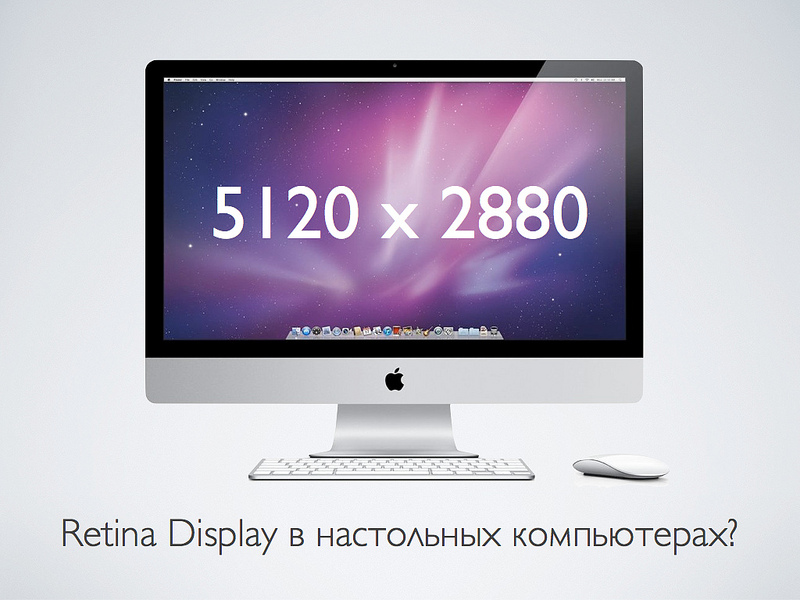
About two years ago, high-density screens, the so-called Retina Display, appeared on the mass market. The bottom line is that their resolution, if you count in dots per inch, is close to the printing quality - about 300 dpi.
With this resolution, pixels become something not very important for screen graphics, they are simply not visible.
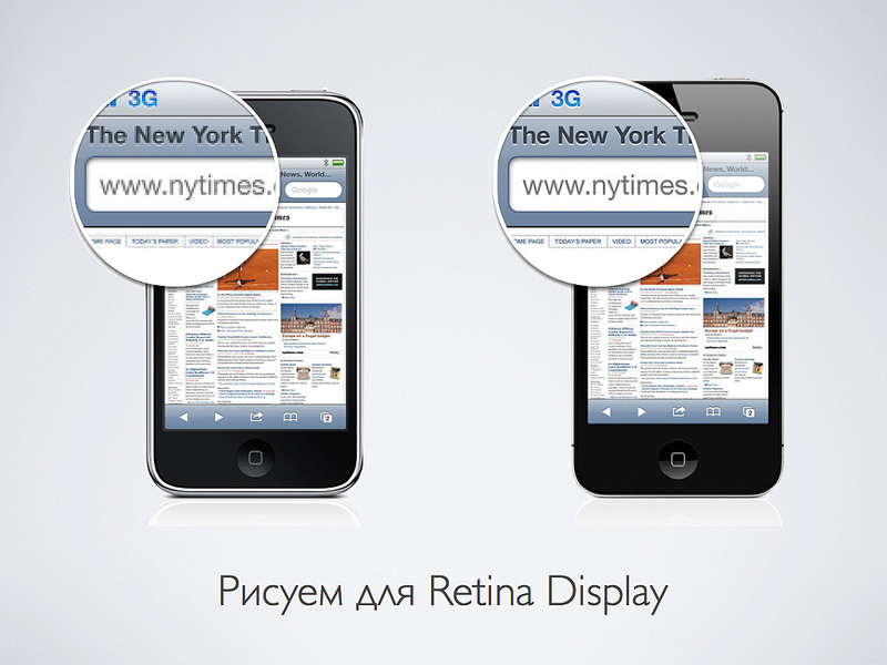
Desktop computers or monitors with high resolution should appear soon. Your design will need to somehow optimize to display on such screens. After all, if you take, for example, iMac 27 and double its resolution, you get almost 15 megapixels. I am even afraid to imagine how much a graphic file will occupy, which will completely fill the screen.
Only one way out - in the interfaces you need to switch to the vector and leave the pixels only for the photo.
What will change in your life and designer career if you start making web and interfaces in a vector editor?
Let's start with the minuses ...
- First, you will suffer. Much will be unusual and generally have to think differently.
- You will not become a better designer. The quality of your work does not grow. You will do the same thing, but a little differently. First time.
- You will really miss some of the raster capabilities. We'll have to think to do some basic things for Photoshop.

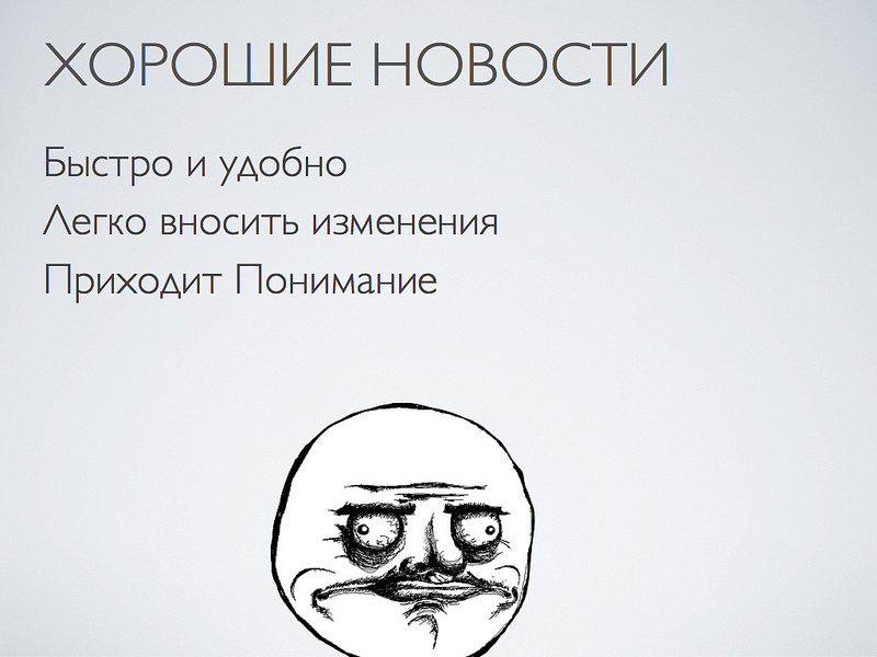
But there is some good news:
- First, the main and most valuable resource for any designer (and indeed any person) is time. Why do something for two days, if it can be done in 4 hours? As a rule, a thought usually goes faster than hands draw. Illustrator helps save time.
- Secondly, vector files are much easier to fix. Something to move, resize, and so on. The ideology “Object, not a layer” gives a significant performance increase.
- Well, the most important point. Understanding begins with a capital letter to you exactly what you are doing. Well, that is, you do something day by day. And then it comes to you! With a capital letter comes. What is important and what is not.
For example, I personally realized that modern interfaces do not draw. They impose. The ideology of the "control panel" is moving away. The interface is becoming more like a magazine layout. Such things as typography and interactivity are of great importance. And some pixel-perfect things do not mean much.
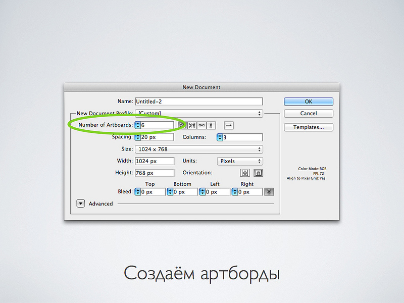
One of the most important and pleasant things that appeared with the transition to the Illustrator is, of course, art boards. Wildly handy thing.

Previously, there was an ideology in Photoshop: “one file - one page”. But modern interfaces and websites very rarely consist of a single screen.
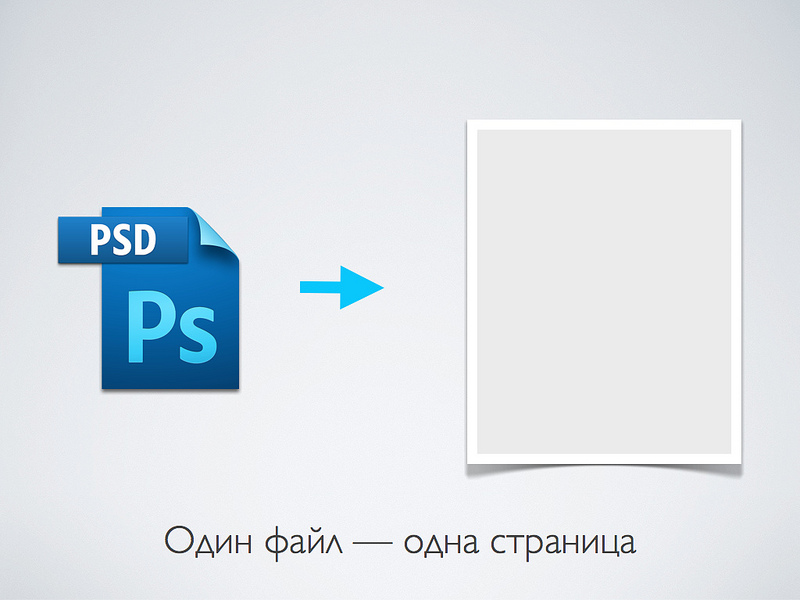
Illustrator allows you to have many screens in one file. It is very convenient. In the project folder an order of magnitude smaller files. All files are always at hand. Well, you need to open new files. Plus, memory is saved, which is important.

New artboards can be created as you work or you can create several zones at once while creating a document. As you can see, the illustrator has become oriented not only to printing, but also contains presets for on-screen graphics.
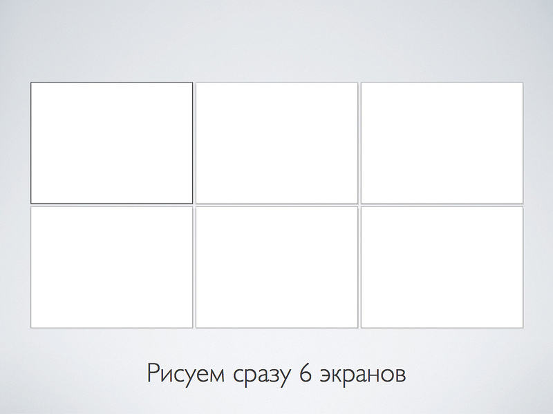
Here's what it looks like. By the way, there is a rather convenient feature: if the same element is on all screens, then it can be drawn only in one place, and then copied and used the function “paste into all artboards”
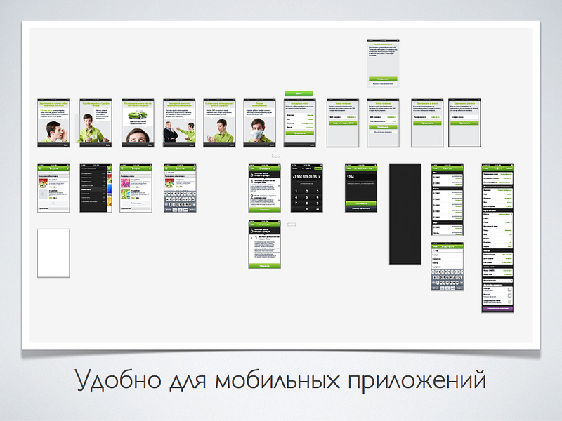
Here is an example of one of the interfaces that we are developing. All web interface screens in one file. Moreover, this file does not take up much space - it is convenient then to transfer it to the developers later.

IPhone application. The peculiarity is that the screens are small, but there are a lot of them. Now imagine that it would be a PSD file and you would need to fix some button that appears on several screens. I would have to open a lot of files and keep track of versions.
Initially, the native illustrator file format is AI. But we store all the layouts in pdf format.
- All data is saved. Nothing is lost and normally displayed, if you do not forget to press the check mark when saving - “save the ability to edit in Illustrator”
- The main convenience is that PDF can be opened on any platform using free applications. Mac OS has a standard Preview application or you can use Acrobat Reader. Yes, perhaps not all the effects will appear correctly, but in general the picture is clear.
Another moment Finder on the Mac displays makes a file icon in the form of such a brochure. And because of the folded leaflet, the second artboard is visible. When I saw this mi-mi-mi, I almost shed a tear from emotion.

The grid is important for any layout. The illustrator has its own features.
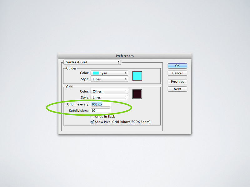
We do not use guides that Guides, and draw directly on the grid, which is a Grid. We mainly use a grid with a step size of 10 pixels. For mobile applications, we take a smaller grid - 8x8. We place the objects so that they all stand on the grid.
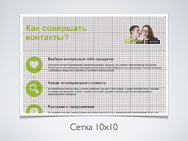
In the settings, simply select a block size of 100 pixels and turn on 10 divisions. As a result, it turns out the squares 10x10. For the 8x8 grid, we use the parameters of the 64 and 8 divisions of the block.
To fully enjoy the convenience of the illustrator, you need to enable the “sticking to the grid” mode. In this case, when creating or moving an object, it will tend to “stand on the grid”. This is the key to a neat layout.

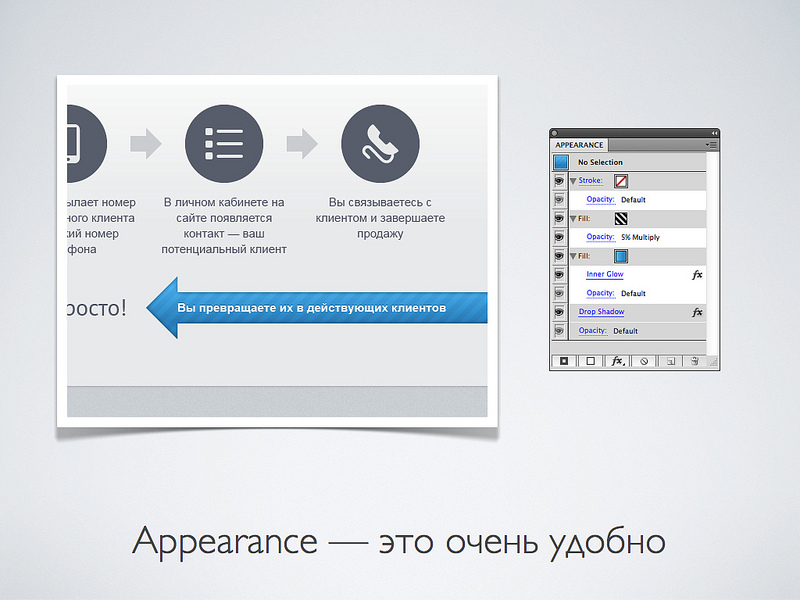
Another powerful tool for Illustrator is Appearance. There is a similar thing in Photoshop - layer effects. But appierance is much more powerful. Vector and raster effects can be applied to each vector object in any sequence, which are recalculated in real time if you change the object.
Let's take a look at this wonderful blue arrow. This is one vector object, well, except for the text. On the right is the appliance plate for this object. In fact, it is very similar to Photoshop, since the object has layers.
The bottom layer is a shadow, which is not a shadow at all, but a highlight. Above is a blue gradient fill. To which the effect of "Inner Shadow" is applied, so that it is clear that the object is as if pressed. Next is the fill in the form of a black striped pattern with 5 percent transparency.
But the button, which is made especially cleverly, to dub it on the grid. Bottom shadow effect, which makes the flare. Next in a row are three consecutive gradient fills, to which Offset Path effects are applied, which make the object smaller by a specified number of pixels. To all this, the “Round Corners” effect is applied to round the edges. And at the very top is an effect that reduces the button so that it stands on the grid.
To make a button from another object, you just need to drag the appliance onto it or poke the button with the eyedropper tool.

As you noticed, the main type of fills in the interface elements are gradients. A couple of versions back in Illustrator redesigned the mechanism for working with gradients and made it very convenient. Now there is finally an opportunity to work with transparency. And these are the quick bars that appear on top of the object.

But let's not forget that the pixels have not disappeared anywhere. And sooner or later, the layout will be rasterized and displayed on the screen.

The illustrator knows not only physical meters, centimeters and inches, but also pixels. Before working with on-screen graphics, specify in the settings that you want to work with pixels.

The first time you will have a problem with the fact that the borders of objects are blurred, as anti-aliasing is turned on. To prevent this from happening, it is necessary that vertical and horizontal lines fall into pixels. You need to make sure that the coordinates and dimensions of the objects are integer values.
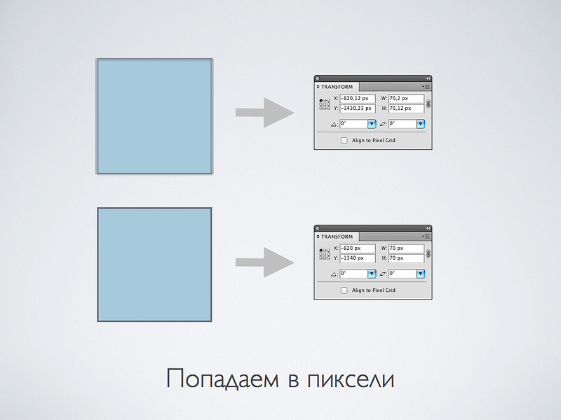
In the illustrator there is another very handy thing for automatic leveling. You do not need to follow the coordinates yourself. This is especially convenient for complex objects that you want to look clear. The feature is cool, but we do not use it. Since it is buggy! When there is an object in the group with the “align to pixel grid” turned on, then this group starts to adhere incorrectly to the grid and the coordinates are floating.

The illustrator has his weak points. You will not be able to completely abandon the raster editor.

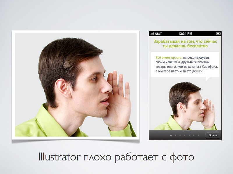
For example, you can not do without Photoshop to work with (surprise-surprise) photo! If there are photos in mock-ups, then it is advisable not to re-size them in the illustrator, but to insert “size to size” right away.
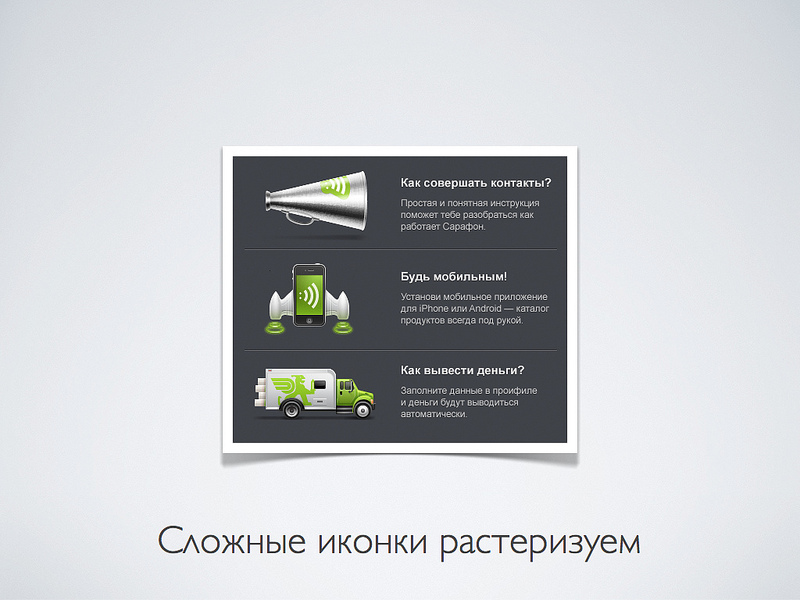
And here is an unexpected twist. But initially it is desirable to rasterize vector icons first, and then insert them into Photoshop in this form.
A few more words about the strengths of the illustrator, which I do not use, but maybe I will start.
After the layout is drawn, you need to somehow create it in HTML or insert graphics into a mobile application. We give the developers vector PDF files, which themselves already cut pictures in the illustrator too.
I still do not fit in my head. HTML coders use a vector editor.

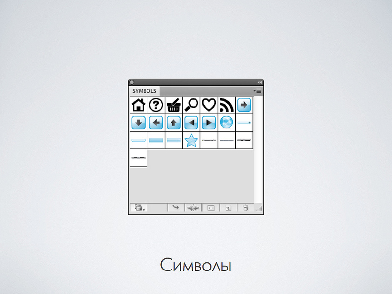
Suppose you have the same element in the layouts. For example, a button. You can make a symbol of it and use it. Why do so? Because if you correct this button, it will be corrected in other places.
Conveniently. But while I use it less often. Since absolutely identical elements are not so common. Probably soon come up with something for this.
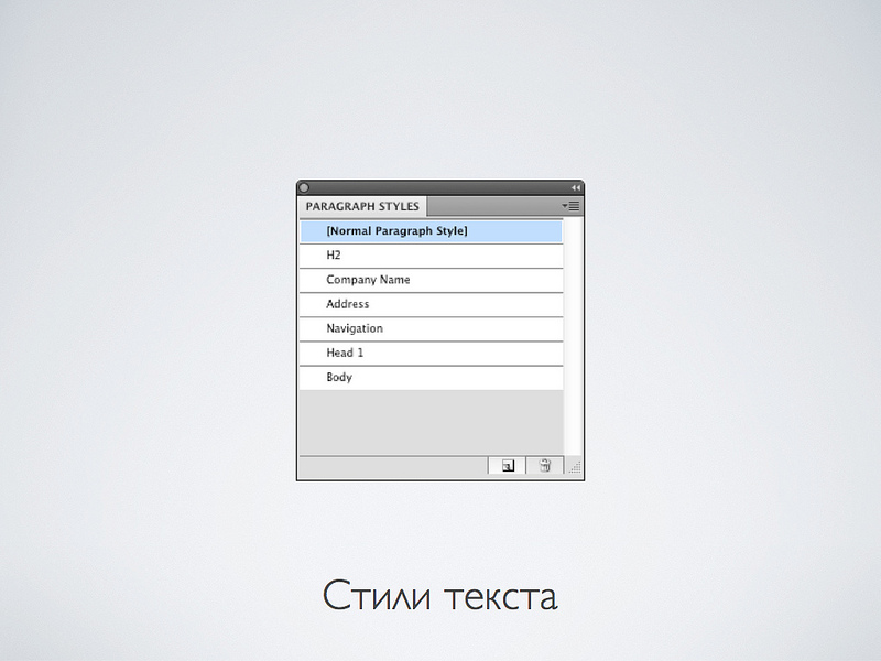
One more thing that we use a little while, but continuing to popularize the ideology of the magazine layout, I am sure that it will come in handy. These are the same text styles as in Word. In the layout, you mark the text not with parameters, but with the logic of its use. Then, for example, you want to change all the styles of headings. It will be necessary to change only in one place.
Behind this sim ... Thank you for reading. If you have questions or you draw differently - write in the comments.
When you show your work, often beginner designers ask the question “What is it painted in?” Experienced designers ask less often because they understand that the same thing can be done with different graphic editors. Nevertheless, I will tell my story ...
')
Somewhere in the year 99 I came to realize that I was a designer and, probably, I would draw something for a while. Then the photoshop of the fifth version just came out, where the most powerful features for the web design were so astounding:
- Text layers. Just think - text as text, not a raster!
- Tiered Undo! Previously, you could only cancel the last action.
Then an even more powerful Photoshop version 5.5 came out, where Save for Web appeared - a very important thing for web design ...
Years went by, Photoshop versions replaced each other. But I drew websites and interfaces in Photoshop. Yes, there were some amenities, even vector objects. But the base was raster, and the main tool was layers.
But about a year ago, it so happened that our entire design team that deals with interfaces switched to Adobe Illustrator. Being a conservative person, at first I suffered a lot. Everything was very uncomfortable and unusual. But then gradually I began to realize that there were some advantages.
In fact, I keep back a little bit. For quite some time now, we used Illustrator to draw icons. Therefore, I already experienced most of the stress when I retrained in drawing icons in a vector.
Why draw web sites and interfaces in a vector editor? What do we get for this?
About two years ago, high-density screens, the so-called Retina Display, appeared on the mass market. The bottom line is that their resolution, if you count in dots per inch, is close to the printing quality - about 300 dpi.
With this resolution, pixels become something not very important for screen graphics, they are simply not visible.
Desktop computers or monitors with high resolution should appear soon. Your design will need to somehow optimize to display on such screens. After all, if you take, for example, iMac 27 and double its resolution, you get almost 15 megapixels. I am even afraid to imagine how much a graphic file will occupy, which will completely fill the screen.
Only one way out - in the interfaces you need to switch to the vector and leave the pixels only for the photo.
What will change in your life and designer career if you start making web and interfaces in a vector editor?
Let's start with the minuses ...
- First, you will suffer. Much will be unusual and generally have to think differently.
- You will not become a better designer. The quality of your work does not grow. You will do the same thing, but a little differently. First time.
- You will really miss some of the raster capabilities. We'll have to think to do some basic things for Photoshop.
But there is some good news:
- First, the main and most valuable resource for any designer (and indeed any person) is time. Why do something for two days, if it can be done in 4 hours? As a rule, a thought usually goes faster than hands draw. Illustrator helps save time.
- Secondly, vector files are much easier to fix. Something to move, resize, and so on. The ideology “Object, not a layer” gives a significant performance increase.
- Well, the most important point. Understanding begins with a capital letter to you exactly what you are doing. Well, that is, you do something day by day. And then it comes to you! With a capital letter comes. What is important and what is not.
For example, I personally realized that modern interfaces do not draw. They impose. The ideology of the "control panel" is moving away. The interface is becoming more like a magazine layout. Such things as typography and interactivity are of great importance. And some pixel-perfect things do not mean much.
One of the most important and pleasant things that appeared with the transition to the Illustrator is, of course, art boards. Wildly handy thing.
Previously, there was an ideology in Photoshop: “one file - one page”. But modern interfaces and websites very rarely consist of a single screen.
Illustrator allows you to have many screens in one file. It is very convenient. In the project folder an order of magnitude smaller files. All files are always at hand. Well, you need to open new files. Plus, memory is saved, which is important.
New artboards can be created as you work or you can create several zones at once while creating a document. As you can see, the illustrator has become oriented not only to printing, but also contains presets for on-screen graphics.
Here's what it looks like. By the way, there is a rather convenient feature: if the same element is on all screens, then it can be drawn only in one place, and then copied and used the function “paste into all artboards”
Here is an example of one of the interfaces that we are developing. All web interface screens in one file. Moreover, this file does not take up much space - it is convenient then to transfer it to the developers later.
IPhone application. The peculiarity is that the screens are small, but there are a lot of them. Now imagine that it would be a PSD file and you would need to fix some button that appears on several screens. I would have to open a lot of files and keep track of versions.
Initially, the native illustrator file format is AI. But we store all the layouts in pdf format.
- All data is saved. Nothing is lost and normally displayed, if you do not forget to press the check mark when saving - “save the ability to edit in Illustrator”
- The main convenience is that PDF can be opened on any platform using free applications. Mac OS has a standard Preview application or you can use Acrobat Reader. Yes, perhaps not all the effects will appear correctly, but in general the picture is clear.
Another moment Finder on the Mac displays makes a file icon in the form of such a brochure. And because of the folded leaflet, the second artboard is visible. When I saw this mi-mi-mi, I almost shed a tear from emotion.
The grid is important for any layout. The illustrator has its own features.
We do not use guides that Guides, and draw directly on the grid, which is a Grid. We mainly use a grid with a step size of 10 pixels. For mobile applications, we take a smaller grid - 8x8. We place the objects so that they all stand on the grid.
In the settings, simply select a block size of 100 pixels and turn on 10 divisions. As a result, it turns out the squares 10x10. For the 8x8 grid, we use the parameters of the 64 and 8 divisions of the block.
To fully enjoy the convenience of the illustrator, you need to enable the “sticking to the grid” mode. In this case, when creating or moving an object, it will tend to “stand on the grid”. This is the key to a neat layout.
Another powerful tool for Illustrator is Appearance. There is a similar thing in Photoshop - layer effects. But appierance is much more powerful. Vector and raster effects can be applied to each vector object in any sequence, which are recalculated in real time if you change the object.
Let's take a look at this wonderful blue arrow. This is one vector object, well, except for the text. On the right is the appliance plate for this object. In fact, it is very similar to Photoshop, since the object has layers.
The bottom layer is a shadow, which is not a shadow at all, but a highlight. Above is a blue gradient fill. To which the effect of "Inner Shadow" is applied, so that it is clear that the object is as if pressed. Next is the fill in the form of a black striped pattern with 5 percent transparency.
But the button, which is made especially cleverly, to dub it on the grid. Bottom shadow effect, which makes the flare. Next in a row are three consecutive gradient fills, to which Offset Path effects are applied, which make the object smaller by a specified number of pixels. To all this, the “Round Corners” effect is applied to round the edges. And at the very top is an effect that reduces the button so that it stands on the grid.
To make a button from another object, you just need to drag the appliance onto it or poke the button with the eyedropper tool.
As you noticed, the main type of fills in the interface elements are gradients. A couple of versions back in Illustrator redesigned the mechanism for working with gradients and made it very convenient. Now there is finally an opportunity to work with transparency. And these are the quick bars that appear on top of the object.
But let's not forget that the pixels have not disappeared anywhere. And sooner or later, the layout will be rasterized and displayed on the screen.
The illustrator knows not only physical meters, centimeters and inches, but also pixels. Before working with on-screen graphics, specify in the settings that you want to work with pixels.
The first time you will have a problem with the fact that the borders of objects are blurred, as anti-aliasing is turned on. To prevent this from happening, it is necessary that vertical and horizontal lines fall into pixels. You need to make sure that the coordinates and dimensions of the objects are integer values.
In the illustrator there is another very handy thing for automatic leveling. You do not need to follow the coordinates yourself. This is especially convenient for complex objects that you want to look clear. The feature is cool, but we do not use it. Since it is buggy! When there is an object in the group with the “align to pixel grid” turned on, then this group starts to adhere incorrectly to the grid and the coordinates are floating.
The illustrator has his weak points. You will not be able to completely abandon the raster editor.
For example, you can not do without Photoshop to work with (surprise-surprise) photo! If there are photos in mock-ups, then it is advisable not to re-size them in the illustrator, but to insert “size to size” right away.
And here is an unexpected twist. But initially it is desirable to rasterize vector icons first, and then insert them into Photoshop in this form.
A few more words about the strengths of the illustrator, which I do not use, but maybe I will start.
After the layout is drawn, you need to somehow create it in HTML or insert graphics into a mobile application. We give the developers vector PDF files, which themselves already cut pictures in the illustrator too.
I still do not fit in my head. HTML coders use a vector editor.
Suppose you have the same element in the layouts. For example, a button. You can make a symbol of it and use it. Why do so? Because if you correct this button, it will be corrected in other places.
Conveniently. But while I use it less often. Since absolutely identical elements are not so common. Probably soon come up with something for this.
One more thing that we use a little while, but continuing to popularize the ideology of the magazine layout, I am sure that it will come in handy. These are the same text styles as in Word. In the layout, you mark the text not with parameters, but with the logic of its use. Then, for example, you want to change all the styles of headings. It will be necessary to change only in one place.
Behind this sim ... Thank you for reading. If you have questions or you draw differently - write in the comments.
Source: https://habr.com/ru/post/144770/
All Articles