Lightweight buttons "Next" are offered (wholesale, cheap)
Initially, the introduction of buttons, noticeably falling out of the design in size, met a lot of convictions in the topic dedicated to updating the site on May 22. The representative of Habr Boomburum completely agrees with this and suggests the design of the button to send him a personal message. However, I suggest that everyone appreciate the prettiness of one decision that has matured during the day.
Picture to attract attention:
(By the way, when I tried to add a large text to a button I found an interesting bug, the text on the button does not digest the letter “e.”)
')
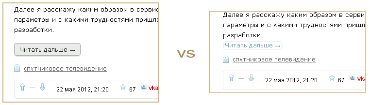
The first desire and action was the complete removal of the signs of the button, since among the text the button looks inappropriate. Thinking over the purpose of introducing a button (so that it differs from a simple link and that its CSS transition cannot be faked with a simple picture), I found a solution that satisfies all the requirements - compact, like text, and similar to a button, and with a CSS transition. The solution turned out to be so organic to the old idea of the link that I decided to share it with everyone through a short video - so that the transitions looked, and not only with those users who installed the ZenComment users , in which such transparent buttons are available from the evening of May 22 (the styles version 2.42). It turned out even better than when the button was a link, provided that it remains light and transparent.
Video (4 min, no sound).
It compares the design and animation of the buttons of the standard design in place of the “Read more” link (the first 2 minutes) and the compact transparent buttons (further from 2:04). 3:07 - the same buttons with HabrAjax + ZenComment. It gives some rough idea of how those and other buttons are perceived in action. Very roughly, due to the various scrolling delays when the screencast is removed. The original size was 640 by 480, so the rest is relatively high quality, if you look at the full screen.
(The previous video by the stylist - the predecessor of ZenComment has not lost its meaning and now it is made much more interesting, with music, for 8 minutes: www.youtube.com/watch?v=nBmTcN7mP-c .)
What we see in the case of a long button:
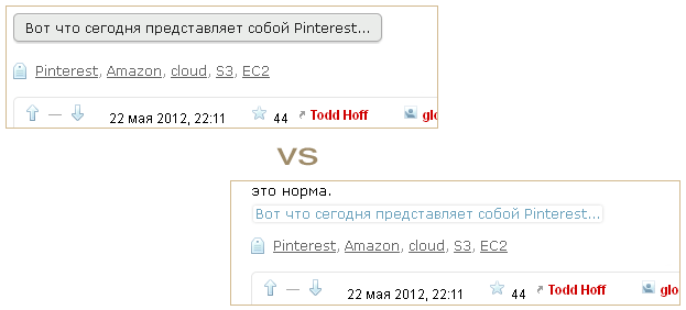
What is observed when you hover the mouse:
Why is the button made to look almost like a link in this solution? Because it is actually a link. It can be opened in another window with the right mouse button or by holding Ctrl. And it is more convenient than if it were a real button (and an input tag). To maintain user confidence that this is a link, the link color, transparent background, and text line size are selected.
Of course, with a big button, it feels cozier on the smartphone and on large screens with a generous attitude to the occupied space. But what to put in the forefront? The Habr option button is a Bootstrap style, where a compromise between Mac, Win7 and compatibility with smartphones is used. The link button of the old version of Habra and the proposed one - satisfies the node of conflicting requirements, but does not support the occupation of additional space, which corresponds to the classic design of the pages and at the same time carries an additional load of security considerations.
Transforming the existing button design into the one shown on the video is no more than 20 minutes for the layout designer (plus a couple of hours for testing in all browsers). I think many will support the installation of just such a button, and the issue with the button during the day (if the administration decides) will be resolved.
For those who already wish to put and test this button through usersystems, the code is given. It is based and consistent with the elements of styles with the decisions of the site, in fact, not much different from them.
To use these styles outside of Firefox, you need to take the rules inside curly brackets after the words "@ -moz-document". For Firefox - copy all the code into the new add-on user style Stylish.
(Another bug-report, very similar to the bug with BR in SOURCE: the characters "@" in the codes turn into <hh user = ...)
On the occasion, in the topic of design - ad. Designers passing by! And not indifferent to the design of the frequently read Habr. There are 2 quite serious socially useful tasks.
1. New design Habra , unofficial, not tied to an existing one. It is planned to be implemented in 3 months.
2. Design of user styles ZenComment - a little touch up the colors, maybe something else. Can be implemented immediately.
(The post was not placed in the Habrabhabr hub-offtopic, so that unauthorized users who have access to the Next button can use the style.)
Picture to attract attention:
(By the way, when I tried to add a large text to a button I found an interesting bug, the text on the button does not digest the letter “e.”)
')
The first desire and action was the complete removal of the signs of the button, since among the text the button looks inappropriate. Thinking over the purpose of introducing a button (so that it differs from a simple link and that its CSS transition cannot be faked with a simple picture), I found a solution that satisfies all the requirements - compact, like text, and similar to a button, and with a CSS transition. The solution turned out to be so organic to the old idea of the link that I decided to share it with everyone through a short video - so that the transitions looked, and not only with those users who installed the ZenComment users , in which such transparent buttons are available from the evening of May 22 (the styles version 2.42). It turned out even better than when the button was a link, provided that it remains light and transparent.
Video (4 min, no sound).
It compares the design and animation of the buttons of the standard design in place of the “Read more” link (the first 2 minutes) and the compact transparent buttons (further from 2:04). 3:07 - the same buttons with HabrAjax + ZenComment. It gives some rough idea of how those and other buttons are perceived in action. Very roughly, due to the various scrolling delays when the screencast is removed. The original size was 640 by 480, so the rest is relatively high quality, if you look at the full screen.
(The previous video by the stylist - the predecessor of ZenComment has not lost its meaning and now it is made much more interesting, with music, for 8 minutes: www.youtube.com/watch?v=nBmTcN7mP-c .)
What we see in the case of a long button:
What is observed when you hover the mouse:
Why is the button made to look almost like a link in this solution? Because it is actually a link. It can be opened in another window with the right mouse button or by holding Ctrl. And it is more convenient than if it were a real button (and an input tag). To maintain user confidence that this is a link, the link color, transparent background, and text line size are selected.
Of course, with a big button, it feels cozier on the smartphone and on large screens with a generous attitude to the occupied space. But what to put in the forefront? The Habr option button is a Bootstrap style, where a compromise between Mac, Win7 and compatibility with smartphones is used. The link button of the old version of Habra and the proposed one - satisfies the node of conflicting requirements, but does not support the occupation of additional space, which corresponds to the classic design of the pages and at the same time carries an additional load of security considerations.
Transforming the existing button design into the one shown on the video is no more than 20 minutes for the layout designer (plus a couple of hours for testing in all browsers). I think many will support the installation of just such a button, and the issue with the button during the day (if the administration decides) will be resolved.
For those who already wish to put and test this button through usersystems, the code is given. It is based and consistent with the elements of styles with the decisions of the site, in fact, not much different from them.
/** haButtons v1_2012-05-22, FF3.6+, Opera11+, Safari5, Chrome, IE9 * Author: spmbt, http://spmbt.habr.ru/ */ @namespace url(http://www.w3.org/1999/xhtml);@-moz-document domain("habrahabr.ru"){ .buttons a.button, .buttons input:disabled:active, .buttons input{padding:0 10px!important} .post .content .buttons{ display:inline-block!important;padding:0!important} .post .content .buttons a.button{ margin-left: 2px!important; padding:0 2px 1px!important; border:0!important; border-radius:2px!important; background:transparent!important; color:#6da3bd!important; box-shadow: 0 0 2px rgba(255,255,255,0.4) inset, 0 0 2px rgba(0,0,0,0.2)!important} .post .content .buttons a.button:hover{background:#f4f4f9!important} .post .content .buttons a.button:visited{color:#b96!important} } To use these styles outside of Firefox, you need to take the rules inside curly brackets after the words "@ -moz-document". For Firefox - copy all the code into the new add-on user style Stylish.
(Another bug-report, very similar to the bug with BR in SOURCE: the characters "@" in the codes turn into <hh user = ...)
On the occasion, in the topic of design - ad. Designers passing by! And not indifferent to the design of the frequently read Habr. There are 2 quite serious socially useful tasks.
1. New design Habra , unofficial, not tied to an existing one. It is planned to be implemented in 3 months.
2. Design of user styles ZenComment - a little touch up the colors, maybe something else. Can be implemented immediately.
(The post was not placed in the Habrabhabr hub-offtopic, so that unauthorized users who have access to the Next button can use the style.)
Source: https://habr.com/ru/post/144353/
All Articles