The simplest techniques of adaptive layout
Every month there are more and more websites with adaptive markup, customers other than cross-browser compatibility are increasingly demanding, but many developers are in no hurry to learn new techniques. But responsive design is easy! This article presents 5 examples of adaptive markup of various elements of web pages.

Very simple CSS and HTML, and your embed video will scale to fit the page width:
')
Max-width helps determine the maximum possible width of an object. In the example below, the width of the div is 800 pixels if possible, but not more than 90% of the width:
You can also scale the image:
This design will work in IE 7 and IE 9, and for IE 8 we do the following hack:
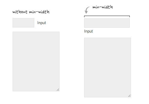
Min-width - the opposite of max-width, allows you to set the minimum width of the object. In the example below, thanks to the min-width, the text field is scaled:
If in adaptive layout use relative values in the right places, you can significantly reduce the CSS code of the page. Below are examples.
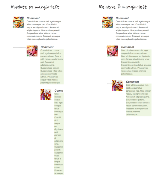
An example of the layout of nested comments, where relative values are used instead of absolute values. As you can see from the screenshot, the second method is much more readable:
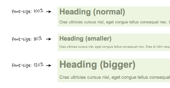
When using relative values (em or%) of a font, the relative values of line space and indents are also inherited:
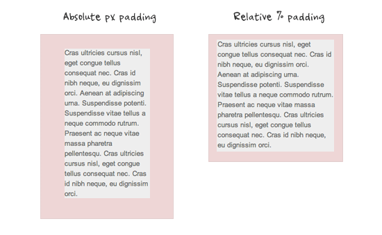
In the screenshot below you can clearly see the advantages of relative values of padding over absolute ones:
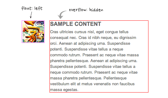
You can clear the float from the previous element and leave the content inside the container using overflow: hidden, which is very useful in adaptive markup. Clearly - in the demo .
With CSS, you can transfer intolerable text constructs:
1. Video ( demo )
Very simple CSS and HTML, and your embed video will scale to fit the page width:
')
<div class="video"> <iframe src="http://player.vimeo.com/video/6929537"frameborder="0"></iframe> </div> .video { position: relative; padding-bottom: 56.25%; height: 0; overflow: hidden; } .video iframe, .video object, .video embed { position: absolute; top: 0; left: 0; width: 100%; height: 100%; } 2. Maximum and minimum width ( demo )
Max-width helps determine the maximum possible width of an object. In the example below, the width of the div is 800 pixels if possible, but not more than 90% of the width:
.container { width: 800px; max-width: 90%; } You can also scale the image:
img { max-width: 100%; height: auto; } This design will work in IE 7 and IE 9, and for IE 8 we do the following hack:
@media \0screen { img { width: auto; /* for ie 8 */ } } Min-width - the opposite of max-width, allows you to set the minimum width of the object. In the example below, thanks to the min-width, the text field is scaled:
3. Relative values ( demo )
If in adaptive layout use relative values in the right places, you can significantly reduce the CSS code of the page. Below are examples.
Relative margin
An example of the layout of nested comments, where relative values are used instead of absolute values. As you can see from the screenshot, the second method is much more readable:
Relative font size
When using relative values (em or%) of a font, the relative values of line space and indents are also inherited:
Relative padding
In the screenshot below you can clearly see the advantages of relative values of padding over absolute ones:
4. The trick with overflow: hidden ( demo )
You can clear the float from the previous element and leave the content inside the container using overflow: hidden, which is very useful in adaptive markup. Clearly - in the demo .
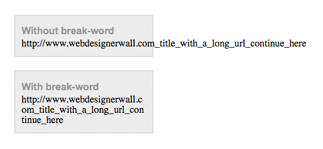
5. Word wrap ( demo )
With CSS, you can transfer intolerable text constructs:
.break-word { word-wrap: break-word; } Source: https://habr.com/ru/post/144003/
All Articles