Landing page that works
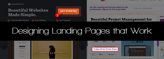
Knowing how to make a good landing page will help increase the number of desired actions that users perform on your site. The article provides an overview of the design elements of a good landing page.
What is landing page?
Before we begin let's define the landing page concept:
- from a technical point of view, the landing page is a page that consists of the same elements as a regular web page (HTML, CSS, text, images, video, etc.)
- from a business point of view , this is the page that pushes the user to take the desired action (purchase or subscription)
- from the user's point of view , this is the page to which he followed the link from another site (from a search engine, twitter, by clicking on a banner)
Three common reasons for creating landing page:
')
- force the user to register or subscribe to the newsletter
- sell a specific product in a specific situation (sale or promotion)
- force user to download or install software
Principles for developing an effective landing page
Let's discuss the components or factors inherent in a good landing page.
Call to action
Call to action asks and even forces the user to perform a specific action. Example call to action - "Subscribe to our newsletter." Often call to action prompts the user to click on some element of the page (link or button) or fill out a form.
Tips:
- Express yourself clearly. Specifically, tell the user what exactly he should do and what will happen next.
- Do not abuse call to action. If there are few of them on the site, then you can focus on the fact that the user takes the desired action as soon as possible.
- Use the buttons. Buttons are a traditional control and any user knows that it can be clicked. Good button design again draws attention to call to action.
- Additional information should be available. She must convince the user to take the necessary action.
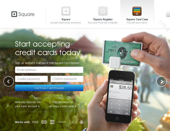
Square's Landing page is a great example of a good call to action, which is aimed at registering a user. The site offers to create an account, and, as a result of the action, you get a free product of the company (Square credit card reader).
Headline
A good landing page should have an effective header. It is he who gives the user to understand what to expect from this page and that he has fallen into the right place.
Keep in mind that the title has only one goal - to make the user stay on the page as long as possible.
When you make a headline, ask yourself: “Is this an interesting headline enough and does it really force the user to continue reading further?”
Tips:
- Write simple and short headlines. Do not waste your time, explain to him the main idea of what he can get on this site as soon as possible.
- The design should attract the attention of the user. Use a large font and place the headline in a conspicuous place - at the top of the page, where it should be.
- Use relevant words. Use words and phrases that make users come to you from search engines - use h1 and h2 tags for headlines.
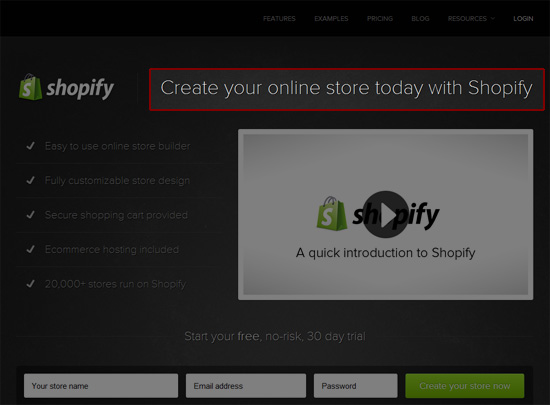
A good example of the title of the landing page of the company Shopify . It is very short and gives an idea of what the service is doing, and attracts attention, because the large font size is used and the title is located in a prominent place. You can find Shopify in a search engine by typing "ecommerce store".
Simplicity
Landing page should be as simple as possible. The user can get confused and leave if the page is too overloaded: the more difficult the landing page, the less chance that the user will perform the necessary actions. Everything should be very clear, and only the necessary elements should be used.
Tips:
- Each page element should push the user to perform an action. Use the principles of reductionism to remove unnecessary elements and text.
- The landing page should have one main call to action. The goal of the page should be very clear and is that the user needs to perform a single action. The presence of other actions is intended to facilitate the implementation of the main.
- There should be a lot of free space on the landing page. Too busy page can scare the user.
Landing page Dropbox is extremely simple. There are only 3 elements: logo, video and one single button. Call to action - download the application. But the video is an additional call to action, giving the user information about why he should become a Dropbox user.

Gaze trajectory
To be sure that the visitor has seen all the elements of the landing page, which will help him make a decision to carry out call to action, the trajectory of the look should be well thought out.
The proper trajectory accelerates the perception of information and ensures that the site visitor ultimately understands call to action.
Tips:
- Arrange the landing page elements in a logical visual sequence. Determine the order in which you want to view the elements and stick to it. You can learn more about visual consistency here: "Working with Gestalt for Visual Hierarchy" .
- Use graphic elements. Arrows, icons and vivid images can help direct the user to the desired area of the page.
- Use contrasting colors for specific webpage components. Bright elements stand out, attracting attention.
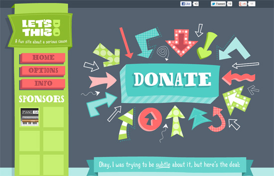
An example of good use of bright elements is LetDoThis! which invites visitors to donate money to a charitable foundation. The first thing you see when you go to the page - call to action - numerous arrows pointing to the “Donate” key button. Note that the button and the arrows have a high contrast of colors compared with a dark gray background.
Relevance
Users get on your landing page from different sources, so the landing page should correspond to each of them. For example, if it is written on an advertising banner that by clicking on it you can buy an iPad 2 times cheaper, then the landing page should be an iPad with a discount.
Tips:
- Create a separate landing page for each marketing campaign. If you are doing an advertising campaign with Facebook, this should be reflected on the landing page.
- Landing page should change depending on the source - add content, promotional codes and call to action.
Do not put users at risk
Obviously, no one likes to take risks. Take responsibility for security, privacy and fraud.
Tips:
- Offer a convincing guarantee. For example, if you offer to buy goods, then you need to provide for the possibility of returning their money if they are not satisfied with the purchase.
- Try to anticipate what the user will doubt and convince him otherwise. Tell us more about what the user will receive by performing such an action. The most common concern is cost, time, or security.
- If possible, offer to try the service or product for free. For example, if you sell a paid service and there are several tariffs, then provide for a free tariff where you will not need to enter credit card details.
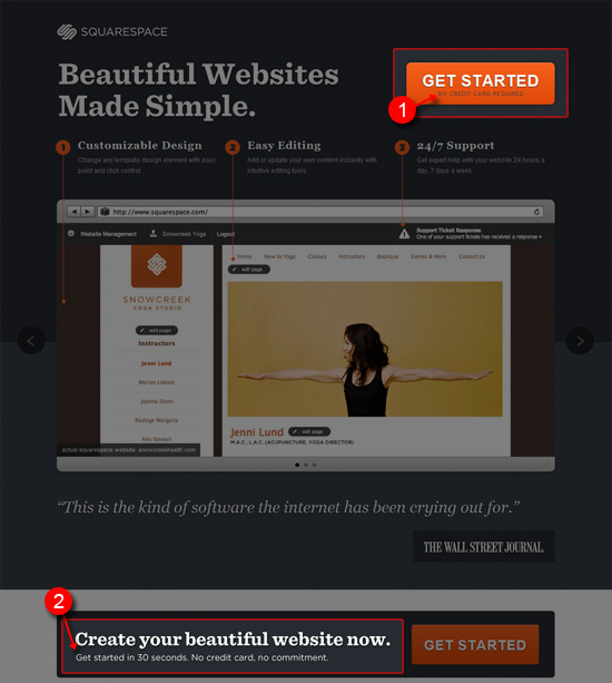
The Squarespace site is a good example of how the risk of subscription or use of the service is reduced. Attention is drawn to the fact that users do not need to enter a credit card number, that the registration process takes only 30 seconds and there are no permanent obligations. Those. Solved cost, time, and safety issues.
Deficiency
Another way to get the landing page to work is to create a sense of scarcity. If the visitor of the page feels that this product may soon disappear from the sale or the price for it will increase, then this may work, and he will take action immediately.
Tips:
- Place text on the page that conveys a sense of urgency. For example, clearly stating that special discounts will end soon, you can encourage users to buy goods right now.
- Dynamically update the information about the deficit. For example, you can show on the page a counter of the quantity of the remaining goods.
The Mighty Deals website has a timer showing the expiration date of the discount. He pushes users not to postpone the purchase for later.

Elements of trust
There are many ways to convince users that the use of the site is safe and secure.
One way is to use social services as evidence. This may be a tweet about the product, feedback from previous customers, as well as positive reviews about you on other sites, such as blogs.
It also makes sense to display the received awards or certificates.
Tips:
- Post social data from reputable and renowned web services. A good example is the number of likes on Facebook.
- Use trust elements associated with call to action and place them nearby.
- Be honest. Do not publish fake statuses or reviews from other sites.
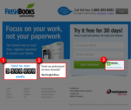
On FreshBooks, you can see three different elements of trust: (1) the number of people using the service, (2) quotes from authoritative and well-known sources, such as the New York Times and (3) a security certificate.
Conclusion
The development of the landing page is crucial in order for the user to perform the desired action. By following the simple tips mentioned above, you can create an effective and efficient landing page.
Source: https://habr.com/ru/post/143923/
All Articles