Alternative method of visualization of the progress of the IT project
Introduction
In this article, I will talk about a new way of visualizing the progress of IT projects that we began to apply in our company recently along with other approaches, and despite our small practical experience, we are already receiving profits from using this method. In fact, this is not even an article at all, but a summary of the report at the Software People 2012 conference. We are talking about a new type of diagrams, which we call “project maps”, and outwardly these diagrams are very similar to military maps describing combat operations.
The article is composed of several parts: first I will tell you where this idea came from - use the principles of making military maps in relation to project management, then tell you about some simple rules for drawing up diagrams, and then on 2 examples I will show how these project maps can help us , to project managers, in the timely detection of 2 problems: 1) the problem of cost overruns, which indicates poor-quality work of the team; 2) the problem of lack of on the project of performers of a certain type. I will also talk about the pros and cons of such diagrams, about the prospects for development.
I do not think that you have heard of this type of diagrams, so the purpose of this article will interest you. I really hope that this visualization method will suit you as well as us. And I hope that with the help of it you will be able to solve at least some of the problems that arise during your project management.
Let me say a few words about my own experience. Previously, I was constantly faced with such a situation, when, coming to the project meeting to the authorities, laying out tables, Gantt charts, displaying burndown graphics on the monitor, I saw the management peering at them thoughtfully, silently trying to remember / compare something , but then all the same asks the same question: “Listen, but tell me, is everything good on the project? What problems are there? And in such cases I always had an internal contradictory feeling “why, then, did I even print and bring all these diagrams? Who do they really need ?? ”, and, as usual, I began to talk about how the project is moving. Now the situation has changed. Now I am preparing a report using these very “project cards”, and now at our meetings there is no need for lengthy oral stories: many problems on the project are immediately visible to the naked eye. Now we skip the long stage with the questions “Is everything OK on the project?” And “Where are the main problems?”, And proceed immediately to discussing the causes and what was done in the current situation. Next, I will talk about how we were able to achieve such results.
How did it all start?

As a child, I really liked books about the Great Patriotic War of 1941-1945. I especially liked to look at military maps. In the notation I used, I understood little, but I was overwhelmed with a sense of pride in my country when I realized that despite the fact that the first to the left were attacked by the “blue arrows”, and there were a lot of them, and they were very fat, we could first stop them, and then push these “blue” ones back even further than the place from which they, in fact, attacked. I still didn’t understand what the inscriptions “Army Group Center” meant; I didn’t understand what really happened where the figures marked “3TGy”, “4TGy”, “4A”, “9A” were located. But I really liked the multi-colored arrows, lines and circles on the maps.
And apparently, this children's hobby played a role when, much later, when I was working as a project manager, I was faced with the question of choosing the most appropriate means of visualizing their states, and came to the concept of “project maps”.
After all, in fact, almost any war can be considered a project, where the approximate dates of commencement and termination are defined, plans are developed, the necessary number of troops are prepared, primary reconnaissance is carried out, and the directions of the main attacks are determined. And in any project, respectively, we can find analogies with such a concept as “war”. For example, analysts will be analogous to “intelligence”, “tanks” are programmers, and “heavy tanks” are good, strong programmers, and “light tanks” are weaker programmers. Division commanders - leading developers, army commanders - project managers, supreme commander in chief - project director, and the head of state - is the general director of the company. I repeat, you can find a lot of analogies.
But the most important thing for us is that in this case the project plan can be displayed as a map using a simple notation.
')
Designations

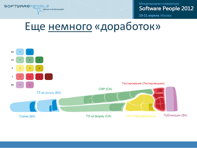
Let the regions designate tasks, the areas of these regions let them designate the planned labor costs required to complete them, the types of tasks can be indicated in color, for example, blue regions are tasks for business analysts, green regions are tasks for system analysts, yellow regions are tasks for programmers , red - for testers, etc. Brief names of tasks can be immediately mapped (in our example, the names of tasks are taken from a real project to transfer public services to electronic form: “Scheme” - developing a BPMN scheme for executing a service according to administrative regulations, “CIR” - developing an executable JPDL process for systems of execution of regulations, “PGU” - development of a JAVA form for a single portal of public services, etc.).
When displaying tasks on the map, you can use different types of borders and regional fillings.

For example, the solid borders of the regions may indicate that the task can be started to be done, and all the initial data for this is available. Dotted boundaries may indicate that it is not yet possible to begin the implementation of these tasks: either you must first perform some other tasks or you must wait for a certain moment.
A uniform area fill can indicate tasks that have already been completed and verified. With white oblique hatching, we can designate tasks that are currently under construction, and by cross-hatching we can designate tasks that are being tested.
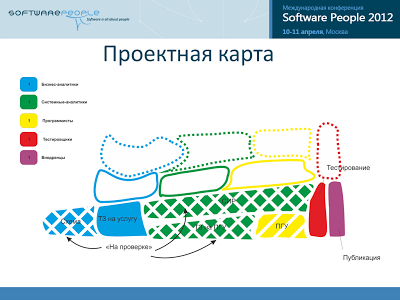
Those tasks, the results of which we have already demonstrated to the customer, and he accepted them, we can even cross out so that they do not interfere with us further.
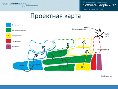
Arrows we can denote the movement of performers between tasks. And we can designate the ultimate goal of a group of tasks by some distinctive sign, indicating two dates: the planned one, when we assumed to completely close the given region of tasks and the one obtained by current calculations.
We can display the planned order of performance of tasks using the following technique: 1) select the approximate direction of “movement” from the current position on the map to the target, for example, from left to right, 2) locate task regions on the map along the “movement” (from left to right) in the order in which they should be performed. Thus, those tasks that must be completed earlier will be to the left. It is clear that in this case the location of the regions will reflect the dependence between the tasks not exactly, but approximately , and therefore the sequence of execution, they will reflect not exactly, but approximately .
The shape of the regions can be chosen arbitrarily, based on personal preferences and the available predefined patterns.
Example 1. Labor cost overrun
Here you looked at the above schematic drawings, and probably say to yourself: “Well, yes ... It looks unusual, interesting, but why come up with something new, if you already have proven diagrams that we use ?! There is a classic - the Gantt chart, there is in the end burndown graphics! Why is something new ??
I will not focus on the burndown-graphs - there will be a separate talk about them, but for now I’ll concentrate on what specifically Gant’s chart has become inconvenient for us. I'll tell you why we decided to go to the "project cards".
So, the figure below shows the classic Gantt chart, and it reflects the work plan for 7 tasks.
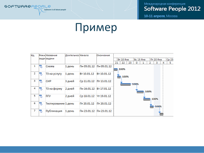
And, it would seem, this chart will continue to perfectly cope with the visualization of the project. But it is not so. Many of those who read this article deal specifically with software development projects. And there is one stage there that always turns the initially understandable plans on Gant diagrams into something monstrous and poorly understood. I'm talking about the testing phase. In which, in 90% of cases, testers detect errors made by executors at the previous stages, and there is a need for additional work, which we call simply “improvements”. And let's see how the Gantt chart will display these improvements to us, and then compare it with what a project map can offer us. After that, I think you yourself will see that the project map is preferable in this case.
In my work, I used the 3rd ways to register these "improvements". Let's look at them all to return to the project map again.
So, the first of these is when all the resulting improvements and additional tasks for testing I had consistently one after another, and, thus, it turned out some "ladder" from which, apparently, you can not understand, absolutely nothing, except that " There were a lot of improvements. ”
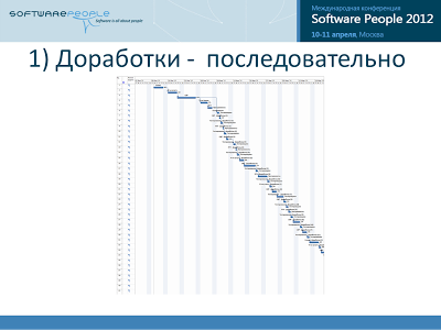
But what kind of improvements have brought more inconvenience, what - LESS? What kind of performers worked poorly, and which ones worked well, I cannot understand from this picture. First, it’s small and unclear, if you look at the whole diagram. Secondly, the improvements are not divided into types.
And then I began to group emerging “improvements”, inserting them as subtasks to the main “summing” tasks. And the diagrams began to turn into something like that (see figure below).
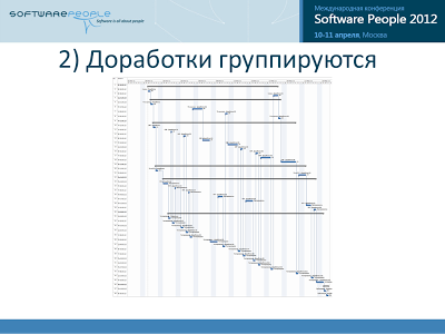
It is evident that here the picture is perceived more clearly. I see that most of the improvements were from system analysts and programmers. And I see that testers had to return tasks for revision 15 times.
But again, please remember that we are now considering a diagram for an initial set of 7 tasks. And she ALREADY is now on the verge of perception. In real projects, where there are at least dozens of major tasks, the diagram will turn into graphical chaos.

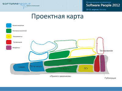
Therefore, at one time I switched to the third way of registering these additional works on the main tasks - I just generally stopped registering new improvements as separate tasks. We began to write off time to the main task, and then “gaps” began to appear on the Gantt chart in the main tasks.
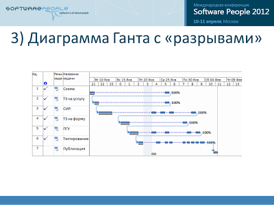
And then, by the number of these gaps, it was already possible to conclude about the number of times tasks were returned from testers, which of the performers most often corrected comments and made improvements. And, which is also important, the diagrams have become more compact, now I could see the situation in many groups of tasks simultaneously. And at first it even seemed to us that the optimal way of displaying was finally found. However, in this way there is a catch.
The problem is that we are dealing with software development projects. And that means you need to remember about 2 features that are inherent in all such projects: firstly, often the performers independently change the order of the tasks, and secondly, they often switch between tasks. And that's fine. But on the Gantt chart, all these cases will be displayed the same way.
And you can not understand - whether it was so many improvements and returns, or just a performer switched to other tasks.
In this diagram, you can not conclude "how well the team works." After all, the Gantt chart is aimed at displaying the distribution of tasks in time.
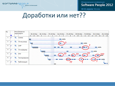
And now the important question: do we need it? Do we need to monitor the distribution of ALL tasks in time?
Personally, as a project manager, is the team interested in high-quality work? I am interested in, and doesn’t a shaft of errors arise there, due to which an overrun of planned labor costs begins?
Yes, I’m interested in dates , but the dates of the demonstration of the final result to the customer, and not the intervals of work on intermediate tasks within the iteration - it doesn’t matter to me!
And the Gantt chart distracts my attention from important issues to irrelevant details. Those. very poorly copes with the task of helping the project manager in assessing the current situation on the project.
Thus, we concluded that in this case the Gantt chart does not suit us. And now you can go back to the project maps and see how they signal us about this problem - about “a large number of improvements”, and then we can conclude that they are more convenient in this.
And if you ask the question “how is it most convenient to display improvements on project maps,” the answer will be simple - dimming. For each revision, we simply draw a darker spot inside the main task. The more improvements - the more spots there will be. The more serious the improvements, the more effort was spent on their removal, and the larger and darker the spots will be.

And then according to the dynamics of the appearance of such spots on our project for a certain period of time, we will be able to judge whether the team has worked efficiently over the considered period of time. I ask you to pay attention to the fact that this diagram does not show “switching” of performers to other tasks at all, it does not distract our attention to this, which is important.
Roughly speaking, the project manager only needs to remember a simple rule: "Dark spots are bad." And make sure that such spots occur as little as possible.
Thus, we examined what a project map can offer us by identifying problems associated with cost overruns, and compared to the Gantt chart, I demonstrated clear advantages.
Let's now consider a second example related to another problem - “the lack of performers of a certain type,” for example, testers. Let's see what the project map can offer us in the “dynamics”.
Example 2. The lack of performers
Below is a short video, less than a minute, which will show how the project map changes over time. The project has about 50 tasks. I recall the notation that you will encounter: “slant hatching” means that the task is in work, “cross hatching” - that the task is ready for testing, “one-color fill” - is accepted by the tester and is ready for demonstration.
On this map, tasks are divided into three types of performers: “blue” are performed by analysts, “yellow” are performed by programmers, and “red” by testers. Area of regions - labor costs.
I ask you to draw your attention to whether the total area of yellow tasks with “cross-hatching” will increase or decrease - these are the tasks of programmers who are in the “ready for testing” state.
So, I hope some geographical analogies did not distract your attention, and you still noticed that during the project the area with cross-hatching was growing all the time, and there were not even hints of a decrease in growth rates, let alone a decrease in this area.

This tells us that the project lacks testers, and despite the fact that the performers of all types of downtime are not there yet, the collapse will come very soon. Therefore, it is necessary to attract additional forces for testing as soon as possible.
Thus, I have now shown you how we can receive information from project maps over time, tracking changes in the state of tasks visually. And he did it on the example of identifying problems about the lack of project performers of a certain type. By the way, how to get the same information from the Gantt chart - I don’t know if anyone has any ideas - please - share.
Pros, Cons, Prospects
Let's now look at other pros and cons of such diagrams.
In fact, there are a lot of advantages, but the main thing is that personally for me, tracking the status of the project has now become more interesting . It is convenient for me to use scaling options - when I quickly, as in a GIS system, can either go down to the maximum level of detail, or, conversely, go up and assess the state of the project as a whole.
However, there are a lot of minuses. And the main one is that this type of diagrams is not common. Accordingly, there are no theoretical developments, and therefore there is no convenient toolkit either.
Now about the prospects.
I will confine myself to just a few phrases to mention that integration with MS Project and JIRA is simply necessary! It was clear to us from the very beginning. Creating a separate (one more) task management system from scratch is a very risky and unpromising venture. It was immediately clear to us that it was necessary to focus all efforts on creating add-ons for visualization of existing systems, using their API.
In our company, these 2 systems are used for project management, and already therefore these two systems will be the first for which there will be extensions for visualizing “project maps”. So far, we have done the integration only for JIRA and, moreover, - one-way - i The project map is built on the basis of the interrelationships between established tasks in the selected project. However, the diagrams obtained at the very beginning of the approbation period of the project maps were so inconvenient for perception (the regions consisted of square segments, the sharp corners spoiled the whole impression, as a result of which the diagram became very difficult for perception, at least personally for me), that the enthusiasm from them the use threatened to slide to nothing, and the method could die without being born. And we made a simple, but very controversial decision (oh, I remember the smiles on Sowftware People 2012 and the cheers "Monkeys won again!"): We hired several students who used these diagrams in one very common graphic editor, using all their fantasy in the choice of forms of regions (I saw the options are quite exotic, some not quite censorship). There are pluses in this approach: firstly, I already see real, understandable and convenient diagrams for current projects, and secondly, we have the opportunity to practice in a variety of ways in designing design maps, choosing the best. Therefore, anyone who wants to try to visualize their projects in this way will have to wait for the release of a toolkit that will do it in a truly convenient way. I hope that we will be the first to release such a toolkit.
But you do not want to just see the status of the project. I would like to immediately make adjustments - for example, to appoint performers. It would be just great if I could immediately stretch an additional arrow on the diagram indicating a specific artist or group of performers either from another less important project or from the “reserve” and give him the command “listen, help, colleagues in this sector” .
I want to see the problem place, immediately contact the executor by tapping the task with the right mouse button and selecting the context menu to contact him — either call or write a letter or convene a meeting if he is unavailable now and ask him to explain the situation.
I want to see and change the directions of the main attacks, when, for example, as a result of any political reasons, for example, because of changing priorities on the customer’s side, it is necessary to speed up work in a certain direction and temporarily freeze work on others.
And I also want, when I come to the office in the morning, to choose the scope of work that interests me, choose the period that interests me and, while enjoying coffee, watch a video, with the ability to filter various layers, and see, in fact, what happened to the project or projects while I absent.
Those. I really want the project map to turn from a regular chart into a basis, a “substrate” for creating a situational center that has all the convenient means for timely detection of problem areas in projects and taking appropriate measures, which so often we lack in our professional Activities - in the management of IT-projects.
Source: https://habr.com/ru/post/143565/
All Articles