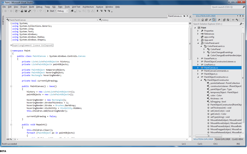
Changing the Visual Studio interface in the incoming RC
With the release of Visual Studio 11 Beta back in February of this year, we made changes, taking into account the user experience, based on two basic principles in the design, the first of which is the allocation of more space for the content, and the second - drawing more attention to this content. After the debut of these changes, we received a great public response and feedback. We took into account the feedback received and, based on it, made a number of changes planned for Visual Studio 11 RC. I want to thank you for your feedback through this blog, as well as through other community channels - please keep in touch.
The purpose of this post is to provide you with information about the changes that we made, just as we did during beta testing. I also included a brief information about the feedback on the results of beta testing, which we used to create these updates.
We are fortunate that we have collected a lot of effective feedback from users who used Visual Studio 11 Beta. As a result of sorting this feedback, we found that it primarily focuses on three aspects of the new topic:
')
Here's a quick look at the changes we made at RC in line with what we heard from you. Each of the changes reflected in these screenshots is described in more detail during the remainder of this post.

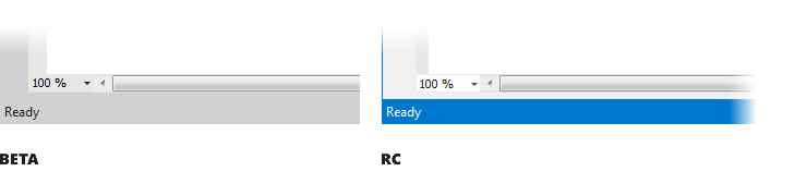
In the beta version there was a lot of feedback related to the overall grayness of the user interface. We heard your call for greater vitality in the user interface and took steps to make the interface easier and brighter with theme accents and a lighter background color.
There are three main aspects of the design, where we “increased the energy” of Visual Studio 11 themes. First, the gray brightening used in Visual Studio 11 in a light theme and the improvement of user interface readability.
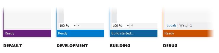
The second is the coloring of the status bar. We use the color of the status bar to add a functional value to the visual interest, passing on various IDE state changes, such as switching to debug mode.
Thirdly, this adds more “flavor” to the themes as a whole, in order to make our color accents more uniform and bold in areas such as the Window tool and other tab headings.

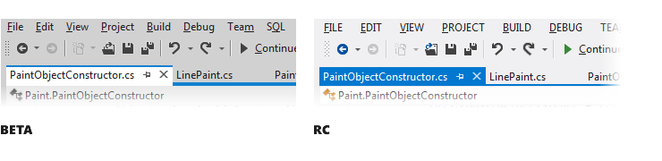
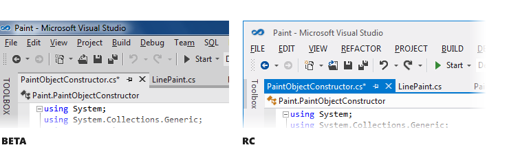
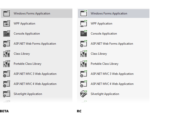
In the collected feedback related to the implementation of the Metro style in the controls of the new user interface, there are three main problems. The use of upper case in the headings of all tools is an area where we heard your concern. In accordance with our general design principles for exit, we made light changes that give structure and focus on the screen such as the window bar title tool, automatically hidden contributions, group tabs and separators that do not require upper case names. As reflected in the screenshots, we removed the entire upper case from the window tools, automatically hidden tabs, tabs in groups.
In RC, the only area where we will use upper case is the top level menu.
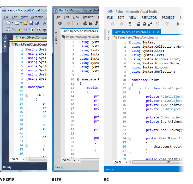
Another area that requires changes and is associated with the user interface of management is the use of chrome in the window title. Having redrawn the main window, we managed to achieve more efficient use of space and to increase the feeling of the metro style.

Redrawing chrome and changing the direction of work that we did along with reducing the number of default toolbars and combining icons gave you three additional visible lines of code in the editor compared to Visual Studio 2010. As I noted at the beginning of the post, one of the main goals of the interface changes Visual Studio 11 was to give you maximum space to focus on your code.
In conclusion of this topic I would like to note the desire to see a stylized scroll bar and other elements of the user interface, so that they are also decorated in the style of metro. We continue to look at these requests, and will keep you updated if there are additional changes or updates.
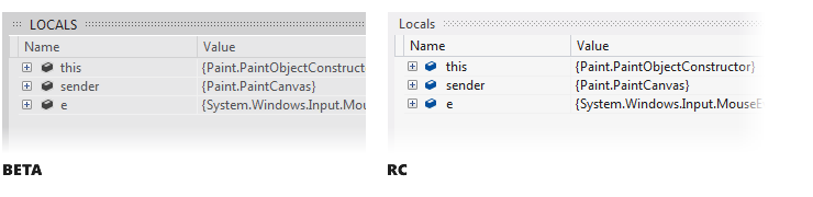
In Visual Studio 11 Beta, we heard a lot of concern about removing colors from icons, because This adversely affected the usability of the tools, especially where the color of the icon helped to quickly distinguish similar items. We solved this problem by systematically adding color back to select commands, IntelliSense, and icons in the decision hierarchy.
We used a simple set of rules that combines a heuristic selection of icons for collaborative actions and the content of conventions based on a five-color palette. This technique, combined with a flat and simple symbol in the style of our Visual Studio 11, gives us recipes for applying color in a very simple and consistent basis for building icons.
The first area where we systematically returned colors to icons is an area with common activities (for example, create / new, add / delete, start / stop, search, move / direction / join). This allows you to add more difference to similar action icons and, in turn, contributes to the breakdown of a piece of a menu or toolbar into smaller subgroups.

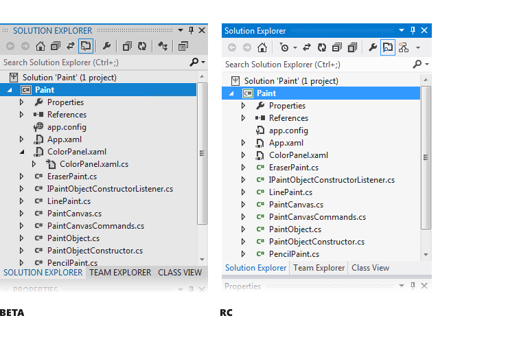
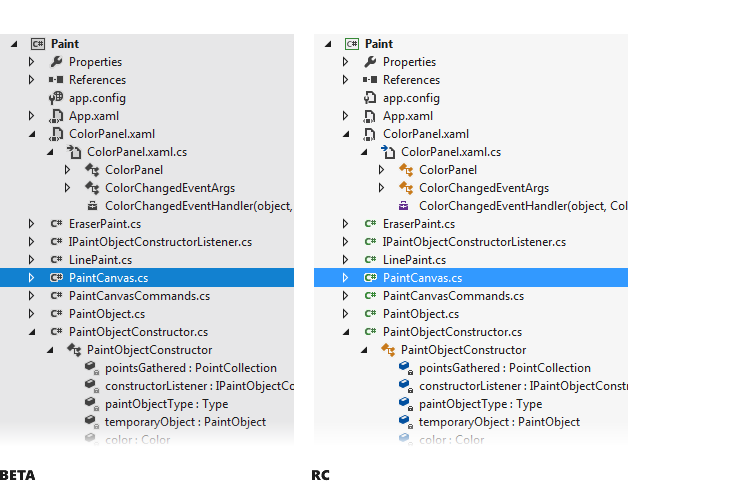
The second area where we returned the color of the icons again is Solution Explorer. Feedback from users, obtaining information from observations and studies, all tell us that next to the next tool, besides the content (ie the code editor), where you spend the most time, is the Solution Explorer. The desire to use color to differentiate icons in Solution Explorer was a key point in the feedback received. We expect to continue to add and improve the use of color in this class of icons in Visual Studio 11.
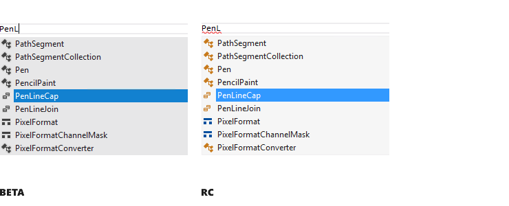
The third direction, where we have returned the color of the icons, is the differentiation of elements in IntelliSense. In the feedback from the beta, it was noted that using the IntelliSense icons very often select elements. For RC, we added color to IntelliSence icons so you can use it more effectively.
In addition to feedback on the colors of the icons, we also received feedback that in the light theme of the icons it is difficult to distinguish because of the transparent or crisp thin contour that appeared around them. The idea was that the same icon could be used on a light, dark, or highly contrasting theme. This led to a lack of clarity and visibility of icons. To solve this problem, we adjusted the use of gray in the icon to eliminate blur and a halo effect that existed in the beta version.
In addition to the above changes, which we will continue to point out, the most important and frequently used icons defined by the community need to be made more visible. We are waiting for your feedback in this area, so send any comments on our way.
As noted above, the changes we make after the release of beta are designated as our priority goals in RC. At that time I talked about these changes mainly in the context of a brighter topic, we check that all changes will work successfully with the dark theme.
Now, I hope you all are overwhelmed with enthusiasm for wanting to share your impressions of these changes, and I hope you think these updates are ultimately steps in the right direction. We want these changes in our hands with RC. When RC is available, please download the release, save the comments let us know what you think.
Monty Hammontree - Director of User Experience, Microsoft Developer Tools.
UPD : You can leave your feedback about the new edition of Visual Studio here . Also, you can vote for existing reviews.
The purpose of this post is to provide you with information about the changes that we made, just as we did during beta testing. I also included a brief information about the feedback on the results of beta testing, which we used to create these updates.
Beta Feedback
We are fortunate that we have collected a lot of effective feedback from users who used Visual Studio 11 Beta. As a result of sorting this feedback, we found that it primarily focuses on three aspects of the new topic:
')
- The overall desire for greater "visual energy" and contrast.
- Calls for a more balanced application of metro style.
- The desire for greater clarity of icons and their differentiation using color.
Here's a quick look at the changes we made at RC in line with what we heard from you. Each of the changes reflected in these screenshots is described in more detail during the remainder of this post.
Increase energy
In the beta version there was a lot of feedback related to the overall grayness of the user interface. We heard your call for greater vitality in the user interface and took steps to make the interface easier and brighter with theme accents and a lighter background color.
There are three main aspects of the design, where we “increased the energy” of Visual Studio 11 themes. First, the gray brightening used in Visual Studio 11 in a light theme and the improvement of user interface readability.
The second is the coloring of the status bar. We use the color of the status bar to add a functional value to the visual interest, passing on various IDE state changes, such as switching to debug mode.
Thirdly, this adds more “flavor” to the themes as a whole, in order to make our color accents more uniform and bold in areas such as the Window tool and other tab headings.
Styling controls
In the collected feedback related to the implementation of the Metro style in the controls of the new user interface, there are three main problems. The use of upper case in the headings of all tools is an area where we heard your concern. In accordance with our general design principles for exit, we made light changes that give structure and focus on the screen such as the window bar title tool, automatically hidden contributions, group tabs and separators that do not require upper case names. As reflected in the screenshots, we removed the entire upper case from the window tools, automatically hidden tabs, tabs in groups.
In RC, the only area where we will use upper case is the top level menu.
Another area that requires changes and is associated with the user interface of management is the use of chrome in the window title. Having redrawn the main window, we managed to achieve more efficient use of space and to increase the feeling of the metro style.
Redrawing chrome and changing the direction of work that we did along with reducing the number of default toolbars and combining icons gave you three additional visible lines of code in the editor compared to Visual Studio 2010. As I noted at the beginning of the post, one of the main goals of the interface changes Visual Studio 11 was to give you maximum space to focus on your code.
In conclusion of this topic I would like to note the desire to see a stylized scroll bar and other elements of the user interface, so that they are also decorated in the style of metro. We continue to look at these requests, and will keep you updated if there are additional changes or updates.
Solving the problem of usability icons
In Visual Studio 11 Beta, we heard a lot of concern about removing colors from icons, because This adversely affected the usability of the tools, especially where the color of the icon helped to quickly distinguish similar items. We solved this problem by systematically adding color back to select commands, IntelliSense, and icons in the decision hierarchy.
We used a simple set of rules that combines a heuristic selection of icons for collaborative actions and the content of conventions based on a five-color palette. This technique, combined with a flat and simple symbol in the style of our Visual Studio 11, gives us recipes for applying color in a very simple and consistent basis for building icons.
The first area where we systematically returned colors to icons is an area with common activities (for example, create / new, add / delete, start / stop, search, move / direction / join). This allows you to add more difference to similar action icons and, in turn, contributes to the breakdown of a piece of a menu or toolbar into smaller subgroups.
The second area where we returned the color of the icons again is Solution Explorer. Feedback from users, obtaining information from observations and studies, all tell us that next to the next tool, besides the content (ie the code editor), where you spend the most time, is the Solution Explorer. The desire to use color to differentiate icons in Solution Explorer was a key point in the feedback received. We expect to continue to add and improve the use of color in this class of icons in Visual Studio 11.
The third direction, where we have returned the color of the icons, is the differentiation of elements in IntelliSense. In the feedback from the beta, it was noted that using the IntelliSense icons very often select elements. For RC, we added color to IntelliSence icons so you can use it more effectively.
In addition to feedback on the colors of the icons, we also received feedback that in the light theme of the icons it is difficult to distinguish because of the transparent or crisp thin contour that appeared around them. The idea was that the same icon could be used on a light, dark, or highly contrasting theme. This led to a lack of clarity and visibility of icons. To solve this problem, we adjusted the use of gray in the icon to eliminate blur and a halo effect that existed in the beta version.
In addition to the above changes, which we will continue to point out, the most important and frequently used icons defined by the community need to be made more visible. We are waiting for your feedback in this area, so send any comments on our way.
Putting it all together
As noted above, the changes we make after the release of beta are designated as our priority goals in RC. At that time I talked about these changes mainly in the context of a brighter topic, we check that all changes will work successfully with the dark theme.
Now, I hope you all are overwhelmed with enthusiasm for wanting to share your impressions of these changes, and I hope you think these updates are ultimately steps in the right direction. We want these changes in our hands with RC. When RC is available, please download the release, save the comments let us know what you think.
Monty Hammontree - Director of User Experience, Microsoft Developer Tools.
UPD : You can leave your feedback about the new edition of Visual Studio here . Also, you can vote for existing reviews.
Source: https://habr.com/ru/post/143486/
All Articles