Introduction to CSS3 Multicolumn. We work with speakers
How to arrange the text on the page in several columns? And can this be done automatically? Surely, many of those of you who are engaged in or were previously engaged in web development, faced with such a task - and often rested on complex solutions that require clever styles , or use additional libraries in JavaScript (see for example the Columnizer plugin for jQuery ).
Multicolumn layout of content (not to be confused with the task of common multicolumn layout of the page, which is rather closer to the grid location problem) has long made its way into the world of web standards and, finally, has not just reached the status of Candidate Recommendation in the form of the corresponding CSS3 Multi module -column Layout , but also received quite wide support in browsers : somewhere with prefixes (-moz- or -webkit-) and somewhere in actual (Opera 11.1+) and planned versions (IE10 +), and without prefixes at once.
Comment
In the case of Internet Explorer 10, this automatically means that you can use the CSS3 Multi-column when developing Metro style apps for Windows 8 using HTML / CSS / JS.
')
As part of the article, I will not use browser prefixes to obfuscate the code, but for real use, do not forget to add support for Firefox, Safari and Chrome prefixes.
Immediately I will note two more important details.
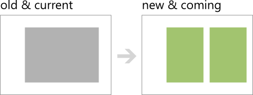
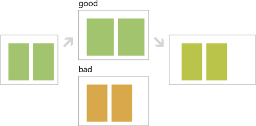
First, in most cases, the use of multicolumn layout for text can be viewed as the development of the display of site content along the path of Progressive Enhancement , in which users of more modern sites will receive more buns:
Secondly, the multi-column display is well combined with the capabilities of the Media Queries (and the ideas of responsive design, Responsive Design ), for example, with different screen sizes you can format the text in a different number of columns:

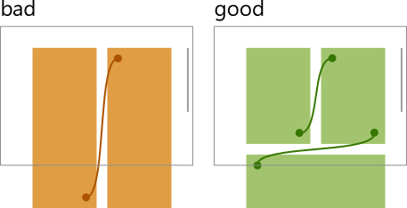
And the last thing I would like to mention in the introduction, so as not to dwell further and with a clear conscience go to the technical details: when using multi-column typesetting, remember that this arrangement also implies a certain reading order (for European languages from left to right). Therefore, it is important that in order to transfer the view from one column to another it was necessary to perform as few additional actions as possible, especially with regard to vertical scrolls:
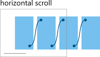
In this sense, the horizontal nature of the columns is better combined with the horizontal scrolling (like this, used in many applications for Win8 - for example, this is clearly seen in the USA Today application):
In general, the speakers are fine, but do not forget about the convenience of users. And now in battle!
Columns
So, we have text (content), which we want to place in several columns. Where to begin?

To turn such an element into a multi -column one, you need to set one of the following properties through CSS styles: column-width or column-count to a value other than auto . For example,
to split the text into two columns, it is enough to do this:
article { column-count: 2; } The browser will do the rest:

The alternative property - column-width - allows you to specify the optimal width of the columns:
article { column-width: 150px; } 
At the same time, the browser itself breaks the content into the required number of columns in order to fill the external container, adjusting to the specified width of the columns. The important point is that the actual width may differ from the given one up or down: in the picture above, the gray bar has a width of just 150px - and, as you can see, it is smaller than the actual width of the column.
This behavior is defined by the specification and allows (automatically) greater flexibility in developing adaptive markup:
For example, if you have a 100px wide container and you specify 45px columns, the browser will consider that it will fit only two columns, and to fill the entire space, it will increase the size of each to 50px. (It also takes into account the spacing between columns, which will be discussed in the next section.)
In a certain sense, this can be considered as an alternative to specifying different numbers of columns using Media Queries, depending on the window size and with automatic calculation of column widths:
@media (min-width:400px) { article { column-count: 2; } } @media (min-width:600px) { article { column-count: 3; } } ... I'm talking about the alternative a second time - and this is why.
count vs. width
As should be clear from the description above, the specification provides two ways to set the number and width of columns (by the way, it is the same for all columns!):
- column-count allows you to specify the number of columns into which you want to divide the content, while the width of the columns is determined by the browser, taking into account the available space.
- column-width comes from the back: it indicates what the columns should be about, however, it leaves the calculation of their number to the discretion of the browser.
In most cases, you will use either one or the other, operating with numbers or lengths, respectively. To simplify writing, there is such a short columns property that reacts to the format of the data to be specified:
columns: 12em; /* column-width: 12em; column-count: auto; */ columns: 2; /* column-width: auto; column-count: 2; */ columns: auto; /* column-width: auto; column-count: auto; */ columns: auto 12em; /* column-width: 12em; column-count: auto; */ columns: 2 auto; /* column-width: auto; column-count: 2; */ What happens if you specify both the number of columns and the optimal width? According to the specification, in this case column-count defines the maximum number of columns:
article { columns: 150px 3; /* column-width: 150px; column-count: 3; */ } 
In the specification you will also find a pseudo-code that describes the algorithm for calculating the number of columns and their width.
Padding and dividing lines
Now that we have learned how to create columns, it's time to learn how to manage what happens between them: indents and dividing lines.
To change the indent between columns, the column-gap property is defined. To visually mark the partition between the columns, another property has been introduced - column-rule- * :
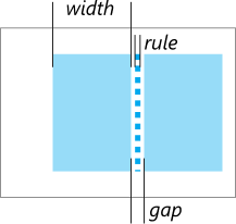
column-gap
column-gap allows you to specify the width of the space between the columns. The property accepts a length value, or a normal value determined by the browser (the specification recommends using 1em), which is also the default value:
article { columns: 3; column-gap: 3em; } 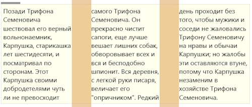
It is important to keep in mind that the indent size between columns is used when calculating the width of columns and their number. For example, if only the number of columns is specified (as in the example above), then the width is calculated as:
W = ((available-width + column-gap) / N) - column-gap; column-rule
If there is not enough free space to designate columns, you can use the column-rule- * properties, which add a line between the columns. According to their behavior and task, they are similar to border- * properties:
- column-rule-color - line color,
- column-rule-style - line style,
- column-rule-width - line width.
As is the case with block boundaries, there is a short form of the entry - just a column-rule :
article { columns: 3; column-rule: 3px dotted CornflowerBlue; } 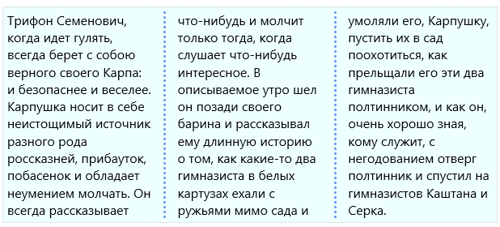
The important point: the dividing line is drawn exactly in the middle of the indent between the columns, without taking up space. If suddenly the dividing line is larger in width, it begins to intersect with the content:
article { columns: 3; column-rule: 5em groove SkyBlue; } 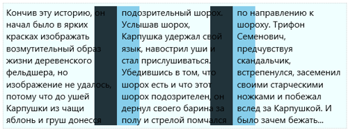
And the separator is drawn immediately after the background (background) of the container.
Breaks
Distributing content to columns is another interesting task that sometimes requires fine control. By default, content is a solid “mass”, in a very straightforward way, flowing from one column to another. But what if, say, I want to be sure that at the end of the column I do not have a lone headline? Or if my visual-aesthetic feeling requires that the quote not be torn into several columns or even more: single-handedly occupy the entire column?
To solve all these problems there are special properties. Meet:
- break-before - what should happen before the content block,
- break-after - what should happen after the block of content,
- break-inside - what should happen inside the content block.
If you are familiar with similar properties that are responsible for splitting content into pages ( page-break- * ), then these properties for columns behave in a similar way: use the same values plus a few additional ones (italicized):
- break-before : auto, always, avoid, left, right, page , column , avoid-page , avoid-column
- break-after : auto, always, avoid, left, right, page , column , avoid-page , avoid-column
- break-inside : auto, avoid, avoid-page , avoid-column
I think that the meaning of actions should be clear from the names of the values. For example, in the assumption described above to avoid the appearance of breaks within the dialogue and at the same time highlight it in a separate column, it suffices for me to specify:
article dialog { break-inside:avoid; break-before: column; break-after: column; display:block; } 
An important point: today, the management of column breaks is supported only in Opera 11.10+, which is not surprising, given that the editor of the specification is Håkon Wyum Li , and IE10.
My experiments with the latest version of Opera and the preliminary public version of IE10 show that in some places the implementations differ from each other. However, here I find it difficult to answer which browser behaves “more correctly”, since the specification, although it contains a separate section on overflow , still leaves some nuances at the discretion of the browser (for example, it allows the appearance of additional extra columns when explicitly specifying breaks ).
Stretching to multiple columns
Now that we have learned how to create columns and control the behavior of content a bit, let's learn another trick - stretching the content into several columns. For this there is a special property: column-span , which takes the values of none and all .
We are interested in the second value. It pulls out a block of content from the common multicolumn stream and stretches it to all columns. At the same time, the content before this element and the content after are automatically balanced on all the available columns.
article dialog.big { column-span:all; display:block; font-size:1.3em; margin:20px 0; } 
In this case, the large-scale conversation from the dialogue is stretched across all columns. Pay attention to the order of the text: upper left column, upper right, dialogue phrase, lower left and then lower right.
By the way, an important nuance: if the height of the columns is limited, and there is no extra space for stretching the elements, the browser can completely legally ignore the stretching requirement.
Stretching items for today is still not supported in Firefox.
Filling
And the last detail, which you probably should have been puzzled by: how, in fact, the browser decides how to fill the columns?
To answer this question, the specification introduces the column-fill property. You can balance it ( balance ), - this is how it is done by default, - trying to maintain the same height of the columns; or automatically ( auto ), filling the columns sequentially.
Compare, this is how the browser balances by default:
article { columns: 2; /*column-fill:balance;*/ height: 250px; } 
And so in automatic sequential mode:
article { columns: 2; column-fill:auto; height: 250px; } 
Fill management is currently supported only by Internet Explorer and Opera.
Results
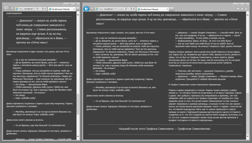
First of all, the continuation of the story A.P. Chekhov "For apples" can
found on Wikisource .
Essentially, following the development of web standards, including in some of my articles on CSS3 (see, for example, an article on CSS3 Grid Layout ), I hope you look at the possibilities that are open to web developers with no less inspiration. Adaptive, flexible and powerful tools for managing the placement of content closer and more accessible. And the solution of complex problems - everything is easier.
Interactive
You can play around with the CSS3 Multi-column at ietestdrive.com :

Try, experiment. Report bugs to browser developers. And do not forget to think about what users of old (and seemingly modern, but still not fully supporting the standard) browsers will see - for example, you can use the plugin for jQuery Columnizer . Remember the adaptability and viewers of small and large screens.
Source: https://habr.com/ru/post/143158/
All Articles