Cyclic slideshow on pure CSS3
Thanks to CSS3, we can create animation effects without using JavaScript, which will simplify the work of many developers.
We should not abuse CSS3, because older browsers do not support all its properties. In any case, we all see the potential of CSS3, and in this article we will discuss how to create a looped image slider using only CSS3 animation.

To understand the process from beginning to end, the following is the content of the article. Please note that this effect will only work properly in modern browsers that support the CSS3 properties used.
')
To use this lesson you need to have a basic understanding of CSS, in particular CSS3 transitions and keyframe animation.
Using these simple concepts, we will see how to make a functional image slider.
Usually, when you change the CSS value, the changes are displayed static. Now, thanks to the property of the transition, we can easily make changes from one state to another.
We can use four transition properties:
Specifies the name (s) of the CSS properties to which transitions should be applied.
Specifies the time over which the transition should occur.
Determines how intermediate transition values are calculated.
Determines when the transition starts.
Currently, CSS3 transitions are supported in Safari 3.2+, Chrome, Firefox 4+, Opera 10.5+, and IE 10. Since the technology is still relatively new, browser prefixes are needed . The syntax is the same for all browsers except for adding the necessary prefixes. We will omit them in this article, but do not forget to include the prefixes in the code.
Let's see how to apply a simple link to the link:
When assigning an animation to an element, you can also use the short form:
W3C has a list of all the “ Animation properties ”
CSS animation allows us to create animation without JavaScript using a set of keyframes.
Unlike CSS transitions, keyframe animation is currently only supported in WebKit browsers, Firefox, and also soon in IE 10. Unsupported browsers will simply ignore the animation code.
The animation property has eight sub-properties:
Determines when the animation starts.
Determines whether the animation should play backwards in alternating loops.
Defines the length of time the animation takes to complete one cycle.
Determines the number of animation cycles before stopping.
Specifies the name of the rule in @keyframes.
Determines whether the animation is playing or paused.
Defines how CSS animations should apply styles to their goal before and after execution.
Let's see how to apply simple animation to a block:
We can use an abbreviated entry to set all the properties of the animation at once:
Each keyframe describes how the animated element should behave at a given time point of the animation. Keyframes take percentages to determine the time: 0% - start the animation, while 100% - end. You can additionally add intermediate frames for animations.
W3C has a lot of useful and detailed information about “ CSS3 animation ”
Now that we know how transitions and animation work, let's see how to create our slider using only CSS3. This sketch shows how the animation should work:
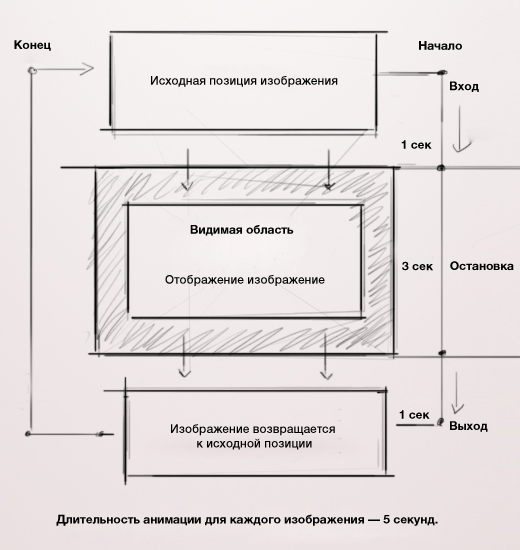
As you can see, the slider will be the container in which the images will be displayed.
The animation is very simple: the image follows a given direction, changing the properties of "
Let's go straight to the HTML markup to create a slider.
HTML markup is very simple. It is well organized and SEO friendly. Let's first take a look at the full code, and then find out in detail how everything works.
This is the main container slider. It does not have a specific function, but we need it to pause the animation.
We will use this block to hide everything that happens outside the slider. In addition to this, the mask allows us to display the content of the slider.
Each item in the list has an ID and a class. The ID displays a tooltip, and the class is tied to the animation that is supposed to occur.
This block displays the image header. You can change it depending on your needs, for example, by making it clickable or by adding a short description.
This block contains a function that shows the progress of the animation.
Now it's time to create a CSS file.
Let's create a basic slider structure. It will be the same size as the image. The border property will be useful for creating a frame around the image.
The class "
Finally, to sort the list of images, we will use "
With these few lines of code, we did a slider layout. Now we just have to add animation.

Before we start with animation, we need to define some parameters in order to get the correct animation representation.
As we know, the total duration of the animation will be 25 seconds, but we need to know how many key frames there will be in 1 second.
Let's solve a series of operations that will give us the exact number of keyframes and the total duration of the animation. Here are the calculations:
Determine the total number of images in the slider: 5 ;
Determine the duration of the animation for each image: 5 seconds ;
We determine the total duration of the animation by multiplying the total number of images by the duration of each: 5 images × 5 seconds = 25 seconds ;
We calculate how many key frames (percent) will be in one second.
We divide the total number of keyframes by the total duration of the animation: 100% / 25 = 4% ,
In one second, 4 keyframes, or 1 second equals 4% of the animation.
With all this math, we can now apply CSS animation to the slider. We can put the animation in an endless loop, because for each image a separate animation will be set, independent of other images.
Once the animation properties have been assigned, we must use keyframes to set the animation in motion.
Following this principle, we can connect all the animations with each other, even if they are independent of each other. This will give us an endless loop.
I added the properties "
As you can see in the code, the first animation has more keyframes than the rest. The reason for this is that when the slider is launched, the first image frees up space for the second, but when the last image finishes its animation, the first image must have additional keyframes so as not to create interruptions between animation cycles.
Here is all the code for the animations:
After creating the animation, we need to add a progress bar to display the duration of each animation.

The process of animating the progress bar is the same as that for the slider. Create the progress bar itself:
Do not be afraid of syntax. There is the same function as “from to”. You can see the keyframes set the appearance and disappearance of each image.

The slider is more or less complete. Let's add some details to make it more functional. We will insert tooltips for image headers that will be visible when hovering over.
Tip styles:
Here we made visible only the headers of the images, but you can do the same for any text, links and everything you want.

We saw how to apply CSS3 transitions to elements, now let's make them for hints.
If you remember, we added an ID to each list (“first”, “second”, etc.) so that when you hover, each hint is associated with a separate image, without all the hints appearing at once.

To allow users to stop the slider, in order to view the content, we have to stop the animation, when you hover the cursor. We will also need to stop the progress bar animation.
Finally, we have reached the end of the lesson. Slider is now 100% ready!
Watch a slider demo ( Alternative source ). It works in Firefox 5+, Safari 4+ and Google Chrome, as well as iPhone and iPad. You can also download the archive ( Alternative source ).
Thanks to Massimo Righi for his images.
The effect is impressive, but admittedly, this slider is not very versatile. For example, to add more images, you need to edit all keyframes. CSS3 has a lot of potential, but it does have limits, and sometimes JavaScript is preferable, depending on the target audience.
This slider has some interesting features, such as a pause (during hover) and unique links for images that allow users to interact with the slider. If full support is required by all browsers, then using CSS3 is not possible, thus JavaScript is recommended. Unfortunately, CSS3 animations have many limitations. At the moment, due to lack of flexibility, we do not have widespread use. I hope this article will encourage you to further explore CSS3.
Feel free to share your thoughts in the comments.
From the translator:
If you find any translation errors, please unsubscribe in private messages. Thank.
We should not abuse CSS3, because older browsers do not support all its properties. In any case, we all see the potential of CSS3, and in this article we will discuss how to create a looped image slider using only CSS3 animation.
Sections of the article
To understand the process from beginning to end, the following is the content of the article. Please note that this effect will only work properly in modern browsers that support the CSS3 properties used.
')
- Introduction
Description of basic concepts related to CSS3 transitions and keyframe animation. - HTML markup
Create HTML markup for image slider. - CSS styles
Creating a style sheet to display a slider. - CSS3 keyframe animation
Adding animation to the slider. We will review the various processes taking place here. - Progress bar
Adding progress bar for our slider. - Tooltip
Adding a tooltip to display headers. - CSS3 transitions
Display a hint when the cursor hovers using CSS3 transitions. - Pause and restart
Stop the slider when you hover the cursor. - Demonstration
We show the slider in action. - Conclusion
Final thoughts.
1. Introduction
To use this lesson you need to have a basic understanding of CSS, in particular CSS3 transitions and keyframe animation.
Using these simple concepts, we will see how to make a functional image slider.
Basic concepts of CSS3 transitions
Usually, when you change the CSS value, the changes are displayed static. Now, thanks to the property of the transition, we can easily make changes from one state to another.
We can use four transition properties:
transition-propertySpecifies the name (s) of the CSS properties to which transitions should be applied.
transition-durationSpecifies the time over which the transition should occur.
transition-timing-functionDetermines how intermediate transition values are calculated.
transition-delayDetermines when the transition starts.
Currently, CSS3 transitions are supported in Safari 3.2+, Chrome, Firefox 4+, Opera 10.5+, and IE 10. Since the technology is still relatively new, browser prefixes are needed . The syntax is the same for all browsers except for adding the necessary prefixes. We will omit them in this article, but do not forget to include the prefixes in the code.
Let's see how to apply a simple link to the link:
a { color: #000; transition-property: color; transition-duration: 0.7s; transition-timing-function: ease-in; transition-delay: 0.3s; } a:hover { color: #fff; } When assigning an animation to an element, you can also use the short form:
a { color: #000; transition: color 0.7s ease-in 0.3s; } a:hover { color: #fff; } W3C has a list of all the “ Animation properties ”
Basic CSS3 Animation Concepts
CSS animation allows us to create animation without JavaScript using a set of keyframes.
Unlike CSS transitions, keyframe animation is currently only supported in WebKit browsers, Firefox, and also soon in IE 10. Unsupported browsers will simply ignore the animation code.
The animation property has eight sub-properties:
animation-delayDetermines when the animation starts.
animation-directionDetermines whether the animation should play backwards in alternating loops.
animation-durationDefines the length of time the animation takes to complete one cycle.
animation-iteration-countDetermines the number of animation cycles before stopping.
animation-nameSpecifies the name of the rule in @keyframes.
animation-play-stateDetermines whether the animation is playing or paused.
animation-fill-modeDefines how CSS animations should apply styles to their goal before and after execution.
Let's see how to apply simple animation to a block:
/* , . */ div { animation-name: move; animation-duration: 1s; animation-timing-function: ease-in-out; animation-delay: 0.5s; animation-iteration-count: 2; animation-direction: alternate; -moz-animation-name: move; -moz-animation-duration: 1s; -moz-animation-timing-function: ease-in-out; -moz-animation-delay: 0.5s; -moz-animation-iteration-count: 2; -moz-animation-direction: alternate; -webkit-animation-name: move; -webkit-animation-duration: 1s; -webkit-animation-timing-function: ease-in-out; -webkit-animation-delay: 0.5s; -webkit-animation-iteration-count: 2; -webkit-animation-direction: alternate; } /* . */ @keyframes move { from { transform: translateX(0); } to { transform: translateX(100px); } } @-moz-keyframes move { from { -moz-transform: translateX(0); } to { -moz-transform: translateX(100px); } } @-webkit-keyframes move { from { -webkit-transform: translateX(0); } to { -webkit-transform: translateX(100px); } } We can use an abbreviated entry to set all the properties of the animation at once:
div { animation: move 1s ease-in-out 0.5s 2 alternate; -moz-animation: move 1s ease-in-out 0.5s 2 alternate; -webkit-animation: move 1s ease-in-out 0.5s 2 alternate; } Keyframes
Each keyframe describes how the animated element should behave at a given time point of the animation. Keyframes take percentages to determine the time: 0% - start the animation, while 100% - end. You can additionally add intermediate frames for animations.
/* 0% 100% */ @keyframes move { 0% { transform: translateX(0); } 100% { transform: translateX(100px); } } /* */ @keyframes move { 0% { transform: translateX(0); } 50% { transform: translateX(20px); } 100% { transform: translateX(100px); } } W3C has a lot of useful and detailed information about “ CSS3 animation ”
The basic structure of our slider
Now that we know how transitions and animation work, let's see how to create our slider using only CSS3. This sketch shows how the animation should work:
As you can see, the slider will be the container in which the images will be displayed.
The animation is very simple: the image follows a given direction, changing the properties of "
top ", " z-index " and " opacity ".Let's go straight to the HTML markup to create a slider.
2. HTML markup
HTML markup is very simple. It is well organized and SEO friendly. Let's first take a look at the full code, and then find out in detail how everything works.
<div class="container"> <div id="content-slider"> <div id="slider"> <!-- --> <div id="mask"> <!-- --> <ul> <li id="first" class="firstanimation"> <!-- ID --> <a href="#"> <img src="images/img_1.jpg" alt="Cougar"/> </a> <div class="tooltip"> <h1>Cougar</h1> </div> </li> <li id="second" class="secondanimation"> <a href="#"> <img src="images/img_2.jpg" alt="Lions"/> </a> <div class="tooltip"> <h1>Lions</h1> </div> </li> <li id="third" class="thirdanimation"> <a href="#"> <img src="images/img_3.jpg" alt="Snowalker"/> </a> <div class="tooltip"> <h1>Snowalker</h1> </div> </li> <li id="fourth" class="fourthanimation"> <a href="#"> <img src="images/img_4.jpg" alt="Howling"/> </a> <div class="tooltip"> <h1>Howling</h1> </div> </li> <li id="fifth" class="fifthanimation"> <a href="#"> <img src="images/img_5.jpg" alt="Sunbathing"/> </a> <div class="tooltip"> <h1>Sunbathing</h1> </div> </li> </ul> </div> <!-- --> <div class="progress-bar"></div> <!-- --> </div> <!-- --> </div> </div> div id="slider"This is the main container slider. It does not have a specific function, but we need it to pause the animation.
div id="mask"We will use this block to hide everything that happens outside the slider. In addition to this, the mask allows us to display the content of the slider.
li id="first" class="firstanimation"Each item in the list has an ID and a class. The ID displays a tooltip, and the class is tied to the animation that is supposed to occur.
div class="tooltip"This block displays the image header. You can change it depending on your needs, for example, by making it clickable or by adding a short description.
div class="progress-bar"This block contains a function that shows the progress of the animation.
Now it's time to create a CSS file.
3. CSS styles
Let's create a basic slider structure. It will be the same size as the image. The border property will be useful for creating a frame around the image.
/* */ #slider { background: #000; border: 5px solid #eaeaea; box-shadow: 1px 1px 5px rgba(0,0,0,0.7); height: 320px; width: 680px; margin: 40px auto 0; overflow: visible; position: relative; } The class "
mask " will hide all elements that are located outside the slider. Its height should be equal to the height of the slider. /* */ #mask { overflow: hidden; height: 320px; } Finally, to sort the list of images, we will use "
position: absolute " and " top: -325px " so that all images are located outside the slider. /* */ #slider ul { margin: 0; padding: 0; position: relative; } #slider li { width: 680px; /* */ height: 320px; /* */ position: absolute; top: -325px; /* ( ) */ list-style: none; } With these few lines of code, we did a slider layout. Now we just have to add animation.
4. CSS3 keyframe animation
Before we start with animation, we need to define some parameters in order to get the correct animation representation.
As we know, the total duration of the animation will be 25 seconds, but we need to know how many key frames there will be in 1 second.
Let's solve a series of operations that will give us the exact number of keyframes and the total duration of the animation. Here are the calculations:
Determine the total number of images in the slider: 5 ;
Determine the duration of the animation for each image: 5 seconds ;
We determine the total duration of the animation by multiplying the total number of images by the duration of each: 5 images × 5 seconds = 25 seconds ;
We calculate how many key frames (percent) will be in one second.
We divide the total number of keyframes by the total duration of the animation: 100% / 25 = 4% ,
In one second, 4 keyframes, or 1 second equals 4% of the animation.
With all this math, we can now apply CSS animation to the slider. We can put the animation in an endless loop, because for each image a separate animation will be set, independent of other images.
#slider li.firstanimation { animation: cycle 25s linear infinite; } #slider li.secondanimation { animation: cycletwo 25s linear infinite; } #slider li.thirdanimation { animation: cyclethree 25s linear infinite; } #slider li.fourthanimation { animation: cyclefour 25s linear infinite; } #slider li.fifthanimation { animation: cyclefive 25s linear infinite; } Once the animation properties have been assigned, we must use keyframes to set the animation in motion.
Following this principle, we can connect all the animations with each other, even if they are independent of each other. This will give us an endless loop.
I added the properties "
opacity " and " z-index " to make the transition from one image to the next more attractive.As you can see in the code, the first animation has more keyframes than the rest. The reason for this is that when the slider is launched, the first image frees up space for the second, but when the last image finishes its animation, the first image must have additional keyframes so as not to create interruptions between animation cycles.
Here is all the code for the animations:
/* */ @keyframes cycle { 0% { top: 0px; } /* , */ 4% { top: 0px; } /* */ 16% { top: 0px; opacity:1; z-index:0; } /* 4% 16 % (3 ) */ 20% { top: 325px; opacity: 0; z-index: 0; } /* 16% 20% (1 ) */ 21% { top: -325px; opacity: 0; z-index: -1; } /* */ 92% { top: -325px; opacity: 0; z-index: 0; } 96% { top: -325px; opacity: 0; } /* 96% 100% (1 ) – */ 100%{ top: 0px; opacity: 1; } } @keyframes cycletwo { 0% { top: -325px; opacity: 0; } /* */ 16% { top: -325px; opacity: 0; }/* 16% */ 20% { top: 0px; opacity: 1; } 24% { top: 0px; opacity: 1; } /* 20% 24% ( 1 ) — */ 36% { top: 0px; opacity: 1; z-index: 0; } /* 24% 36 % (3 ) */ 40% { top: 325px; opacity: 0; z-index: 0; } /* 36% 40% (1 )— */ 41% { top: -325px; opacity: 0; z-index: -1; } /* */ 100%{ top: -325px; opacity: 0; z-index: -1; } } @keyframes cyclethree { 0% { top: -325px; opacity: 0; } 36% { top: -325px; opacity: 0; } 40% { top: 0px; opacity: 1; } 44% { top: 0px; opacity: 1; } 56% { top: 0px; opacity: 1; } 60% { top: 325px; opacity: 0; z-index: 0; } 61% { top: -325px; opacity: 0; z-index: -1; } 100%{ top: -325px; opacity: 0; z-index: -1; } } @keyframes cyclefour { 0% { top: -325px; opacity: 0; } 56% { top: -325px; opacity: 0; } 60% { top: 0px; opacity: 1; } 64% { top: 0px; opacity: 1; } 76% { top: 0px; opacity: 1; z-index: 0; } 80% { top: 325px; opacity: 0; z-index: 0; } 81% { top: -325px; opacity: 0; z-index: -1; } 100%{ top: -325px; opacity: 0; z-index: -1; } } @keyframes cyclefive { 0% { top: -325px; opacity: 0; } 76% { top: -325px; opacity: 0; } 80% { top: 0px; opacity: 1; } 84% { top: 0px; opacity: 1; } 96% { top: 0px; opacity: 1; z-index: 0; } 100%{ top: 325px; opacity: 0; z-index: 0; } } After creating the animation, we need to add a progress bar to display the duration of each animation.
5. Progress bar
The process of animating the progress bar is the same as that for the slider. Create the progress bar itself:
/* */ .progress-bar { position: relative; top: -5px; width: 680px; height: 5px; background: #000; animation: fullexpand 25s ease-out infinite; } Do not be afraid of syntax. There is the same function as “from to”. You can see the keyframes set the appearance and disappearance of each image.
/* */ @keyframes fullexpand { /* */ 0%, 20%, 40%, 60%, 80%, 100% { width: 0%; opacity: 0; } /* — */ 4%, 24%, 44%, 64%, 84% { width: 0%; opacity: 0.3; } /* — */ 16%, 36%, 56%, 76%, 96% { width: 100%; opacity: 0.7; } /* */ 17%, 37%, 57%, 77%, 97% { width: 100%; opacity: 0.3; } /* , */ 18%, 38%, 58%, 78%, 98% { width: 100%; opacity: 0; } } 6. Tooltip
The slider is more or less complete. Let's add some details to make it more functional. We will insert tooltips for image headers that will be visible when hovering over.
Tip styles:
#slider .tooltip { background: rgba(0,0,0,0.7); width: 300px; height: 60px; position: relative; bottom: 75px; left: -320px; } #slider .tooltip h1 { color: #fff; font-size: 24px; font-weight: 300; line-height: 60px; padding: 0 0 0 10px; } Here we made visible only the headers of the images, but you can do the same for any text, links and everything you want.
7. CSS3 transitions
We saw how to apply CSS3 transitions to elements, now let's make them for hints.
If you remember, we added an ID to each list (“first”, “second”, etc.) so that when you hover, each hint is associated with a separate image, without all the hints appearing at once.
#slider .tooltip { … transition: all 0.3s ease-in-out; } #slider li#first: hover .tooltip, #slider li#second: hover .tooltip, #slider li#third: hover .tooltip, #slider li#fourth: hover .tooltip, #slider li#fifth: hover .tooltip { left: 0px; } 8. Pause and restart
To allow users to stop the slider, in order to view the content, we have to stop the animation, when you hover the cursor. We will also need to stop the progress bar animation.
#slider: hover li, #slider: hover .progress-bar { animation-play-state: paused; } 9. Demonstration
Finally, we have reached the end of the lesson. Slider is now 100% ready!
Watch a slider demo ( Alternative source ). It works in Firefox 5+, Safari 4+ and Google Chrome, as well as iPhone and iPad. You can also download the archive ( Alternative source ).
Thanks to Massimo Righi for his images.
10. Conclusion
The effect is impressive, but admittedly, this slider is not very versatile. For example, to add more images, you need to edit all keyframes. CSS3 has a lot of potential, but it does have limits, and sometimes JavaScript is preferable, depending on the target audience.
This slider has some interesting features, such as a pause (during hover) and unique links for images that allow users to interact with the slider. If full support is required by all browsers, then using CSS3 is not possible, thus JavaScript is recommended. Unfortunately, CSS3 animations have many limitations. At the moment, due to lack of flexibility, we do not have widespread use. I hope this article will encourage you to further explore CSS3.
Feel free to share your thoughts in the comments.
From the translator:
If you find any translation errors, please unsubscribe in private messages. Thank.
Source: https://habr.com/ru/post/143025/
All Articles