Sales funnel: we make an automatically updated report from the database using Excel
If you are selling an online service, you probably would like to see what happens at each stage of the sales funnel. From the analysis of the funnel, we can draw important conclusions: how clear and convenient is the installation process and the initial setup of the application, how many and which clients become active users of the service, what percentage goes from the free version to the paid one. In addition, the dynamics of conversion rates can be inferred about the effectiveness of measures taken to increase sales.
Under the cat you will find a description of some techniques for working with Excel, which can be useful when analyzing data arrays. We will describe how we maintain management statistics on the jivosite.ru service using Excel pivot tables and connecting to MySQL via ODBC using the example of a report on the sales funnel. The proposed method is quite simple and versatile, with its help you can build beautiful reports in minutes.
It is required to build a report on the sales funnel for the jivosite.ru service. This is an online consultant for online stores, which is sold on the model of freemium. Users connect with a two-week demo period during which an extended version is available. After 2 weeks, there is a free version that continues to work for an unlimited period.
Thus, we have the following sales funnel:
')
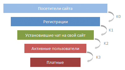
It is required to show the number of customers at each level of the funnel, as well as to calculate the conversion rate for each level, broken down by weeks and months. The source data is in MySQL, reports should be built automatically by pressing a few buttons, and also allow, if necessary, to build cuts into different categories and enter filters without additional programming.
To load data from the database to Excel, we need an ODBC driver. In our case, we will use the ODBC-MySQL for Windows connector . On a Mac with a connector, something didn't work out for us, but maybe it was already corrected in new versions.
After installing the driver, create an empty Excel workbook, open the “Data” tab - “From other sources” - “From Microsoft Query”

Then select “New data source”, enter the name of the connection, select the driver “MySQL ODBC Driver”. Then we press the "Connection" button, enter the connection parameters to our database, click "OK". After that, if the connection is successfully established, Microsoft Query will offer a step-by-step query creation wizard. Close all failed pop-up windows, and then click “SQL” and enter our SQL query, which will return the original table, manually. Our query simply makes a selection from the table of connected clients from the database slave server.
In our source table, we will use the following columns:
The result of the query will go to the Excel sheet as an ordered table.

This ordered table has a number of useful properties that we will use later.
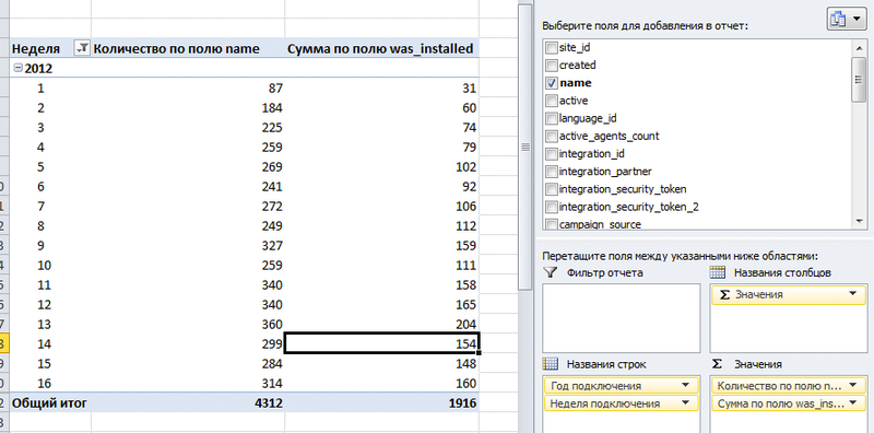
To make a large source data array into convenient and beautiful reports, we will use pivot tables . Click on the upper-left-hand cell of the table with the original data (cell A1) then "Insert" - "Pivot Table" - "OK". Thus, the initial array for the pivot table will be the entire result of the query in MySQL, when adding new columns and rows, the pivot table will be updated automatically.
An empty pivot table looks like this:

Before generating such a report, for each row in the source table we need to add the week number and the year in which the client was connected. This is needed to group data by year and week. To do this, open the sheet with the source data, scroll to the right to the last column, click on the cell to the right of the last column header, and write “Connection week” there. A new column has been added to the table with empty values in the rows. Now, in the cell under the heading of the new column, we write the formula “= NUMBER OF WEEKS (”) and click on the cell in this line, in which we have the date of connection of the client.

In this case, the formula will look like “= NOMEDELIES ([@ created]; 21)”. If the cell is in the same row as the formula, smart Excel creates a link to it by column name, and also automatically fills all the rows in the table with this formula. When adding rows to the source data table, new calculated cells will be added automatically. Convenient, Exel Respect :). Please note that there are different algorithms for calculating the number of the week . For ourselves, we chose the scheme number 21.
Similarly, we add the column “Year of Connection” with the formula “= YEAR ([@ created])”. After that, go to the sheet with our pivot table, click on the pivot table with the right button - “Update” so that the table will learn about new columns in the source data.
Of course, these columns could be added to the original data by means of SQL, but in Ekzel it is somehow faster and more pleasant. Although it is certainly a matter of taste :)
Now we drag the “Connection Year” and “Connection Week” columns from the list of fields to the “Row Names” area, and the “name” field (we have the site URL in this field) to the “Values” area.

We will get a neat table, in which the number of clients connected by weeks is broken. We dragged the "name" field to the value area so that Exel counted the number of elements in this column (i.e. all elements), grouped by weeks and years. This will be the number of registrations (second stage of the funnel).
Let us calculate how many of the clients who registered in each week have installed our chat on the site. To do this, drag the "was_installed" field to the value area. This field in the source data is “0” if the widget is not set, and “1” if set. Then right click - “Parameters of value fields” - select the operation “Amount”. Now in the pivot table there is a second column in which we see how many of the clients registered in any week have installed the widget on the site.
Now we will count active clients. We will consider active those who had more than 20 conversations with site visitors. To do this, we need to add the column “is_active” with the cell formula “= IF ([@ [chats_count]]> 20; 1; 0)” to the source data table. In the "chats_count" column we have the number of client chats. As a result, in the “is_active” column we will have “1” if the client has more than 20 chats. Now the is_active field can also be dragged to the value area.
Adding a little feng shui in the form of histograms and renaming the columns, we get the following label:
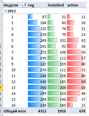
Here we have already received nice statistics, which is also automatically updated from the database. To update the data, you must first go to the sheet with the original data, there right click on the table - “Update”. And then right click on the pivot table - “Refresh”.
To calculate k0, you need to take the data on unique visitors from Google analytics, and we will leave this outside of the scope of this manual (by the way, we are solving this problem by copy-paste from Google analytics).
Let's start by counting k1 - the ratio of the number of people who installed chat on their site to the total number of registered customers.
There is one not quite beautiful moment, which we did not find, how to solve directly: the column “one” should be added to the source data table with the formula “= 1” - so that in all cells of the source table there is a unit in this column.
Now you can add such a calculated field:

Name we write "k1", in the formula we specify "= SUM (was_installed) / SUM (one)".

If the report in the summary table is grouped by weeks, then we get the ratio of the number of customers who installed the widget (SUM (was_installed)) to the total number of customers who registered for this week (SUM (one)). If the report is grouped by month, the coefficient will be recalculated accordingly. It is important to note that the conversion shows the proportion of customers who established a chat on their website among those who registered on a particular week. Those. if the client has registered on the fourth week, and has established a chat on the site only on the 10th week, then the figure in the 4th week report will change.
Now we consider the conversion from installed to active clients:
k2 = SUM (is_active) / SUM (was_installed)
In the same way, we add a field for conversion from active clients to paid ones:
k3 = SUM (is_paid) / SUM (is_active)
Only k3 in the screenshots can not be shown, a trade secret :)
Now in our pivot table there are fields k1, k2, k3, which can be dragged into the range of values. Adding a little feng shui, we get this table by funnel broken down by weeks:

It is already possible to draw some conclusions from it, but we will leave the business analytics questions to another post, now we are interested in technical issues.
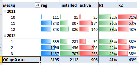
From the weekly report to make a report by month is very simple. In the initial data, add the column “Month of connection” with the formula “= MONTH ([@ created])”, right-click on the pivot table - “update” and drag the field “Month of connection” in the pivot table to the “Row names” area (after "Year of connection"). It turns out like this:

And here is a beautiful sign for months:
If you are not familiar with the pivot tables, I suggest you play with them yourself. This is a great analytics tool that doesn’t reveal interesting dependencies. For example, it is interesting to see the conversion at different stages in the context of the source of customers (advertising campaigns). To do this, we save UTM tags in the database when registering each client, and build a report on the effectiveness of various advertising campaigns in absolute (rubles) and relative (conversion) units.
By the way, double-clicking on each cell of the pivot table opens a list of rows of input data that were used to calculate this digit. Very handy to figure out where it is growing from.
In the pivot tables, there are many more features and tools that allow you to quickly get interesting reports. I strongly recommend to all entrepreneurs who want to be aware of the processes occurring in their business, to master these tools.
Under the cat you will find a description of some techniques for working with Excel, which can be useful when analyzing data arrays. We will describe how we maintain management statistics on the jivosite.ru service using Excel pivot tables and connecting to MySQL via ODBC using the example of a report on the sales funnel. The proposed method is quite simple and versatile, with its help you can build beautiful reports in minutes.
Formulation of the problem
It is required to build a report on the sales funnel for the jivosite.ru service. This is an online consultant for online stores, which is sold on the model of freemium. Users connect with a two-week demo period during which an extended version is available. After 2 weeks, there is a free version that continues to work for an unlimited period.
Thus, we have the following sales funnel:
')
It is required to show the number of customers at each level of the funnel, as well as to calculate the conversion rate for each level, broken down by weeks and months. The source data is in MySQL, reports should be built automatically by pressing a few buttons, and also allow, if necessary, to build cuts into different categories and enter filters without additional programming.
Load the source data from the database
To load data from the database to Excel, we need an ODBC driver. In our case, we will use the ODBC-MySQL for Windows connector . On a Mac with a connector, something didn't work out for us, but maybe it was already corrected in new versions.
After installing the driver, create an empty Excel workbook, open the “Data” tab - “From other sources” - “From Microsoft Query”
Then select “New data source”, enter the name of the connection, select the driver “MySQL ODBC Driver”. Then we press the "Connection" button, enter the connection parameters to our database, click "OK". After that, if the connection is successfully established, Microsoft Query will offer a step-by-step query creation wizard. Close all failed pop-up windows, and then click “SQL” and enter our SQL query, which will return the original table, manually. Our query simply makes a selection from the table of connected clients from the database slave server.
In our source table, we will use the following columns:
- created - the date of registration of the client
- name - site URL
- was_installed - 1 if the client installed the widget on his site, 0 if he never installed
- chats_count - the number of dialogs that took place using our service
- is_paid - 0 if the client did not pay us anything, 1 - if he paid
The result of the query will go to the Excel sheet as an ordered table.
This ordered table has a number of useful properties that we will use later.
Create a pivot table
To make a large source data array into convenient and beautiful reports, we will use pivot tables . Click on the upper-left-hand cell of the table with the original data (cell A1) then "Insert" - "Pivot Table" - "OK". Thus, the initial array for the pivot table will be the entire result of the query in MySQL, when adding new columns and rows, the pivot table will be updated automatically.
An empty pivot table looks like this:
We count the number of customers at each stage of sales.
Before generating such a report, for each row in the source table we need to add the week number and the year in which the client was connected. This is needed to group data by year and week. To do this, open the sheet with the source data, scroll to the right to the last column, click on the cell to the right of the last column header, and write “Connection week” there. A new column has been added to the table with empty values in the rows. Now, in the cell under the heading of the new column, we write the formula “= NUMBER OF WEEKS (”) and click on the cell in this line, in which we have the date of connection of the client.
In this case, the formula will look like “= NOMEDELIES ([@ created]; 21)”. If the cell is in the same row as the formula, smart Excel creates a link to it by column name, and also automatically fills all the rows in the table with this formula. When adding rows to the source data table, new calculated cells will be added automatically. Convenient, Exel Respect :). Please note that there are different algorithms for calculating the number of the week . For ourselves, we chose the scheme number 21.
Similarly, we add the column “Year of Connection” with the formula “= YEAR ([@ created])”. After that, go to the sheet with our pivot table, click on the pivot table with the right button - “Update” so that the table will learn about new columns in the source data.
Of course, these columns could be added to the original data by means of SQL, but in Ekzel it is somehow faster and more pleasant. Although it is certainly a matter of taste :)
Now we drag the “Connection Year” and “Connection Week” columns from the list of fields to the “Row Names” area, and the “name” field (we have the site URL in this field) to the “Values” area.
We will get a neat table, in which the number of clients connected by weeks is broken. We dragged the "name" field to the value area so that Exel counted the number of elements in this column (i.e. all elements), grouped by weeks and years. This will be the number of registrations (second stage of the funnel).
Let us calculate how many of the clients who registered in each week have installed our chat on the site. To do this, drag the "was_installed" field to the value area. This field in the source data is “0” if the widget is not set, and “1” if set. Then right click - “Parameters of value fields” - select the operation “Amount”. Now in the pivot table there is a second column in which we see how many of the clients registered in any week have installed the widget on the site.
Now we will count active clients. We will consider active those who had more than 20 conversations with site visitors. To do this, we need to add the column “is_active” with the cell formula “= IF ([@ [chats_count]]> 20; 1; 0)” to the source data table. In the "chats_count" column we have the number of client chats. As a result, in the “is_active” column we will have “1” if the client has more than 20 chats. Now the is_active field can also be dragged to the value area.
Adding a little feng shui in the form of histograms and renaming the columns, we get the following label:
Here we have already received nice statistics, which is also automatically updated from the database. To update the data, you must first go to the sheet with the original data, there right click on the table - “Update”. And then right click on the pivot table - “Refresh”.
Consider conversion rates
To calculate k0, you need to take the data on unique visitors from Google analytics, and we will leave this outside of the scope of this manual (by the way, we are solving this problem by copy-paste from Google analytics).
Let's start by counting k1 - the ratio of the number of people who installed chat on their site to the total number of registered customers.
There is one not quite beautiful moment, which we did not find, how to solve directly: the column “one” should be added to the source data table with the formula “= 1” - so that in all cells of the source table there is a unit in this column.
Now you can add such a calculated field:
Name we write "k1", in the formula we specify "= SUM (was_installed) / SUM (one)".
If the report in the summary table is grouped by weeks, then we get the ratio of the number of customers who installed the widget (SUM (was_installed)) to the total number of customers who registered for this week (SUM (one)). If the report is grouped by month, the coefficient will be recalculated accordingly. It is important to note that the conversion shows the proportion of customers who established a chat on their website among those who registered on a particular week. Those. if the client has registered on the fourth week, and has established a chat on the site only on the 10th week, then the figure in the 4th week report will change.
Now we consider the conversion from installed to active clients:
k2 = SUM (is_active) / SUM (was_installed)
In the same way, we add a field for conversion from active clients to paid ones:
k3 = SUM (is_paid) / SUM (is_active)
Only k3 in the screenshots can not be shown, a trade secret :)
Now in our pivot table there are fields k1, k2, k3, which can be dragged into the range of values. Adding a little feng shui, we get this table by funnel broken down by weeks:
It is already possible to draw some conclusions from it, but we will leave the business analytics questions to another post, now we are interested in technical issues.
Monthly sales funnel
From the weekly report to make a report by month is very simple. In the initial data, add the column “Month of connection” with the formula “= MONTH ([@ created])”, right-click on the pivot table - “update” and drag the field “Month of connection” in the pivot table to the “Row names” area (after "Year of connection"). It turns out like this:
And here is a beautiful sign for months:
Other report options
If you are not familiar with the pivot tables, I suggest you play with them yourself. This is a great analytics tool that doesn’t reveal interesting dependencies. For example, it is interesting to see the conversion at different stages in the context of the source of customers (advertising campaigns). To do this, we save UTM tags in the database when registering each client, and build a report on the effectiveness of various advertising campaigns in absolute (rubles) and relative (conversion) units.
By the way, double-clicking on each cell of the pivot table opens a list of rows of input data that were used to calculate this digit. Very handy to figure out where it is growing from.
In the pivot tables, there are many more features and tools that allow you to quickly get interesting reports. I strongly recommend to all entrepreneurs who want to be aware of the processes occurring in their business, to master these tools.
Source: https://habr.com/ru/post/142864/
All Articles