When you do not need to listen to users when designing an interface
Most professionals involved in the design and development of user interfaces have long remembered a simple truth - “the interface is created for the end user”. So, the user needs to love, cherish and listen to his every response. But there are cases when a usability player should not listen to the user, let's talk about designing an interface for professional systems.
Not so long ago we were engaged in the complete processing of one medical system. In particular, the interface of the procedural sister (which registers patients and helps with the selection of the necessary tests) looked like this:
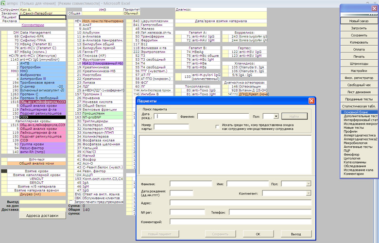
This interface is very bad. And the point is not that it is written with the help of Excel and not in graphic design, it just does not perform many of the tasks necessary for the user. Procedural sister, using this software, is forced, firstly, to visit several other resources to answer a number of clarifying questions, secondly, she often has to look for the necessary lines (the search does not work), thirdly, she has to write from hands, because the system does not allow you to print all the necessary documents. In short, the system is inconvenient to use and takes an unacceptably long time of the sister for each patient.
')
Recently, I had to visit one of the branches of this medical network to get my son tested. Looking at how the procedural sister long filled the necessary papers, I told her that right now we are developing a new interface for their system. Pretty girl was very happy and said "finally." But continuing the conversation, I realized with horror that her wishes for the new interface boil down to “add beautiful kittens.” When I asked if it was convenient to use the current system, she confidently answered that yes, I like everything, everything suits me.
If business owners listened to users, they would not change anything (except for adding kittens). But fortunately, they are sane people and understand that 6 minutes to register one patient is a lot and if you shorten this time by a couple of minutes and multiply by hundreds of branches across the country, you will get serious savings.
The second such case occurred when I re-recorded for a massage on my neck that had suffered from osteochondrosis. As in the first example, it was also a network of several branches. The first time I signed up on the phone, and then I saw how a girl took calls and wrote everything down in such a barn book.

Having seen such an old-school user interface, I began to ask the girl, trying to figure out, what if it is much more convenient and efficient than a computer. It turned out that it is not more convenient or more efficient. First, the canceled massage sessions need to be smeared with white “Stroke”, and the action “move everyone by a bit” turns into a feat. Secondly, there are several massage rooms and several master massage therapists who do not work every day - this needs to be kept in mind, hence the mistakes. Naturally, with this method of recording synchronization of several branches of the network (we are busy at 7 pm, but if you come to another branch) you should forget.
And once again I was surprised that the girl was very positive about this paper user interface. She acknowledged the shortcomings, but said that she liked everything and everything was very convenient.
Personally, it seems to me that saying “I have been forced to use this poor interface for two years now” is like admitting that you are a loser in life. However, let's leave to psychologists and sociologists to find out why people love their surroundings , scold, but love.
We better think about how this can help with interface design. Vlad Golovach in his online book, The Art of Elephant Wash , suggests using Schneiderman indicators, according to which interfaces are characterized by:
At the same time, Vlad quite rightly notes that “it is possible to achieve high rates only for any two, discarding the two remaining ones” (p. 54).
It seems to me that for the majority of professional systems that people use repeatedly, the first two indicators are very important (user speed and number of human errors) and the second two are absolutely not important (subjective satisfaction and speed of learning how to operate the interface).
Saying “not important” I mean objective indicators of business, i.e. if the procedural sister is upset by the lack of “kittens”, it is undeniably bad for her personally, but for the business she is absolutely indifferent (in contrast to the speed of work, for example). The speed of learning how to operate the interface is also usually not important, because personally I have never met, say, supermarket salesmen who would quit because they could not master the cash register interface in 10 minutes.
So, to summarize and decide whether to listen to the user when designing the interface of professional systems.
- Of course, you need!
Yes, yes, you should always listen to users. Another question is that it is not at all necessary to do what the user asks.
And Schneiderman's indicators are good to use in dialogue with the customer and justifying why the “we don't like” criterion is not at all important for some interfaces. This is something like a taxi driver "you have to go or go."
Case of medicine
Not so long ago we were engaged in the complete processing of one medical system. In particular, the interface of the procedural sister (which registers patients and helps with the selection of the necessary tests) looked like this:
This interface is very bad. And the point is not that it is written with the help of Excel and not in graphic design, it just does not perform many of the tasks necessary for the user. Procedural sister, using this software, is forced, firstly, to visit several other resources to answer a number of clarifying questions, secondly, she often has to look for the necessary lines (the search does not work), thirdly, she has to write from hands, because the system does not allow you to print all the necessary documents. In short, the system is inconvenient to use and takes an unacceptably long time of the sister for each patient.
')
Recently, I had to visit one of the branches of this medical network to get my son tested. Looking at how the procedural sister long filled the necessary papers, I told her that right now we are developing a new interface for their system. Pretty girl was very happy and said "finally." But continuing the conversation, I realized with horror that her wishes for the new interface boil down to “add beautiful kittens.” When I asked if it was convenient to use the current system, she confidently answered that yes, I like everything, everything suits me.
If business owners listened to users, they would not change anything (except for adding kittens). But fortunately, they are sane people and understand that 6 minutes to register one patient is a lot and if you shorten this time by a couple of minutes and multiply by hundreds of branches across the country, you will get serious savings.
Another case
The second such case occurred when I re-recorded for a massage on my neck that had suffered from osteochondrosis. As in the first example, it was also a network of several branches. The first time I signed up on the phone, and then I saw how a girl took calls and wrote everything down in such a barn book.
Having seen such an old-school user interface, I began to ask the girl, trying to figure out, what if it is much more convenient and efficient than a computer. It turned out that it is not more convenient or more efficient. First, the canceled massage sessions need to be smeared with white “Stroke”, and the action “move everyone by a bit” turns into a feat. Secondly, there are several massage rooms and several master massage therapists who do not work every day - this needs to be kept in mind, hence the mistakes. Naturally, with this method of recording synchronization of several branches of the network (we are busy at 7 pm, but if you come to another branch) you should forget.
And once again I was surprised that the girl was very positive about this paper user interface. She acknowledged the shortcomings, but said that she liked everything and everything was very convenient.
Ergonomic interface features
Personally, it seems to me that saying “I have been forced to use this poor interface for two years now” is like admitting that you are a loser in life. However, let's leave to psychologists and sociologists to find out why people love their surroundings , scold, but love.
We better think about how this can help with interface design. Vlad Golovach in his online book, The Art of Elephant Wash , suggests using Schneiderman indicators, according to which interfaces are characterized by:
- user speed;
- the amount of human error;
- subjective satisfaction;
- the speed of learning the skills of operating the interface.
At the same time, Vlad quite rightly notes that “it is possible to achieve high rates only for any two, discarding the two remaining ones” (p. 54).
It seems to me that for the majority of professional systems that people use repeatedly, the first two indicators are very important (user speed and number of human errors) and the second two are absolutely not important (subjective satisfaction and speed of learning how to operate the interface).
Saying “not important” I mean objective indicators of business, i.e. if the procedural sister is upset by the lack of “kittens”, it is undeniably bad for her personally, but for the business she is absolutely indifferent (in contrast to the speed of work, for example). The speed of learning how to operate the interface is also usually not important, because personally I have never met, say, supermarket salesmen who would quit because they could not master the cash register interface in 10 minutes.
Do I need to listen to the user
So, to summarize and decide whether to listen to the user when designing the interface of professional systems.
- Of course, you need!
Yes, yes, you should always listen to users. Another question is that it is not at all necessary to do what the user asks.
And Schneiderman's indicators are good to use in dialogue with the customer and justifying why the “we don't like” criterion is not at all important for some interfaces. This is something like a taxi driver "you have to go or go."
Source: https://habr.com/ru/post/142772/
All Articles