Prototyping for Finishing in Adobe Fireworks
I believe that Adobe Fireworks is the most underrated software for prototyping interfaces. In some divisions of our company, Fireworks is the main tool for usability specialists. At the same time, we almost do not use the animation capabilities of the program. In this article I want to tell why we consider this program the best for drawing the interface.
Many yuzabelisty accept for the axiom the idea that you first need to implement the interface in the form of wireframes, debug, align, and only then “paint”. Some people think that the design should be done by another person (I design, and the designer suggests beauty). At first glance, this is an absolutely correct approach, which allows you to save time, focus on the logic of interaction, divide responsibilities, etc.
However, splitting a GUI into two stages has its drawbacks. Often, color, non-standard size, graphic design techniques - all this not only adds “niceness” to the gray squares, but also completely changes the user’s perception of the interface. That is why I always disliked wireframes and tried to make the interface immediately “fair”. It is worth mentioning that in Digital Design we mainly design utilitarian systems where some special “beauty” is not required, so why draw gray rectangles if you can draw “rounded and gradient” right away.
')
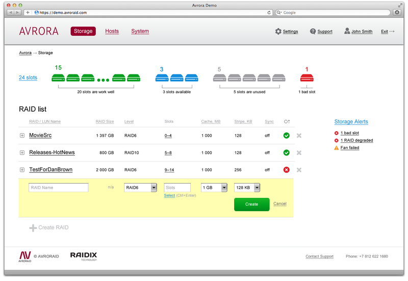
Here is an example of an interface that I recently designed and at the same time worked on graphic design:
But the interface from Ivan Filippenko, another Fireworks fan:

We did not spend more time than if we designed these interfaces in InDesign, Visio or Axure, and the screens look much nicer than in the listed programs. And since for such professional systems, more glamorous design and not required, we have eliminated one stage, without deterioration. Yes, in Photoshop, you can also draw something like this, but it will take more time.
I worked in Photoshop for many years and I believe that this wonderful tool spawned the myth that it is difficult to correct a clean design and it is necessary to postpone it to the very end of the design. I myself had fiercely defended the merits of Photoshop and denied its shortcomings: nothing, many layers, I know the ctrl and shift magic keys, I can work in Shope quickly. But in the end, we recognized the advantage of Fireworks and passed on to it in unison.
Here are some reasons why Fireworks is better suited for visualizing interfaces:
If it is useful to someone, I will show you the location of the panels in Fireworks I use. As you can see, the main panels are Pages, States, Layers, as well as libraries of symbols and properties of the selected symbol (the image is clickable):

Creating a simplified visualization first is still useful. We have a unit that deals with applications for the iPad, on this platform it is somehow customary to do everything glamorous and beautiful. Well, you know, a glass letter on a granite base, on which a drop of dew rolls :) Drawing it right away is really harmful, distracting yourself and distracting the customer (and not everyone can draw dew on glass).
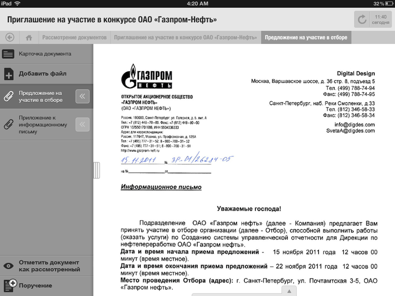
But here, Fireworks helps a lot. You put all the repeating elements either in the Master Page or in the library of symbols and you think only about logic and location. And when you need to impose textures, you just need to change the characters from the library. Here is an example of one tablet prototype (author Olga Sokolova):
By the way, we often sell custom tablet products. As a rule, customers are asked to change the color, texture and here a well-designed layout helps a lot.
Of course, Adobe Fireworks has not won the deserved popularity, not only because of the competition Photoshop. Non-native for Adobe interface half out from Macromedia does not add fans to it. But the main problem of the program is low stability. However, this is a problem rather than the Windows platform, on a Mac the program works quite well (although not perfectly). Well, about resource consumption, I think it is not worth mentioning, yet it is a design tool.
PS The already mentioned Ivan Filippenko asserts that if you set the values for antialiasing text “4 time, 190, 10”, then it will become “as in a browser” and the eternal problem of web designers will be solved. However, I tried and did not notice any special improvement, although the fact of the settings pleases, maybe some of the readers will suggest the best settings.
Wireframes or finishing design
Many yuzabelisty accept for the axiom the idea that you first need to implement the interface in the form of wireframes, debug, align, and only then “paint”. Some people think that the design should be done by another person (I design, and the designer suggests beauty). At first glance, this is an absolutely correct approach, which allows you to save time, focus on the logic of interaction, divide responsibilities, etc.
However, splitting a GUI into two stages has its drawbacks. Often, color, non-standard size, graphic design techniques - all this not only adds “niceness” to the gray squares, but also completely changes the user’s perception of the interface. That is why I always disliked wireframes and tried to make the interface immediately “fair”. It is worth mentioning that in Digital Design we mainly design utilitarian systems where some special “beauty” is not required, so why draw gray rectangles if you can draw “rounded and gradient” right away.
')
Here is an example of an interface that I recently designed and at the same time worked on graphic design:
But the interface from Ivan Filippenko, another Fireworks fan:
We did not spend more time than if we designed these interfaces in InDesign, Visio or Axure, and the screens look much nicer than in the listed programs. And since for such professional systems, more glamorous design and not required, we have eliminated one stage, without deterioration. Yes, in Photoshop, you can also draw something like this, but it will take more time.
Photoshop or Fireworks
I worked in Photoshop for many years and I believe that this wonderful tool spawned the myth that it is difficult to correct a clean design and it is necessary to postpone it to the very end of the design. I myself had fiercely defended the merits of Photoshop and denied its shortcomings: nothing, many layers, I know the ctrl and shift magic keys, I can work in Shope quickly. But in the end, we recognized the advantage of Fireworks and passed on to it in unison.
Here are some reasons why Fireworks is better suited for visualizing interfaces:
- All pages (pages) of the interface are stored in a single file, and the Master Page allows not hard-coding duplicate elements;
- the size of the canvas may be different for each page;
- Each page has many states (States), so if I need to show a pop-up window on the page or expand the item, I don’t have to constantly turn on / off the layers;
- the layers do not breed like rabbits, they can, if desired, not be used at all (there is enough Pages + States), but if you use them, they are not obsessed with their number, but using the possibilities of their sharing between different pages;
- there is a library of symbols and you can create your own symbols with certain properties, including variables, this allows you to flexibly and quickly change duplicate interface elements, such as buttons, icons, etc .;
- good old-style (Styles) and filters (Filters) complement the flexibility and allow you to not forget the useful photoshop habits;
- excellent work with objects, as in a vector editor (just selected with a frame and grouped or just moved, no hot key hold) and at the same time adequate work with a raster both in display and editing;
- I do not speak about animation, cutting and export, because it is self-implied.
If it is useful to someone, I will show you the location of the panels in Fireworks I use. As you can see, the main panels are Pages, States, Layers, as well as libraries of symbols and properties of the selected symbol (the image is clickable):
And if still not on fair?
Creating a simplified visualization first is still useful. We have a unit that deals with applications for the iPad, on this platform it is somehow customary to do everything glamorous and beautiful. Well, you know, a glass letter on a granite base, on which a drop of dew rolls :) Drawing it right away is really harmful, distracting yourself and distracting the customer (and not everyone can draw dew on glass).
But here, Fireworks helps a lot. You put all the repeating elements either in the Master Page or in the library of symbols and you think only about logic and location. And when you need to impose textures, you just need to change the characters from the library. Here is an example of one tablet prototype (author Olga Sokolova):
By the way, we often sell custom tablet products. As a rule, customers are asked to change the color, texture and here a well-designed layout helps a lot.
A spoon of tar
Of course, Adobe Fireworks has not won the deserved popularity, not only because of the competition Photoshop. Non-native for Adobe interface half out from Macromedia does not add fans to it. But the main problem of the program is low stability. However, this is a problem rather than the Windows platform, on a Mac the program works quite well (although not perfectly). Well, about resource consumption, I think it is not worth mentioning, yet it is a design tool.
PS The already mentioned Ivan Filippenko asserts that if you set the values for antialiasing text “4 time, 190, 10”, then it will become “as in a browser” and the eternal problem of web designers will be solved. However, I tried and did not notice any special improvement, although the fact of the settings pleases, maybe some of the readers will suggest the best settings.
Source: https://habr.com/ru/post/142771/
All Articles