Shadow Triangles on CSS
Most likely, you already know how to make a triangle on pure CSS using the border property. If you do not know, then you can read, for example, here . But what if you need triangles with a shadow?
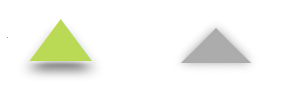
Classical manipulation with the border can not change the shape of the object, it is just a visual deception.
Those. you can't just take and add box-shadow to such a triangle, because we get something like this:
')
Let's look at a few alternative solutions.
There are several triangles among unicode characters. For example:
▲ ▼
More options can be found here .
If you use this variant of the triangle, then you can do all sorts of funny things with it.
Those. color, shade, size, all of your choice. In addition, if the shape of the triangle does not suit you, you can use CSS3 transformations to stretch or rotate it.

Example link
I like this technique, but there are several problems in it, and the main one is the weak support for CSS3 transformations by browsers. Especially in IE8. Although on the other hand, this article is about shadows, so we need CSS3 anyway. In addition, older browsers may have problems with unicode icons by themselves.
Knowing CSS3 at a good level, you can use another method, where the container with overflow: hidden is used with another container inside, which is rotated inside the external one by 45 degrees. Thus, the visible part will be our triangle. You can now use box-shadow for both containers to add shadow to them and achieve the desired effect.

Note that a negative radius value is used for the parent block, thus forming a shadow on one side only.
Example link
I am not a big fan of this method, because it is either an additional HTTP request, or additional manipulation of the sprite. In addition, a simple image is not very suitable for adaptive design - problems with scaling, plus pixelation will be visible on displays with increased pixel density. At the same time, the first two techniques allow manipulating triangles as vector objects - without any pixelation.
Internet Explorer continues to insert poles into the wheels, imposing some restrictions on the use of the first two techniques, but no one bothers us to use them in the layout of mobile sites.
Here we have to go beyond the CSS, but this technique is also quite promising.

Example link
Classical manipulation with the border can not change the shape of the object, it is just a visual deception.
Those. you can't just take and add box-shadow to such a triangle, because we get something like this:
')
Let's look at a few alternative solutions.
Use Unicode
There are several triangles among unicode characters. For example:
▲ ▼
More options can be found here .
If you use this variant of the triangle, then you can do all sorts of funny things with it.
<span class="triangle">▲</span> .triangle { color: #BADA55; text-shadow: 0 0 20px black; } Those. color, shade, size, all of your choice. In addition, if the shape of the triangle does not suit you, you can use CSS3 transformations to stretch or rotate it.
.triangle { display: inline-block; transform: scaleX(2.5); /* */ color: #BADA55; text-shadow: 0 2px 2px rgba(255,255,255,0.7), 0 10px 4px rgba(0,0,0,0.5); font-size: 32px; } Example link
I like this technique, but there are several problems in it, and the main one is the weak support for CSS3 transformations by browsers. Especially in IE8. Although on the other hand, this article is about shadows, so we need CSS3 anyway. In addition, older browsers may have problems with unicode icons by themselves.
Double-Box Method
Knowing CSS3 at a good level, you can use another method, where the container with overflow: hidden is used with another container inside, which is rotated inside the external one by 45 degrees. Thus, the visible part will be our triangle. You can now use box-shadow for both containers to add shadow to them and achieve the desired effect.
<div class="triangle"></div> .triangle-with-shadow { width: 100px; height: 100px; position: relative; overflow: hidden; box-shadow: 0 16px 10px -17px rgba(0,0,0,0.5); } .triangle-with-shadow:after { content: ""; position: absolute; width: 50px; height: 50px; background: #999; transform: rotate(45deg); /* */ top: 75px; left: 25px; box-shadow: -1px -1px 10px -2px rgba(0,0,0,0.5); } Note that a negative radius value is used for the parent block, thus forming a shadow on one side only.
Example link
Just use the image
I am not a big fan of this method, because it is either an additional HTTP request, or additional manipulation of the sprite. In addition, a simple image is not very suitable for adaptive design - problems with scaling, plus pixelation will be visible on displays with increased pixel density. At the same time, the first two techniques allow manipulating triangles as vector objects - without any pixelation.
Internet Explorer continues to insert poles into the wheels, imposing some restrictions on the use of the first two techniques, but no one bothers us to use them in the layout of mobile sites.
Additional option: use canvas
Here we have to go beyond the CSS, but this technique is also quite promising.
<canvas id="triangle" height="50" width="50">Triangle</canvas> var canvas = document.getElementById('triangle'); var context = canvas.getContext('2d'); context.beginPath(); context.moveTo(10, 25); context.lineTo(40, 10); context.lineTo(40, 40); context.lineTo(10, 25); context.closePath(); context.shadowColor = "rgba(0, 0, 0, 0.4)"; context.shadowBlur = 7; context.shadowOffsetX = 2; context.shadowOffsetY = 5; context.fillStyle = "rgba(132, 28, 255, 0.8)"; context.fill(); Example link
Source: https://habr.com/ru/post/142534/
All Articles