Details on the float property
Proper use of CSS float properties can be a daunting task even for an experienced layout maker. This article summarizes the use of float, as well as some errors, with illustrative examples.
Some elements in CSS are block and therefore begin on a new line. For example, if you place two paragraphs with tags P, they will be under each other. Other elements are "lower case", i.e. displayed on the page in one line.
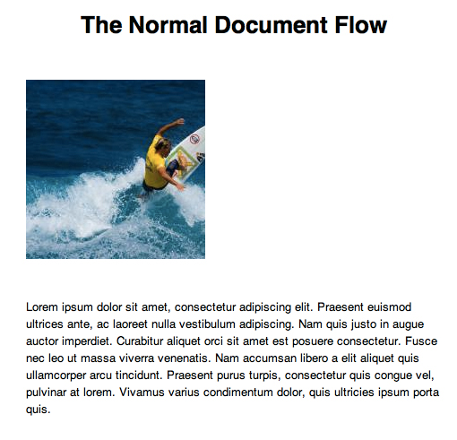
One way to reassign wrap type to elements is to use the float property. A classic example is the use of float to align an image along the left or right edge. Here is a simple HTML code for the image and paragraph:
')
They are displayed on a new line:
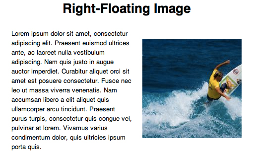
Add a little CSS image:
It turns out the alignment to the right:
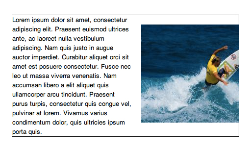
If there is more text, then the paragraph will wrap the picture:

Suppose we need to indent 20 pixels between the image and the text. This construction will not work:
Right like this:

Why doesn't the paragraph indent work? To understand, add a frame:
The result may surprise you:
It turns out that the picture is inside the paragraph! Therefore, the margin property does not work in the first case. To fix this, you can apply float: left to the paragraph and specify the absolute width:

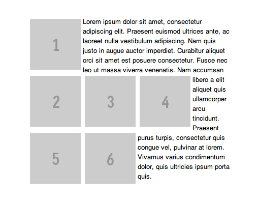
Let us turn to more complex uses of float: to the rules governing floating objects. This is necessary when creating the image gallery. For example:
By default, each item in the list will appear on a new line. If you apply to each float: left, the images will stand in a row with a line break:

But what if the images are of different heights?

If we add a one-line mapping to the elements of the list, we’ll get a little nicer:
Now align vertically:
It should be remembered that in the case of greater height of the pictures, the other images flow around only the previous one, for example:
An example of changing the order of elements - for example, we have a list of elements in order:
If we want to arrange them in reverse order, we simply use float: right instead of float: left, and we don’t have to change the order in HTML:
Using float, it is convenient to group elements on the page, but the big problem is that subsequent elements (text or block) also get the wrapping property. For example, we have a block of pictures:
The text below it starts to wrap around the whole block:
To avoid this, you must use the clear property. If we apply it to the second image:
We get this:
In this case, the remaining images continue to inherit float: left. Correspondingly, the text will be displayed clumsily:
It is necessary to apply clear: both to the paragraph:
Our problem is solved:
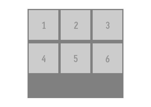
Now suppose we need to set the background for the gallery from the previous examples. If the elements were not floating, it would be like this:

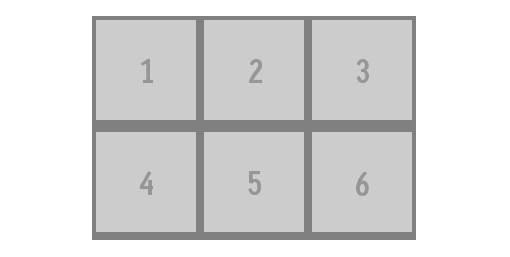
But if float: left is applied to the elements of the list, the background completely disappears:
If we first set the height for UL:
This also does not solve the problem, because The background dimensions are set absolutely. We are helped by the clearfix class, which will be applied to the div at the same level as the UL elements.
There is another solution using overflow:
What is a float?
Some elements in CSS are block and therefore begin on a new line. For example, if you place two paragraphs with tags P, they will be under each other. Other elements are "lower case", i.e. displayed on the page in one line.
One way to reassign wrap type to elements is to use the float property. A classic example is the use of float to align an image along the left or right edge. Here is a simple HTML code for the image and paragraph:
')
<img src="http://lorempixum.com/200/200/" /> <p>Lorem ipsum...</p> They are displayed on a new line:
Add a little CSS image:
img { float: right; margin: 20px; } It turns out the alignment to the right:
If there is more text, then the paragraph will wrap the picture:
Suppose we need to indent 20 pixels between the image and the text. This construction will not work:
p {margin: 20px;} Right like this:
img {margin: 20px;} Why doesn't the paragraph indent work? To understand, add a frame:
p { border: solid 1px black; } The result may surprise you:
It turns out that the picture is inside the paragraph! Therefore, the margin property does not work in the first case. To fix this, you can apply float: left to the paragraph and specify the absolute width:
img { float: right; margin: 20px; } p { float: left; width: 220px; margin: 20px; } Strange rules float
Let us turn to more complex uses of float: to the rules governing floating objects. This is necessary when creating the image gallery. For example:
<ul> <li><img src="1450823466601083332032"/></li> <li><img src="http://placehold.it/100x150&text=2"/></li> <li><img src="1450823466394721548724"/></li> <li><img src="1450823466376067888878"/></li> <li><img src="1450823466279266032276"/></li> <li><img src="http://placehold.it/100x150&text=6"/></li> <li><img src="http://placehold.it/100x100&text=7"/></li> </ul> By default, each item in the list will appear on a new line. If you apply to each float: left, the images will stand in a row with a line break:
li { float: left; margin: 4px; } But what if the images are of different heights?
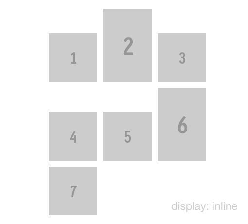
If we add a one-line mapping to the elements of the list, we’ll get a little nicer:
li { display: inline; } Now align vertically:
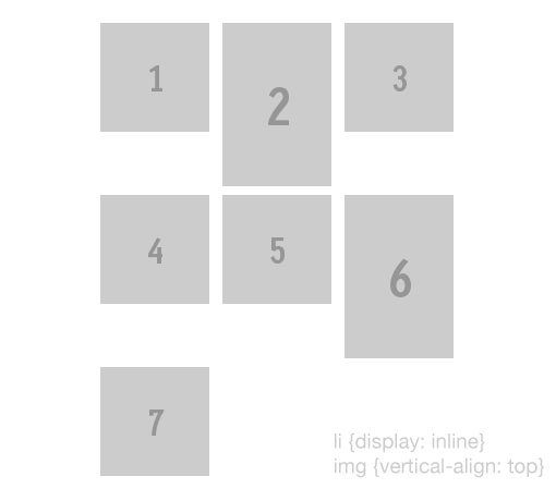
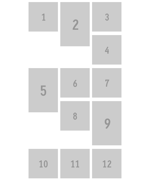
img { vertical-align: top; } It should be remembered that in the case of greater height of the pictures, the other images flow around only the previous one, for example:
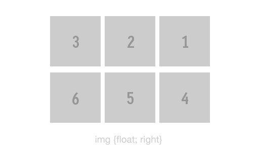
An example of changing the order of elements - for example, we have a list of elements in order:
<ul> <li><img src="1450823466601083332032"/></li> <li><img src="http://placehold.it/100x100&text=2"/></li> <li><img src="1450823466394721548724"/></li> <li><img src="1450823466376067888878"/></li> <li><img src="1450823466279266032276"/></li> <li><img src="http://placehold.it/100x100&text=6"/></li> </ul> If we want to arrange them in reverse order, we simply use float: right instead of float: left, and we don’t have to change the order in HTML:
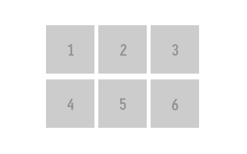
Using float, it is convenient to group elements on the page, but the big problem is that subsequent elements (text or block) also get the wrapping property. For example, we have a block of pictures:
The text below it starts to wrap around the whole block:
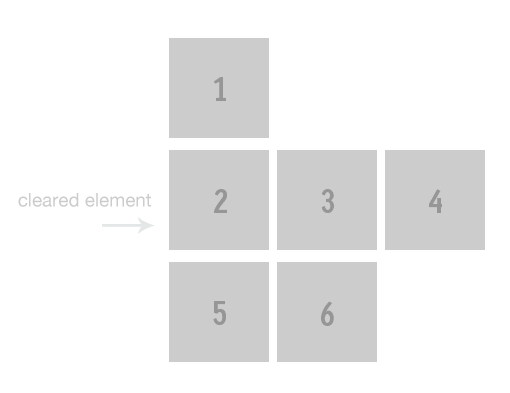
To avoid this, you must use the clear property. If we apply it to the second image:
ul li:nth-child(2) { clear: left; } We get this:
In this case, the remaining images continue to inherit float: left. Correspondingly, the text will be displayed clumsily:
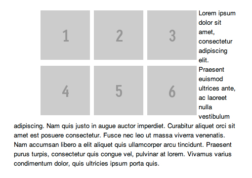
It is necessary to apply clear: both to the paragraph:
p { clear: both; } Our problem is solved:
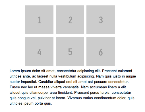
Now suppose we need to set the background for the gallery from the previous examples. If the elements were not floating, it would be like this:
ul { background: gray; } But if float: left is applied to the elements of the list, the background completely disappears:
If we first set the height for UL:
ul { height: 300px; } This also does not solve the problem, because The background dimensions are set absolutely. We are helped by the clearfix class, which will be applied to the div at the same level as the UL elements.
.clearfix { clear: both; } There is another solution using overflow:
ul { overflow: auto; } Nine rules for float elements:
- Floating elements cannot extend beyond the edge of their parent container.
- Each floating element will be displayed to the right or below from the previous one with float: left, or to the left and below, with float: right.
- A block with float: left cannot be more to the right than a block with float: right.
- A floating element cannot extend beyond the upper boundary of its container.
- A floating element cannot be located higher than the parent unit or the previous floating element.
- Floating element can not be located higher than the previous line of inline-elements
- The floating unit should be located as high as possible.
- One floating element, following another, cannot go beyond its container - transfer to the next line takes place.
- The block with float: left should be located as far as possible to the left, and with float: right - as far as possible to the right.
Source: https://habr.com/ru/post/142486/
All Articles