Make friends with mobile design with your fingers: perfect sizes for touchscreens
Not so long ago, an interesting article came across in which the author reflects on the usability of mobile interfaces. Some of his judgments are from the discharge of the findings of Captain Evidence, however, there are a number of quite useful facts and arguments, so I decided to share her translation with commonplaceness. Moreover, this topic can generate useful discussions in the comments - I suspect that many designers themselves have repeatedly encountered this issue.

Playing darts to hit the bull's eye is much more difficult than any other part of the target. This is natural because the center of the target is the smallest part of it. This principle can also be applied to mobile devices.
It is much more difficult to get into small controls with a finger than with large ones. When you are designing a mobile interface, it’s best to foresee this immediately and make these elements bigger. This way you make life easier for the user of the touch device. But how large should they be in order to satisfy the majority of users to the maximum? Many developers of mobile applications are interested in this issue and most of them refer to the official user guides provided by platform developers.
')
Apple's Guideline - iPhone Human Interface Guidelines - recommends these minimum dimensions for a touch-element: 44px wide and 44px high. Microsoft’s Windows Phone UI Design and Interaction Guide suggests 34px with a minimum touch area of 26px. Nokia’s developer’s guide suggests that this size should be at least 1 x 1 sq. Cm. or 28 x 28 px.
At that time, as long as these guidelines all provide common dimensions for touch objects, it can be noted that not only do they not agree with each other, they also do not correspond to the actual dimensions of the human finger. In fact, the dimensions they provide are much smaller than the size of an average finger, which can cause some problems when using a mobile device.
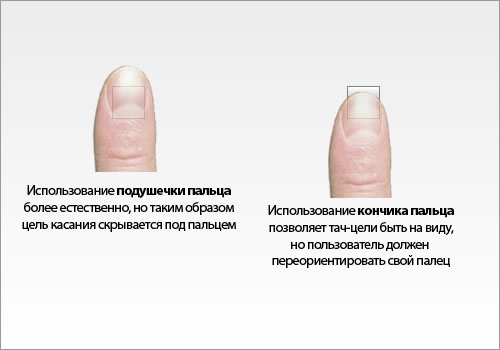
Small touch objects force users to strain to once again carefully aim and get into the desired area. Users have to change the principle of managing their fingers, using either their tips or their fingertips. Using fingertips to click, mobile device users get a large contact area, but hide the touch object, making their target invisible. In other cases, users use their fingertips, mainly to click on small areas, because in this way they get a visual feedback and see that they hit the target accurately. Because of such frequent changes in the behavior of the fingers, the work with the mobile application is slowed down and complicated.
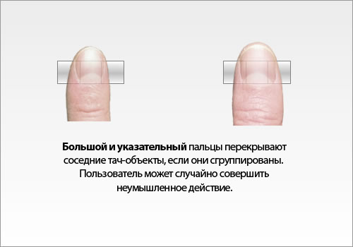
In addition, small touch objects can lead to a number of errors. When they are grouped next to each other, the user can accidentally click on a nearby object and perform an unnecessary action. And all because the general area of a finger can cover several neighboring objects at once. So if during pressing the purpose of this pressing is not clearly defined, then be prepared for unexpected consequences. It's pretty easy to make mistakes, using only your index finger, and using your thumb to navigate your thumb is even easier, because usually the thumb region has significantly more targets on the touchscreen. Sometimes users turn their finger sideways in order to use its narrower part, but this requires additional time for unnecessary manipulations of their limbs.
The use of the thumb is quite popular among users of mobile devices. Some users do not always have two hands free while working with their device. Many people prefer to use only one hand, holding their device in the palm of their hands and using their thumb to interact with the interface. Users do not have to switch between one hand and two, or between thumb and forefinger in order to hit the target more accurately. And more importantly, the size of the target should not lead to errors associated with clicks. Small touch-goals greatly complicate the lives of users, in contrast to the friendly to the fingers.
MIT Touch Lab in his work The fingers of a man in the study of the mechanics of tactile sensations (Human Fingertips to investigate the Mechanics of Tactile Sense) determined that the average width of a finger is 1.6 - 2 cm (16 - 20 mm) for most adults. In pixels, these values will be equal to 45 - 57 px , which is wider than indicated in most guidelines for developers.

Thus, the target of pressing, having a width of 45 - 57 px, will allow the user to press it as comfortably as possible. The edges of the target will always be visible while clicking. This provides its visual impact, which signals a successful press. Plus, due to the large size of the targets, the speed of moving the fingers between them increases. This is consistent with Fitt's Law , which says that the smaller the goal, the more time is spent to achieve it. Small goals slow users down because they have to pay extra attention for accurate clicking. Goals with dimensions equal to the width of the fingers allow them not to waste time on this and not to worry about the accuracy of the clicks.
There is a fairly large number of users who use their index fingers for clicking on mobile devices. However, lovers of the thumb, there is no less. The main difference between the thumb and index finger is its width, which is on average 2.5 cm for an adult , which can be converted to 72 px .
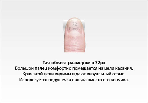
For those who use the thumb, 72 pixels work wonders. Thanks to this width, it is easier and faster for users to click on the interface elements, since each time they press the thumb will always hit their target. It also allows the edges of the target to be visible at any angle. This means that the user does not have to turn his finger to see every touch target. One touch is enough to reach his goal.
A Study of target sizes for the thumb of one hand on small touchscreen devices (Target Size on One Touchscreen Devices) found that the number of errors decreased as the size of the target increased. Users have the opportunity to click on the target components with greater accuracy faster without unnecessary movements, such as turning fingers.
Another study, " Touch Key Design for Selecting a Mobile Phone Area (Touch Key Design for Target Selection on a Mobile Phone) ", also found that the number of errors decreased as soon as the area of pressing was increased.
Despite all the advantages of using touch-related size of fingers, this approach will not be practical in all situations. In a mobile device you are working on a limited area. This means that if you use finger sizes for different interface elements, they can take up much more space than the screen of the device can allow. However, when you have several such objects, you can mark them on the screen without any problems. You will need to measure the size of the screen and the size of the touch-elements to find out how large the large touch-areas you can afford. If you can not afford to use the dimensions under your fingers in your interface, then follow the official guidelines provided by the developers of mobile platforms.
Obviously, finger ideal sizes are much easier to use on tablet computers than on mobile devices, because tablets have more screens and more free space is available. You can no doubt use this space and improve tablet usability. However, mobile devices are exactly those devices that cause problems with user clicks. And therefore, it is they who first of all need touch-sizes that are comfortable for fingers. The challenge now for designers is to figure out how to optimally place them on the screen of a mobile phone. This may require using fewer touch objects on the screen than usual. But it can be a plus, because it will force designers to make navigation easier and clearer.
Another thing to think about is when it is unknown which finger will be used. It is difficult to determine which version of the interaction your users prefer - thumb or forefinger. If your application is a game, then most likely most users will use their thumb to play instead of the index finger. For this reason, thumb sizes are particularly useful for gaming applications. Setting the size for the controls, equal to the area of the thumb, you thereby improve the management and control of the game. Users thus have the opportunity to see the controls even while clicking on them, which allows you to quickly adapt to the game.

Gyro13 Steam Copter Arcade has great touch controls.
There is no doubt that the size of the touch objects, equal to the width of the middle finger, improve the usability of mobile devices for most of them. Whether the game is your application, or for any other purposes, the touch objects are designed for users to click on them. If the user has to divert his attention from the application in order to think about how best to click on the control, it impairs the experience with your application. With an understanding of the new approach, you can create applications that will truly make friends with the fingers of users. This finger-friendly design is not reserved for several developers; it is a new design standard for mobile applications that you can always follow.
PS: For some terms and expressions, I could not find an unambiguous translation, so do not judge strictly.
Playing darts to hit the bull's eye is much more difficult than any other part of the target. This is natural because the center of the target is the smallest part of it. This principle can also be applied to mobile devices.
It is much more difficult to get into small controls with a finger than with large ones. When you are designing a mobile interface, it’s best to foresee this immediately and make these elements bigger. This way you make life easier for the user of the touch device. But how large should they be in order to satisfy the majority of users to the maximum? Many developers of mobile applications are interested in this issue and most of them refer to the official user guides provided by platform developers.
')
What the Mobile Platform Guides say
Apple's Guideline - iPhone Human Interface Guidelines - recommends these minimum dimensions for a touch-element: 44px wide and 44px high. Microsoft’s Windows Phone UI Design and Interaction Guide suggests 34px with a minimum touch area of 26px. Nokia’s developer’s guide suggests that this size should be at least 1 x 1 sq. Cm. or 28 x 28 px.
At that time, as long as these guidelines all provide common dimensions for touch objects, it can be noted that not only do they not agree with each other, they also do not correspond to the actual dimensions of the human finger. In fact, the dimensions they provide are much smaller than the size of an average finger, which can cause some problems when using a mobile device.
Small touch areas can cause big problems.
Small touch objects force users to strain to once again carefully aim and get into the desired area. Users have to change the principle of managing their fingers, using either their tips or their fingertips. Using fingertips to click, mobile device users get a large contact area, but hide the touch object, making their target invisible. In other cases, users use their fingertips, mainly to click on small areas, because in this way they get a visual feedback and see that they hit the target accurately. Because of such frequent changes in the behavior of the fingers, the work with the mobile application is slowed down and complicated.
In addition, small touch objects can lead to a number of errors. When they are grouped next to each other, the user can accidentally click on a nearby object and perform an unnecessary action. And all because the general area of a finger can cover several neighboring objects at once. So if during pressing the purpose of this pressing is not clearly defined, then be prepared for unexpected consequences. It's pretty easy to make mistakes, using only your index finger, and using your thumb to navigate your thumb is even easier, because usually the thumb region has significantly more targets on the touchscreen. Sometimes users turn their finger sideways in order to use its narrower part, but this requires additional time for unnecessary manipulations of their limbs.
The use of the thumb is quite popular among users of mobile devices. Some users do not always have two hands free while working with their device. Many people prefer to use only one hand, holding their device in the palm of their hands and using their thumb to interact with the interface. Users do not have to switch between one hand and two, or between thumb and forefinger in order to hit the target more accurately. And more importantly, the size of the target should not lead to errors associated with clicks. Small touch-goals greatly complicate the lives of users, in contrast to the friendly to the fingers.
The average width of the index finger in pixels.
MIT Touch Lab in his work The fingers of a man in the study of the mechanics of tactile sensations (Human Fingertips to investigate the Mechanics of Tactile Sense) determined that the average width of a finger is 1.6 - 2 cm (16 - 20 mm) for most adults. In pixels, these values will be equal to 45 - 57 px , which is wider than indicated in most guidelines for developers.
Thus, the target of pressing, having a width of 45 - 57 px, will allow the user to press it as comfortably as possible. The edges of the target will always be visible while clicking. This provides its visual impact, which signals a successful press. Plus, due to the large size of the targets, the speed of moving the fingers between them increases. This is consistent with Fitt's Law , which says that the smaller the goal, the more time is spent to achieve it. Small goals slow users down because they have to pay extra attention for accurate clicking. Goals with dimensions equal to the width of the fingers allow them not to waste time on this and not to worry about the accuracy of the clicks.
The average width of the thumb in pixels.
There is a fairly large number of users who use their index fingers for clicking on mobile devices. However, lovers of the thumb, there is no less. The main difference between the thumb and index finger is its width, which is on average 2.5 cm for an adult , which can be converted to 72 px .
For those who use the thumb, 72 pixels work wonders. Thanks to this width, it is easier and faster for users to click on the interface elements, since each time they press the thumb will always hit their target. It also allows the edges of the target to be visible at any angle. This means that the user does not have to turn his finger to see every touch target. One touch is enough to reach his goal.
A Study of target sizes for the thumb of one hand on small touchscreen devices (Target Size on One Touchscreen Devices) found that the number of errors decreased as the size of the target increased. Users have the opportunity to click on the target components with greater accuracy faster without unnecessary movements, such as turning fingers.
Another study, " Touch Key Design for Selecting a Mobile Phone Area (Touch Key Design for Target Selection on a Mobile Phone) ", also found that the number of errors decreased as soon as the area of pressing was increased.
The area of the fingers is almost always perfect, but not always practical.
Despite all the advantages of using touch-related size of fingers, this approach will not be practical in all situations. In a mobile device you are working on a limited area. This means that if you use finger sizes for different interface elements, they can take up much more space than the screen of the device can allow. However, when you have several such objects, you can mark them on the screen without any problems. You will need to measure the size of the screen and the size of the touch-elements to find out how large the large touch-areas you can afford. If you can not afford to use the dimensions under your fingers in your interface, then follow the official guidelines provided by the developers of mobile platforms.
Obviously, finger ideal sizes are much easier to use on tablet computers than on mobile devices, because tablets have more screens and more free space is available. You can no doubt use this space and improve tablet usability. However, mobile devices are exactly those devices that cause problems with user clicks. And therefore, it is they who first of all need touch-sizes that are comfortable for fingers. The challenge now for designers is to figure out how to optimally place them on the screen of a mobile phone. This may require using fewer touch objects on the screen than usual. But it can be a plus, because it will force designers to make navigation easier and clearer.
Sizes for fingers in gaming applications
Another thing to think about is when it is unknown which finger will be used. It is difficult to determine which version of the interaction your users prefer - thumb or forefinger. If your application is a game, then most likely most users will use their thumb to play instead of the index finger. For this reason, thumb sizes are particularly useful for gaming applications. Setting the size for the controls, equal to the area of the thumb, you thereby improve the management and control of the game. Users thus have the opportunity to see the controls even while clicking on them, which allows you to quickly adapt to the game.
Gyro13 Steam Copter Arcade has great touch controls.
There is no doubt that the size of the touch objects, equal to the width of the middle finger, improve the usability of mobile devices for most of them. Whether the game is your application, or for any other purposes, the touch objects are designed for users to click on them. If the user has to divert his attention from the application in order to think about how best to click on the control, it impairs the experience with your application. With an understanding of the new approach, you can create applications that will truly make friends with the fingers of users. This finger-friendly design is not reserved for several developers; it is a new design standard for mobile applications that you can always follow.
PS: For some terms and expressions, I could not find an unambiguous translation, so do not judge strictly.
Source: https://habr.com/ru/post/142445/
All Articles