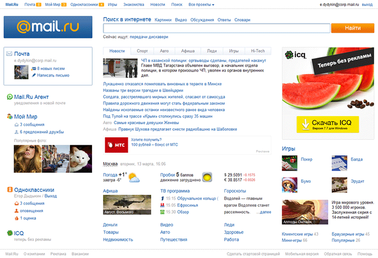
New Home Mail.Ru portal
I think many of you have ever seen the old Mail.Ru main page, which has not changed for a long time. Therefore, for general understanding, a small preamble: the technical update, which will be discussed in this post, became possible after internal changes in the company.
A rather large team was engaged in the development of the main one : it included designers, usability specialists and, of course, developers, including me and note .

')
First, the old page was overlaid on the tables and did not load as fast as we would like. So, the first step was to speed up the download.
Secondly, it was necessary to modernize the page both visually and technologically. The page should meet current expectations and trends.
For example, I can say that one of the requirements for the redesign was the absence of a scroll.
First things first.
Mail.ru download users with both good and very slow Internet channel. We wanted the portal navigation, logo, mail and social blocks to be displayed as quickly as possible so that users with a slow channel could start working with the page as soon as possible.
To do this, we placed in front of the HTML code of each of the blocks the CSS rules describing it in the style tag. The browser, having on hand everything necessary for rendering the block, does it right away.
To prevent the block from being drawn already, but it still does not fulfill its function, for example, the authorization form in the mail block with “custom” interface elements, right after HTML, the basic JS functionality is placed in inline scripts.
Thus, the accelerated blocks are displayed sequentially as the page loads, and after drawing are fully functional.

Then you can do the rest of the blocks.
After the left column, we load the external style sheet containing the remaining rules, the center HTML, the extended functionality script, and the right HTML column.
We have experimentally found the optimal place to load the JS-file with extended functionality.
According to our measurements, the transitions to the Search are highly dependent on the presence of search sadzhestov. Therefore, the script containing the logic of sadzhestov, I want to download as close as possible to the search block. But below in the central column there are not less important blocks with content followed by users on the page. So, move the script for the central column.
If you rearrange the script a little further along the code, you will have to wait for the banner to load, which on average is loaded 180ms, and the central column is two times less.
Accordingly, the optimal place is between the central and left columns.
The next step is loading the blocks, which are not possible or necessary to load immediately.
This is a block with photos in the left column and hidden news tabs.
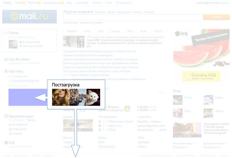
The block with the photo contains external non-static content. These are images that the user in any case will see later on the left column display, since you will have to wait for them to download, which means you can postpone the download.
Initially, instead of a block, there is a placeholder that simply occupies the necessary space. At the end of the page, in post-loading, the placeholder is replaced with the real block code and the loading of images begins.

When loading the page, the user will see only one tab of the news, and the rest - only after clicking on the taboo. We put the hidden tabs in the post-load and substitute it in the right place only at the user's request, which significantly reduces the block loading time.
There are a number of rarely used blocks (such as various promotional popups), the elements of which are called before the blocks themselves are declared.
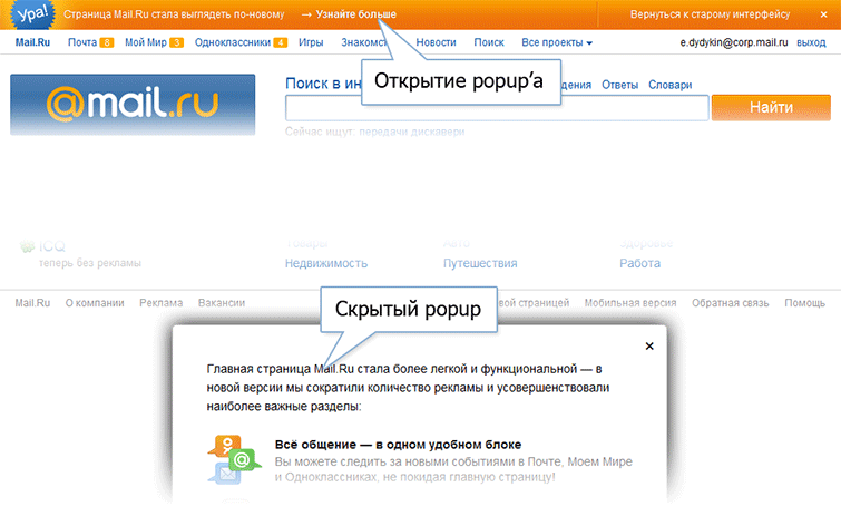
For example, the “Learn more” link in the promo dash about a new design, opening a popup with additional information.
Because the block is rarely used, there is no point in loading it next to the link at the top of the page, slowing down the loading of more important content. Therefore, the hidden popup is at the end of the page. But the link is displayed almost immediately, and the user can click on it even before the popup is loaded.
To handle such situations, we use a simple deferred function call system.
A handler hangs on the link, storing the function passed to it in the queue:
At the end of the page, the queue handler is given the command that the page is loaded, the handler starts all the functions stored in the queue, after which all new functions transferred to it will be started immediately.
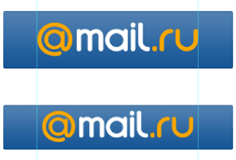
Looking ahead, it is worth discussing the loading of the logo.
There are actually two of them. Large - for large resolutions, and small - for the rest.
When the page loads, one of them will appear, and the user will still not see the second logo at the moment. To postpone loading a hidden logo, use the following solution:
Initially, in the code, instead of images, there are two span'ki with similar image classes
After that, the script determines which of them is hidden through the Media Queries to allow the given user and the corresponding image is added to the post download. The second is displayed immediately.
Of course, both images are displayed in noscript for users with JS disabled.
The styles of each block are separated from each other and are each in their own file.

For blocks that need to be loaded quickly, styles are collected block by block into the appropriate subdirectories of the forced-blocks folder, and then automatically inserted into the style tag at the required place on the page.
The rest of the styles are collected in one file (/css/styles.scss) and uploaded to the page via the link after the left column.
This approach makes it easy to manipulate the loading block. If we need to speed up a block, we just need to connect its styles differently.
There are some nuances in the JS boot process too.
The HEAD page inline loads the base part of the “core”, for example, the event handling functions necessary for the basic functionality of accelerated blocks.
Then the external script of the extended functionality is loaded, in which
basic feature set is expanding.
Thus, loading scripts is also easy to manage.
As a result of the work done, the following averaged figures were obtained:
That well illustrates the video of the page loading process with a slow connection emulation.

As shown in the graph, the user sees most of the page, namely the portal navigation and the left and center columns after 600 milliseconds in a few milliseconds, and most of the functionality works after another 500ms. And after 1.5 seconds the page is fully operational.

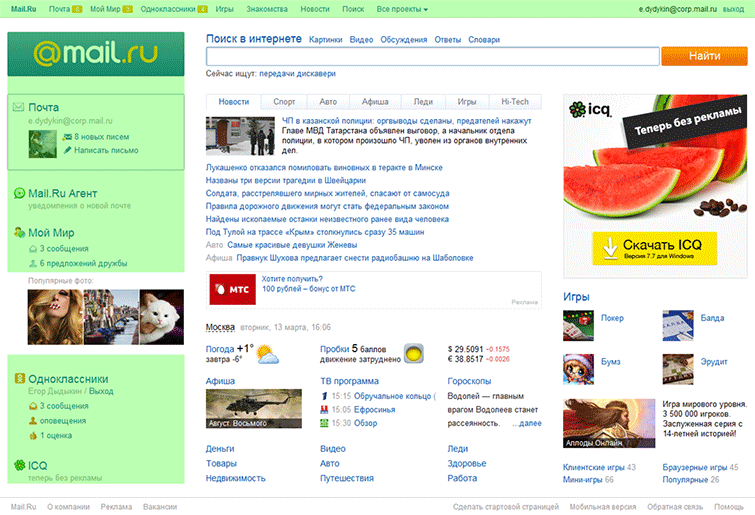
The second big challenge was the lack of a scroll.
Everyone immediately remembered the technology Media Queries, with which you can fit the page to the desired size.
The main thing - to understand, under what customized.
The simplest, at first glance, solution would be to look at the already available statistics on screen resolutions.
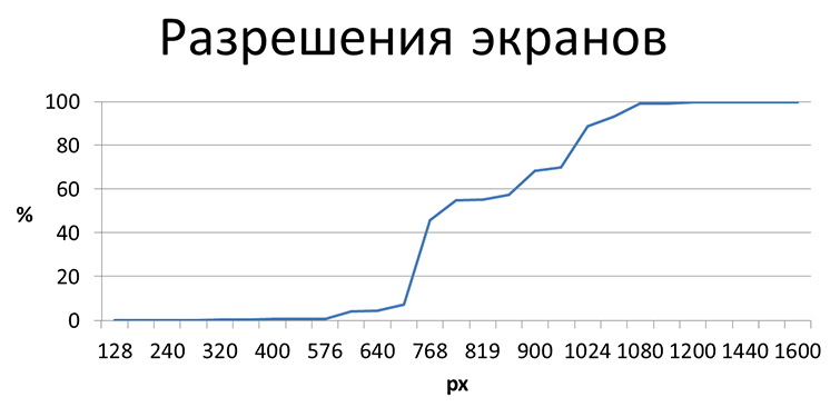
Although these data give an idea of specific figures, they do not give a real picture: they do not take into account the settings of the OS interface elements and the browser. It is not clear how much space is available page.
Therefore, it was decided to make their own measurements of real viewports.

The x axis is the height of the viewport, and the y axis is the number of users whose viewport is less than this height.
At first we measured the viewport on the loading page. But it seemed to us that we should not rely on this data, since we all often saw users open the page, then maximize the browser window and continue working with the page.
We counted the number of resize windows. There are quite a few users who do this, about 12%.
To confirm our guesses, we decided to measure the maximum viewport per session. As well as the maximum viewport per session in browsers that do not support Media Queries, which our users have quite a lot - about 15%.

The data obtained confirmed our guesswork.
The graph shows that the same users have one window size when opening a page, and later a different one.
The graphs clearly show jumps, meaning that at this height there are a lot of users. We decided to focus on these races.

We chose the following values:
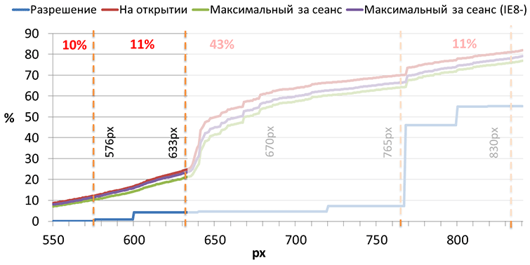
What does 633px mean?
That 21% of users who have a smaller viewport will see a scroll. It did not suit us, and we broke this area with another value of 576px - where there are practically no changes on the graph.
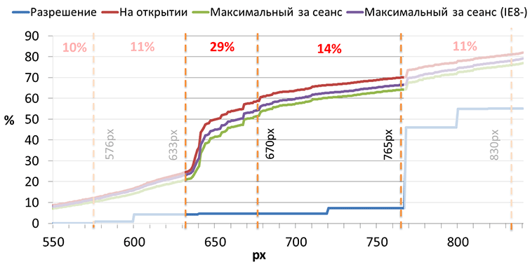
We also decided to split the region from 633 to 765 pixels with another value of 670 pixels. Exclusively for aesthetic reasons, we decided to fill the free space of a large group of users.
So, starting from 576px, the user does not have a scroll.
At 633px we change the indents, display the captions in the left column, additional information on the main news and a couple of games in the right column.
At 670px we simply change the padding to fill the free space.
At 765px, we increase the logo and photo block in the left column, display the “Now Looking for” block under the search, additional information blocks and a big game in the right column.
At 830px, indents are changed and additional news is displayed.
The width also has changes.
On wide pages, indents between the columns are increased, and on narrow ones, the news tabs that do not fit are transferred to the “More” dropout.
For browsers without Media Queries, we chose the 633px height option.
The Media Queries code and threshold numbers can change at any time.
Therefore, in order not to have to shovel the half-project, you need a centralized place for generating media expressions.
We decided to use the SASS mixin.
For a block, the default styles are first specified, and below, in minxin, dynamic styles are transferred with an indication of the heights and axis to which they should be applied.
Mixin understands the media expression to be output by the transmitted constants, and the result is the following code:
Default state
And state changes for browsers that support Media Queries

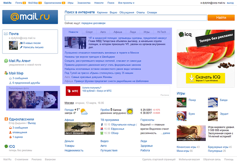
The entire Mail.Ru portal at the top of the page contains a single block of active portal navigation.
It updates user data by timeout: the number of unread emails in the Mail, the number of new events in My World and Odnoklassniki.
The new main page in the left column, in addition to the mail block, contains extensive information on social networks, which also needs to be dynamically updated.
The first problem is that we receive data from different sources: in the portal navigation data from My World and Mail from one server, Odnoklassniki from another, and extended data on My World we receive from the main page itself.
The second problem is that the portal navigation, being cross-portal, is highlighted in a separate project, and we cannot influence it on the page, and the data needs to be updated synchronously: when receiving data from the Odnoklassniki in the portal navigation, the data on the page is also updated, when receiving data on My World and Mail, make a request for the expanded data of My World, update your part of the page, and only then update the portal navigation.
To do this, JSONP callbacks in portal navigation introduced the ability to give control to scripts on the page and update the numbers on the reverse command.
Rendering is started only if no callback is declared on the page that returns false.
If you declare such a callback, you can make an asynchronous request, update the necessary blocks on the page, and only then return control of the portal navigation by running the transferred portal navigation drawing function.
So The page can control the display of updates depending on the availability of the necessary information.
Although the topic of stability is beyond the scope of this article, I can’t leave it alone.
The main page, in fact, is an aggregator of data from different projects. Previously, we received HTML blocks directly from projects. It is a lot of projects, to control issue it is unreal. Chances are high that the page will fall apart due to an unclosed attribute or some other error.
In the process of developing a new main page, we switched to data acquisition and transformation already on our side, which significantly reduced the likelihood of an explosion.
Yegor Dydykin,
leader of the development team for the main Mail.Ru page and cross-portal projects
A rather large team was engaged in the development of the main one : it included designers, usability specialists and, of course, developers, including me and note .
')
First, the old page was overlaid on the tables and did not load as fast as we would like. So, the first step was to speed up the download.
Secondly, it was necessary to modernize the page both visually and technologically. The page should meet current expectations and trends.
For example, I can say that one of the requirements for the redesign was the absence of a scroll.
First things first.
Fast download
Mail.ru download users with both good and very slow Internet channel. We wanted the portal navigation, logo, mail and social blocks to be displayed as quickly as possible so that users with a slow channel could start working with the page as soon as possible.
<style> /* mailbox styles */ </style> <div class="mailbox"> <!-- mailbox HTML --> </div> <script> // mailbox JS </script> To do this, we placed in front of the HTML code of each of the blocks the CSS rules describing it in the style tag. The browser, having on hand everything necessary for rendering the block, does it right away.
To prevent the block from being drawn already, but it still does not fulfill its function, for example, the authorization form in the mail block with “custom” interface elements, right after HTML, the basic JS functionality is placed in inline scripts.
Thus, the accelerated blocks are displayed sequentially as the page loads, and after drawing are fully functional.
Then you can do the rest of the blocks.
After the left column, we load the external style sheet containing the remaining rules, the center HTML, the extended functionality script, and the right HTML column.
We have experimentally found the optimal place to load the JS-file with extended functionality.
According to our measurements, the transitions to the Search are highly dependent on the presence of search sadzhestov. Therefore, the script containing the logic of sadzhestov, I want to download as close as possible to the search block. But below in the central column there are not less important blocks with content followed by users on the page. So, move the script for the central column.
If you rearrange the script a little further along the code, you will have to wait for the banner to load, which on average is loaded 180ms, and the central column is two times less.
Accordingly, the optimal place is between the central and left columns.
The next step is loading the blocks, which are not possible or necessary to load immediately.
This is a block with photos in the left column and hidden news tabs.
The block with the photo contains external non-static content. These are images that the user in any case will see later on the left column display, since you will have to wait for them to download, which means you can postpone the download.
Initially, instead of a block, there is a placeholder that simply occupies the necessary space. At the end of the page, in post-loading, the placeholder is replaced with the real block code and the loading of images begins.
When loading the page, the user will see only one tab of the news, and the rest - only after clicking on the taboo. We put the hidden tabs in the post-load and substitute it in the right place only at the user's request, which significantly reduces the block loading time.
There are a number of rarely used blocks (such as various promotional popups), the elements of which are called before the blocks themselves are declared.
For example, the “Learn more” link in the promo dash about a new design, opening a popup with additional information.
Because the block is rarely used, there is no point in loading it next to the link at the top of the page, slowing down the loading of more important content. Therefore, the hidden popup is at the end of the page. But the link is displayed almost immediately, and the user can click on it even before the popup is loaded.
To handle such situations, we use a simple deferred function call system.
A handler hangs on the link, storing the function passed to it in the queue:
<a onclick="callbackQuery.run(function(){openPopup()});">...</a> At the end of the page, the queue handler is given the command that the page is loaded, the handler starts all the functions stored in the queue, after which all new functions transferred to it will be started immediately.
<div class="popup">...</div> <script> function openPopup(){ … } </script> ... <script> callbackQuery.loaded(); </script> </body> Looking ahead, it is worth discussing the loading of the logo.
There are actually two of them. Large - for large resolutions, and small - for the rest.
When the page loads, one of them will appear, and the user will still not see the second logo at the moment. To postpone loading a hidden logo, use the following solution:
Initially, in the code, instead of images, there are two span'ki with similar image classes
<style> @media all and (min-height: 765px) { .logo__link__img_medium { display:none; } } @media all and (min-height: 765px) { .logo__link__img_wide { display:block; } } </style> <span class="logo__link__img logo__link__img_medium"></span> <span class="logo__link__img logo__link__img_wide"></span> After that, the script determines which of them is hidden through the Media Queries to allow the given user and the corresponding image is added to the post download. The second is displayed immediately.
<script> logos.forEach(function(logo){ if (logo.currentStyle.display === "block"){ document.write("<img … />"); } else { var image = document.createElement("img"); ... } }); </script> Of course, both images are displayed in noscript for users with JS disabled.
<noscript> <img class="logo__link__img logo__link__img_medium" … /> <img class="logo__link__img logo__link__img_wide" … /> </noscript> CSS
The styles of each block are separated from each other and are each in their own file.
For blocks that need to be loaded quickly, styles are collected block by block into the appropriate subdirectories of the forced-blocks folder, and then automatically inserted into the style tag at the required place on the page.
/* css/forced-blocks/mailbox.scss */ @import "../../blocks/mailbox/mailbox"; <style> <fest:insert src="css/forced-blocks/mailbox.scss" /> </style> The rest of the styles are collected in one file (/css/styles.scss) and uploaded to the page via the link after the left column.
@import "blocks/news/_news.scss"; @import "blocks/text-banner/_text-banner.scss"; @import "blocks/banner/_banner.scss"; @import "blocks/informers/_informers.scss"; <link href="styles.css" /> This approach makes it easy to manipulate the loading block. If we need to speed up a block, we just need to connect its styles differently.
Js
There are some nuances in the JS boot process too.
The HEAD page inline loads the base part of the “core”, for example, the event handling functions necessary for the basic functionality of accelerated blocks.
<head> <script> var mr = { bind: function(){} }; </script> </head> <div class="mailbox">...</div> <script> mr.bind </script> Then the external script of the extended functionality is loaded, in which
basic feature set is expanding.
<script> extend(mr, { position: function(){} }); </script> Thus, loading scripts is also easy to manage.
What did it give
As a result of the work done, the following averaged figures were obtained:
- The page is fully loaded 550ms after the start of the request, of which 16ms is the time the page is generated by the server.
- Portal navigation is displayed through 195ms
- Left column - 180ms
- Search - 40ms
- News - 12ms
- Informers - 30ms
- Banner - 180ms
- Styles - 190ms
- Post-loading - 117ms
- Scripts - 500ms
That well illustrates the video of the page loading process with a slow connection emulation.
As shown in the graph, the user sees most of the page, namely the portal navigation and the left and center columns after 600 milliseconds in a few milliseconds, and most of the functionality works after another 500ms. And after 1.5 seconds the page is fully operational.
Scroll
The second big challenge was the lack of a scroll.
Everyone immediately remembered the technology Media Queries, with which you can fit the page to the desired size.
The main thing - to understand, under what customized.
The simplest, at first glance, solution would be to look at the already available statistics on screen resolutions.
Although these data give an idea of specific figures, they do not give a real picture: they do not take into account the settings of the OS interface elements and the browser. It is not clear how much space is available page.
Therefore, it was decided to make their own measurements of real viewports.
The x axis is the height of the viewport, and the y axis is the number of users whose viewport is less than this height.
At first we measured the viewport on the loading page. But it seemed to us that we should not rely on this data, since we all often saw users open the page, then maximize the browser window and continue working with the page.
We counted the number of resize windows. There are quite a few users who do this, about 12%.
To confirm our guesses, we decided to measure the maximum viewport per session. As well as the maximum viewport per session in browsers that do not support Media Queries, which our users have quite a lot - about 15%.
The data obtained confirmed our guesswork.
The graph shows that the same users have one window size when opening a page, and later a different one.
The graphs clearly show jumps, meaning that at this height there are a lot of users. We decided to focus on these races.
We chose the following values:
- 633px, slightly lower than the big jump
- 765px, which is slightly lower than the second group of jumps
- 830px - the maximum height above which we change nothing
What does 633px mean?
That 21% of users who have a smaller viewport will see a scroll. It did not suit us, and we broke this area with another value of 576px - where there are practically no changes on the graph.
We also decided to split the region from 633 to 765 pixels with another value of 670 pixels. Exclusively for aesthetic reasons, we decided to fill the free space of a large group of users.
So, starting from 576px, the user does not have a scroll.
At 633px we change the indents, display the captions in the left column, additional information on the main news and a couple of games in the right column.
At 670px we simply change the padding to fill the free space.
At 765px, we increase the logo and photo block in the left column, display the “Now Looking for” block under the search, additional information blocks and a big game in the right column.
At 830px, indents are changed and additional news is displayed.
The width also has changes.
On wide pages, indents between the columns are increased, and on narrow ones, the news tabs that do not fit are transferred to the “More” dropout.
For browsers without Media Queries, we chose the 633px height option.
Implementation
The Media Queries code and threshold numbers can change at any time.
Therefore, in order not to have to shovel the half-project, you need a centralized place for generating media expressions.
We decided to use the SASS mixin.
For a block, the default styles are first specified, and below, in minxin, dynamic styles are transferred with an indication of the heights and axis to which they should be applied.
.someblock { margin-top:10px; @include respond-to-media(xsmall, vertical, margin-top, 5px); @include respond-to-media(small, vertical, margin-top, 10px); } @mixin respond-to-media($screen, $direction, $property, $value: "") { @if $direction == vertical { @if $screen == xsmall { @media only screen and (max-height: 632px) { ... } } @else if $screen == small { @media only screen and (min-height: 633px) and (max-height: 668px) {...} } ... } @else if $direction == horizontal { ... } } Mixin understands the media expression to be output by the transmitted constants, and the result is the following code:
Default state
.someblock { margin-top:5px; } And state changes for browsers that support Media Queries
@media only screen and (max-height: 632px) { .someblock { margin-top:5px; } } @media only screen and (min-height: 633px) and (max-height: 668px) { .someblock { margin-top:10px; } } Synchronization with portal navigation
The entire Mail.Ru portal at the top of the page contains a single block of active portal navigation.
It updates user data by timeout: the number of unread emails in the Mail, the number of new events in My World and Odnoklassniki.
The new main page in the left column, in addition to the mail block, contains extensive information on social networks, which also needs to be dynamically updated.
The first problem is that we receive data from different sources: in the portal navigation data from My World and Mail from one server, Odnoklassniki from another, and extended data on My World we receive from the main page itself.
The second problem is that the portal navigation, being cross-portal, is highlighted in a separate project, and we cannot influence it on the page, and the data needs to be updated synchronously: when receiving data from the Odnoklassniki in the portal navigation, the data on the page is also updated, when receiving data on My World and Mail, make a request for the expanded data of My World, update your part of the page, and only then update the portal navigation.
To do this, JSONP callbacks in portal navigation introduced the ability to give control to scripts on the page and update the numbers on the reverse command.
Rendering is started only if no callback is declared on the page that returns false.
// function JSONPCallback(data){ var _cb = JSONPCallback._pageCallback; if (typeof _cb == 'function' && _cb(data, draw) !== false){ draw(); }; function draw(){ // } } If you declare such a callback, you can make an asynchronous request, update the necessary blocks on the page, and only then return control of the portal navigation by running the transferred portal navigation drawing function.
// JSONPCallback._pageCallback = function(data, draw){ new AJAX('/', …, function(data){ // … // draw(); }); // false, return false; } So The page can control the display of updates depending on the availability of the necessary information.
Results
- Accelerated loading of the page as a whole and controllability of loading stages on slow channels
- Get rid of the scroll - all content is available on one screen
- Job stability
Although the topic of stability is beyond the scope of this article, I can’t leave it alone.
The main page, in fact, is an aggregator of data from different projects. Previously, we received HTML blocks directly from projects. It is a lot of projects, to control issue it is unreal. Chances are high that the page will fall apart due to an unclosed attribute or some other error.
In the process of developing a new main page, we switched to data acquisition and transformation already on our side, which significantly reduced the likelihood of an explosion.
Yegor Dydykin,
leader of the development team for the main Mail.Ru page and cross-portal projects
Source: https://habr.com/ru/post/142193/
All Articles