The vagueness of the icons weary
After the appearance of retinal displays, people are looking for alternatives to PNG icons that do not depend on resolution. Someone falls in love with font icons, others shout “SVG”. Sorry, but if you are looking for a cure-all, then I am afraid that it does not exist. Let's take a closer look at what options we have.
Fonts with badges are amazing, but ...
they are blurred. There is no real pixel sharpness in them. Yes, using @ font-face for icons has become very popular. I myself recommended and even began to collect them. But in such icons there is a flaw that suffers me. They are still a little blurred on non-rash displays (and there are still the vast majority of them). Try running the size of Chris in a demonstration and look more closely. The effect is manifested differently in different sizes, but they all have the same “ half pixel blur ” problem. Perhaps it is not so easy to notice, so here I have increased the screenshot of a fifteen-pixel size (and at the same time removed the background noise):
')

Subpixel anti-aliasing works fine on curved lines, but not on straight lines - they just stop looking clear. In theory, it would be possible to use font hinting so that the contours of the icons would be closer to full pixel ones. But so far I don’t know of any such font of icons that would have done so. I also guess that hinting would require significant additional work of the font author and significantly increase the file size.
Overhang : @thijs notices that hinting only works on systems that support it — and on OS X, iOS and Android will not help.
SVG to the rescue?
No, in fact. The use ofSVG icons has a great advantage: in their original size, they look clear, accurate to the pixel. However, it is only worthwhile to start resizing them, as they still blur sub-pixel until you reach a size that is a multiple of their original size . Pay attention to the view of the inner cross:
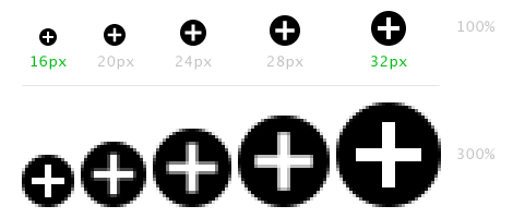
In practice, using only multiple sizes can be dispensed with. Create all your icons in the main size (say, 16 pixels), and on large buttons use an enlarged version of 32 pixels or 48 pixels.
Overhang : @erikdahlstrom and @Marco_Rosella mentioned the property “ shape-rendering: crispEdges ”. If it is superimposed on individual rectangles in SVG, then it will force them to become pixel-perfect. The proportions may be distorted, but the clarity will remain. You can try in jsFiddle .
No problems? I would like that; but there are other difficulties:
Here fiddle , you can check.
You can, of course, use inline SVG or place the SVG in the <img> element, but then SVG is difficult to make a sprite. Unless to place elements in each other and external to set "overflow: hidden"? But this is still not a direct and flexible solution like background-image.
Overhang : David Bushell found a workaround by making the size of the SVG large and resorting only to decreasing, not increasing.
PNGs
Many fonts with icons also have aPNG version that can be used instead of a font, but you will have to solve the problem of displaying a highly accurate version on retinal displays. The media request " device-pixel-ratio " can help the cause. Well, Apple has just implemented “ -webkit-image-set ” - it looks promising, but implementation will take time.
So what to do? As I said ... there is no panacea, but ...
Here is a small recipe that can help.
There is no one image format suitable for all applications; perhaps never will be. So why not mix them up? It may be best to use PNG (in a variety of different sizes) for a highly accurate, multi-colored logo, and icons in the SVG for the navigation buttons of the same size (but looking clearer on retinal displays). Responsive inline SVG for graphs and charts, font with icons for all your buttons of various sizes. After all, this is how we act.
Looking to the future
Is there a way out of the current tedious situation with its fuzzy icons? Well ... let's just go around a bit ... as soon as retinal displays are everywhere (yes, it will take a couple of years), the problem of sub-pixel definition will end, and browsers may fix their SVG increase problems, and then we all celebrate the appearance of icons that do not depend on permissions? But even then we will have to solve the problem of dependence of detail on size .
Fonts with badges are amazing, but ...
they are blurred. There is no real pixel sharpness in them. Yes, using @ font-face for icons has become very popular. I myself recommended and even began to collect them. But in such icons there is a flaw that suffers me. They are still a little blurred on non-rash displays (and there are still the vast majority of them). Try running the size of Chris in a demonstration and look more closely. The effect is manifested differently in different sizes, but they all have the same “ half pixel blur ” problem. Perhaps it is not so easy to notice, so here I have increased the screenshot of a fifteen-pixel size (and at the same time removed the background noise):
')
Subpixel anti-aliasing works fine on curved lines, but not on straight lines - they just stop looking clear. In theory, it would be possible to use font hinting so that the contours of the icons would be closer to full pixel ones. But so far I don’t know of any such font of icons that would have done so. I also guess that hinting would require significant additional work of the font author and significantly increase the file size.
Overhang : @thijs notices that hinting only works on systems that support it — and on OS X, iOS and Android will not help.
SVG to the rescue?
No, in fact. The use of
In practice, using only multiple sizes can be dispensed with. Create all your icons in the main size (say, 16 pixels), and on large buttons use an enlarged version of 32 pixels or 48 pixels.
Overhang : @erikdahlstrom and @Marco_Rosella mentioned the property “ shape-rendering: crispEdges ”. If it is superimposed on individual rectangles in SVG, then it will force them to become pixel-perfect. The proportions may be distorted, but the clarity will remain. You can try in jsFiddle .
No problems? I would like that; but there are other difficulties:
- Not many good icon sets in SVG.
- The lack of tools for creating
SVG-sprites. - You can not change the color of the icon with CSS. That is, it is possible , but only if the SVG code is internal (inline) , and the addition of pieces of SVG to the markup of the document does not please me.
- You can not impose effects - for example, a shadow. (There are filters in SVG, but, again, you can’t easily change them through CSS.)
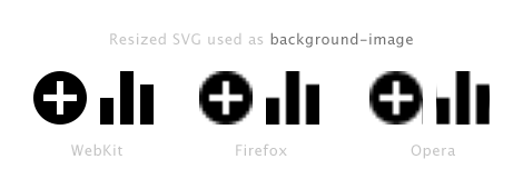
- And here is the biggest bummer: poor support in Firefox and Opera browsers when SVG is used as background-image . It turns out that SVG is actually converted to a raster, and when the background size changes, the browser does not redraw it - it only stretches, and the background looks unusually blurry. The language does not turn to call it scalable vector graphics.
Here fiddle , you can check.
You can, of course, use inline SVG or place the SVG in the <img> element, but then SVG is difficult to make a sprite. Unless to place elements in each other and external to set "overflow: hidden"? But this is still not a direct and flexible solution like background-image.
Overhang : David Bushell found a workaround by making the size of the SVG large and resorting only to decreasing, not increasing.
PNGs
Many fonts with icons also have a
So what to do? As I said ... there is no panacea, but ...
Here is a small recipe that can help.
- Starting a new project, in the design and development of the prototype, use fonts with icons. Nothing beats the freedom to quickly and easily replace badges, repainting them, casting shadows and imposing other effects.
- Then at some point you have to make a decision: is it worth it to switch to icons in SVG or PNG format with all their flaws. Solving is not easy; it all depends on the requirements and priorities. Maybe even have a plan to draw
;-) You must be ready to accept the above limitations of formats. Look, whether additional work will keep within the available budget, count, how many all icons, whether they will be necessary in various sizes or not.
There is no one image format suitable for all applications; perhaps never will be. So why not mix them up? It may be best to use PNG (in a variety of different sizes) for a highly accurate, multi-colored logo, and icons in the SVG for the navigation buttons of the same size (but looking clearer on retinal displays). Responsive inline SVG for graphs and charts, font with icons for all your buttons of various sizes. After all, this is how we act.
Looking to the future
Is there a way out of the current tedious situation with its fuzzy icons? Well ... let's just go around a bit ... as soon as retinal displays are everywhere (yes, it will take a couple of years), the problem of sub-pixel definition will end, and browsers may fix their SVG increase problems, and then we all celebrate the appearance of icons that do not depend on permissions? But even then we will have to solve the problem of dependence of detail on size .
Source: https://habr.com/ru/post/141813/
All Articles