Why does infographic make sense?

The central object attracts attention, then you get into the details. It looks good, but the designer has very carefully hidden meaning.
Infographics is a popular thing, because it allows you to communicate the facts in an understandable manner. Initially, infographics were created in order to convince, simply to break through cynical brains or to convey data to the management in such a way as to save time.
Andrey Skvortsov told how exactly the market looks (why a beautiful picture is better sold) and what is needed for really understanding customers. Andrey himself has been engaged in infographics for many years, but he has never been a designer and cannot draw. But he knows what “working material” is, and it is this that helps him to sell his product. At the workshop in Digital October, he gave some useful tips.
')
How it works?
Very simple: 150 years ago, John Snow, a doctor and an artist, plotted places for the detection of cholera patients on a map, and then applied the layout of columns with water to the same map. The result was an infographic scheme, which made it easy to determine where the source of infection was (one specific cholera column).
What makes up a working message
Meaningfulness . Here it is clear: infographics without quantitative information is not needed in principle: it turns into an illustration, no more.
Meaning It is easy to lose in infographics, especially at the drawing stage. The editor knows the message he wants to convey to the viewer, and the designer makes a visual that can go away. Therefore, the designer and editor should work together very closely. On the other hand, the meaning may not be relevant to the visual, but consist in the proper selection of comparison parameters before drawing.
Design . Design is the ease of perception. The most characteristic difficulty, for example, is the choice of diagrams. It is very difficult and inconvenient to compare sectors of pie charts: the difference between 61% and 75% is almost impossible to distinguish, while bars are better for comparing fractions. Graphs are better for comparing ratings.
Legend makes infographics heavier. Without a legend, in most cases, you can do.
Some complicate the diagrams, forcing them to look for the necessary items in favor of a beautiful picture. This is neither good nor bad: it depends on the task. A bright reversal can attract readers, but infographics will then solve another problem.
There is an infographic of high resolution (what is drawn on paper or a computer screen) and low resolution (television or presentation). It is clear that in high resolution it is possible to use all sorts of small parts and fonts, while in the low they only interfere.
Types of infographics
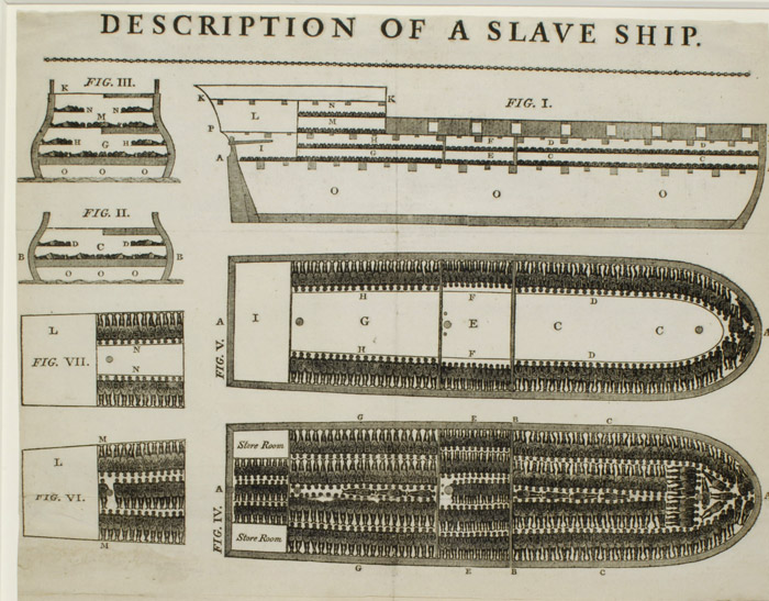
With infographics it is good to explain what a complex fact that should be associated with something specific and already familiar. For example, such a picture had simply a crushing effect on the human psyche from the beginning of the twentieth century, when there was no TV with news. These are slaves on the ship:
The second type is presentation, that is, infographics, which allows to reveal the meaning of some phenomenon or process. Here are two examples that can also be attributed in part to illustrative ones:
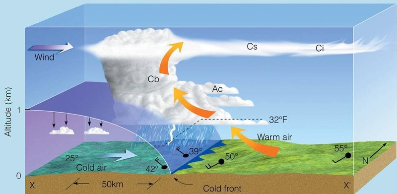
A lot of data, but not very clear.
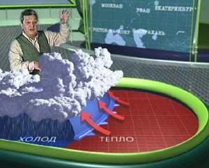
Little data, but clear. By the way, work for NTV, which never went on the air.
Manipulation
The desire to come to a meeting of graduates and success after graduation is a direct relationship, even better than a direct one. Alcohol selling and UFO sightings are almost the same. Pirates and global warming - no.
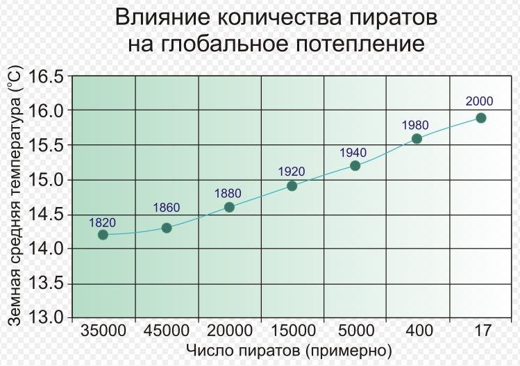
The correlation is clearly visible.
The main manipulations are as follows: the place of zero (for example, comparing the two bars you can show only their tops), averaging, scale and errors.
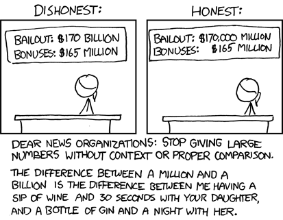
Scale manipulation.
What can this be used in reality?
In fact, almost everywhere, but the most fun example, perhaps, about the design of commercial proposals. Once for Andrei it worked better than a shot in the head:
I received (about 2 years ago) a letter from Masha, in which there was no text. The text was there, but it was in the form of a picture. Only one picture in jpg format. Masha drew that she came to work in the 7th year, at the internship stage she made 3 projects, the next year 7 projects, the next year 13, 20. At the bottom, money is like a pulse from a dead man. This is not entirely true; there were jerks from time to time in the form of bonuses and bonuses. She also drew the growth of the consumer basket during this time. I looked at it and realized that there was nothing to argue about. It can be seen that the growth of the consumer basket, it is clear that Masha is a professional. Besides, I was bribed that Masha saved me time. There was no talk "raise your salary." Here, I realized that she also communicates with clients. Here are all the numbers. Result - Masha works with us so far, I raised her salary.
Links
- Lecture at Digital October , where there are many different examples of infographics, videos and transcripts.
- Russia in numbers : video with infographics
- CMS Magazine Tips for Creating Infographics
Source: https://habr.com/ru/post/141775/
All Articles