The correct keyboard for information terminals
Application interfaces for information touch screens (tables, terminals, kiosks) are usually made by analogy with interfaces of sites or mobile applications. Practice shows that this is not correct.
I deal with applications exclusively for information terminals and constantly observe the interaction of people with different applications in different situations. I highlight 5 important differences between such devices from computers and mobile devices:
1. Publicity (you use the terminal outside the zone of personal comfort);
2. Short term use (you use the terminal for a few minutes);
3. Clear specialization (you have a limited set of functions available);
4. Binding to the physical features of the body (compare the table and the vertical panel);
5. Uselessness (you do not get tangible benefits (unlike an ATM or a ticketing terminal)).
')
The correct interface of the information terminal must be very specific. It is categorically impossible to use modal modes or to allow double interpretations. Extremely undesirable pop-up menus or stylized hidden buttons. Need maximum protection against errors.
To achieve the right result is simple - remove all unnecessary. The most common example is the on-screen keyboard. At the information terminal, it, as a rule, performs a very narrow function: filling in a short questionnaire, entering an e-mail, searching the database. About a year ago, we, together with the architect Edward Hyman, developed the “right” keyboard for our information terminals. Let us use it to illustrate the stated theses.
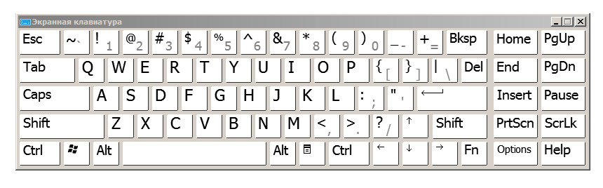
Standard Windows 7 keyboard. This is a universal keyboard.
And here is the correct keyboard for the information terminal. This is a keyboard for entering an email address, filling in simple forms or a search string.
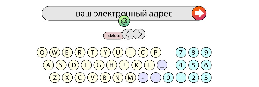
For the mail address, you need only Latin letters, numbers and 4 characters: hyphen, underscore, period and @. Why keep separate modal shift for underscore and @? Who needs capital letters in the address? Who uses tabs?
Pay attention to the block of three buttons: delete and arrows left-right. This is a moving block - it is always under the cursor.
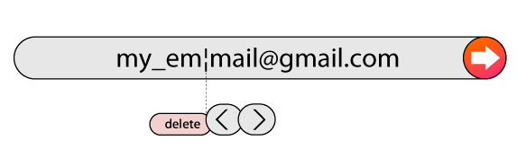
In theory, the name of the delete key is wrong here (correctly - backspace). In practice, no one is mistaken in the functional, because the button is always to the left of the cursor, and delete is a clearer name than backspace. The cursor moves by clicking on the desired letter in the line, and the arrows work as an auxiliary element: move the cursor one or two characters faster.
The numbers are located on the right, as on the extended keyboards. When the numbers are located in the top row, zero is above the letter “o”. This leads to a huge amount of typos 0-o. And if you use the Russian layout (for example, to enter a name), the numbers 7, 8, and 4 are replaced by X, b, and E, respectively.
And finally, “one-time” and contextual buttons. @ is used in the address once. As soon as you pressed the button, @ appeared in the line, and the button disappeared. On the right, contextual buttons with addresses of mail services gmail.com, mail.ru, etc. appear. As soon as you start typing the server name, the context buttons change to .com .ru .org zones, etc.

I hope that my view on the interfaces of interactive terminals and the proposed practical keyboard solution will help you in developing your own applications. I don’t give my company name and terminals, because I don’t understand how it relates to the rules of Habr. Thank.
I deal with applications exclusively for information terminals and constantly observe the interaction of people with different applications in different situations. I highlight 5 important differences between such devices from computers and mobile devices:
1. Publicity (you use the terminal outside the zone of personal comfort);
2. Short term use (you use the terminal for a few minutes);
3. Clear specialization (you have a limited set of functions available);
4. Binding to the physical features of the body (compare the table and the vertical panel);
5. Uselessness (you do not get tangible benefits (unlike an ATM or a ticketing terminal)).
')
The correct interface of the information terminal must be very specific. It is categorically impossible to use modal modes or to allow double interpretations. Extremely undesirable pop-up menus or stylized hidden buttons. Need maximum protection against errors.
To achieve the right result is simple - remove all unnecessary. The most common example is the on-screen keyboard. At the information terminal, it, as a rule, performs a very narrow function: filling in a short questionnaire, entering an e-mail, searching the database. About a year ago, we, together with the architect Edward Hyman, developed the “right” keyboard for our information terminals. Let us use it to illustrate the stated theses.
Standard Windows 7 keyboard. This is a universal keyboard.
And here is the correct keyboard for the information terminal. This is a keyboard for entering an email address, filling in simple forms or a search string.
For the mail address, you need only Latin letters, numbers and 4 characters: hyphen, underscore, period and @. Why keep separate modal shift for underscore and @? Who needs capital letters in the address? Who uses tabs?
Pay attention to the block of three buttons: delete and arrows left-right. This is a moving block - it is always under the cursor.
In theory, the name of the delete key is wrong here (correctly - backspace). In practice, no one is mistaken in the functional, because the button is always to the left of the cursor, and delete is a clearer name than backspace. The cursor moves by clicking on the desired letter in the line, and the arrows work as an auxiliary element: move the cursor one or two characters faster.
The numbers are located on the right, as on the extended keyboards. When the numbers are located in the top row, zero is above the letter “o”. This leads to a huge amount of typos 0-o. And if you use the Russian layout (for example, to enter a name), the numbers 7, 8, and 4 are replaced by X, b, and E, respectively.
And finally, “one-time” and contextual buttons. @ is used in the address once. As soon as you pressed the button, @ appeared in the line, and the button disappeared. On the right, contextual buttons with addresses of mail services gmail.com, mail.ru, etc. appear. As soon as you start typing the server name, the context buttons change to .com .ru .org zones, etc.
I hope that my view on the interfaces of interactive terminals and the proposed practical keyboard solution will help you in developing your own applications. I don’t give my company name and terminals, because I don’t understand how it relates to the rules of Habr. Thank.
Source: https://habr.com/ru/post/141712/
All Articles