Meet Parallax Scrolling
Anyone who played or watched the game of friends, or, in principle, saw games that were released in the 80-90s, should be familiar with the parallax-scrolling technique.
Think of games like Mario Bros , Streets of Rage , Mortal Kombat , Turtles in Time, or the original Moon Patrol game. In these games, the parallax technique is observed at the moment when several background layers with different textures move at different speeds, which creates the effect of three-dimensional space.
Why did I start talking about retro games in a web development article? The simplest answer would be “because they are cool,” but no. Parallax scrolling is a cool design concept that makes its way into the world of web design. Nike was one of the first to use this technique with great success when they hired marketing giants Weiden and Kennedy to design their original Nike Better World website. The Nike Better World site has since been updated and replaced with a new one, however there is another site quite similar to what Nike's first parallax design looked like — the Activate sports drink site.
')

You may have noticed that while scrolling down a page of a site downward, several different elements on this page move at different speeds. Let's take for example the page displayed in the image above. As you scroll down the page, you will see that the blue dots in the background (those that are slightly blurred) are moving at the same speed as the scrollbar. Also, you will see that a group of blue dots that are more focused and lie in the foreground move at a slightly higher speed than the scrollbar. The text “0 SUGAR | 0 CALORIES | NATURALLY SWEETENED ”and the main heading of the“ Products ”page. And finally, there are images of the product itself, both small and defocused in the background, as well as large, focused and lying in the foreground. Product background images move at the same speed as text, while product images in the foreground move faster than this text. This is all an ideal demonstration of parallax scrolling, when different layers of images overlap each other and all move at different speeds while scrolling through the page, creating the effect of three dimensions.
Parallax scrolling is not limited to vertical page scrolling or straight line scrolling. Let's give Nintendo the right to demonstrate the perfect example that confirms this statement. Remember the early Nintendo games, where our heroes usually moved horizontally from left to right along the screen, rather than vertically down, as we saw on Activate above. Take a ride on the MarkioKart Wii and let's talk about some cool things we can see there.

The first thing you notice is the page scrolling direction - it is not vertical, but as stated above, but initially horizontal. Of course, this is cool, but it is also not a new concept. Also, you will notice a parallax effect with a dinosaur Yoshi and armor on the background, Mario and Luigi in the foreground and the main content that move at different speeds when scrolling. But as soon as you reach the #highlights and #attack pages, the offset path will no longer be perfectly horizontal. The same goes for the transition between the #rediscover and #snes pages. Images not only retain their different offset speeds, but also change the overall direction from horizontal to vertical.
It is also worth noting that the use of the parallax effect on your site should not be limited only by the possibility of creating an artificial 3D effect. The site of the German web design studio Webseitenfactory is an example of how parallax can be used to add different effects to a website page, such as moving icons along different paths, increasing and decreasing them as the site scrolls.

Parallax scrolling can also help to revive a site that is not very rich in content. What if your entire site consists of a mission statement, or about us, plus contact information? Most likely, you could do it with one page and under certain conditions you would have made a good one-page website, but will it be remembered by visitors? Most likely no. But what if you add a little parallax to it, like people did at Spring / Summer ?
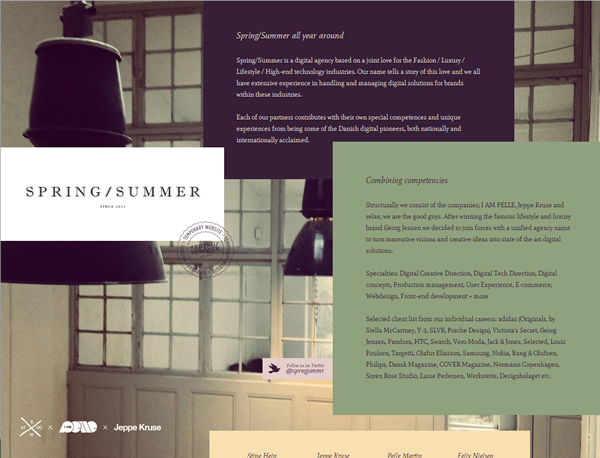
My first impression was “Oh, this site looks pretty.” But when I started to scroll it, the impression immediately became “Wow, this site is cool!”. Adding a simple parallax effect just makes the difference between good and memorable.
Parallax scrolling is a good trick that can be kept up your sleeve. And it can always be used regardless of whether you are creating a complex multi-page site or a simple one-page business card site.
Some of them are very cool, I recommend reading:
Think of games like Mario Bros , Streets of Rage , Mortal Kombat , Turtles in Time, or the original Moon Patrol game. In these games, the parallax technique is observed at the moment when several background layers with different textures move at different speeds, which creates the effect of three-dimensional space.
Why did I start talking about retro games in a web development article? The simplest answer would be “because they are cool,” but no. Parallax scrolling is a cool design concept that makes its way into the world of web design. Nike was one of the first to use this technique with great success when they hired marketing giants Weiden and Kennedy to design their original Nike Better World website. The Nike Better World site has since been updated and replaced with a new one, however there is another site quite similar to what Nike's first parallax design looked like — the Activate sports drink site.
')
You may have noticed that while scrolling down a page of a site downward, several different elements on this page move at different speeds. Let's take for example the page displayed in the image above. As you scroll down the page, you will see that the blue dots in the background (those that are slightly blurred) are moving at the same speed as the scrollbar. Also, you will see that a group of blue dots that are more focused and lie in the foreground move at a slightly higher speed than the scrollbar. The text “0 SUGAR | 0 CALORIES | NATURALLY SWEETENED ”and the main heading of the“ Products ”page. And finally, there are images of the product itself, both small and defocused in the background, as well as large, focused and lying in the foreground. Product background images move at the same speed as text, while product images in the foreground move faster than this text. This is all an ideal demonstration of parallax scrolling, when different layers of images overlap each other and all move at different speeds while scrolling through the page, creating the effect of three dimensions.
Parallax scrolling is not limited to vertical page scrolling or straight line scrolling. Let's give Nintendo the right to demonstrate the perfect example that confirms this statement. Remember the early Nintendo games, where our heroes usually moved horizontally from left to right along the screen, rather than vertically down, as we saw on Activate above. Take a ride on the MarkioKart Wii and let's talk about some cool things we can see there.
The first thing you notice is the page scrolling direction - it is not vertical, but as stated above, but initially horizontal. Of course, this is cool, but it is also not a new concept. Also, you will notice a parallax effect with a dinosaur Yoshi and armor on the background, Mario and Luigi in the foreground and the main content that move at different speeds when scrolling. But as soon as you reach the #highlights and #attack pages, the offset path will no longer be perfectly horizontal. The same goes for the transition between the #rediscover and #snes pages. Images not only retain their different offset speeds, but also change the overall direction from horizontal to vertical.
It is also worth noting that the use of the parallax effect on your site should not be limited only by the possibility of creating an artificial 3D effect. The site of the German web design studio Webseitenfactory is an example of how parallax can be used to add different effects to a website page, such as moving icons along different paths, increasing and decreasing them as the site scrolls.
Parallax scrolling can also help to revive a site that is not very rich in content. What if your entire site consists of a mission statement, or about us, plus contact information? Most likely, you could do it with one page and under certain conditions you would have made a good one-page website, but will it be remembered by visitors? Most likely no. But what if you add a little parallax to it, like people did at Spring / Summer ?
My first impression was “Oh, this site looks pretty.” But when I started to scroll it, the impression immediately became “Wow, this site is cool!”. Adding a simple parallax effect just makes the difference between good and memorable.
Parallax scrolling is a good trick that can be kept up your sleeve. And it can always be used regardless of whether you are creating a complex multi-page site or a simple one-page business card site.
Examples of sites with parallax
Some of them are very cool, I recommend reading:
- artofflightmovie.com
- laurentiuswonen.com/jaarverslag2010
- smartusa.com
- beetle.com
- liptonicetea.pl
- manufacturedessai.it
- iutopi.com
- marklawrencedesign.com
- rapidboot.com
- reverenddanger.com
- netlash-bseen.be
- discover.store.sony.com
Tools for creating parallax effects:
- jQuery Parallax Image Slider
- jQuery Image Parallax by Steve Fenton
- crolling Parallax: A jQuery Plugin by John Raasch
- Scrollorama by John Polacek
- Scrolldeck by John Polacek
- jParallax
- Stellar.js by Mark Dalgleish
- jQuery Scroll Path by Joel Besada
- Curtain.js by Victor Coulon
- Plax by Cameron McEfee
Tutorials on creating sites with parallax effects (English):
- How to create a scrolling effect with jQuery, HTML and CSS for SmashingMagazine.com
- One page website, vertical parallax
- Build a parallax scrolling website interface with jQuery and CSS
- jQuery Parallax Tutorial - Animated Header Background
- Building a parallax scrolling storytelling framework
- Parallax Slider with jQuery
Source: https://habr.com/ru/post/141687/
All Articles