Scale CSS Sprites with SVG, killing three birds with one stone
Hi, Habr.
I want to note right away that if we are talking about icons, they can be scaled in two ways (I just don’t know others): convert icons to a font and connect them via @ font-face, or use SVG as a format for these icons.
A little bit away from the topic and tell the background.
I decided to use font icons on my website, it would seem that everything is good: you can change the size, set the color to the server and request only one (to connect the font). In other words, the plug-in font is a kind of “CSS sprite”, right?
')
Let me check if everything looks beautiful everywhere. It turned out that not everything is as good as we would like, because in some sizes the icons looked crooked, and with anti-aliasing turned off, it became disgusting to look at them. What to do? Use the second option - SVG, which will be discussed.
The idea to add a sprite to SVG format is not new. Surely, many have read this post on smashingmagazine. So, I decided to develop the idea of the author, experiment and offer a more flexible option. And to make everything clear, I will repeat some examples here.
So, first we need to make an SVG sprite. How to make an SVG file programmatically, I have not figured it out yet (I hope the community will forgive me and give a link where to read about it). Therefore, I will make my sprite in CorelDRAW (I think Illustrator will work as well) and save it in SVG.
For quick implementation, I used a font and typed these icons (clickable):

Take an arbitrary HTML code for example:
Let's write the most basic in CSS:
It is worth noting one feature that sprite.svg was created with clearly defined sizes of 76x520, i.e. The maximum size to which we can increase our icon will be 76x76.
And what if you save SVG with relative sizes, those. in percents? This is better because Icons can now be scaled to absolutely any size without losing their quality.
A little tweak in CSS styles:
The result is the same, but the
In the example above, only 5 icons are used and calculating percentages is not so difficult. Let's look at a more complex example. So far with the same "font" icons. Suppose we have this sprite:

What we are doing is either adding a new
Or we make out an icon using pseudo-elements
Please note that I did not invent new classes for links (after all, the sprite has changed) and left the old ones, of course, for new icons, the classes will be different. And we will consider with these not to litter a post code.
So, we will make changes to CSS:
I will make a few explanations, otherwise I myself almost got confused :).
In
In addition, the size of the block is now influenced by the width and height of the block formed by the pseudo-element, i.e. along with the
Perhaps this is a key point and you should make a choice here, either you set the absolute size and change the
So, the actual size of the sprite is 500x250 pixels, 10 icons per line and 5 per column, for a total of 50 icons (in Example 49) each 50x50 pixels in size.
To calculate the size is quite simple, because we will build on the actual size of the sprite. Who worked with sprites is not worth explaining. The truth is there is one subtlety - the size of the icon is reduced to 20 pixels, respectively, the sprite has also changed and became equal to 200x100 pixels (10 * 20 and 5 * 20), and hence the
Thus, we can make a sprite of any complexity and calculate the
Suppose we have a certain design, quite roughly depicted (clickable):
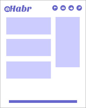
Suppose that the rectangles are some beautiful cliparts, it is difficult, but suppose. What we can do:
1. Fold all layers into the sprite without changing the original size and position each object in the corresponding element;
2. Fold all layers into a sprite, first reducing all objects to the same size and positioning each object in the corresponding element by changing the size of the object to the required value.
I think it makes no sense to give an example of HTML or CSS code. And so everything is clear, configured by analogy with the previous examples.
Now I want to summarize and note the advantages of sprites with SVG. Firstly, we have only one file, which means one request to the north - Hare1 is killed, secondly, the weight of the SVG file is much less than, for example, PNG or JPG, and therefore the download speed is higher - Hare2 is killed, thirdly , we got an unlimited size sprite without losing image quality, which means we solved the problem with unlimited image scaling - the hare is killed.
The only negative SVG in front of font icons: you cannot decorate icons with CSS, for example, add
PS SVG gives us a huge field for activity and I am completely convinced of this using the example of CSS sprites. Of course, it was possible to get by with dry words and say “keep the SVG in relative sizes,” but this resulted in a whole post for me.
Thanks for attention. Until new meetings.
UPD:
UPD: And about "::" I did not remember: ( Proof
I want to note right away that if we are talking about icons, they can be scaled in two ways (I just don’t know others): convert icons to a font and connect them via @ font-face, or use SVG as a format for these icons.
A little bit away from the topic and tell the background.
Prehistory
I decided to use font icons on my website, it would seem that everything is good: you can change the size, set the color to the server and request only one (to connect the font). In other words, the plug-in font is a kind of “CSS sprite”, right?
')
Let me check if everything looks beautiful everywhere. It turned out that not everything is as good as we would like, because in some sizes the icons looked crooked, and with anti-aliasing turned off, it became disgusting to look at them. What to do? Use the second option - SVG, which will be discussed.
CSS sprite with SVG
The idea to add a sprite to SVG format is not new. Surely, many have read this post on smashingmagazine. So, I decided to develop the idea of the author, experiment and offer a more flexible option. And to make everything clear, I will repeat some examples here.
So, first we need to make an SVG sprite. How to make an SVG file programmatically, I have not figured it out yet (I hope the community will forgive me and give a link where to read about it). Therefore, I will make my sprite in CorelDRAW (I think Illustrator will work as well) and save it in SVG.
For quick implementation, I used a font and typed these icons (clickable):
Take an arbitrary HTML code for example:
<div class="icons"> <a class="tw" href="#">Twitter</a> <a class="fb" href="#">Facebook</a> <a class="vk" href="#"></a> <a class="gl" href="#">Google+</a> <a class="rs" href="#">RSS</a> </div> Let's write the most basic in CSS:
.icons a { float: left; display: inline-block; padding: 4px 0 4px 25px; margin-right: 5px; text-decoration: none; color: #444; /* */ background-image: url('sprite.svg'); background-repeat: no-repeat; background-size: 20px auto; } /* smashingmagazine.com, px em */ .icons .tw {background-position: 0 0;} .icons .fb {background-position: 0 -48px;} .icons .vk {background-position: 0 -96px;} .icons .gl {background-position: 0 -144px;} .icons .rs {background-position: 0 -192px;} It is worth noting one feature that sprite.svg was created with clearly defined sizes of 76x520, i.e. The maximum size to which we can increase our icon will be 76x76.
And what if you save SVG with relative sizes, those. in percents? This is better because Icons can now be scaled to absolutely any size without losing their quality.
A little tweak in CSS styles:
/* */ .icons a { float: left; display: inline-block; padding: 4px 0 4px 25px; margin-right: 5px; text-decoration: none; color: #444; /* */ background-image: url('sprite.svg'); background-repeat: no-repeat; background-size: 20px auto; } /* */ .icons .tw {background-position: 0 0;} .icons .fb {background-position: 0 -25%;} .icons .vk {background-position: 0 -50%;} .icons .gl {background-position: 0 -75%;} .icons .rs {background-position: 0 -100%;} The result is the same, but the
background-size can be any, whatever.Creating complex sprites
In the example above, only 5 icons are used and calculating percentages is not so difficult. Let's look at a more complex example. So far with the same "font" icons. Suppose we have this sprite:
What we are doing is either adding a new
i tag to html, for which we can write styles with an icon: <div class="icons"> <a class="tw" href="#"><i></i>Twitter</a> <a class="fb" href="#"><i></i>Facebook</a> <a class="vk" href="#"><i></i></a> <a class="gl" href="#"><i></i>Google+</a> <a class="rs" href="#"><i></i>RSS</a> </div> Or we make out an icon using pseudo-elements
::before or ::after . I will use the pseudo-element ::before , you - whatever you like.Please note that I did not invent new classes for links (after all, the sprite has changed) and left the old ones, of course, for new icons, the classes will be different. And we will consider with these not to litter a post code.
So, we will make changes to CSS:
.icons a { float: left; display: inline-block; padding: 4px 0 4px 25px; margin-right: 5px; text-decoration: none; color: #444; /* */ position: relative; } /* ::before */ .icons a::before { position: absolute; left: 0; top: 0; content: ''; width: 25px; height: 25px; /* */ background-image: url('sprite.svg'); background-repeat: no-repeat; background-size: 20px auto; } /* ( , ) */ .icons .tw::before {background-position: 0 0;} .icons .fb::before {background-position: 0 -25%;} .icons .vk::before {background-position: 0 -50%;} .icons .gl::before {background-position: 0 -75%;} .icons .rs::before {background-position: 0 -100%;} I will make a few explanations, otherwise I myself almost got confused :).
In
background-size: 20px auto; the number “20” is the size of the icon we need, and “auto” is the remaining size of the sprite. If we replace “auto” for example at 20px, then instead of a single icon, we’ll have a whole sprite of 20x20 pixels in size.In addition, the size of the block is now influenced by the width and height of the block formed by the pseudo-element, i.e. along with the
background-size now you need to change the width and height so that the icon is not cropped.Calculate relative sizes
Perhaps this is a key point and you should make a choice here, either you set the absolute size and change the
background-size , width and height change them too, or (which is more difficult) calculate the relative sizes and when changing the background-size , width and height nothing more don't changeSo, the actual size of the sprite is 500x250 pixels, 10 icons per line and 5 per column, for a total of 50 icons (in Example 49) each 50x50 pixels in size.
To calculate the size is quite simple, because we will build on the actual size of the sprite. Who worked with sprites is not worth explaining. The truth is there is one subtlety - the size of the icon is reduced to 20 pixels, respectively, the sprite has also changed and became equal to 200x100 pixels (10 * 20 and 5 * 20), and hence the
background-position we will assume either 0 0 , 0 -20px, -20px 0, -20px -20px, 0 -40px, -40px 0, -40px -40px, etc., or 0 0, 0 -11.1%, 0 -22.2%, 0 -33.3, 25% 0, 25% -11.1%, 25% -22.2%, 25% -33.3, etc.Thus, we can make a sprite of any complexity and calculate the
background-position for each element. Fortunately or unfortunately, the inquisitive mind does not allow to dwell on what has been said, therefore we shall briefly consider an even more complex example.More difficult sprite with SVG
Suppose we have a certain design, quite roughly depicted (clickable):
Suppose that the rectangles are some beautiful cliparts, it is difficult, but suppose. What we can do:
1. Fold all layers into the sprite without changing the original size and position each object in the corresponding element;
2. Fold all layers into a sprite, first reducing all objects to the same size and positioning each object in the corresponding element by changing the size of the object to the required value.
I think it makes no sense to give an example of HTML or CSS code. And so everything is clear, configured by analogy with the previous examples.
In custody
Now I want to summarize and note the advantages of sprites with SVG. Firstly, we have only one file, which means one request to the north - Hare1 is killed, secondly, the weight of the SVG file is much less than, for example, PNG or JPG, and therefore the download speed is higher - Hare2 is killed, thirdly , we got an unlimited size sprite without losing image quality, which means we solved the problem with unlimited image scaling - the hare is killed.
The only negative SVG in front of font icons: you cannot decorate icons with CSS, for example, add
text-shadow or change color. And a very big plus is that with anti-aliasing turned off, all the lines in the SVG will be even and distinct in contrast to the font.PS SVG gives us a huge field for activity and I am completely convinced of this using the example of CSS sprites. Of course, it was possible to get by with dry words and say “keep the SVG in relative sizes,” but this resulted in a whole post for me.
Thanks for attention. Until new meetings.
UPD:
::before and ::after are pseudo-elements, not pseudo-classes - sorry, wrong, corrected. Thank you psywalker prompt.UPD: And about "::" I did not remember: ( Proof
Source: https://habr.com/ru/post/141654/
All Articles