We translate into code 5 really useful templates of adaptive markup.
Greetings to all.
Recently, our habrakollega published an interesting article on adaptive markup.
The time is not far off when we will give much more attention to the layout for all resolutions than we do now. Therefore, I consider it necessary to approach this period savvy in this matter, or at least have a clear idea of what it is and what it is eaten with.We stock up on smartphones and tablets.
* Who does not want to read, links below.
Just want to say that the layout of adaptive layouts requires a slightly different approach than the layout of statics. We impose a “fixed” layout and it will work, it will work everywhere and under any conditions. However, when translating it into an adaptive layout, we may encounter some problems. Such as: block and padding sizes, fonts, in the end, the created markup does not allow us to manipulate the blocks as the layout requires. To create a responsive layout, you need to think in advance about all these questions. By the way, this also applies to web designers. Web designers, you heard, right?
')
I will not paint every template, because in many ways, the implementation of the basic elements is very similar, and I will analyze one, the most interesting template, pattern No. 4:
1) Logo;
2) The menu in the upper right corner;
3) A block consisting of text and pictures;
4) Three columns, each of which has its own content;
As a basis, I took a common wrapper everywhere, 80% wide, but not more than 960pc. Divided everything into 3 large blocks: top, main and content.
There are no problems with the logo, placed it at the top and let it hang there for life.
But the menu through the
The menu items are arranged in a row through
* Since I did not score the content, I indicate height almost everywhere. In a real project, you can rely on the amount of content.
We make the text block 50% wide:
And the “picture” through the
* I did not want to calculate the size for the border-radius, so the circle will be square;)
Now we make three columns through the same
Why I use float almost everywhere, I will write below.
In the columns we place the content in regular blocks. I think there are no questions here.
Our layout is ready and we start the transformation.
Almost in all the templates I used two kinds of screen sizes: 600 and 800 pixels, but no one forbids, at least for each pixel, to hang the behavior we need.
So, with a width of 800pc, we will have a logo, a menu, a text block and a picture in place. We do not touch them. Their sizes are rubber, and with this resolution everything will remain completely watchable and readable. But the block with the “banners” on the left of us took a horizontal position, having built all the blocks inside one line.
To do this with
We cancel the
On the contrary, we apply
We leave the remaining two columns upright, only stretching to half the total width:
We get the result!
The next width is 600 pixels:
Here, the transformation becomes an order of magnitude greater.
First, we shift the menu under the logo, removing both
We also stretch the text block to the full width and, as always, remove the
And we send the block with the picture “under it”, canceling the
The width of the picture, as we remember, was set out initially, but here we fix it a little to make it look better.
Banners. The block with banners again took upright position, while the pictures themselves stretched to their full width. At the same time, we absolutely do not need to write code for this, since they are initially in the version we need.
But blocks with “articles” and “comments” are now becoming full owners of the entire width of the layout:
Thus, we have a completely vertical page structure, and our layout has become fully adaptive.
That's all the tricks. Links to examples of all layouts below. In the meantime ...
I myself love inline blocks more. And as we know, inlines have a feature to take into account the width of the spaces between the blocks. We even know how to deal with them . But we need to remove only spaces, but not indents between the blocks, because the vast majority of the methods are swept aside.
Remained in
Everything would be good in statics, once canceled and forgotten. And for Safari also
Although I used pixels for the sizes, I decided to make the example more universal and this method was dismissed.
Such methods I use about never. Due to poor code readability. And in general, this is not all too iron, somewhere something was forgotten and everything swam away.
In general, inline-blocks can be used, but in some cases it is necessary to compromise.
As you can see, in some places we didn’t specify properties for layout transformations at all, while everything was arranged as we should. The original block styles were applied.
It should be understood that using media queries we do not create a fundamentally new version of the site with our CSS, but only change or redefine the styles already written above. We operate only with initially defined classes. This is where the dog is buried. As written in the introduction, adaptive layout requires a different approach. We need to think in advance how our site will look like, what will be shifted and how to transform, what markup to write and what styles to use. All this will help to reduce the amount of code after changing the structure.
With the help of media queries, we can create a lot of transformations. But, as a rule, they typically use typical values.
240 * 320
320 * 480 \ 240
480 * 800
800 * 600 \ 480
1024 * 768 \ 600
From 1024 pixels (we will not take absolutely old into account).
So for each of these permissions, we can create our own "behavior" markup. In this case, we must remember the inheritance of properties.
For example, here:
If in this case you do not specify the minimum size, then when writing styles, for example, for 320 pixels, styles written for
1) Override properties for lower permissions (and why do we need lots of extra code?).
2) Use double values in media queries. Thus, we can perform point transformations of our layout for certain screen sizes.
However, the indication of only one parameter can be justified. For example, when we need the same block position / its dimensions at all resolutions. We ask once and we forget.
You may notice that when the browser window is resized, almost all transformations take place smoothly. This is achieved by adding this transcription:
In fact, this shaped disgrace, but I left only for beauty. In a real project you shouldn’t do that :)
Services that I use to view in different resolutions (well, just in case, it may be useful to someone).
http://quirktools.com/
http://viewlike.us/
One , two , three , four , five .
Everything was checked in browsers Chrome 17.0.963.83 m, Firefox 11.0, Opera 11.62, Safari 5.1.4, IE 9. All under Windows 7. And on a couple of mobile devices.
UPD shimdim suggests that for iPhones it is necessary to use min-device-width and max-device-width.
The code will look like this:
Thanks for attention.
Recently, our habrakollega published an interesting article on adaptive markup.
The time is not far off when we will give much more attention to the layout for all resolutions than we do now. Therefore, I consider it necessary to approach this period savvy in this matter, or at least have a clear idea of what it is and what it is eaten with.
* Who does not want to read, links below.
Just want to say that the layout of adaptive layouts requires a slightly different approach than the layout of statics. We impose a “fixed” layout and it will work, it will work everywhere and under any conditions. However, when translating it into an adaptive layout, we may encounter some problems. Such as: block and padding sizes, fonts, in the end, the created markup does not allow us to manipulate the blocks as the layout requires. To create a responsive layout, you need to think in advance about all these questions. By the way, this also applies to web designers. Web designers, you heard, right?
')
From words to deeds
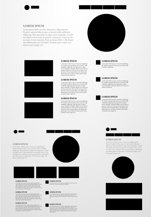
I will not paint every template, because in many ways, the implementation of the basic elements is very similar, and I will analyze one, the most interesting template, pattern No. 4:
What we have:
1) Logo;
2) The menu in the upper right corner;
3) A block consisting of text and pictures;
4) Three columns, each of which has its own content;
As a basis, I took a common wrapper everywhere, 80% wide, but not more than 960pc. Divided everything into 3 large blocks: top, main and content.
There are no problems with the logo, placed it at the top and let it hang there for life.
But the menu through the
float: right sent to the right, setting the size to 60% of the total width. .item { float: right; width: 60%; } The menu items are arranged in a row through
float: left , without forgetting to set the size and indents: .list { float: left; width: 24%; height: 50px; margin: 0 0 0 1%; } * Since I did not score the content, I indicate height almost everywhere. In a real project, you can rely on the amount of content.
We make the text block 50% wide:
.m-text { float: left; width: 50%; font-size: 20px; font-style: italic; line-height: 1.5em; } And the “picture” through the
float: right sent to the right, providing a width of 40%, thereby making a margin of 10% between the blocks. .m-image { float: right; width: 40%; min-height: 360px; } * I did not want to calculate the size for the border-radius, so the circle will be square;)
Now we make three columns through the same
float : .c-block, .c-article, .c-comment { float: left; width: 30%; } Why I use float almost everywhere, I will write below.
In the columns we place the content in regular blocks. I think there are no questions here.
Our layout is ready and we start the transformation.
Almost in all the templates I used two kinds of screen sizes: 600 and 800 pixels, but no one forbids, at least for each pixel, to hang the behavior we need.
So, with a width of 800pc, we will have a logo, a menu, a text block and a picture in place. We do not touch them. Their sizes are rubber, and with this resolution everything will remain completely watchable and readable. But the block with the “banners” on the left of us took a horizontal position, having built all the blocks inside one line.
To do this with
@media screen and (min-width: 600px) and (max-width: 800px) sizes @media screen and (min-width: 600px) and (max-width: 800px)We cancel the
float and stretch it to the full width: .c-block { float: none; width: 100%; margin: 0 0 30px 0; overflow: hidden; } On the contrary, we apply
float to the blocks inside and set the required sizes: .b-list { float: left; width: 32%; margin: 0 0 0 2%; } .b-list:first-child { margin: 0; } We leave the remaining two columns upright, only stretching to half the total width:
.c-article { width: 48%; margin: 0; } .c-comment { width: 48%; margin: 0 0 0 4%; } We get the result!
The next width is 600 pixels:
@media screen and (max-width: 600px)Here, the transformation becomes an order of magnitude greater.
First, we shift the menu under the logo, removing both
float from both, and allowing it to stretch its full width (it’s not a big one for 4 points). .logo { float: none; } .item { float: none; width: 100%; margin: 30px 0 0; } We also stretch the text block to the full width and, as always, remove the
float : .m-text { float: none; width: 100%; margin: 0 0 40px 0; } And we send the block with the picture “under it”, canceling the
float : .m-image { float: none; width: 80%; margin: 0 auto; } The width of the picture, as we remember, was set out initially, but here we fix it a little to make it look better.
Banners. The block with banners again took upright position, while the pictures themselves stretched to their full width. At the same time, we absolutely do not need to write code for this, since they are initially in the version we need.
But blocks with “articles” and “comments” are now becoming full owners of the entire width of the layout:
.c-article { float: none; width: 100%; margin: 0 0 30px 0; } .c-comment { float: none; width: 100%; margin: 0; } Thus, we have a completely vertical page structure, and our layout has become fully adaptive.
That's all the tricks. Links to examples of all layouts below. In the meantime ...
Notes
Why used float
I myself love inline blocks more. And as we know, inlines have a feature to take into account the width of the spaces between the blocks. We even know how to deal with them . But we need to remove only spaces, but not indents between the blocks, because the vast majority of the methods are swept aside.
Remained in
font-size: 0; and comments between the blocks.font-size: 0;
Everything would be good in statics, once canceled and forgotten. And for Safari also
display: table hung. But we have a “live” layout, and very often in such a layout, scalable units of measurement (em) are used. Now quote from the post from psywalker 'a:"Because of the parent's font-size zero, we cannot apply scalable length units to descendants, since they are repelled from the inherited font size and, accordingly, from zero in our case. ”
Although I used pixels for the sizes, I decided to make the example more universal and this method was dismissed.
Comments between blocks \ physical removal of spaces between blocks
Such methods I use about never. Due to poor code readability. And in general, this is not all too iron, somewhere something was forgotten and everything swam away.
In general, inline-blocks can be used, but in some cases it is necessary to compromise.
Styles are one and they are inherited!
As you can see, in some places we didn’t specify properties for layout transformations at all, while everything was arranged as we should. The original block styles were applied.
It should be understood that using media queries we do not create a fundamentally new version of the site with our CSS, but only change or redefine the styles already written above. We operate only with initially defined classes. This is where the dog is buried. As written in the introduction, adaptive layout requires a different approach. We need to think in advance how our site will look like, what will be shifted and how to transform, what markup to write and what styles to use. All this will help to reduce the amount of code after changing the structure.
Permissions and their number
With the help of media queries, we can create a lot of transformations. But, as a rule, they typically use typical values.
Mobile:
240 * 320
320 * 480 \ 240
480 * 800
Pills:
800 * 600 \ 480
1024 * 768 \ 600
PCs and laptops
From 1024 pixels (we will not take absolutely old into account).
So for each of these permissions, we can create our own "behavior" markup. In this case, we must remember the inheritance of properties.
For example, here:
@media screen and (min-width: 600px) and (max-width: 800px) we specified two values at once. Thus, we can make transformations that best fit the screen size from 600 to 800 pixels.If in this case you do not specify the minimum size, then when writing styles, for example, for 320 pixels, styles written for
max-width: 800px will be taken into account, because 320 clearly fits into 800. There are two ways out:1) Override properties for lower permissions (and why do we need lots of extra code?).
2) Use double values in media queries. Thus, we can perform point transformations of our layout for certain screen sizes.
However, the indication of only one parameter can be justified. For example, when we need the same block position / its dimensions at all resolutions. We ask once and we forget.
Beautiful
You may notice that when the browser window is resized, almost all transformations take place smoothly. This is achieved by adding this transcription:
*{ -webkit-transition: all 0.3s ease; -moz-transition: all 0.3s ease; -o-transition: all 0.3s ease; -ms-transition: all 0.3s ease; transition: all 0.3s ease; } In fact, this shaped disgrace, but I left only for beauty. In a real project you shouldn’t do that :)
For a snack
Services that I use to view in different resolutions (well, just in case, it may be useful to someone).
http://quirktools.com/
http://viewlike.us/
Pattern Examples
One , two , three , four , five .
Everything was checked in browsers Chrome 17.0.963.83 m, Firefox 11.0, Opera 11.62, Safari 5.1.4, IE 9. All under Windows 7. And on a couple of mobile devices.
UPD shimdim suggests that for iPhones it is necessary to use min-device-width and max-device-width.
The code will look like this:
@media only screen and (max-width: 480px), only screen and (max-device-width: 480px) { } @media only screen and (min-width: 480px) and (max-width: 768px), only screen and (min-device-width: 480px) and (max-device-width: 768px) { } Thanks for attention.
Source: https://habr.com/ru/post/141199/
All Articles