Modern design of websites under the heading "Updated classics"
Over the past 10 years, smoothly pumping from place to place on the Internet and analyzing the course of development of web design, I came to the conclusion that the Internet, having experienced the brilliance of meaningless sparkling effects, remained the same as it was far 10 years ago. True, he left a few minor changes, which sometimes designers put in the design of their projects:
And now for all the details ...
To display examples of article materials, the old and new Google Mail interface was used.
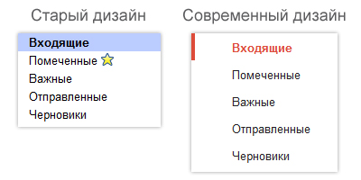
The modern style of web design began to rely more on the space between the different elements of the layout, giving the displayed pages more volume and convenience of perception. If you pay attention at least to the menu of categories of letters received or sent by your mailbox, you can notice the very effect of increasing the space between layout objects.
')
More space gives us the opportunity to desire to consider everything much more extensive. And this is a very good indicator for any modern website.
Long ago 10 years ago, a person knew the standard types of flowers and was limited only to them and their closest shades, now for the usual design of the pages gentle and light places are used, sometimes coarse and strict, sometimes bright and light colors that can make up a completely different chain of shades. For comparison, a snippet from the Gmail mail tokens will be taken.
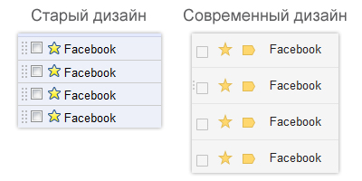
If you pay attention to the element of the “important” message, which is marked with a star, then you can see that in the style of the old design the color of the star itself is the most common yellow, and the color of its border is the standard blue color. In modern design, shades of yellow and orange colors are used, which by their uniqueness make the review of the label more pleasant and more interesting.
Initially, each website was a static page, on which, in addition to the text of images, links and blocks, nothing else was found. But with the advent of the Web 2.0 programming methodology, the design began to rely more and more on the bulk, which designers achieved by placing, as the design of the site elements, images with shadows and glitter. Over the past 1.5 - 2 years, the method of creating these effects has smoothly shifted from conventional images to the generation of these effects in a cascading style sheet.

This example shows how the appearance of these effects affected the perception of users. Also, having considered the examples of the “Classic” tabs, you will see the difference between the shadows generated by the images (the old design) and the CSS3 code (modern design).
The old site design did not even anticipate its own design of the lists, their elements, the “input”, “textarea” fields and other tags included in the <form> tag structure. It cannot be said that all modern changes to these tags are performed without the participation of java-scripts and other additional programming languages. But the very essence of such changes was another step towards modern web design.
In this example, a fragment of the old site luna-art6.narod.ru will be a sample of the old design.
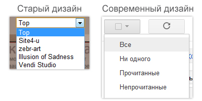
Surely, you have already noticed and felt for yourself how pleasant and easy it was, both for management and for perception, to change the elements of the <form> tag in modern design.
If the old web design assumed the usual buttons and text links as menu items and controls, in modern web design everything is completely different. After all, paying attention to the sites released in the last year, you can see that designers are very fond of using small pixel icons as links or auxiliary elements of links in the menu or blocks.

In this example, the text name of the “Refresh” link in the design of modern web design was replaced with the colorful and well-known label “Refresh”.
PS: in fact, modern web design involves many changes if we analyze each year from the first year in the global network (1993) to today. But more about that another time ...
- free space among layout objects;
- nice colors for design elements;
- shadow and gloss effects thanks to CSS3;
- trends in the design of the elements of the <form> tag;
- the introduction of pixel icons in the control design elements.
And now for all the details ...
To display examples of article materials, the old and new Google Mail interface was used.
Free space among layout objects
The modern style of web design began to rely more on the space between the different elements of the layout, giving the displayed pages more volume and convenience of perception. If you pay attention at least to the menu of categories of letters received or sent by your mailbox, you can notice the very effect of increasing the space between layout objects.

')
More space gives us the opportunity to desire to consider everything much more extensive. And this is a very good indicator for any modern website.
Nice colors for design elements
Long ago 10 years ago, a person knew the standard types of flowers and was limited only to them and their closest shades, now for the usual design of the pages gentle and light places are used, sometimes coarse and strict, sometimes bright and light colors that can make up a completely different chain of shades. For comparison, a snippet from the Gmail mail tokens will be taken.

If you pay attention to the element of the “important” message, which is marked with a star, then you can see that in the style of the old design the color of the star itself is the most common yellow, and the color of its border is the standard blue color. In modern design, shades of yellow and orange colors are used, which by their uniqueness make the review of the label more pleasant and more interesting.
Shadows & Shine Effects With CSS3
Initially, each website was a static page, on which, in addition to the text of images, links and blocks, nothing else was found. But with the advent of the Web 2.0 programming methodology, the design began to rely more and more on the bulk, which designers achieved by placing, as the design of the site elements, images with shadows and glitter. Over the past 1.5 - 2 years, the method of creating these effects has smoothly shifted from conventional images to the generation of these effects in a cascading style sheet.

This example shows how the appearance of these effects affected the perception of users. Also, having considered the examples of the “Classic” tabs, you will see the difference between the shadows generated by the images (the old design) and the CSS3 code (modern design).
Trends in custom decoration of <form> tag zone elements
The old site design did not even anticipate its own design of the lists, their elements, the “input”, “textarea” fields and other tags included in the <form> tag structure. It cannot be said that all modern changes to these tags are performed without the participation of java-scripts and other additional programming languages. But the very essence of such changes was another step towards modern web design.
In this example, a fragment of the old site luna-art6.narod.ru will be a sample of the old design.

Surely, you have already noticed and felt for yourself how pleasant and easy it was, both for management and for perception, to change the elements of the <form> tag in modern design.
The introduction of pixel icons in the control design elements
If the old web design assumed the usual buttons and text links as menu items and controls, in modern web design everything is completely different. After all, paying attention to the sites released in the last year, you can see that designers are very fond of using small pixel icons as links or auxiliary elements of links in the menu or blocks.

In this example, the text name of the “Refresh” link in the design of modern web design was replaced with the colorful and well-known label “Refresh”.
PS: in fact, modern web design involves many changes if we analyze each year from the first year in the global network (1993) to today. But more about that another time ...
Source: https://habr.com/ru/post/140841/
All Articles