Login form and registration using HTML5 and CSS3
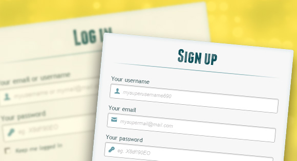
Hello, dear habradrug! In this tutorial, we will learn how to create two HTML5 forms: the login form and the registration form. These forms will be swapped with the help of the CSS3 : target pseudo-class. We will use CSS3 and icon font. The idea of this demo is to show the user a login form and provide him with a “go to” link to the registration form.
In this tutorial I will talk in detail about how to create an effect like in Demo 1 .
HTML
<div id="container_demo" > <!-- , http://www.css3create.com/Astuce-Empecher-le-scroll-avec-l-utilisation-de-target#wrap4 --> <a class="hiddenanchor" id="tosubscribe"></a> <a class="hiddenanchor" id="tologin"></a> <div id="wrapper"> <div id="login" class="animate form"> <form action="mysuperscript.php" autocomplete="on"> <h1>Log in</h1> <p> <label for="username" class="uname" data-icon="u" > Your email or username </label> <input id="username" name="username" required="required" type="text" placeholder="myusername or mymail@mail.com"/> </p> <p> <label for="password" class="youpasswd" data-icon="p"> Your password </label> <input id="password" name="password" required="required" type="password" placeholder="eg. X8df!90EO" /> </p> <p class="keeplogin"> <input type="checkbox" name="loginkeeping" id="loginkeeping" value="loginkeeping" /> <label for="loginkeeping">Keep me logged in</label> </p> <p class="login button"> <input type="submit" value="Login" /> </p> <p class="change_link"> Not a member yet ? <a href="#tosubscribe" class="to_subscribe">Join us</a> </p> </form> </div> <div id="subscribe" class="animate form"> <form action="mysuperscript.php" autocomplete="on"> <h1> Sign up </h1> <p> <label for="usernamesignup" class="uname" data-icon="u">Your username</label> <input id="usernamesignup" name="usernamesignup" required="required" type="text" placeholder="mysuperusername690" /> </p> <p> <label for="emailsignup" class="youmail" data-icon="e" > Your email</label> <input id="emailsignup" name="emailsignup" required="required" type="text" placeholder="mysupermail@mail.com"/> </p> <p> <label for="passwordsignup" class="youpasswd" data-icon="p">Your password </label> <input id="passwordsignup" name="passwordsignup" required="required" type="password" placeholder="eg. X8df!90EO"/> </p> <p> <label for="passwordsignup_confirm" class="youpasswd" data-icon="p">Please confirm your password </label> <input id="passwordsignup_confirm" name="passwordsignup_confirm" required="required" type="password" placeholder="eg. X8df!90EO"/> </p> <p class="signin button"> <input type="submit" value="Sign up"/> </p> <p class="change_link"> Already a member ? <a href="#tologin" class="to_subscribe"> Go and log in </a> </p> </form> </div> </div> </div> Here we used several HTML5 techniques. For example, the type = password element automatically hides what the user types and replaces characters with dots or asterisks (depending on the browser). The type = email element allows the browser to verify the format of the email address. In addition, we used the parameter require = required ; browsers that support this option will not allow the user to submit the form until the field is empty, JavaScript is not required here. The autocomplete = on parameter will automatically fill in some fields. We also used substitute text to help the user complete the form.
Now about two tricky moments. You probably noticed two links <a href> at the beginning of the form. This clever technique will allow our form to behave properly when working with anchors.
The second point is associated with the use of a font with icons. We will use the data-attribute to display the icons. By setting the data-icon = ”icon_character” parameter with the corresponding characters in HTML, we need to assign only one rule in CSS to establish the style of all the icons. More information about this technique can be found on the website: 24 Ways: Displaying Icons with Fonts and Data-Attributes .
CSS
For the purity of the code, I will skip the basic parameters (html, body, etc.), but you can find them in the source files. I repeat that I use CSS3 techniques that will not work in all browsers. So let's get started!
')
Styling forms using CSS3
First, let's assign a basic style to our forms.
#subscribe, #login{ position: absolute; top: 0px; width: 88%; padding: 18px 6% 60px 6%; margin: 0 0 35px 0; background: rgb(247, 247, 247); border: 1px solid rgba(147, 184, 189,0.8); box-shadow: 0pt 2px 5px rgba(105, 108, 109, 0.7), 0px 0px 8px 5px rgba(208, 223, 226, 0.4) inset; border-radius: 5px; } #login{ z-index: 22; } We added two shadows to the element: one to create an internal blue glow, and the second an external shadow. I'll explain to you z-index a little later.
Here we assign properties for the header:
/**** ****/ #wrapper h1{ font-size: 48px; color: rgb(6, 106, 117); padding: 2px 0 10px 0; font-family: 'FranchiseRegular','Arial Narrow',Arial,sans-serif; font-weight: bold; text-align: center; padding-bottom: 30px; } /** webkit background-clip:text; **/ #wrapper h1{ background: -webkit-repeating-linear-gradient(-45deg, rgb(18, 83, 93) , rgb(18, 83, 93) 20px, rgb(64, 111, 118) 20px, rgb(64, 111, 118) 40px, rgb(18, 83, 93) 40px); -webkit-text-fill-color: transparent; -webkit-background-clip: text; } #wrapper h1:after{ content:' '; display:block; width:100%; height:2px; margin-top:10px; background: linear-gradient(left, rgba(147,184,189,0) 0%, rgba(147,184,189,0.8) 20%, rgba(147,184,189,1) 53%, rgba(147,184,189,0.8) 79%, rgba(147,184,189,0) 100%); } I note that today only webkit browsers support background-clip: text , so we will make a striped webkit-only background and tie it to the H1 header. Since the background-clip: text parameter works only in Webkit browsers, I decided to work only with webkit properties. That is why I divided the CSS into two parts and used only the webkit gradient. However, you should not only use webkit on your websites! For example, the -webkit-text-fill-color: transparent parameter allows us to have a transparent background, but only for webkit browsers, all other browsers will ignore this property.
We also created a thin line under the heading using the element: after pseudo-class. We used a gradient from 2px in height and reduced the transparency at the edges to zero.
Now let's take care of the input fields and give them a nice view.
/**** advanced input styling ****/ /* placeholder */ ::-webkit-input-placeholder { color: rgb(190, 188, 188); font-style: italic; } input:-moz-placeholder, textarea:-moz-placeholder{ color: rgb(190, 188, 188); font-style: italic; } input { outline: none; } First, we style the fields and remove the stroke. But be careful: the stroke helps the user to understand which field he is on. If you remove it, you need to apply the properties: active and: focus.
/* submit checkbox */ #wrapper input:not([type="checkbox"]){ width: 92%; margin-top: 4px; padding: 10px 5px 10px 32px; border: 1px solid rgb(178, 178, 178); box-sizing : content-box; border-radius: 3px; box-shadow: 0px 1px 4px 0px rgba(168, 168, 168, 0.6) inset; transition: all 0.2s linear; } #wrapper input:not([type="checkbox"]):active, #wrapper input:not([type="checkbox"]):focus{ border: 1px solid rgba(91, 90, 90, 0.7); background: rgba(238, 236, 240, 0.2); box-shadow: 0px 1px 4px 0px rgba(168, 168, 168, 0.9) inset; } Here we used the pseudo class: not to style all fields except checkboxes. In addition, I decided to remove the stroke and added properties: focus and: active.
Now is the time to have fun: font with icons. Since we cannot use the: before and: after pseudo-classes, we will add an icon to the label parameter and then place it in the field. I will use the fontomas library . You can compare the icons with the corresponding letter. Remember the data-icon attribute? It is necessary to insert a letter into it. I used data-icon = 'u' for login, 'e' for email, 'p' for password. As soon as I selected the letters, I downloaded the font and used the fontsquirrel font generator to convert to a format suitable for @ font-face.
@font-face { font-family: 'FontomasCustomRegular'; src: url('fonts/fontomas-webfont.eot'); src: url('fonts/fontomas-webfont.eot?#iefix') format('embedded-opentype'), url('fonts/fontomas-webfont.woff') format('woff'), url('fonts/fontomas-webfont.ttf') format('truetype'), url('fonts/fontomas-webfont.svg#FontomasCustomRegular') format('svg'); font-weight: normal; font-style: normal; } /** ! **/ [data-icon]:after { content: attr(data-icon); font-family: 'FontomasCustomRegular'; color: rgb(106, 159, 171); position: absolute; left: 10px; top: 35px; width: 30px; } That's all. You do not need to have a separate class for each icon. We used the content: attr (data-icon) parameter to get the letter from the data-icon attribute. Thus, we only need to assign a font, select a color and place an icon.
Now let's set the rules for the form submit button.
/* */ #wrapper p.button input{ width: 30%; cursor: pointer; background: rgb(61, 157, 179); padding: 8px 5px; font-family: 'BebasNeueRegular','Arial Narrow',Arial,sans-serif; color: #fff; font-size: 24px; border: 1px solid rgb(28, 108, 122); margin-bottom: 10px; text-shadow: 0 1px 1px rgba(0, 0, 0, 0.5); border-radius: 3px; box-shadow: 0px 1px 6px 4px rgba(0, 0, 0, 0.07) inset, 0px 0px 0px 3px rgb(254, 254, 254), 0px 5px 3px 3px rgb(210, 210, 210); transition: all 0.2s linear; } #wrapper p.button input:hover{ background: rgb(74, 179, 198); } #wrapper p.button input:active, #wrapper p.button input:focus{ background: rgb(40, 137, 154); position: relative; top: 1px; border: 1px solid rgb(12, 76, 87); box-shadow: 0px 1px 6px 4px rgba(0, 0, 0, 0.2) inset; } p.login.button, p.signin.button{ text-align: right; margin: 5px 0; } The trick is to use box-shadow to create multiple frames. Naturally, you can use only one frame, but you can also use several. We will use the length parameter to create a “fake” second white frame, 3px wide, with no blur.
Now let's style the checkbox, here we will not create anything unusual:
/* " "*/ .keeplogin{ margin-top: -5px; } .keeplogin input, .keeplogin label{ display: inline-block; font-size: 12px; font-style: italic; } .keeplogin input#loginkeeping{ margin-right: 5px; } .keeplogin label{ width: 80%; } We style the basement of the form using multiple linear gradients to create a striped gradient.
p.change_link{ position: absolute; color: rgb(127, 124, 124); left: 0px; height: 20px; width: 440px; padding: 17px 30px 20px 30px; font-size: 16px ; text-align: right; border-top: 1px solid rgb(219, 229, 232); border-radius: 0 0 5px 5px; background: rgb(225, 234, 235); background: repeating-linear-gradient(-45deg, rgb(247, 247, 247) , rgb(247, 247, 247) 15px, rgb(225, 234, 235) 15px, rgb(225, 234, 235) 30px, rgb(247, 247, 247) 30px ); } #wrapper p.change_link a { display: inline-block; font-weight: bold; background: rgb(247, 248, 241); padding: 2px 6px; color: rgb(29, 162, 193); margin-left: 10px; text-decoration: none; border-radius: 4px; border: 1px solid rgb(203, 213, 214); transition: all 0.4s linear; } #wrapper p.change_link a:hover { color: rgb(57, 191, 215); background: rgb(247, 247, 247); border: 1px solid rgb(74, 179, 198); } #wrapper p.change_link a:active{ position: relative; top: 1px; } Now you see that we have two pleasant forms, but we want only one of them to be displayed. It's time for the animation!
Create an animation
The first thing we will do is hide the second shape by setting the opacity to 0:
#register{ z-index: 21; opacity: 0; } Remember that the login form has the parameter z-index: 22? To the second form we assign this parameter to 21 to put it “under” the login form.
Now the most interesting: we swap forms using the pseudo class: target. You need to understand one thing about: target: we will use anchors to move. The normal behavior of the anchor is to jump to a specific element of the page. But we don’t want this, we just want to swap forms. And here comes our trick using two links at the top of the page. Instead of directing us directly to the second form, at the risk of experiencing the “leap” effect, we will give the links the display: none parameter. This will help avoid jumping. I discovered this trick on the site: CSS3 create (French).
#toregister:target ~ #wrapper #register, #tologin:target ~ #wrapper #login{ z-index: 22; animation-name: fadeInLeft; animation-delay: .1s; } This is what happens: when we click the Join button, we are headed to #toregister. Then the animation takes place and only then we go to the element #register. We use an animation called fadeInLeft . Since we “hide” the form using zero transparency, we will apply the animation, which will gradually appear. We also modified the z-index to appear on top of another form. The same happens for the other form same happens for the other form.
Here is the code for the animation. We used the CSS3 animation framework from Dan Eden and adapted this framework for our tutorial.
.animate{ animation-duration: 0.5s; animation-timing-function: ease; animation-fill-mode: both; } @keyframes fadeInLeft { 0% { opacity: 0; transform: translateX(-20px); } 100% { opacity: 1; transform: translateX(0); } } A shape that “disappears” will have a blackout animation left:
#toregister:target ~ #wrapper #login, #tologin:target ~ #wrapper #register{ animation-name: fadeOutLeftBig; } @keyframes fadeOutLeft { 0% { opacity: 1; transform: translateX(0); } 100% { opacity: 0; transform: translateX(-20px); } } You can now use Dan Eden's other animations using the animate.css file: just change the .animate class and animation names. You will also find several other animations at the end of the animate-custom.css file.
That's all friends. Hope you enjoyed this tutorial!
Note that in some browsers the background-clip: text parameter is not supported. In Internet Explorer 9, animations do not work. In Internet Explorer 8 and below, the pseudo-class: target pseudo-class is not supported, so this effect will not work there at all.
Demo
View demo | Download source files
PS All remarks about the translation with pleasure I will accept in a personal. Thank!
Source: https://habr.com/ru/post/140816/
All Articles