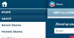
Adaptive navigation: where to put the menu on smartphones

Many people are already trying to adapt their site to mobile devices. Use new CSS3 features on simple sites and on much more complex ones. In the process there are some difficulties, and one of the most important is the behavior of the site menu when viewed on small screens. Solve this problem, as it turned out, in several ways. For me, this task has recently become particularly relevant, so I follow the materials on the network concerning adaptive design. And recently I came across a good analysis of existing patterns of adaptive navigation.
As I relate to Simpliste's open-sour adaptive HTML5 template, I decided to try out all the existing navigation capabilities . But besides gaining my own experience, I managed to create several illustrative examples available for use by anyone, as well as prepare a description of the process that I invite you to get acquainted with.
The article itself, which interested me and pushed me into action, is called Responsive Navigation Patterns . I will rely on it, and the examples will be the pages of the Simpliste template with the implementation of patterns and a complete description of how to achieve the same result.
')
There are several approaches to adaptive navigation. Consider them in order.

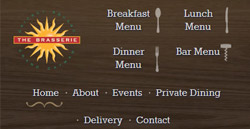
1. Navigate at the top or leave it at that.
The most obvious and most common way. You just need to make sure that everything fits in the width of the screen and does not stick out. Nothing changes in the HTML structure, but menu links can get slightly modified styles, various kinds of variations are possible with the appearance of links, which can be simplified, centered, replaced with icons, or imitate the appearance of mobile device interfaces.
This approach is used in the themes of the design of Simpliste.
Benefits
The easiest to achieve. You do not need to use Javascript (and there is no dependence on it), you do not need incredible maneuvers with CSS.
disadvantages
The problem may begin when the number of menu items is too large. Firstly, the height of the navigation unit may become such that it completely overlaps the contents of the site on the first page and the user will have to “scroll” the site down to get to the information he needs. And so on every page of the site. Secondly, the question of multi-level menus arises. If we simply build them one below the other, then we return to the problem of the height of the navigation unit. Thirdly, if everything is not foreseen in advance, the addition of new menu items can cause unpleasant “creeping” and hyphenation.
Examples

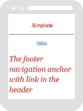
2. Link to footer, to navigation
Demo with full description.
This method is not so common. Its essence is that a link is created in the header, which is hidden on wide monitors and displayed, if necessary, on mobile devices. This anchor link leads to the menu that is in the footer of the site. In this case, the menu itself is either positioned using CSS, or duplicated in the header and footer, then the menu in the header is hidden at low resolutions. As a reference, you can use both text and some clear icon.
Virtues
It remains the only link in the header, which takes up very little space. No dependency on scripts.
disadvantages
You have to add additional CSS code to either move the menu from the footer up on the desktop (using position: absolute or position: fixed), or hide the menu in the header on mobile devices if it duplicates the footer menu. In addition, the feeling of a sharp "jump" when moving through such a link may take the user by surprise.
Example


3. Drop-down list (<select>) instead of navigation
Demo with full description.
This approach is spreading more and more. It uses Javascript, which "runs over" all the menu items, creating a list of them. That is, the navigation will be an interface element supported by the visitor's operating system.
The process of writing a script for such a menu was described in detail in an article on Smashing Magazine . But you can use a ready-made jQuery plugin , as I did in my own solution.
Virtues
Smooth compact. Recognizable as an element of navigation and familiar to the user. For sites with complex navigation and nested menus can be a great solution.
disadvantages
It will be difficult to make the mobile OS interface element look like you want. On different devices, the appearance and behavior will be slightly different. Javascript dependency. The inconvenience when navigating is really big, when all the points are arranged in a long monotonous row, although the nesting of the levels remains.
Examples


4. Drop-down menu
Demo with full description.
This approach is also quite popular. Especially considering the opportunity to experiment with the design. Its essence is that in the mobile version of the menu is hidden, but there is a link or button, clicking on which you can open the navigation. Everything works with Javascript. You can compare the approach with the link to the footer, but in this case the menu appears in the same place where the user pressed the button, that is, at the top of the page. Alternatively, a couple of the most important links can be left, and when you click on the button to reveal the rest.
There is a turnkey solution that works with jQuery. But it seemed to me difficult to personalize. Therefore, I wrote my own code for jQuery, which is not so complicated and, if desired, it can be easily converted into either pure Javascript or some code that is more mobile-friendly. But tests on emulators showed that my solution is quite working.
var menuText = "Menu"; $( function(){ $("body").addClass("js"); $(".menu_main").prepend("<a href='#' class='link_nav'>"+ menuText +"</a>"); $(".menu_main li:has(ul)").addClass("menu_parent"); $(".link_nav").click( function(){ $(".menu_main > ul").toggleClass("menu_expanded"); $(this).toggleClass("menu_parent_exp"); return false; } ) $(".menu_parent").click( function(){ $(this).find(">ul").toggleClass("menu_expanded"); $(this).toggleClass("menu_parent_exp"); return false; } ) } ) The script creates a link that will reveal a previously hidden menu. You can see in business and take the necessary styles in the demo .
Virtues
Looks like you want. The user does not throw anywhere. For nested menus, it is possible to create hierarchies with expansion when clicked.
disadvantages
Javascript dependency. Possible performance problems if you need to animate the menu.
Examples


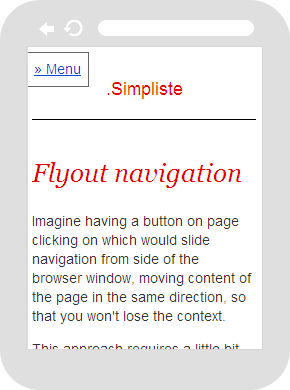
5. Outbound content shift menu
Demo with full description.
This option was described as a separate approach. But in reality, this is more a variation of the drop-down menu. Its essence is that when you click on a link or a menu button is not just revealed, but leaves the edge of the browser window, while shifting the content beyond the window.
We did not manage to find a ready solution, therefore our own was created.
$( function(){ $("body").addClass("js"); $(".link_nav").click( function(){ $("body").toggleClass("mobile_nav"); } ); } ) In fact, not a lot of scripts.
The main work is done by CSS. When you change the class of the body tag, the position of the menu changes , which is positioned through position: fixed, and the content acquires an additional indent on the left , giving way to the menu. In Webkit browsers, it was even possible to achieve animation through CSS transitions, that is, in iPhones and Androids, the menu will effectively go out. Again, you can see and take the necessary styles in the demo .
There is a flaw that needs to be described separately. When there are too many items in the menu, the menu with position: fixed will be “eaten up” by the bottom edge. In this case, using position: absolute helps, but there is a “jump” to the top of the site after clicking on the link button.
Virtues
An interesting solution, the ability to experiment with appearance. The context is not lost, since the content, although covered with the edge of the window, is still visible.
disadvantages
Dependence on Javascript, the need to customize CSS. position: fixed is not supported in all old versions of mobile devices (there will be position: absolute), the problem described above with the height of the menu.
Example
6. Variations
There are various variations, both in the approach to navigation, and in its design and in functionality.
You can simply put the menu in the footer, without reference to it. You can hide the menu at all (which is not recommended). You can experiment with the drop-down menu, for example, giving users the opportunity to pull it out . No one bothers to combine navigation going to the edge with the disclosure of submenu items.
All these demos are part of the xtensions extensions for the HTML5 Simpliste template, which you can download and use for free in your own projects.
Source: https://habr.com/ru/post/140801/
All Articles