Introduction to CSS3 Grid Layout. We work with nets
Update: Some of the information in this article is out of date. I recommend fresh materials on css-live.ru .
The CSS3 Grid Layout module is one of the most interesting, in my opinion, modules in the CSS3 family. The official history of the module in the form of a draft specification totals today a little less than a year. Vladimir Yanev wrote about the preliminary announcement with the name CSS Grid Alignment at TPAC 2010 back in December 2010. It should also be noted that with a slightly different name and a slightly different syntax, but with the same essence, it was declared as WD back in 2007. Today, work on modifying the module is in full swing, preliminary implementation already exists in Internet Explorer 10 and it is hoped that support for new features will also appear in future versions of other popular browsers.
')
The task that the CSS3 Grid Layout model solves is very simple and clear to any web-maker (and not only to him): to provide a convenient mechanism for positioning content on a virtual grid.
Unlike the old tabular approaches based on the use of the table, the semantics of the document are not littered here and the presentation is clearly separated from the content. Unlike various block layout variations with insane and multi-storied floats that become complex with somewhat complicated structure, combined with manually calculated indents, here the description of styles becomes trivially simple and transparent. Unlike absolute positioning with reference to coordinates, flexibility is retained. In contrast to today's popular css / js libraries for grid marking by specifying the appropriate classes (take at least the same bootstrap or yui css grids ), the binding of classes is not littered here.
Sheer pleasure! It remains only to wait for broad support :) However, if you plan to make Metro-style applications for Windows 8 on html / js, the key features described in the CSS3 Grid Layout module are already working - and you can move forward using convenient and practical mechanisms.
To quickly understand how Grid Layout works, let's start immediately with an example. Imagine that you need to solve the classical problem of typesetting a three-column layout with something like this:
which needs to be spread into three columns like this:
This is a classic problem, so I will not dwell on how it is solved in the case of using the already traditional approaches for multi-column block layout. Let's see what can be done using the Grid Layout (I skip the browser prefixes in the examples, however, in practice they need to be added - for IE this is -ms- ).
Here is a sample code in CSS:
In the simplest version, all that needs to be done is to specify in the container (section) that the content inside it needs to be placed on the grid and set up a virtual grid using the properties of grid-columns and grid-rows (I’ll tell you about what values they take). Further for each element inside it is enough to say where it should be located.
And it's all! Total:
Now let's understand the details and additional features.
To create a virtual grid, on which elements are placed further, it is necessary to describe the grid tracks (Grid Tracks) - rows and columns inside the grid:
The tracks are located between the grid lines (Grid Lines), which, in turn, are located on the right-to-left and top-bottom of each track:
To set how exactly the element will be placed on the grid, you must specify which line it will be attached to: vertically and horizontally:

By default, the element occupies the space from the specified line to the next one (therefore, this numbering coincides with the numbering of the cells and everything looks as if we are saying which cell to place the element in).
To stretch an item into several grid cells, you can use the grid-row-span and grid-column-span properties:
By default, both properties are set to 1, which corresponds to the stretching of the available space from the specified line to the next (+1).
It often happens that the intended for use grid contains some characteristic pattern:

It would be convenient to describe such grids in a more compact and transparent form - and there is such an opportunity! The example above can be described as:
The pattern itself is described in parentheses, after which the number of repetitions is indicated in square ones.
===
Now that we know the basic capabilities for describing grid lines, let's go back to the tracks again and try to figure out the units used.
As you may have noticed above, in some places I used an unusual value when specifying the sizes of some columns and lines - 1fr. About this and other possible values when specifying the length we now talk.
When describing column widths and row heights (track sizes), the following units and values can be used:
Let's try to figure out how the fraction value works. The grid occupies some space in width and height. It may depend on the content, be rigidly fixed, or occupy all the available space in an external container. Further, when describing tracks of a part of columns and lines, you can explicitly specify what size they should be, for another part you can indicate that their length depends on the content.
Now, if from the available length, allotted to the grid vertically or horizontally, subtract the sum of all such explicit or “content” lengths, the remaining space is distributed between the remaining tracks in proportion to the fractions specified in them (the size of the share divided by the sum of all such shares):

In the example above, these are three columns with widths in a ratio of 2: 1: 1 and two rows with heights in a ratio of 5: 2.
The draft specification provides such a comprehensive example that allows you to see the whole scheme with different types of values at once:
The following lines are defined here (tracks, they are columns in this case):
There is still a slight nuance regarding the accounting for the shares that were inside the minmax function: they are taken into account in the total amount of shares only if they are indicated in the maximum position. The shares designated in the minimum position are considered equal to 0px. More details of the calculation, see the specification.
===
The next step is to try to figure out how the elements are placed between the grid lines (inside the cells).
Now, when the elements are “tied” to the grid lines, a natural question arises: how are they located between the lines?

The snapping of elements to cell borders is controlled using the properties grid-column-align and grid-row-align . You can use the following values for control:
I think the actions are obvious from the title, I note only that in each case we are talking about positioning the element in its margin-boxing. The default value is stretch.
Binding in columns (horizontally) corresponds to the direction of the text (for example, in Arabic, start will be on the right and end will be on the left). Binding in rows (vertically) coincides with the direction of the flow of blocks (this, by the way, means that in some East Asian languages, rows and columns can be swapped).
The next important point: the location of the elements inside the grid with overlays. What happens if, for example, two elements are tied to the same lines, or they are superimposed when expanding over several cells?
First of all, it is important to understand the following nuance: the elements placed inside the grid do not directly affect the location of each other. If you tie ten elements, say, to the second line horizontally and the third vertically, then by default they will all be placed one on another as if each one is tied to the corresponding corner. Elements can only affect the dimensions of the tracks, if they are tied, in turn, on the dimensions of the content.

To control the display order of such layers, the current version of the specification extends the capabilities of z-index, allowing you to control the layers of elements within the grid.
Note : in the previous version of the specification on which the current version of IE10 (platform preview 5) relies, a separate grid-layer property was defined for this purpose so as not to conflict with the z-index, however, later in the discussion in the working group this decision was revised.
Example of use:

To start working with grids in browsers (not yet) supporting the CSS Grid Layout module, you can use the eCSStender js library and the CSS3 Grid Alignment extension , which provide support for the following properties:
An example of work can be found here .
Finally, let's slightly open the door to the future and see what other features are being prepared in the CSS3 Grid Layout module .
Please note that for today the features mentioned below are only described in the draft specification, but do not yet have support among the released browsers (including pre-release versions). They may also change in the future depending on the community response and the recommendations of the CSS working group.
Optionally, to bind an element to a grid, you can specify not only the start line, but also the end line.
Unlike the “span” mechanism, which says how many cells the element should stretch horizontally or vertically, this feature allows you to clearly indicate on which line the element should end. It is also convenient to use in combination with the possibility of naming individual grid lines.
For convenience, the lines can be given names. This is done by inserting string values in the appropriate places when describing tracks (several names can be given if this makes practical sense, for example, in terms of markup semantics):
Further, when describing the binding of elements you can refer to these names:
The specification also introduces 4 pre-named lines - vertical and horizontal start and end , in fact, framing the entire grid. This allows, for example, to position the element “from the second column to the last”, without thinking about the total number of columns.

Another way of placing elements on the grid is to use templates that allow you to describe the virtual block structure:
At the same time, to place an element with a tie to one or another virtual cell, it is enough to refer to it by the corresponding rule:
This approach is especially convenient if, depending on various conditions, for example, the screen resolution, you need to change the location of the elements and even redo the grid itself. In this situation, the Grid Layout works well with Media Queries:

Please note that the binding of the article itself to the named cell does not change. (Pens are already itching to start using, however, we are waiting for all of this to be implemented in browsers.)
I tried to give an article review of the key features of the CSS3 Grid Layout module. I hope they inspire you no less than me. :)
Let me remind you that the module continues to evolve, the editors collect feedback from the external community and within the CSS working group. The current implementation of the main functionality can be viewed in Internet Explorer 10 . Some interesting examples can be found at ietestdrive.com : The Grid System and Hands On: CSS3 Grid Layout :
Also, I note once again that the Grid Layout features already supported by the IE10 engine can also be used when developing applications in the Metro style on HTML / JS for Windows 8 .
Introduction
The CSS3 Grid Layout module is one of the most interesting, in my opinion, modules in the CSS3 family. The official history of the module in the form of a draft specification totals today a little less than a year. Vladimir Yanev wrote about the preliminary announcement with the name CSS Grid Alignment at TPAC 2010 back in December 2010. It should also be noted that with a slightly different name and a slightly different syntax, but with the same essence, it was declared as WD back in 2007. Today, work on modifying the module is in full swing, preliminary implementation already exists in Internet Explorer 10 and it is hoped that support for new features will also appear in future versions of other popular browsers.
')
Why do you need a grid layout?
The task that the CSS3 Grid Layout model solves is very simple and clear to any web-maker (and not only to him): to provide a convenient mechanism for positioning content on a virtual grid.
Unlike the old tabular approaches based on the use of the table, the semantics of the document are not littered here and the presentation is clearly separated from the content. Unlike various block layout variations with insane and multi-storied floats that become complex with somewhat complicated structure, combined with manually calculated indents, here the description of styles becomes trivially simple and transparent. Unlike absolute positioning with reference to coordinates, flexibility is retained. In contrast to today's popular css / js libraries for grid marking by specifying the appropriate classes (take at least the same bootstrap or yui css grids ), the binding of classes is not littered here.
Sheer pleasure! It remains only to wait for broad support :) However, if you plan to make Metro-style applications for Windows 8 on html / js, the key features described in the CSS3 Grid Layout module are already working - and you can move forward using convenient and practical mechanisms.
The basics
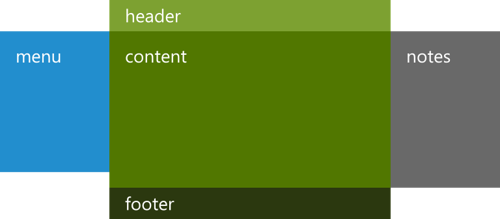
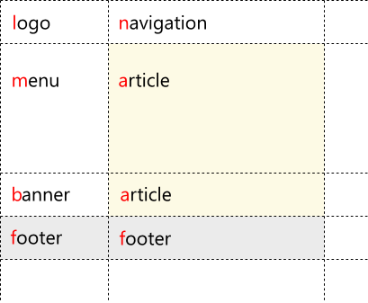
To quickly understand how Grid Layout works, let's start immediately with an example. Imagine that you need to solve the classical problem of typesetting a three-column layout with something like this:
<section> <header>Title</header> <nav>Menu</nav> <article>Content</article> <aside>Notes</aside> <footer>Footer</footer> </section> which needs to be spread into three columns like this:
This is a classic problem, so I will not dwell on how it is solved in the case of using the already traditional approaches for multi-column block layout. Let's see what can be done using the Grid Layout (I skip the browser prefixes in the examples, however, in practice they need to be added - for IE this is -ms- ).
Here is a sample code in CSS:
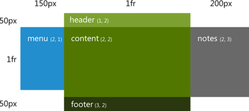
section { display: grid; grid-columns: 150px 1fr 200px; grid-rows: 50px 1fr 50px; } section header { grid-column: 2; grid-row: 1; } section nav { grid-column: 1; grid-row: 2; } section article { grid-column: 2; grid-row: 2; } section aside { grid-column: 3; grid-row: 2; } section footer { grid-column: 2; grid-row: 3; } In the simplest version, all that needs to be done is to specify in the container (section) that the content inside it needs to be placed on the grid and set up a virtual grid using the properties of grid-columns and grid-rows (I’ll tell you about what values they take). Further for each element inside it is enough to say where it should be located.
And it's all! Total:
- Virtual grid : grid-column s and grid-row s in a container
- Element placement : grid-column and grid-row.
Now let's understand the details and additional features.
Virtual grid
Tracks: rows and columns
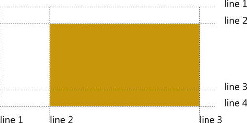
To create a virtual grid, on which elements are placed further, it is necessary to describe the grid tracks (Grid Tracks) - rows and columns inside the grid:
#grid { display: grid; grid-columns: 150px 1fr; /* */ grid-rows: 50px 1fr 50px; /* */ } Grid lines
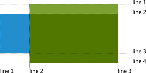
The tracks are located between the grid lines (Grid Lines), which, in turn, are located on the right-to-left and top-bottom of each track:
To set how exactly the element will be placed on the grid, you must specify which line it will be attached to: vertically and horizontally:
#item { grid-column: 2; grid-row: 2; } By default, the element occupies the space from the specified line to the next one (therefore, this numbering coincides with the numbering of the cells and everything looks as if we are saying which cell to place the element in).
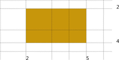
Multiple stretch
To stretch an item into several grid cells, you can use the grid-row-span and grid-column-span properties:
#item { grid-column: 2; grid-column-span: 3; grid-row: 2; grid-row-span:2; } By default, both properties are set to 1, which corresponds to the stretching of the available space from the specified line to the next (+1).
Duplicate tracks
It often happens that the intended for use grid contains some characteristic pattern:
#grid { display: grid; grid-columns: 24px 120px 24px 120px 24px 120px 24px 120px 24px; grid-rows: 1fr 24px 1fr 24px 1fr 24px; } It would be convenient to describe such grids in a more compact and transparent form - and there is such an opportunity! The example above can be described as:
#grid { display: grid; grid-columns: 24px (120px 24px)[4]; grid-rows: (1fr 24px)[3]; } The pattern itself is described in parentheses, after which the number of repetitions is indicated in square ones.
===
Now that we know the basic capabilities for describing grid lines, let's go back to the tracks again and try to figure out the units used.
Units
As you may have noticed above, in some places I used an unusual value when specifying the sizes of some columns and lines - 1fr. About this and other possible values when specifying the length we now talk.
When describing column widths and row heights (track sizes), the following units and values can be used:
- linear dimensions — standard length units, defined in the CSS3 Values and Units module, for example, pt, px, em, vw, etc .;
- percent - the size of the track as a percentage of the size of the container with the grid (although if the height or length of the grid depends on the content, the result will be uncertain);
- fraction (fraction) is a non-negative number followed by the unit of measurement fr , the size of each fraction is taken proportional to the specified number (see below for details);
- max-content - a keyword to specify the maximum length of the maximum lengths of elements in the track;
- min-content - a keyword to specify the maximum length of the minimum lengths of elements in the track;
- minmax (min, max) - sets the range of values (the principle of operation can be described as minmax (p, q) = max (p, min (fill-available, q))
- the maximum of the lower threshold and the minimum of available space and the upper threshold); - auto is a keyword equivalent to minmax (min-content, max-content) .
Shares
Let's try to figure out how the fraction value works. The grid occupies some space in width and height. It may depend on the content, be rigidly fixed, or occupy all the available space in an external container. Further, when describing tracks of a part of columns and lines, you can explicitly specify what size they should be, for another part you can indicate that their length depends on the content.
Now, if from the available length, allotted to the grid vertically or horizontally, subtract the sum of all such explicit or “content” lengths, the remaining space is distributed between the remaining tracks in proportion to the fractions specified in them (the size of the share divided by the sum of all such shares):
In the example above, these are three columns with widths in a ratio of 2: 1: 1 and two rows with heights in a ratio of 5: 2.
Example
The draft specification provides such a comprehensive example that allows you to see the whole scheme with different types of values at once:
#grid { display: grid; grid-columns: 100px 1fr max-content minmax(min-content, 1fr) } The following lines are defined here (tracks, they are columns in this case):
- Starting first line.
- Line 100px from the first.
- Another line at a distance of 1/2 of the space left after all the calculations is from the second line.
- And one more line, whose distance from the third is equal to the maximum of the sizes of the content of the elements in the column.
- Finally, the last line, located from the fourth at a distance equal to either the minimum length of the elements in the column, or 1/2 of the remaining space, whichever is greater.
There is still a slight nuance regarding the accounting for the shares that were inside the minmax function: they are taken into account in the total amount of shares only if they are indicated in the maximum position. The shares designated in the minimum position are considered equal to 0px. More details of the calculation, see the specification.
===
The next step is to try to figure out how the elements are placed between the grid lines (inside the cells).
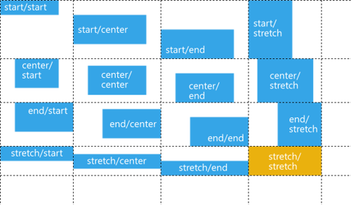
Snapping elements
Now, when the elements are “tied” to the grid lines, a natural question arises: how are they located between the lines?
The snapping of elements to cell borders is controlled using the properties grid-column-align and grid-row-align . You can use the following values for control:
- start
- end
- center
- stretch
I think the actions are obvious from the title, I note only that in each case we are talking about positioning the element in its margin-boxing. The default value is stretch.
Binding in columns (horizontally) corresponds to the direction of the text (for example, in Arabic, start will be on the right and end will be on the left). Binding in rows (vertically) coincides with the direction of the flow of blocks (this, by the way, means that in some East Asian languages, rows and columns can be swapped).
Layer management
The next important point: the location of the elements inside the grid with overlays. What happens if, for example, two elements are tied to the same lines, or they are superimposed when expanding over several cells?
First of all, it is important to understand the following nuance: the elements placed inside the grid do not directly affect the location of each other. If you tie ten elements, say, to the second line horizontally and the third vertically, then by default they will all be placed one on another as if each one is tied to the corresponding corner. Elements can only affect the dimensions of the tracks, if they are tied, in turn, on the dimensions of the content.
To control the display order of such layers, the current version of the specification extends the capabilities of z-index, allowing you to control the layers of elements within the grid.
Note : in the previous version of the specification on which the current version of IE10 (platform preview 5) relies, a separate grid-layer property was defined for this purpose so as not to conflict with the z-index, however, later in the discussion in the working group this decision was revised.
Example of use:
#grid { display: grid; grid-columns: (1fr)[3]; grid-rows: (1fr)[4]; } #A { grid-column:1; grid-row:3; grid-column-span:2; } #B { grid-column:1; grid-row:1; grid-row-span:2; /* grid-layer: 10; */ z-index:10; margin-top:10px; } #C { grid-column:1; grid-row:1; grid-column-span:2; margin-left:50px; } #D { grid-column:2; grid-row:3; grid-row-span:2; grid-column-span:2; margin:10px 0 0 10px; } #E { grid-column:2; grid-row:2; /* grid-layer: 5; */ z-index:5; margin: -20px; } css3 grid library
To start working with grids in browsers (not yet) supporting the CSS Grid Layout module, you can use the eCSStender js library and the CSS3 Grid Alignment extension , which provide support for the following properties:
- display: grid
- grid-columns & grid-rows
- grid-column & grid row
- grid-column-span & grid-row-span
An example of work can be found here .
A little about the future, or what other features are described in the module
Finally, let's slightly open the door to the future and see what other features are being prepared in the CSS3 Grid Layout module .
Please note that for today the features mentioned below are only described in the draft specification, but do not yet have support among the released browsers (including pre-release versions). They may also change in the future depending on the community response and the recommendations of the CSS working group.
Specify the end line for the element binding
Optionally, to bind an element to a grid, you can specify not only the start line, but also the end line.
#item { grid-column: 2; grid-row: 2 4; } Unlike the “span” mechanism, which says how many cells the element should stretch horizontally or vertically, this feature allows you to clearly indicate on which line the element should end. It is also convenient to use in combination with the possibility of naming individual grid lines.
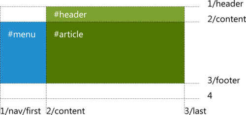
Named Grid Lines
For convenience, the lines can be given names. This is done by inserting string values in the appropriate places when describing tracks (several names can be given if this makes practical sense, for example, in terms of markup semantics):
#grid { display: grid; grid-columns: "nav" "first" 150px "content" 1fr "last"; grid-rows: "header" 50px "content" 1fr "footer" 50px; } Further, when describing the binding of elements you can refer to these names:
#menu { grid-column: "nav"; grid-row: "content"; } #header { grid-column: "content"; grid-row: "header"; } #article { grid-column: "content"; grid-row: "content"; } The specification also introduces 4 pre-named lines - vertical and horizontal start and end , in fact, framing the entire grid. This allows, for example, to position the element “from the second column to the last”, without thinking about the total number of columns.
#menu { grid-column: 1; grid-row: start end; } #footer { grid-column: 2 end; grid-row: 3; } Named cells and patterns
Another way of placing elements on the grid is to use templates that allow you to describe the virtual block structure:
#grid { display: grid; grid-template: "ln" "ma" "ba" "ff"; grid-columns: auto minmax(min-content, 1fr); grid-rows: auto minmax(min-content, 1fr) auto auto; } At the same time, to place an element with a tie to one or another virtual cell, it is enough to refer to it by the corresponding rule:
#article { grid-cell: "a"; } This approach is especially convenient if, depending on various conditions, for example, the screen resolution, you need to change the location of the elements and even redo the grid itself. In this situation, the Grid Layout works well with Media Queries:
@media (orientation: portrait) { #grid { display: grid; grid-template: "ln" "ma" "ba" "ff"; grid-columns: auto minmax(min-content, 1fr); grid-rows: auto minmax(min-content, 1fr) auto auto; } } @media (orientation: landscape) { #grid { display: grid; grid-template: "ln" "ma" "mb" "sf"; grid-columns: auto minmax(min-content, 1fr); grid-rows: auto minmax(min-content, 1fr) auto auto; } } #article { grid-cell: "a"; } Please note that the binding of the article itself to the named cell does not change. (Pens are already itching to start using, however, we are waiting for all of this to be implemented in browsers.)
Conclusion
I tried to give an article review of the key features of the CSS3 Grid Layout module. I hope they inspire you no less than me. :)
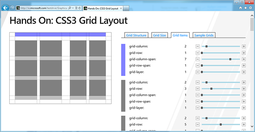
Let me remind you that the module continues to evolve, the editors collect feedback from the external community and within the CSS working group. The current implementation of the main functionality can be viewed in Internet Explorer 10 . Some interesting examples can be found at ietestdrive.com : The Grid System and Hands On: CSS3 Grid Layout :
Also, I note once again that the Grid Layout features already supported by the IE10 engine can also be used when developing applications in the Metro style on HTML / JS for Windows 8 .
Source: https://habr.com/ru/post/140715/
All Articles