Differences in the design of applications iPad and Metro
To help iPad developers port applications to Windows 8 tablets, Microsoft published a case on the Windows Dev Center that showed how Metro application design differs from iPad design . For example, they took some fictional application, an online calendar of photos and videos with comments. It shows how information is fed to the iPad, and how the same should look like in Metro.
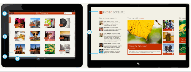
Specific examples show key differences. For example, in Windows 8, the user's attention is more concentrated on the content of the application due to the absence of some interface elements: the top navigation bar, the pagination interface, that is, the pagination, and the bottom tab panel.
More contextual information is displayed on the main page of the application, and the pictures themselves are drawn up in a different style: borderless, with smaller intervals.
')

The navigation hierarchy of iPad applications needs to be simplified to one level. For example, in an iPad application, the bottom tab panel is responsible for switching between two screens: viewing photos and viewing comments.
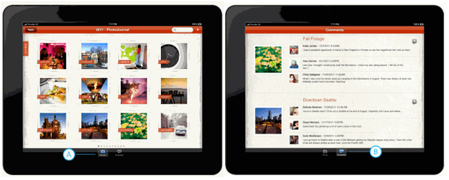
In the Metro interface, all this is simplified to one level.

Gestures instead of a finger. To select the calendar year, in the iPad application, press the "Year" button with your finger and select the desired year from the drop-down list. In Metro, this is done with a two-finger gesture, and the calendar interface corresponds to the Metro style.

In the case of Microsoft, we are talking about the differences between the iPad / Metro in the style of management, the implementation of horizontal and vertical orientation of the application, viewing modes, notifications and gestures on the touchscreen.
This guide is intended primarily for designers. In addition to it, a separate guide for the sale of Windows 8 applications , as well as a guide for developers, have been released .
Specific examples show key differences. For example, in Windows 8, the user's attention is more concentrated on the content of the application due to the absence of some interface elements: the top navigation bar, the pagination interface, that is, the pagination, and the bottom tab panel.
More contextual information is displayed on the main page of the application, and the pictures themselves are drawn up in a different style: borderless, with smaller intervals.
')
The navigation hierarchy of iPad applications needs to be simplified to one level. For example, in an iPad application, the bottom tab panel is responsible for switching between two screens: viewing photos and viewing comments.
In the Metro interface, all this is simplified to one level.
Gestures instead of a finger. To select the calendar year, in the iPad application, press the "Year" button with your finger and select the desired year from the drop-down list. In Metro, this is done with a two-finger gesture, and the calendar interface corresponds to the Metro style.
In the case of Microsoft, we are talking about the differences between the iPad / Metro in the style of management, the implementation of horizontal and vertical orientation of the application, viewing modes, notifications and gestures on the touchscreen.
This guide is intended primarily for designers. In addition to it, a separate guide for the sale of Windows 8 applications , as well as a guide for developers, have been released .
Source: https://habr.com/ru/post/140609/
All Articles