Web interface with a figurative representation of the menu block
After analyzing several existing Internet sites, such as: ru.asus.com (a leading manufacturer of computer components), bbc.com (site of the world's leading media agency), msu.ru (site of Moscow State University), admhmao.ru ( website of the administration of the Khanty-Mansi Autonomous Okrug - Ugra), it was found that the design of the user web-interface is reduced to the creation of a structure consisting of the following blocks:
1. Top, title part of the design of the web page ("header" or header).
2. The bottom, title part of the design of the web page ("basement" or footer).
3. The menu block, which can be located both horizontally and vertically. Menu items are often executed in block-text or symbolic form.
4. The block with the main content of the page (“content”), which may also contain additional functionality.
The methods in this design are mainly: the method of the "Golden Section", "Miller's Purse" and the "Principle of Grouping".
Due to the fact that the functionality of existing web applications is growing, and developers are trying to reach and attract as many users as possible, the interface of such applications can have a complex structured menu, and the content block of the title web page can exceed the physical dimensions of the computer monitor screen several times. In view of this, a new user, when working with such a web interface, has difficulty finding the right information and understanding the overall picture of the application.
')
Therefore, it became necessary to design the web interface in such a way that, from the point of view of a new user, the interface was as simple and convenient to use as possible.
To achieve this goal it is necessary to solve a number of tasks:
1. Replace the block-text menu with a set of familiar, easily recognizable images.
2. Combine a set of used images in one context.
3. Arrange the image elements in terms of optimal use of the working space.
4. Create additional interactive interface elements that provide assistance in working with the main functionality.
In the case of a designed web interface, the main target audience is “university graduates”, and there is an additional target audience - “employers”.
Based on the tasks, it was decided to replace the menu items (objects) with images (images) used to identify these objects. Selecting and activating the image causes the action associated with the selected menu object.
As the area of activity of the university division for which the web application is designed is the organization of interaction of graduates with the employer, it was decided to combine a set of images (images) into the contextual projection of the real workplace of the student, graduate or employer contact person. At the same time, the location of this set of images and the size of its elements were chosen in such a way that, at a monitor screen resolution of 1024x768 dpi, the contextual projection was reliable.
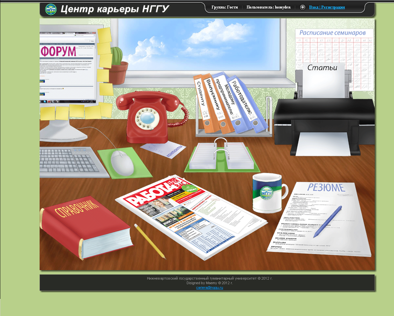
Fig. 1 Designed web page title layout.
During the design, the main controls were made in the form of images (Fig. 1), which serve to identify these elements (thematic sections).
Activation of these elements leads to the transition to the appropriate section.
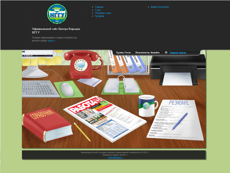
Fig. 2 View of a hidden panel with additional information.
Controls that are not part of the basic information, but are an integral part of the web interface (sections: "profile", "registration", "input", "feedback"), it was decided to put in a separate block (Fig. 2). Access to such a block is provided by the user when pressing a special button (“login / registration” in a buried form, “close the panel” in the open). In a minimized version, this block does not distract the user from working with the web interface.
Auxiliary interface elements were also created, such as “tooltips” (they appear when you move the cursor to an object of interest), which serve as an additional tool for teaching the interface.
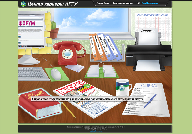
Fig.3 An example of the work of the “tooltip”.
1. Top, title part of the design of the web page ("header" or header).
2. The bottom, title part of the design of the web page ("basement" or footer).
3. The menu block, which can be located both horizontally and vertically. Menu items are often executed in block-text or symbolic form.
4. The block with the main content of the page (“content”), which may also contain additional functionality.
The methods in this design are mainly: the method of the "Golden Section", "Miller's Purse" and the "Principle of Grouping".
Due to the fact that the functionality of existing web applications is growing, and developers are trying to reach and attract as many users as possible, the interface of such applications can have a complex structured menu, and the content block of the title web page can exceed the physical dimensions of the computer monitor screen several times. In view of this, a new user, when working with such a web interface, has difficulty finding the right information and understanding the overall picture of the application.
')
Therefore, it became necessary to design the web interface in such a way that, from the point of view of a new user, the interface was as simple and convenient to use as possible.
To achieve this goal it is necessary to solve a number of tasks:
1. Replace the block-text menu with a set of familiar, easily recognizable images.
2. Combine a set of used images in one context.
3. Arrange the image elements in terms of optimal use of the working space.
4. Create additional interactive interface elements that provide assistance in working with the main functionality.
In the case of a designed web interface, the main target audience is “university graduates”, and there is an additional target audience - “employers”.
Based on the tasks, it was decided to replace the menu items (objects) with images (images) used to identify these objects. Selecting and activating the image causes the action associated with the selected menu object.
As the area of activity of the university division for which the web application is designed is the organization of interaction of graduates with the employer, it was decided to combine a set of images (images) into the contextual projection of the real workplace of the student, graduate or employer contact person. At the same time, the location of this set of images and the size of its elements were chosen in such a way that, at a monitor screen resolution of 1024x768 dpi, the contextual projection was reliable.
Fig. 1 Designed web page title layout.
During the design, the main controls were made in the form of images (Fig. 1), which serve to identify these elements (thematic sections).
Activation of these elements leads to the transition to the appropriate section.
Fig. 2 View of a hidden panel with additional information.
Controls that are not part of the basic information, but are an integral part of the web interface (sections: "profile", "registration", "input", "feedback"), it was decided to put in a separate block (Fig. 2). Access to such a block is provided by the user when pressing a special button (“login / registration” in a buried form, “close the panel” in the open). In a minimized version, this block does not distract the user from working with the web interface.
Auxiliary interface elements were also created, such as “tooltips” (they appear when you move the cursor to an object of interest), which serve as an additional tool for teaching the interface.
Fig.3 An example of the work of the “tooltip”.
Source: https://habr.com/ru/post/140094/
All Articles