Changes on Habré eyes of the developer from
I spread the promised small review of innovations and small, in my opinion, deficiencies (not bugs), which I tried to fix in the user script.
1) Consideration of the site at an angle of layout and scripts has generated a number of observations and observations that will be of interest to everyone - both the developers of the frontend and the rest of the users of the site.
2) A small, purely business message: a script that supports layout and makes various improvements to the interfaces on Habré, HabrAjax , has already been uploaded to its hosting with corrections taking into account the new layout. Of course, ZenComment styles have also been updated .
Further, the changes will contain a personal professional assessment, so I will allow every new thought to supply “Plus” or “Minus”, but everything, of course, is subjective.
')
(+)
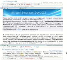
I would like to show in the illustrations how conveniently hubs and tags are located in the interface of the loaded article in the main mode HabrAjax + ZenComment. At the top and bottom of the article there are buttons-strips that folded the article after reading. Over the surface of the bottom button traditionally (several months already) tags were located. Now, in the exact same location above the top button are the hubs. The universe has become complete.
(+)
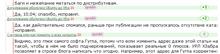
From the unobvious good in the changes in the layout, the appearance in the personal pages - in the comments, the sum of the votes “for” and “against” should be noted. Now, from the comments page, you can easily observe whether the “struggle” of pros and cons or whether it's just 0 is “peace and quiet” and no one reacts violently to the comment. The amounts will become apparent if you put the script " Charts of Interest ". Unfortunately, it is not yet integrated with HabrAjax, uploaded articles do not circle (TODO, rather make plug-ins for it!).
(-)
From the same, but not very good - in the old layouts of companies, including in the layout of the blog themselves TM there is no indication of opposite amounts of estimates.
(-)
The best in 24 hours is “blind”. It does not mark blogs or hubs, only article titles and links remain. Therefore, part of the payload, unfortunately, loses this sidebar section. And he was quite useful.
(+)
The site is even more distant from the old layout. Individual pages (favorites, comments) have long been her stronghold. Now they are in the camp of innovators.
(-)
Not all old layouts have died. The real and the hardest stronghold of the old - corporate blogs, for which in userscripts will have to contain the old code when walking on the DOM tree. They will live for a long time. They also invested money in them when they created their own unique individual style of layout. And now it is outdated.
(+)
The changes are not affected too much. Compared with October, the amount of corrections took one evening; however, some changes are even pleasant. For example, buttons to send comments.
(-)
The “Q & A” link in the subtitle of the list of articles leads not to the same place as the QA link in the menu.
(...)
The era of the old Habr is canceled completely. The links / all / and / all / new / have stopped working. Good or bad - to speak early. If the New link shows ALL new articles, then this is equivalent to the entire stream. If, for the sake of the whole stream, you have to sacrifice your blog filter and set all blogs selected, then the filters will be lost as marks on which topics you are interested in.
(-)
Remains ill-considered links "live" in the sidebar. The link points to the profile and the user message. If you think, then the cases that the user will be interested in this or that link are highly unlikely. Only if he knows the author of the post personally or wants to learn more about him. Much more often, the transitions are in content - in the title of the article. And get - on a specific comment. The script corrects this confusion, but it is better that it was originally so - a link to the article, and not to a specific post.
(-)
Remains a similar lack of thoughtful links in their comments. Links lead the opposite way to the article. And only the second one-character "#" - to comment. In this case, the author of the post, of course, is more interested in the answer to his post and comments in general, i.e. link #comments. (It will be necessary to fix the script.)
(-)
The words "Company Blog" take up a lot of space. Repeat often, so they can be reduced to a mark. For example, in HabrAjax companies used to stand out in color. Now the company name is the last hub. Therefore, if we highlight the company name in color, it will be recognizable in the hub row.
(-)
Lists of tags and hubs are stuck to the left edge, because of which they merge with other texts. No problem, in HabrAjax + ZenComment they stick to the right edge. To make the last hub more noticeable, its font is slightly larger. But so that it is not too long, its length is limited to 13 characters, if it is a company blog.
(+)
Filtering articles not on blogs, but on all hubs. Previously, HabrAjax has already been filtering blog articles. The blog was considered equivalent to the annotation text. If there is a stop word (or reg. Log) in the blog name, the annotation is minimized. Now the area of interest of the filter has spread to all hubs. As usual, 2 special filters are in separate settings: podcasts and company blogs.
(+) - HabrAjax
Tint translations and topic links. To make translations more recognizable, the title of the translation is highlighted with a blue background. Links - green.
(+) - HabrAjax
Font size in the title - depending on the length of the title.
(-)
Who needs a tenth of the rating? They take up space. As many as 2 characters of unnecessary data that you have to constantly filter with your eyes ??? No, better by the script. HabrAjax does this.
(-)
The word "Frontend" in the names of groups of blogs. Written through the "e".
Summarizing, we can conclude that the changes are more good than bad. First of all, because they are not so global compared to the previous ones (from October 2011) and move towards simplification through the generalization of the site system, and not to the multiplication of entities.
1) Consideration of the site at an angle of layout and scripts has generated a number of observations and observations that will be of interest to everyone - both the developers of the frontend and the rest of the users of the site.
2) A small, purely business message: a script that supports layout and makes various improvements to the interfaces on Habré, HabrAjax , has already been uploaded to its hosting with corrections taking into account the new layout. Of course, ZenComment styles have also been updated .
Further, the changes will contain a personal professional assessment, so I will allow every new thought to supply “Plus” or “Minus”, but everything, of course, is subjective.
')
(+)
I would like to show in the illustrations how conveniently hubs and tags are located in the interface of the loaded article in the main mode HabrAjax + ZenComment. At the top and bottom of the article there are buttons-strips that folded the article after reading. Over the surface of the bottom button traditionally (several months already) tags were located. Now, in the exact same location above the top button are the hubs. The universe has become complete.
(+)
From the unobvious good in the changes in the layout, the appearance in the personal pages - in the comments, the sum of the votes “for” and “against” should be noted. Now, from the comments page, you can easily observe whether the “struggle” of pros and cons or whether it's just 0 is “peace and quiet” and no one reacts violently to the comment. The amounts will become apparent if you put the script " Charts of Interest ". Unfortunately, it is not yet integrated with HabrAjax, uploaded articles do not circle (TODO, rather make plug-ins for it!).
(-)
From the same, but not very good - in the old layouts of companies, including in the layout of the blog themselves TM there is no indication of opposite amounts of estimates.
(-)
The best in 24 hours is “blind”. It does not mark blogs or hubs, only article titles and links remain. Therefore, part of the payload, unfortunately, loses this sidebar section. And he was quite useful.
(+)
The site is even more distant from the old layout. Individual pages (favorites, comments) have long been her stronghold. Now they are in the camp of innovators.
(-)
Not all old layouts have died. The real and the hardest stronghold of the old - corporate blogs, for which in userscripts will have to contain the old code when walking on the DOM tree. They will live for a long time. They also invested money in them when they created their own unique individual style of layout. And now it is outdated.
(+)
The changes are not affected too much. Compared with October, the amount of corrections took one evening; however, some changes are even pleasant. For example, buttons to send comments.
(-)
The “Q & A” link in the subtitle of the list of articles leads not to the same place as the QA link in the menu.
(...)
The era of the old Habr is canceled completely. The links / all / and / all / new / have stopped working. Good or bad - to speak early. If the New link shows ALL new articles, then this is equivalent to the entire stream. If, for the sake of the whole stream, you have to sacrifice your blog filter and set all blogs selected, then the filters will be lost as marks on which topics you are interested in.
(-)
Remains ill-considered links "live" in the sidebar. The link points to the profile and the user message. If you think, then the cases that the user will be interested in this or that link are highly unlikely. Only if he knows the author of the post personally or wants to learn more about him. Much more often, the transitions are in content - in the title of the article. And get - on a specific comment. The script corrects this confusion, but it is better that it was originally so - a link to the article, and not to a specific post.
(-)
Remains a similar lack of thoughtful links in their comments. Links lead the opposite way to the article. And only the second one-character "#" - to comment. In this case, the author of the post, of course, is more interested in the answer to his post and comments in general, i.e. link #comments. (It will be necessary to fix the script.)
(-)
The words "Company Blog" take up a lot of space. Repeat often, so they can be reduced to a mark. For example, in HabrAjax companies used to stand out in color. Now the company name is the last hub. Therefore, if we highlight the company name in color, it will be recognizable in the hub row.
(-)
Lists of tags and hubs are stuck to the left edge, because of which they merge with other texts. No problem, in HabrAjax + ZenComment they stick to the right edge. To make the last hub more noticeable, its font is slightly larger. But so that it is not too long, its length is limited to 13 characters, if it is a company blog.
(+)
Filtering articles not on blogs, but on all hubs. Previously, HabrAjax has already been filtering blog articles. The blog was considered equivalent to the annotation text. If there is a stop word (or reg. Log) in the blog name, the annotation is minimized. Now the area of interest of the filter has spread to all hubs. As usual, 2 special filters are in separate settings: podcasts and company blogs.
(+) - HabrAjax
Tint translations and topic links. To make translations more recognizable, the title of the translation is highlighted with a blue background. Links - green.
(+) - HabrAjax
Font size in the title - depending on the length of the title.
(-)
Who needs a tenth of the rating? They take up space. As many as 2 characters of unnecessary data that you have to constantly filter with your eyes ??? No, better by the script. HabrAjax does this.
(-)
The word "Frontend" in the names of groups of blogs. Written through the "e".
Summarizing, we can conclude that the changes are more good than bad. First of all, because they are not so global compared to the previous ones (from October 2011) and move towards simplification through the generalization of the site system, and not to the multiplication of entities.
Source: https://habr.com/ru/post/140019/
All Articles