Appeal to the developers of iPad applications for children
 I bring to your attention a free translation of the article.
 I often have to buy iPad apps for my two-year-old daughter. Observing how she uses them, I can definitely say what is right and what is wrong in them. I will take the responsibility to summarize these findings for all children, and to offer four basic principles for developers working on creating iPad apps for children.
1. Obvious interactive elements.
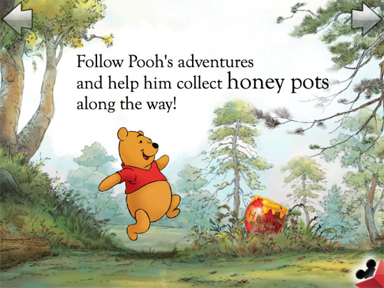
Usually in applications for children, there is a large variety of interactive elements on the screen. It can be anything: animals or parts of the interior. But most applications do not give instructions as to whether these elements are interactive or not. This usually leads to clicking on everything. The solution is simple, to make these elements obvious only in one type. For example, in the Winnie the Pooh Puzzle Book application from Disney, the honey in the pot is a bit mobile, meaning that you can “touch” it.

')
2. Pagination
Pagination is a very important part in applications for children, but each application does it in its own way. The most common method is touch arrows and paging. Both of these interactions are good solutions, but the arrows are much better suited for this purpose.
In addition, the entire bottom of the screen is a hot area. Children constantly touch this part of the tablet randomly, so you should avoid placing control elements there. I like how the application Old MacDonald implements this principle by placing arrows at the top of the screen.

3. Inaccessible menu
Again speaking about the bottom of the screen: do not put any interactive elements there, especially the main menu, which is not an important part of the game for the child. How many times have I had to help my child to continue the game, after random clicks at the bottom of the screen.
The Mickey Mouse Puzzle Book is an example of such a game.

PlayTales is an example of the correct implementation of the main menu. Firstly, the menu button is located in the upper right corner, which makes it less accessible if you press it accidentally (although it would be best to place it in the middle, then there would be room for page navigation buttons). Moreover, two sensor actions are used to activate it. One gesture removes translucency, another opens it. Although this is not the most reliable way to hide the menu from children, it allows you to avoid many random clicks.


4. Do not try to fool my child.
I look at you Talking Tom Cat . There are many talking applications, but this is the most provocative of occasional purchases. The screen is crammed with carefully selected icons, clicking on which leads to a random purchase - not to mention the large number of animated banners that distract from the application itself. I can put up with GoDaddy, who fraudulently force users to buy more domains, but if you try to use this tactic on my daughter, then we will say goodbye. Your applications will be deleted and all will soon be forgotten.

Conclusion
Developing apps for kids is very difficult. Not only the design features for this age became a difficult task, but also the management of such applications in which it is worth refraining from using advanced gestures that only confuse children (and subsequently their parents) is also in itself. However, all applications must follow certain principles described above.
UPD: The original article has been significantly modified and supplemented, thanks to all for the comments below.
Source: https://habr.com/ru/post/139883/
All Articles