Adapt graphics to the Retina screen.
Very often I find sites that look disgusting on iPhone4, and the point is not that most of them are not adapted for a small screen, but that developers do not take into account the new type of screens. I don’t want to look at the icons, I don’t want to click on the buttons, but from the pictures I really want ... to close the site. What is intended to lure the user to the site, to penetrate into its essence, and not to leave it right there - now it works quite the opposite. But iPhone users are generally accustomed to this situation, because The phone can not replace full-featured browsing.
However, quite recently Apple gave us an
Now that you are here, we will proceed directly to the methods for adapting graphics to screens with high pixel density.
')
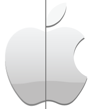
Method 1. Using SVG
.selector { background: url(../path_to_png/apple.png) no-repeat; } html.svg .selector { background-image: url(../path_to_svg/apple.svg); } Perfect for logos, icons, as well as any vector graphics.
This method gives the highest quality result, because the graphics will look equally clear at any approximation. However, SVG is a vector format, and your graphics should be correspondingly in a vector. To prepare the SVG file, you can use Adobe Illustrator, or another analogue (Inkscape, CorelDRAW).
Then everything is very simple. It is enough to specify the path to the SVG file in the CSS background-image property. However, there are browsers that do not support SVG . In this case, I recommend using Modernizr , as part of the HTML5 Boilerplate template, this will allow you to define directly supported functions, not browser versions.
Method 2. CSS Media Query and background-size property
.selector { background: url(../path_to_png/apple.png) no-repeat; } @media (-webkit-min-device-pixel-ratio: 2) { .selector { background-image: url(../path_to_png/apple@2x.png); background-size: cover; } } Using the “min-device-pixel-ratio” selector, devices with a pixel density of 2 and higher are determined, the picture is connected twice as large for them, and the background-size: cover property tells the browser that the existing picture needs to be scaled to block keeping proportions. Read about the background-size property and the values it can take
Method 3. Replacing src in pictures
jQuery( document ).ready(function(){ if( 'devicePixelRatio' in window && window.devicePixelRatio == 2 ){ var img_to_replace = jQuery( 'img.replace-2x' ).get(); for (var i=0,l=img_to_replace.length; i<l; i++) { var src = img_to_replace[i].src; src = src.replace(/\.(png|jpg|gif)+$/i, '@2x.$1'); img_to_replace[i].src = src; }; } }); In the HTML code we set the <img> tag with the required class, width or height, so that the enlarged picture does not spoil the design.
<img src="../path_to_png/apple.png" width="200" height="200" class="replace-2x" /> This method uses the window.devicePixelRatio property to define a screen with increased density, finds all the images that need to be adapted and replaces their src with a similar one, but with the addition of “@ 2x”. If you don’t want to write a class for each picture, then it’s pretty easy to modify the code above so that it finds any pictures. In my opinion, this method is not the best and I would use it with extreme caution.
Method 4. Cookies and non-server solution
(function(){ if( document.cookie.indexOf('device_pixel_ratio') == -1 && 'devicePixelRatio' in window && window.devicePixelRatio == 2 ){ document.cookie = 'device_pixel_ratio=' + window.devicePixelRatio + ';'; window.location.reload(); } })(); Using JavaScript, this method allows you to set a cookie once and reload the page. Further, on the basis of this cookie, the server may decide to immediately issue an adapted picture for screens with increased density.
Finally, a link to the demo , only the owners of devices with a Retina screen will notice the difference.
At last
Try to make the most of the CSS features for creating buttons, shadows, gradients, and other elements on your page. These elements look great at any scale and pixel density, but do not forget about the graceful degradation for older browsers.
I will be glad to hear from you about the problems that you encountered when adapting to Retina screens and solutions that I missed.
Source: https://habr.com/ru/post/139682/
All Articles