The Tale of wx.Python
Hello Habrhabr!
In this article I would like to tell, to formulate my thoughts about such a wonderful library as wxPython . Under the cat you will find a small theory, description of forms, analysis of the properties of forms, various controls and all that concerns wxPython.
Welcome to wxPython .
')
Some theory-entry.
1. wxPython in action (Russian) - the Russian version of the book (I can’t say anything about its quality and origin, as I prefer the original, but actually it’s wxPython in action (English) - here it costs $ 54 in paper form (electronic I hope you will find it yourself.) The general opinion is excellent. Everything is described and written in detail. Of course, many moments are not described in detail, and some things are best seen in the documentation , but in general all the examples are true, the workers. perfect for beginners.
2. wxPython 2.8 Application Development Cookbook . This book in the Russian version did not even try to find it, because most likely it does not exist. This book contains “recipes” for writing GUI forms, which are often not trivial and not easy to parse (although there are attempts to understand each line in the book. It is quite easy to read.
3. python.su is a great forum with a good base of topics on various topics. Do not think for advertising, but it is really good, it’s a pity that it’s not working steadily lately.
4. habrahabr.ru - and here I was in for a fiasco. At that time, when I looked, there was not a single article on this library. Only not long ago a small article of the basics flashed (those that are written in the book on the front pages). Actually, even then I had an idea to write this article.
Looking ahead, I want to immediately advise several tools that I found after a long time working with the library.
1. wxPythom demos and docs . This is the best example of any controls and forms written using the wxpython library. There you will find examples of various forms and controls, lists, trees, and various combinations thereof. The sources of all these examples are not rich in comments, so it’s even good that I found it later, when I understood what was happening, it made it very easy to understand what was happening.
2. wxFormBuilder is a form and control application for wxPython (and not only). I found this application when I wrote about 30 forms with my hands. Those. everything was written by hands, from the size of the form, to the use of various types of sizers and their properties. Then I could just save time, since I knew what and where, how and why. This application does not have the full functionality of the entire library, and this is understandable, wx is a complex and very voluminous library, the complete writing of the library constructor will take a huge amount of time, and there is no special need for this. Throwing and making forms with the help of this application is not necessary at once, then you will not catch even 30% of the library’s entire functionality and your interface will be limited to three buttons and two events.
Before you begin to delve into various types of windows and their properties, you need to learn a few things, without which it will be difficult to understand what and how it should be:
1. All elements must be in Sizer. A saiser ( wx.Sizer ) is an invisible form element that indicates the location of all form components.
2. The hierarchy is as follows: The form ( wx.Frame ) contains a saiser on it, a container - panel ( wx.Panel ) is added to the saiser, another saiser is added to the panel, and all the elements of the form are added to this saiser.
3. It is wrong to add a component to the panel without adding it to the saser (and wxFormBuilder will not allow you to do this).
4. The properties of all controls can not be fully prescribed. Suppose if the size of the text input field is not important to you, then it will automatically be built as standard.
There are several types of forms in wx:
wx.Dialog is a dialog box.
wx.Frame - the usual form representing a window with standard functionality (minimize ( wx.ICONIZE ), maximize ( wx.MAXIMIZE ), close ( wx.Close )).
The usual wx.Frame in the code:
This line of code initializes the form and draws it using the entered properties. By the way of saying:
Also draws a form, and all the properties of the form will be standard.
self and parent are two required parameters of any form.
Let's sort the form initialization:
self indicates class membership, parent is the parent of this window. id - each element, the window has its own id to address or assign an element an action, an event. You can not bother with this and put -1 or wx.ID_ANY - which formalizes any id (Each element must have its own unique id, which can be used for reversal or for assigning actions to an element; if it is not required, then you can set the id the value of wx.ID_ANY, which, in fact, is -1.). title - window title, pos - location of the form in the x and y coordinates on the screen, size - size of the form in pixels, style - window style. You can see all sorts of styles in the documentation. I will note a few:
wx.CAPTION - displays the top bar with the title, but without the system menu; wx.STAY_ON_TOP - stay on top of windows of other applications, I would like to note one detail: if several windows have this style, then the window that will be higher in the parent hierarchy in the application will remain on the “top”; wx.SYSTEM_MENU - a “close” button appears on the top bar, but it is not active;
The differences between Dialog and Frame are as follows:
1. Dialog modal window, i.e. until you perform actions in this window, the user will not be able to go to any other window that is open
this application.
2. The Dialog window contains a panel already, therefore for the dialog window only a sizer is needed and all elements should already be located on this sizer.
3. The dialog box can do without additional events on the buttons (more on this later).
The abundance of various controls that the library has is amazing. Everything is here, from buttons to a notebook with tabs (there are several types of them).
It is meaningless to talk here about everything in a row, it will drag on for several months, so let's briefly go over several elements, explaining moments that are standard for almost all controls and elements.
The simplest elements are shown in the following piece of code:
Initialization window type wx.Frame , as you can see all the properties are present. Some of them are given to standard values. Here you should pay attention to the layout of styles. We get a window with the top bar, and the system menu in the form of an inactive “Close” button. Also, the window will always be active ( wx.STAY_ON_TOP ). Sizer announcement. The wx.BoxSizer sizer type is a box. All items to line up one after another in a line either horizontally or vertically (the argument passed to the saiser is responsible for this, in this case it is wx.HORIZONTAL ). Announcement laptop (tabbed panel). For a start, it is given a name: self.regexps_notebook , so that it can be generated to it from any method of the class. Next comes the announcement of the wx.Notebook component with properties. The ad panel that fits on the laptop. Note that the panel placed on the laptop will be a platform for all tabs. Also, placing a panel in the role of a notebook tab does not require a separate Sizer (this contradicts the fact that all elements must be in Sizers, that is, this is an exception to this rule)
Announcement of the second Sizer. The minimum size of the saser. Add a new checkbox component. Add it to the self.dq_params_tab panel, i.e. on the laptop tab.
An important point. Adding the created checkbox to the saser, this is the same saser that lies on the panel (tab). The addition has the following structure: sizer2 - created saiser, Add - we call the method of Adding an element, and the arguments of the Add method: what we add ( self.use_param_checkbox , wx.ALL - this is the display parameter, in this case, the elmenet will be shown in full size, 0 (this is the proportionality of the element and 5 (this is the size of the element borders) Next is the drop-down list with values. Actually self.params_quality_choices is a list of values. Next is the wx.Choice element which too omeschaetsya tab.
Here we have an additional option. wx.EXPAND - this means that the added element will stretch in width, depending on its size. Adding a text box for entering wx.TextCtrl . There is an additional option validator . This will be explained in another code.
Come to an interesting point. After adding all the elements to the saiser ( sizer2 ), which is on the panel ( self.dq_params_tab ), it is necessary to “expand” the saiser to the entire area of the panel and fix the saiser to the panel.
Add listbox ( wx.ListBox ). Options wx.LB_HSCROLL | wx.LB_SINGLE indicate the presence of a horizontal scroll and that you can select only one item in the list. Creating a grid. Further, all described in the comments.
The syntax of the digressions is a bit confusing, since the lines are longer. Such is the library syntax.
The code omits similar constructions and the location of elements, but if we run the full code of the entire module, we will see the following (if anyone is interested in the full code, write):
1st tab
2nd tab

3rd tab.
Having disassembled some elementary elements we will pass to more difficult things.
The control sheet is a universal element and we see it very often in various applications.
Now we will analyze the code for building a list of controls for random data.
The class declaration as an argument is passed to the listmix 'a component to sort the data into columns. Next is the initialization of the list control in which all the most intimate occurs.
We transfer to it the name of columns ( columns ) and lines ( rows ). The length of the list with rows must be equal to the length of the list with the name of the columns. We call list.control self.list and set properties for it.
Concerning the properties: wx.LC_REPORT style - list control in the form of column names on top, all the data under the columns, as a table, is a certain similarity. The rest of the styles are understandable based on the translation from English.
Further, a cleverly clever data generation algorithm. This has nothing to do with wx, so I will not write down in detail. But the point is
that the data for the control list should be of the following form:
rows = {1 :( "data0", "data0.1", "data0.2"), 2 :( "data1", "data1.0", "data1.1", "data1.2"), ... }
The above algorithm leads random data to this form.
We set the size of the list control, the size of the column and the event bindim (more on this later). Next is not quite a working piece of code, since
self.itemDataMap should be equal to the data reduced to the form as shown above, at the moment data is immediately entered into the list control, without sorting.
Right-clicking on the data line will give us the sequence number of this line. The OnColClick method will give us the serial number of the column. And when we select a row with data, we are in a variable
self.data will be recorded with a list of data that we have selected (just such here, the getColumnText method is used, with the help of it we pull data from each column.

An example of built listcontrol.
Now, let's move into an integral part of any application - the menu.
Ad menubar. Menubar is a bar where all menu items with drop-down lists are located. self.BD = wx.Menu () - creating a menu item, then adding
menu items in self.BD. We will examine in more detail:
wx.MenuItem ( to which menu we add the menu item, id, name \ hotkey, help text displayed in the status line (if there is one), type of menu item )
After the name, a hot key goes through the \ t (tab character), by clicking on which the menu item will be called if it is active. Handle this event additionally is not necessary.
Types of menu items can be different:
wx.ITEM_RADIO - menu item in the video radio buttons, wx.ITEM_CHECK - in the form of a checkbox,
Next, we add several menu items in the same way.
Creating a status bar. And we present one of the menu items inactive. The argument True is active. We also add text to the status bar immediately when the class is initialized.
And here is the menu.
Any item, any form are subject to influence by the user. With the wxPython library, you can describe absolutely any actions of the user, and not only the user, but also the program.
Let's start with the rules of the announcement of events. We have a button:
And we want the program to add 2 + 2 by pressing the button:
The OnOk method will trigger a button click. Actually, this is the whole essence of events. The differences are only in wx.EVT_BUTTON (in the event being processed) and the element on which we hang this event (in our case it is the self.ok_btn button.
Event # 1 will trigger on pressing the corresponding menu item, and event # 2 will appear when a form is idle (user inactivity) when it appears.
Any text field needs to be validated by the user in order to protect it from expected errors. For this wx offers validators - self-test checks. They are handwritten, because there are no embedded checks, each validator must be described.
Here is an example with explanations:
Create a class whose argument we give wx.PyValidator which says that this class is a validator.
The OnChar method is described by the self.Bind event (wx.EVT_CHAR, self.OnChar) , and will be executed when typing characters. With the command key = event.GetKeyCode (), we catch the code of each keystroke, and the built-in function chr () translates the code symbol into the usual representation of a pressed key. string.digits contains a list of numbers from 0 to 9, also in the class string there are almost all the characters that are entered from the keyboard, up to hexdigits (unfortunately there are even ascii characters, but Russian, as far as I understand, is not included ).
Validate method.
tc = self.GetWindow () determines the window where the text field is located, the val value entered, then the check loop. This validator will not allow the user to press any key except numbers, points and backspace. By the way, about backspace, wx describes all the keys, wx.WXK_Numpad0 for example, but the backspace is not there, everything is from F1 to Numlock, so I had to track the key values.
After writing the validator, it is necessary to define a text field and point it to the validator that corresponds to it.
That's all for it. The article turned out to be very voluminous and a bit confused. That's because if you start describing ALL the properties and events that can be tied to, say, wx.ListCtrl, then the article will turn out even more than this. If you liked the article and it makes sense to continue, then I will start writing the next one, revealing other elements and features of the library, for example wx.aui - this is an advanced notebook with tabs, where there is where to turn.
Thanks for attention.
ADDITION:
Code
class regexps (wx.Frame):
def __init __ (self, main, schema, table, connection):
wx.Frame .__ init__ (self, parent = None, id = wx.ID_ANY, ...)
can be rewritten more beautifully through super:
class regexps (wx.Frame):
def __init __ (self, main, schema, table, connection):
super (regexps, self) .__ init__ (parent = None, id = wx.ID_ANY, ...)
by Jenyay
In this article I would like to tell, to formulate my thoughts about such a wonderful library as wxPython . Under the cat you will find a small theory, description of forms, analysis of the properties of forms, various controls and all that concerns wxPython.
Welcome to wxPython .
the initial data
')
Some theory-entry.
1. wxPython in action (Russian) - the Russian version of the book (I can’t say anything about its quality and origin, as I prefer the original, but actually it’s wxPython in action (English) - here it costs $ 54 in paper form (electronic I hope you will find it yourself.) The general opinion is excellent. Everything is described and written in detail. Of course, many moments are not described in detail, and some things are best seen in the documentation , but in general all the examples are true, the workers. perfect for beginners.
2. wxPython 2.8 Application Development Cookbook . This book in the Russian version did not even try to find it, because most likely it does not exist. This book contains “recipes” for writing GUI forms, which are often not trivial and not easy to parse (although there are attempts to understand each line in the book. It is quite easy to read.
3. python.su is a great forum with a good base of topics on various topics. Do not think for advertising, but it is really good, it’s a pity that it’s not working steadily lately.
4. habrahabr.ru - and here I was in for a fiasco. At that time, when I looked, there was not a single article on this library. Only not long ago a small article of the basics flashed (those that are written in the book on the front pages). Actually, even then I had an idea to write this article.
Looking ahead, I want to immediately advise several tools that I found after a long time working with the library.
1. wxPythom demos and docs . This is the best example of any controls and forms written using the wxpython library. There you will find examples of various forms and controls, lists, trees, and various combinations thereof. The sources of all these examples are not rich in comments, so it’s even good that I found it later, when I understood what was happening, it made it very easy to understand what was happening.
2. wxFormBuilder is a form and control application for wxPython (and not only). I found this application when I wrote about 30 forms with my hands. Those. everything was written by hands, from the size of the form, to the use of various types of sizers and their properties. Then I could just save time, since I knew what and where, how and why. This application does not have the full functionality of the entire library, and this is understandable, wx is a complex and very voluminous library, the complete writing of the library constructor will take a huge amount of time, and there is no special need for this. Throwing and making forms with the help of this application is not necessary at once, then you will not catch even 30% of the library’s entire functionality and your interface will be limited to three buttons and two events.
introduction
Before you begin to delve into various types of windows and their properties, you need to learn a few things, without which it will be difficult to understand what and how it should be:
1. All elements must be in Sizer. A saiser ( wx.Sizer ) is an invisible form element that indicates the location of all form components.
2. The hierarchy is as follows: The form ( wx.Frame ) contains a saiser on it, a container - panel ( wx.Panel ) is added to the saiser, another saiser is added to the panel, and all the elements of the form are added to this saiser.
3. It is wrong to add a component to the panel without adding it to the saser (and wxFormBuilder will not allow you to do this).
4. The properties of all controls can not be fully prescribed. Suppose if the size of the text input field is not important to you, then it will automatically be built as standard.
basic elements
There are several types of forms in wx:
wx.Dialog is a dialog box.
wx.Frame - the usual form representing a window with standard functionality (minimize ( wx.ICONIZE ), maximize ( wx.MAXIMIZE ), close ( wx.Close )).
The usual wx.Frame in the code:
wx.Frame.__init__ ( self, parent=None, id = wx.ID_ANY, title = u"NameWindow", pos = wx.DefaultPosition, size = wx.Size( int,int ), style = wx.CAPTION ) This line of code initializes the form and draws it using the entered properties. By the way of saying:
wx.Frame.__init__ (self, parent = None) Also draws a form, and all the properties of the form will be standard.
self and parent are two required parameters of any form.
Let's sort the form initialization:
self indicates class membership, parent is the parent of this window. id - each element, the window has its own id to address or assign an element an action, an event. You can not bother with this and put -1 or wx.ID_ANY - which formalizes any id (Each element must have its own unique id, which can be used for reversal or for assigning actions to an element; if it is not required, then you can set the id the value of wx.ID_ANY, which, in fact, is -1.). title - window title, pos - location of the form in the x and y coordinates on the screen, size - size of the form in pixels, style - window style. You can see all sorts of styles in the documentation. I will note a few:
wx.CAPTION - displays the top bar with the title, but without the system menu; wx.STAY_ON_TOP - stay on top of windows of other applications, I would like to note one detail: if several windows have this style, then the window that will be higher in the parent hierarchy in the application will remain on the “top”; wx.SYSTEM_MENU - a “close” button appears on the top bar, but it is not active;
The differences between Dialog and Frame are as follows:
1. Dialog modal window, i.e. until you perform actions in this window, the user will not be able to go to any other window that is open
this application.
2. The Dialog window contains a panel already, therefore for the dialog window only a sizer is needed and all elements should already be located on this sizer.
3. The dialog box can do without additional events on the buttons (more on this later).
The abundance of various controls that the library has is amazing. Everything is here, from buttons to a notebook with tabs (there are several types of them).
It is meaningless to talk here about everything in a row, it will drag on for several months, so let's briefly go over several elements, explaining moments that are standard for almost all controls and elements.
The simplest elements are shown in the following piece of code:
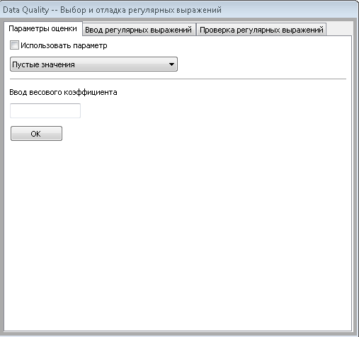
class regexps ( wx.Frame ): def __init__( self, main, schema, table, connection ): wx.Frame.__init__ ( self, parent=None, id = wx.ID_ANY, title = u"Data Quality -- ", pos = wx.DefaultPosition, size = wx.Size( 510,477 ), style = wx.CAPTION|wx.STAY_ON_TOP|wx.TAB_TRAVERSAL ) sizer1 = wx.BoxSizer( wx.HORIZONTAL ) self.regexps_notebook = wx.Notebook( self, wx.ID_ANY, wx.DefaultPosition, wx.DefaultSize, 0 ) self.dq_params_tab = wx.Panel( self.regexps_notebook, wx.ID_ANY, wx.DefaultPosition, wx.DefaultSize, wx.TAB_TRAVERSAL ) Initialization window type wx.Frame , as you can see all the properties are present. Some of them are given to standard values. Here you should pay attention to the layout of styles. We get a window with the top bar, and the system menu in the form of an inactive “Close” button. Also, the window will always be active ( wx.STAY_ON_TOP ). Sizer announcement. The wx.BoxSizer sizer type is a box. All items to line up one after another in a line either horizontally or vertically (the argument passed to the saiser is responsible for this, in this case it is wx.HORIZONTAL ). Announcement laptop (tabbed panel). For a start, it is given a name: self.regexps_notebook , so that it can be generated to it from any method of the class. Next comes the announcement of the wx.Notebook component with properties. The ad panel that fits on the laptop. Note that the panel placed on the laptop will be a platform for all tabs. Also, placing a panel in the role of a notebook tab does not require a separate Sizer (this contradicts the fact that all elements must be in Sizers, that is, this is an exception to this rule)
sizer2 = wx.BoxSizer( wx.VERTICAL ) self.use_param_checkbox = wx.CheckBox( self.dq_params_tab, wx.ID_ANY, u" ", wx.DefaultPosition, wx.DefaultSize, 0 ) Announcement of the second Sizer. The minimum size of the saser. Add a new checkbox component. Add it to the self.dq_params_tab panel, i.e. on the laptop tab.
sizer2.Add( self.use_param_checkbox, 0, wx.ALL, 5 ) self.params_quality_choices = [1,2,3,4,5,6,7,8,9,10] self.params_choice_pull = wx.Choice( self.dq_params_tab, wx.ID_ANY, wx.DefaultPosition, wx.DefaultSize, self.params_quality_choices, 0 ) # , wx.Choice. self.params_choice_pull.SetSelection( 0 ) # . self.static_line = wx.StaticLine( self.dq_params_tab, wx.ID_ANY, wx.DefaultPosition, wx.DefaultSize, wx.LI_HORIZONTAL ) An important point. Adding the created checkbox to the saser, this is the same saser that lies on the panel (tab). The addition has the following structure: sizer2 - created saiser, Add - we call the method of Adding an element, and the arguments of the Add method: what we add ( self.use_param_checkbox , wx.ALL - this is the display parameter, in this case, the elmenet will be shown in full size, 0 (this is the proportionality of the element and 5 (this is the size of the element borders) Next is the drop-down list with values. Actually self.params_quality_choices is a list of values. Next is the wx.Choice element which too omeschaetsya tab.
sizer2.Add( self.static_line, 0, wx.EXPAND |wx.ALL, 5 ) self.static_text = wx.StaticText( self.dq_params_tab, wx.ID_ANY, u" ", wx.DefaultPosition, wx.DefaultSize, 0 ) sizer2.Add( self.static_text, 0, wx.ALL, 5 ) self.weights_txt = wx.TextCtrl( self.dq_params_tab, validator = WeightsValidator() ) sizer2.Add( self.weights_txt, 0, wx.ALL, 5 ) Here we have an additional option. wx.EXPAND - this means that the added element will stretch in width, depending on its size. Adding a text box for entering wx.TextCtrl . There is an additional option validator . This will be explained in another code.
self.dq_params_tab.SetSizer( sizer2 ) self.dq_params_tab.Layout() sizer2.Fit( self.dq_params_tab ) # . self.regexps_notebook.AddPage( self.dq_params_tab, u" ", False ) self.regexps_tab = wx.Panel( self.regexps_notebook, wx.ID_ANY, wx.DefaultPosition, wx.DefaultSize, wx.TAB_TRAVERSAL ) sizer3 = wx.BoxSizer( wx.VERTICAL ) Come to an interesting point. After adding all the elements to the saiser ( sizer2 ), which is on the panel ( self.dq_params_tab ), it is necessary to “expand” the saiser to the entire area of the panel and fix the saiser to the panel.
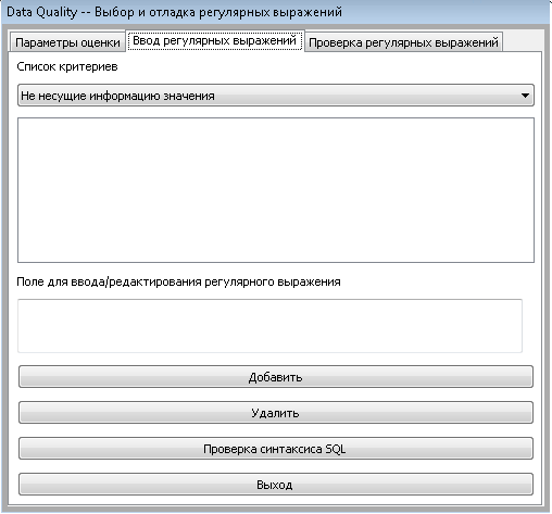
regexps_listboxChoices = [] self.regexps_listbox = wx.ListBox( self.regexps_tab, wx.ID_ANY, wx.DefaultPosition, wx.DefaultSize, regexps_listboxChoices, wx.LB_HSCROLL|wx.LB_SINGLE ) # (wx.grid.Grid). , mysql, oracle, sqlite and etc. , . self.check_grid = wx.grid.Grid( self.check_sql_tab, wx.ID_ANY, wx.DefaultPosition, wx.Size(480,407), wx.HSCROLL|wx.VSCROLL ) # , . # Grid self.check_grid.CreateGrid( 5, 5 ) # . self.check_grid.EnableEditing( False ) self.check_grid.EnableGridLines( True ) self.check_grid.EnableDragGridSize( False ) self.check_grid.SetMargins( 0, 0 ) # # Columns self.check_grid.EnableDragColMove( False ) self.check_grid.EnableDragColSize( False ) self.check_grid.SetColLabelSize( 20 ) self.check_grid.SetColLabelAlignment( wx.ALIGN_CENTRE, wx.ALIGN_CENTRE ) # . # Rows self.check_grid.AutoSizeRows( True ) self.check_grid.EnableDragRowSize( True ) self.check_grid.SetRowLabelSize( 40 ) self.check_grid.SetRowLabelAlignment( wx.ALIGN_CENTRE, wx.ALIGN_CENTRE ) Add listbox ( wx.ListBox ). Options wx.LB_HSCROLL | wx.LB_SINGLE indicate the presence of a horizontal scroll and that you can select only one item in the list. Creating a grid. Further, all described in the comments.
The syntax of the digressions is a bit confusing, since the lines are longer. Such is the library syntax.
The code omits similar constructions and the location of elements, but if we run the full code of the entire module, we will see the following (if anyone is interested in the full code, write):
1st tab
2nd tab
3rd tab.
building list control
Having disassembled some elementary elements we will pass to more difficult things.
The control sheet is a universal element and we see it very often in various applications.
Now we will analyze the code for building a list of controls for random data.
class main_stat(listmix.ColumnSorterMixin): def __init__( self, rows, columns ): data = [] self.columns = columns self.rows = rows self.list = wx.ListCtrl(self.main.panelMainStat, 0, style=wx.LC_REPORT | wx.BORDER_NONE | wx.LC_EDIT_LABELS | wx.LC_SORT_ASCENDING | wx.LC_SINGLE_SEL) The class declaration as an argument is passed to the listmix 'a component to sort the data into columns. Next is the initialization of the list control in which all the most intimate occurs.
We transfer to it the name of columns ( columns ) and lines ( rows ). The length of the list with rows must be equal to the length of the list with the name of the columns. We call list.control self.list and set properties for it.
Concerning the properties: wx.LC_REPORT style - list control in the form of column names on top, all the data under the columns, as a table, is a certain similarity. The rest of the styles are understandable based on the translation from English.
for col, text in enumerate(self.columns): self.list.InsertColumn(col, text) for item in rows: info = '%s:(%s)' % (col, item) data.append(info) index = self.list.InsertStringItem(sys.maxint, item[0]) for col, text in enumerate(item[1:]): self.list.SetStringItem(index, col+1, text) Further, a cleverly clever data generation algorithm. This has nothing to do with wx, so I will not write down in detail. But the point is
that the data for the control list should be of the following form:
rows = {1 :( "data0", "data0.1", "data0.2"), 2 :( "data1", "data1.0", "data1.1", "data1.2"), ... }
The above algorithm leads random data to this form.
self.list.SetSize((900, 200)) self.list.SetColumnWidth(0, 120) self.list.Bind(wx.EVT_LIST_COL_CLICK, self.OnColClick, self.list) self.list.Bind(wx.EVT_COMMAND_RIGHT_CLICK, self.OnRightClick) self.list.Bind(wx.EVT_LIST_ITEM_SELECTED, self.OnItemSelected) self.itemDataMap = data listmix.ColumnSorterMixin.__init__(self, 3) We set the size of the list control, the size of the column and the event bindim (more on this later). Next is not quite a working piece of code, since
self.itemDataMap should be equal to the data reduced to the form as shown above, at the moment data is immediately entered into the list control, without sorting.
def getColumnText(self, index, col): item = self.list.GetItem(index, col) return item.GetText() def OnRightClick(self, event): index = self.list.GetFirstSelected() print index def OnColClick(self, event): print ("OnColClick: %d\n" % event.GetColumn()) event.Skip() def OnItemSelected(self, event): self.currentItem = event.m_itemIndex self.data = (self.getColumnText(self.currentItem, 1), self.getColumnText(self.currentItem, 2), self.getColumnText(self.currentItem, 3), self.getColumnText(self.currentItem, 4))( True ) Right-clicking on the data line will give us the sequence number of this line. The OnColClick method will give us the serial number of the column. And when we select a row with data, we are in a variable
self.data will be recorded with a list of data that we have selected (just such here, the getColumnText method is used, with the help of it we pull data from each column.
An example of built listcontrol.
menu
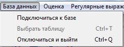
Now, let's move into an integral part of any application - the menu.
self.menubar = wx.MenuBar( 0 ) self.BD = wx.Menu() self.m_menuItem1 = wx.MenuItem( self.BD, 1, u" ", u' ', wx.ITEM_NORMAL ) self.BD.AppendItem(self.m_menuItem1, ) self.m_menuItem2 = wx.MenuItem( self.BD, 2, u" \tCtrl+T", u' ', wx.ITEM_NORMAL ) self.BD.AppendItem( self.m_menuItem2 ) self.m_menuItem3 = wx.MenuItem( self.BD, 3, u" \tCtrl+Q", u' ', wx.ITEM_NORMAL ) self.BD.AppendItem( self.m_menuItem3 ) Ad menubar. Menubar is a bar where all menu items with drop-down lists are located. self.BD = wx.Menu () - creating a menu item, then adding
menu items in self.BD. We will examine in more detail:
self.m_menuItem1 = wx.MenuItem( self.BD, 1, u" ", u' ', wx.ITEM_NORMAL ) wx.MenuItem ( to which menu we add the menu item, id, name \ hotkey, help text displayed in the status line (if there is one), type of menu item )
After the name, a hot key goes through the \ t (tab character), by clicking on which the menu item will be called if it is active. Handle this event additionally is not necessary.
Types of menu items can be different:
wx.ITEM_RADIO - menu item in the video radio buttons, wx.ITEM_CHECK - in the form of a checkbox,
Next, we add several menu items in the same way.
self.statusbar = self.CreateStatusBar( 1, wx.ST_SIZEGRIP, wx.ID_ANY ) self.BD.Enable(2, False) self.statusbar.SetStatusText(u' , , .') Creating a status bar. And we present one of the menu items inactive. The argument True is active. We also add text to the status bar immediately when the class is initialized.
And here is the menu.
event-driven environment
Any item, any form are subject to influence by the user. With the wxPython library, you can describe absolutely any actions of the user, and not only the user, but also the program.
Let's start with the rules of the announcement of events. We have a button:
self.ok_btn = wx.Button( self.m_panel5, wx.ID_ANY, u"OK", wx.DefaultPosition, wx.DefaultSize, 0 ) And we want the program to add 2 + 2 by pressing the button:
self.ok_btn.Bind( wx.EVT_BUTTON, self.OnOk ) # # self.Bind( wx.EVT_BUTTON, self.OnOk, self.ok_btn ) def OnOk(self, event): a = 2+2 print a The OnOk method will trigger a button click. Actually, this is the whole essence of events. The differences are only in wx.EVT_BUTTON (in the event being processed) and the element on which we hang this event (in our case it is the self.ok_btn button.
# 1 self.Bind(wx.EVT_MENU, self.About, id=10) # 2 self.Bind( wx.EVT_IDLE, self.OnInit ) Event # 1 will trigger on pressing the corresponding menu item, and event # 2 will appear when a form is idle (user inactivity) when it appears.
validators
Any text field needs to be validated by the user in order to protect it from expected errors. For this wx offers validators - self-test checks. They are handwritten, because there are no embedded checks, each validator must be described.
Here is an example with explanations:
class Numbers(wx.PyValidator): def __init__(self): wx.PyValidator.__init__(self) self.Bind(wx.EVT_CHAR, self.OnChar) def Clone(self): return Numbers() def Validate(self, win): tc = self.GetWindow() val = tc.GetValue() for x in val: if x not in string.digits: return False return True def OnChar(self, event): key = event.GetKeyCode() try: # 8 backspace if chr(key) in string.digits or chr(key) == '.' or key == 8: event.Skip() else: return False except ValueError, info: print chr(key) print info return Create a class whose argument we give wx.PyValidator which says that this class is a validator.
The OnChar method is described by the self.Bind event (wx.EVT_CHAR, self.OnChar) , and will be executed when typing characters. With the command key = event.GetKeyCode (), we catch the code of each keystroke, and the built-in function chr () translates the code symbol into the usual representation of a pressed key. string.digits contains a list of numbers from 0 to 9, also in the class string there are almost all the characters that are entered from the keyboard, up to hexdigits (unfortunately there are even ascii characters, but Russian, as far as I understand, is not included ).
Validate method.
tc = self.GetWindow () determines the window where the text field is located, the val value entered, then the check loop. This validator will not allow the user to press any key except numbers, points and backspace. By the way, about backspace, wx describes all the keys, wx.WXK_Numpad0 for example, but the backspace is not there, everything is from F1 to Numlock, so I had to track the key values.
After writing the validator, it is necessary to define a text field and point it to the validator that corresponds to it.
self.ip_ctrl = wx.TextCtrl( self.m_panel5, wx.ID_ANY, wx.EmptyString, wx.DefaultPosition, wx.Size( 190,-1 ), 0, Numbers() ) That's all for it. The article turned out to be very voluminous and a bit confused. That's because if you start describing ALL the properties and events that can be tied to, say, wx.ListCtrl, then the article will turn out even more than this. If you liked the article and it makes sense to continue, then I will start writing the next one, revealing other elements and features of the library, for example wx.aui - this is an advanced notebook with tabs, where there is where to turn.
Thanks for attention.
ADDITION:
Code
class regexps (wx.Frame):
def __init __ (self, main, schema, table, connection):
wx.Frame .__ init__ (self, parent = None, id = wx.ID_ANY, ...)
can be rewritten more beautifully through super:
class regexps (wx.Frame):
def __init __ (self, main, schema, table, connection):
super (regexps, self) .__ init__ (parent = None, id = wx.ID_ANY, ...)
by Jenyay
Source: https://habr.com/ru/post/139560/
All Articles