Designing Interfaces for Small Children
I bring to your attention a free translation of the article Avi Itzkovitch Designing Experiments for Young Kids: Child Proofing your Application
 I was recently lucky enough to work on an interactive book for preschool children (2-5 years old) for the iPad and Android platforms. When designing for small children, it is necessary to look at things from the point of view of the child, and, in the process of working on the project, I received for myself several important lessons.
Children are curious and want to explore everything. As a rule, they touch with hands everything that they see, and may notice something that adults usually do not notice. For example, children are not subject to banner blindness , for them this is another opportunity to find out what will happen if you click on it. Most of the problems of young users cause the ability to navigate in the application, because they are afraid to click something wrong. Advertising, a random touch, or just a menu button can make it harder for a child to use the app.
Children learn the interface, touching on everything, trying to figure out everything that is possible. Banners and buttons like Facebook can work in some applications, but when we design for children, we need to understand that by clicking on such a button or link to a page, the child may no longer go back to the application.
A similar usability problem occurs when a young user accidentally touches a menu button. And if, while building an interface with UX specialists, this is considered to be a normal practice when creating an easy-to-use interface, then for curious children this can cause difficulties in use.
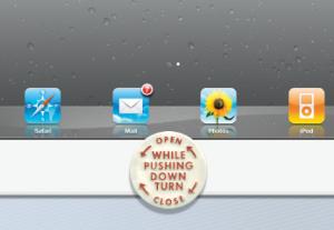
When designing for toddlers and preschoolers, I recommend creating a “Child Protection”, in case of a possible accidental pressing. The idea is simple: give access to the menu only to the parent. In much the same way as the manufacturers of drugs for pill jars do, we create a menu that is inaccessible for children.
For example, an inaccessible menu in an application may require one click to change its state, while another pressing after a short period of time activates it. This small delay will give the child the opportunity to divert attention to something else on the screen. If the child presses something and does not see the reaction, he is unlikely to press it again. Another example is using the “pull” button to see the menu.
')
Here are some interesting examples of applications designed for children:
Heydooda! The kitty says: Hello animal kids

The home button in the lower left corner, when pressed, will slide in up.
Bartleby's Book of Buttons Vol. 2
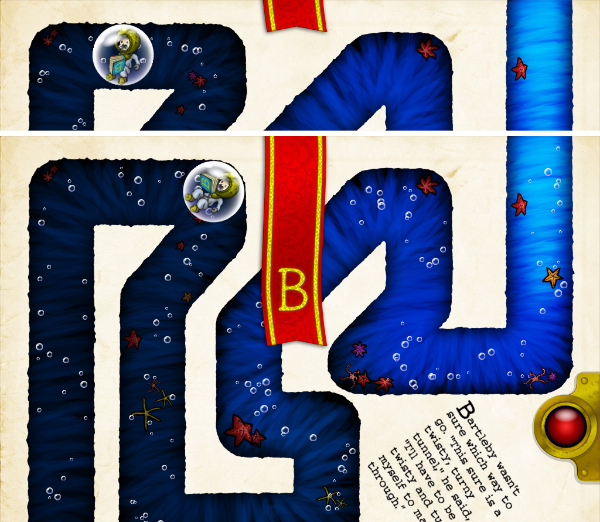
Dragging the red stripe down activates the menu.
Roxie's doors

Dragging the red down arrow gives access to the menu.
Nighty Night! Hd

An example of linear navigation with access to the menu.
The paging gesture is used to turn a page in an interactive book, but for small children, this gesture may not be what they are trying to do. For an inquisitive child, flipping through the back and forward buttons will be more effective. In general, it is better to avoid any sensitive triggers when designing for small children.
A Present for Milo is an application that is a good example of intricate navigation; accidental use of paging gestures distract from reading;
Accidental clicking on interactive elements causes inadvertent turning of the page.
Using an accelerometer to control the application would be a bad idea. Since children often carelessly handle devices and can even throw it. This can be catastrophic when an accelerometer is used in controlling the application.
Toy Story Read-Along
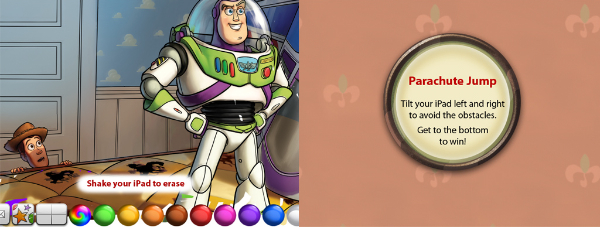
Using an accelerometer can be dangerous.
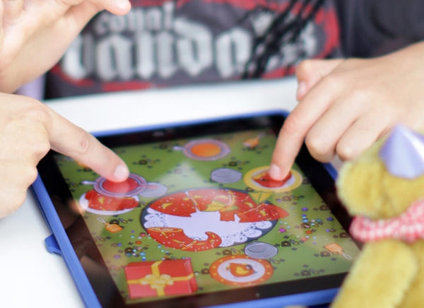
Children love to play together, so the application should use multi-touch. For example, a drawing application must have the ability to draw several children at the same time. In addition, the child may be very upset if he accidentally presses the screen with one finger and the other performs the action without a result, because the application is not designed for simultaneous pressing with several fingers. Luke Wroblewski writes about this in his article Touch-based App Design for Toddlers
Toca Boca Birthday Party Playtime
The game allows you to play multiple children at the same time.
Luke writes that when interface elements pop up in an application over their usual interface with large and bright buttons, children do not know what to do with them. Here is an example:
Toy Story Read-Along
The game interface assumes features that they are not aware of.
Hush little baby
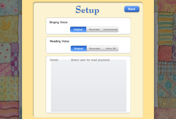
Children may not know how to use the settings menu.
Some specific gestures and a system control panel (bar) on iPad and Android devices that were pressed accidentally may cause frustration in children. An application for children should be able to quickly return if these buttons are inadvertently pressed. And for easy recovery, you should avoid displaying a screensaver when it starts up.
I was recently lucky enough to work on an interactive book for preschool children (2-5 years old) for the iPad and Android platforms. When designing for small children, it is necessary to look at things from the point of view of the child, and, in the process of working on the project, I received for myself several important lessons.Children are curious and want to explore everything. As a rule, they touch with hands everything that they see, and may notice something that adults usually do not notice. For example, children are not subject to banner blindness , for them this is another opportunity to find out what will happen if you click on it. Most of the problems of young users cause the ability to navigate in the application, because they are afraid to click something wrong. Advertising, a random touch, or just a menu button can make it harder for a child to use the app.
Children learn the interface, touching on everything, trying to figure out everything that is possible. Banners and buttons like Facebook can work in some applications, but when we design for children, we need to understand that by clicking on such a button or link to a page, the child may no longer go back to the application.
Child-oriented navigation.
A similar usability problem occurs when a young user accidentally touches a menu button. And if, while building an interface with UX specialists, this is considered to be a normal practice when creating an easy-to-use interface, then for curious children this can cause difficulties in use.
When designing for toddlers and preschoolers, I recommend creating a “Child Protection”, in case of a possible accidental pressing. The idea is simple: give access to the menu only to the parent. In much the same way as the manufacturers of drugs for pill jars do, we create a menu that is inaccessible for children.
For example, an inaccessible menu in an application may require one click to change its state, while another pressing after a short period of time activates it. This small delay will give the child the opportunity to divert attention to something else on the screen. If the child presses something and does not see the reaction, he is unlikely to press it again. Another example is using the “pull” button to see the menu.
')
Here are some interesting examples of applications designed for children:
Heydooda! The kitty says: Hello animal kids
The home button in the lower left corner, when pressed, will slide in up.
Bartleby's Book of Buttons Vol. 2
Dragging the red stripe down activates the menu.
Roxie's doors
Dragging the red down arrow gives access to the menu.
Nighty Night! Hd
An example of linear navigation with access to the menu.
Gestures for young children
The paging gesture is used to turn a page in an interactive book, but for small children, this gesture may not be what they are trying to do. For an inquisitive child, flipping through the back and forward buttons will be more effective. In general, it is better to avoid any sensitive triggers when designing for small children.
A Present for Milo is an application that is a good example of intricate navigation; accidental use of paging gestures distract from reading;
Accidental clicking on interactive elements causes inadvertent turning of the page.
Using device capabilities
Using an accelerometer to control the application would be a bad idea. Since children often carelessly handle devices and can even throw it. This can be catastrophic when an accelerometer is used in controlling the application.
Toy Story Read-Along
Using an accelerometer can be dangerous.
Children love to play together, so the application should use multi-touch. For example, a drawing application must have the ability to draw several children at the same time. In addition, the child may be very upset if he accidentally presses the screen with one finger and the other performs the action without a result, because the application is not designed for simultaneous pressing with several fingers. Luke Wroblewski writes about this in his article Touch-based App Design for Toddlers
Toca Boca Birthday Party Playtime
The game allows you to play multiple children at the same time.
Luke writes that when interface elements pop up in an application over their usual interface with large and bright buttons, children do not know what to do with them. Here is an example:
Toy Story Read-Along
The game interface assumes features that they are not aware of.
Hush little baby
Children may not know how to use the settings menu.
Some specific gestures and a system control panel (bar) on iPad and Android devices that were pressed accidentally may cause frustration in children. An application for children should be able to quickly return if these buttons are inadvertently pressed. And for easy recovery, you should avoid displaying a screensaver when it starts up.
Source: https://habr.com/ru/post/139523/
All Articles