Stopwatch on CSS3 without pictures, scripts and SMS
Hi, Habrayuzer!
I do not even know what is worse, that the code for this stopwatch takes ~ 1100 lines, or that it only works in half of the browsers.
But if you wonder how it works, I ask for cat.
Introduction
First, about browsers. This code works, from present: in FireFox, Safari and Chrome. On the way are such
Secondly, I want to immediately note that I will describe exactly the process of animation, and not drawing on CSS3. For the future, the plan is just the opposite to make a very beautiful picture, on CSS. O yes, it became not so tedious after the developers from safari abandoned their old standard linear-gradient'a (goodbye color-stop, from, to, 0 0) and Opera finally began to support radial-gradient (the last happened relatively long ago).
At first I thought that I would make everyone a familiar stopwatch, with arrows and only, but this is very boring.
There is no drive, and the sensation of the mechanism, when you see two arrows running around the monitor. On the other hand, I immediately remembered how I once did something like an odometer, for the path traveled by the mouse. And it dawned on me.
Rushed
First of all, we build HTML (below is an example, only for “odometer”).
')
<div class="timer"> <div class="numb tenHour"> </div> <div class="numb hour"> </div> <div class="numb tenMin"> </div> <div class="numb min"> </div> <div class="numb tenSec"> </div> <div class="numb sec"> </div> <div> :</div> <div class="numb tenMilisec"> </div> <div class="numb milisec"> </div> </div> The plan is this: each diva numb we assign a pseudo-element with the entry "0 1 2 3 4 5 6 7 8 9 0".
Why two zeros? Animation passes from one edge to another, and then without delay the time moves to its original position. In fact, we see two different zeros, but this is not noticeable in the living example.
Why precisely pseudo-element? Why not write the numbers directly to the div? There are two advantages, firstly, we do not spoil the look of HTML, and secondly, we write it only once.
We get some no CSS
.timer div { float: left; width: 30px; height: 30px; position: relative; } .numb::before { content:"0 1 2 3 4 5 6 7 8 9 0"; position: absolute; width: 30px; /* 30px, , . */ height: 360px; color: #334; text-align: center; } .timer div::after { content: ""; height: 360px; width: 1px; left: 0; background: #889; } .timer div:first-child::after { display: none; } Put the parent overflow: hidden and voila! All odometer ready.
Animation
Let's start the animation, everything is simple:
.numb { animation-delay: 0; /* */ animation-iteration-count: infinite; /* - */ animation-timing-function: linear; /* - */ } .tenHour {animation-duration: 1000000s;} /* */ .hour { animation-duration: 100000s;} .tenMin { animation-duration: 10000s;} .min { animation-duration: 1000s;} .tenSec { animation-duration: 100s;} .sec { animation-duration: 10s;} .tenMilisec { animation-duration: 1s;} .milisec { animation-duration: .1s;} /* , ms, */ Now the most boring, frames, more precisely, key frames, they are also “frames”.
@-keyframes timer { 0% {top:0} 100% {top:-300px;} } This code does not suit us, everything moves smoothly, but this is ugly and wrong, because during a pause, we can easily get to an incomprehensible meaning. We write this:
@-keyframes timer { 0% {top:0} 9% {top:0} 10% {top:-30px} 19% {top:-30px} 20% {top:-60px} 29% {top:-60px} 30% {top:-90px} 39% {top:-90px} 40% {top:-120px} 49% {top:-120px} 50% {top:-150px} 59% {top:-150px} 60% {top:-180px} 69% {top:-180px} 70% {top:-210px} 79% {top:-210px} 80% {top:-240px} 89% {top:-240px} 90% {top:-270px} 99% {top:-270px} 100% {top:-300px;} } I will not paint everything, there is no point in this. The bottom line is that we take 1% of 10 seconds, as the time allotted for turning the counter.
Therefore, for the tenths - 0% 9.9% 10% 19.9% and so on. Further more, hundredths - 0% 9.99%, thousandths - 0% 9.999%.
Earned!
Now the most delicious, how without JS to make it all move? How do we simulate onclick?
There are several tricks that meet our requirements.
The first, oldest and simplest - pseudo-classes for reference
I mean: active,: focus. But it's boring, and besides, it works in Chrome (what? Maybe in IE! No, it’s in Chrome)
The second more fun way is to use
<input /> radio and checkbox.And his pseudo-element: cheked. I crossed out this way, because I need an extra label element for each
<input />The third way that came to my mind is the same link, but using: target.
These are not all the ways in which you can resort, but when I settled on: target, I didn’t want to think anymore.
So the HTML code:
<a class="start" id="start" href="#start"></a> <a class="pause" id="pause" href="#pause"></a> <a class="stop" id="stop" href="#stop"></a> There is even nothing to explain.
And now CSS:
.start:target ~ .timerInner .numb, .pause:target ~ .timerInner .numb { animation-name: timer; } .start:target ~ .timerInner .numb.tenSec, .pause:target ~ .timerInner .numb.tenSec { animation-name: timertenSec; } .pause:target ~ .timerInner .sec, .pause:target ~ .timerInner .tenMilisec { animation-play-state: paused; } .stop:target ~ .timer .tenSec, .stop:target ~ .timer .sec, { animation-name: reset; } We set as the name of the animation those names of the keiframes that were given above.
And everything starts to work. For the Pause button, we also set it, so that the animation would not be reset when you click on it, but the animation needs to be stopped, for this the animation-play-state is provided
When you click on Stop, in theory you can assign any name, the main thing that it does not coincide with the name of our animations, then zeroing will occur. I have presented not all the animation code, the fact is that it is monotonous, and is assigned to each diva separately, to whom the code looks interesting.
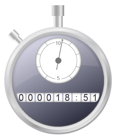
Ok, now let's make a watch. It is the arrow, the dial is not interesting to us.
HTML
<div class="clock"> <div class="line one"></div> <div class="line three"></div> <div class="line five"></div> <div class="arrow"></div> </div> Divas line simply denote the vertical on which we put the division by minutes.
Arrow is our arrow.
CSS
.arrow { animation-delay: 0; /* */ animation-iteration-count: infinite; /* */ animation-timing-function: linear; /* */ animation-duration: 600s; /* 10 x 60 = 600, */ background:#666; } We start the arrow in the same way with the odometer.
Give the code I think too much.
In general, the final result , again.
Thank you for your attention, I essentially didn’t say anything, personally I own this info for a long time.
Just someone it may be useful, or just interesting.
Source: https://habr.com/ru/post/139329/
All Articles