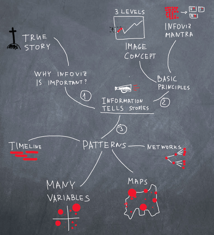
Information Visualization Patterns
A couple of years ago, I became very interested in UX and everything connected with it. Gradually, an understanding of how important the visualization of information has come, especially now. After reading Taffy, Cleveland and Bertin , it is simply impossible not to think in this direction. Constantly come to mind ideas how to make things (in particular, in our product ) more visual, more understandable.
Below I tried to show why the visualization of information is important, to talk about its basic principles and to show some cool examples. I apologize in advance for a couple of boring definitions and the lack of jokes in the article. This is intentional. Article deadly serials.
And, as usual, I apologize for the volume of the article. But, I hope you will be interested to read to the end.
')
A classic example of using visualization to answer the question is the cholera epidemic in London (an example taken from the book of Taffy). One doctor, John Snow, used imaging to prove his hypothesis about carrying cholera by water, although everyone thought it was being transported by air.
Within 40 days, more than 600 people died in one of the districts of London. Dr. Snow collected the death data and plotted it on the map. The black rectangle is a single death case. It is seen that, in general, they are grouped near the water intake pump.

Many cases, of course, happened in remote houses. John Snow was investigating every single case and looking for confirmation of his hypothesis. For example, in the brewery nearby, not a single person died. The owner of the brewery said that workers have the right to drink beer and they have their own well in the yard. In general, when the pump was closed, the epidemic quickly ended.
In this case, the visualization helped to establish the cause of the epidemic. This example alone is enough to be respected by Dr. Snow and fall in love with Taffeta.
Basic principles are not so much. Let us dwell on two: the concept of the image (Image) and the Mantra of visualization. I deliberately omit the low-level principles like data-to-ink ratio and legibility rules, they affect the execution, not the patterns.
Jacques Bertin can be considered one of the most influential authors in the field of information visualization. His fundamental work Semiology of Graphic , written 40 years ago, has not yet been surpassed.
Bertin introduced the concept of Image (Image) and levels of reading information.
That is, if we can look at the picture and immediately say what it is, then the picture is the image. What does this have to do with the visualization of information?
For a start, let's deal with read levels. There are 3 of them: elementary, intermediate and common .
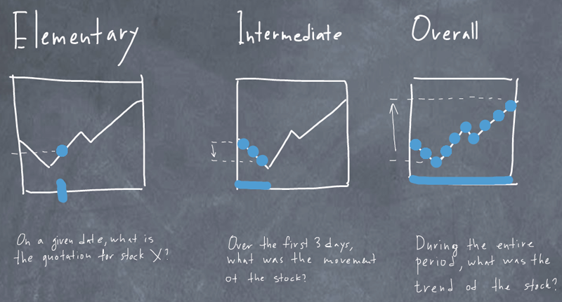
Above is a boring chart that shows stock quotes by day.
Good visualization can answer questions from all three levels very quickly. Bad - can not. That is, a good visualization should be close to the Image. We have to spend as little time as possible on finding answers.
Ben Schneiderman also made a significant contribution to the development of information visualization. In particular, he owns the mantra of visualization
In the future, the mantra was finalized, and so looks like a more modern version:
And here we have the criteria by which we must do the visualization, as well as to check whether this visualization is good. A person should be able to
As you can see, modern visualization is very interactive. And this is a fairly new and poorly studied area.
So:
Information visualization = presentation + interaction
In general, there are only 4 patterns.
Refer to the examples.
The most uninteresting for me personally is the pattern, because in my work the cards are useless. The most understandable and interesting pattern for a wide audience, because everyone is interested to know what is happening in the United States (and in this country ).
A good example of an interactive map created by wizards from the New York Times. In general, this edition is notable for its love of visualization, and many excellent examples were created on which to learn.
Immigration Explorer successfully exploits all five principles of good visualization, partly because it is so interesting to use them, exploring various aspects of immigration in the United States.

You can filter data by country and year. Change the presentation of information on the percentage of the population and the number of residents. Increase the map area, as well as change the size of the circles.

With an interactive map, playing is much more fun than just looking at a static picture. You see how the structure of immigration has changed in different periods, connect it with your knowledge of history and feel that you have found something new, interesting for yourself. By the way, immigrants from the USSR chose Los Angeles and New York.
With a clear conscience, I would call this an almost perfect example of visualization.
There are a lot of timelines. I will give a couple of examples. Schedule of commuter trains from San Francisco. On the X axis we have the departure time of the train. Along the Y axis - cities on the way.
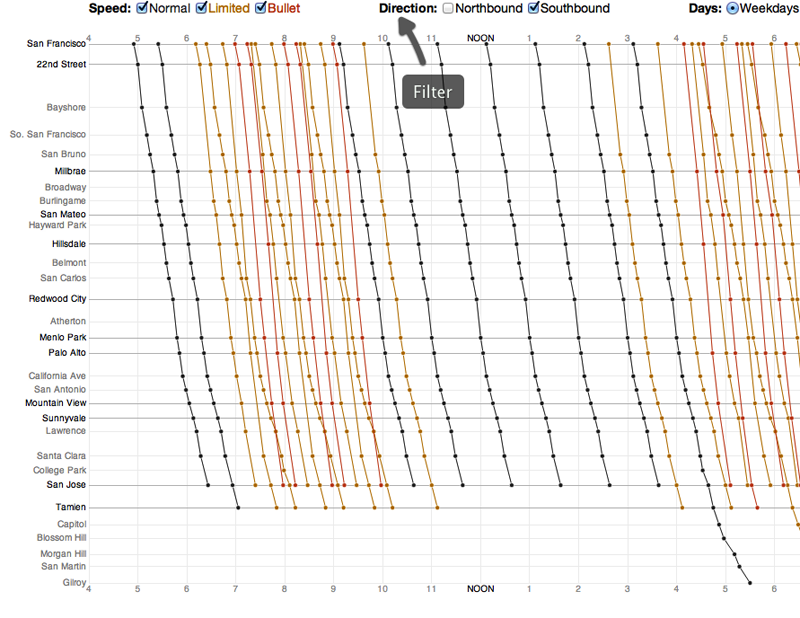
We immediately notice that on this schedule are visible distances between cities. We also notice where trains stop and where not. Well, in addition to everything, the slope of the line shows the speed of the train. We have high-speed trains as well as regular trains (black). Some trains, with a later departure time, overtake slower trains.
Unfortunately, schedule interactivity is rather limited. It is possible only to filter trains by speed, direction and days of the week. You can also watch the exact time of arrival, if you hover the cursor on the point. And I would like to increase individual time intervals or regions, select types of trains, change the schedule view to a more usual timeline.
Here I cannot resist, and I will show a second example from the TargetProcess project management system that we are doing (this is a shameless advertisement, you can skip). Below we see the progress of developing one feature. Namely, in what states it was and how many days, who worked on it, when new tasks and bugs appeared, when they were closed.
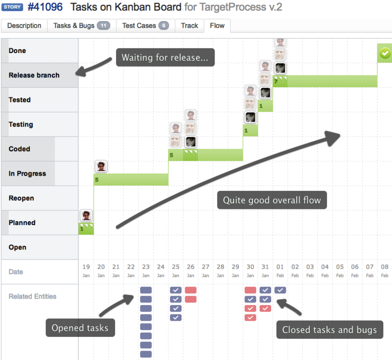
We work on kanban and the feature goes through several states. It can be seen that, on the whole, everything was smooth, except that a week hung in the pre-release state.
There are no filters here, nothing can be changed and it is even difficult to see the big picture when the development of a feature takes more than a few weeks. So there is something to refine. However, the timeline itself shows a lot of information on one screen.
When there are a lot of variables, you have to think. Is it possible to decently visualize 6 variables? Why not? In the picture below, we can see that the risk of cardiovascular disease is at risk for 10 years depending on gender, age, blood pressure, cholesterol level and smoking.
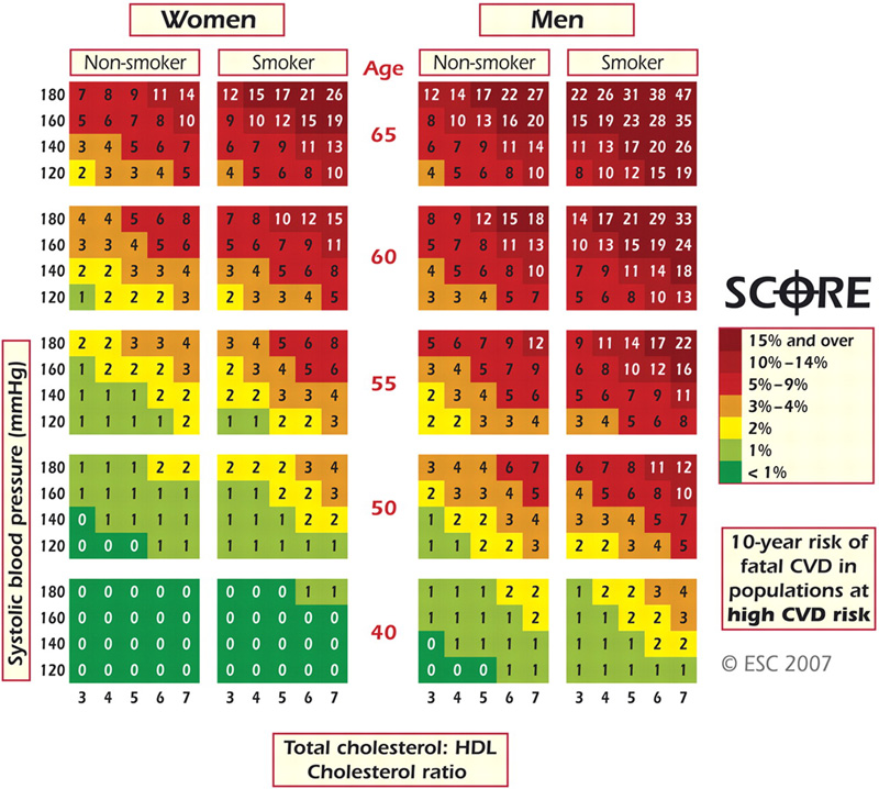
Let's not pay attention to the style that leaves much to be desired. This picture can be investigated for quite a long time, noting that women have an average risk 2 times lower; young people can sleep well; smoking, it turns out, begins to affect after 40 in a pretty decent way. Very successful solution to a complex problem.
And back to the New York Times. How to distinguish market leaders from outsiders? Who in the market begins to return to the correct rails, and who on the contrary begins to lose ground? Below is a great example of answers to such questions. Visualization is quite complicated at first glance, but when you figure out how it works, you will like it.

The chart shows how companies feel compared to the market in two time variables: for the year (Y-axis), and for your chosen interval (day, week, month, quarter - X-axis). Thus, there are 4 groups of companies:
You can filter data by industry, view details of an individual company, and also change the scale. And yes, the big green circle on the right is Apple.
We still have networks. A typical and simple example of tree visualization is the mind map of this article.
A more detailed version with links to other interesting examples is also available.
Visualization of structures such as trees, etc., is usually quite complicated, because the monitor screens are small. Here on posters in polsteny it looks great.
My goal was to convey to you the importance of visualizing information and show with real examples how it can help people make decisions and work with data.
If I succeed, I am immensely happy. And thanks for scrolling to the end of the article (sorry, it was a joke).
Mikhail Dubakov
@mdubakov
Below I tried to show why the visualization of information is important, to talk about its basic principles and to show some cool examples. I apologize in advance for a couple of boring definitions and the lack of jokes in the article. This is intentional. Article deadly serials.
And, as usual, I apologize for the volume of the article. But, I hope you will be interested to read to the end.
')
1. Why is visualization important?
- It allows you to see what is otherwise difficult to notice . Yes, information is present in the data, but without visualization you do not notice trends, patterns of behavior and dependencies.
- She gives answers to many questions faster . In the simplest case, it is much easier to look at the chart and see the trend than on the column of numbers.
- Good visualization allows you to “explore the data”, play with them, identifying interesting things, which is especially important in journalism, for example.
- Nowadays, data volumes are growing at an incredible rate. Visualization helps to cope with the increasing complexity and diversity of data.
- Everyone loves to look at intriguing color pictures, but almost no one likes boring tables with numbers. Subjective perception of information, confidence in information is higher when it is presented visually.
A classic example of using visualization to answer the question is the cholera epidemic in London (an example taken from the book of Taffy). One doctor, John Snow, used imaging to prove his hypothesis about carrying cholera by water, although everyone thought it was being transported by air.
Within 40 days, more than 600 people died in one of the districts of London. Dr. Snow collected the death data and plotted it on the map. The black rectangle is a single death case. It is seen that, in general, they are grouped near the water intake pump.
Many cases, of course, happened in remote houses. John Snow was investigating every single case and looking for confirmation of his hypothesis. For example, in the brewery nearby, not a single person died. The owner of the brewery said that workers have the right to drink beer and they have their own well in the yard. In general, when the pump was closed, the epidemic quickly ended.
In this case, the visualization helped to establish the cause of the epidemic. This example alone is enough to be respected by Dr. Snow and fall in love with Taffeta.
2. Basic principles of information visualization
Basic principles are not so much. Let us dwell on two: the concept of the image (Image) and the Mantra of visualization. I deliberately omit the low-level principles like data-to-ink ratio and legibility rules, they affect the execution, not the patterns.
Jacques Bertin can be considered one of the most influential authors in the field of information visualization. His fundamental work Semiology of Graphic , written 40 years ago, has not yet been surpassed.
Bertin introduced the concept of Image (Image) and levels of reading information.
Boring Definition # 1
Image - the meaningful visual form, perceptible in the minimum instant of vision
The image is an expressive visual form that can be recognized in the shortest time.
That is, if we can look at the picture and immediately say what it is, then the picture is the image. What does this have to do with the visualization of information?
For a start, let's deal with read levels. There are 3 of them: elementary, intermediate and common .
Above is a boring chart that shows stock quotes by day.
- At the elementary level, we can ask a question like “What was the quotation on March 5?”
- At the intermediate level, the question will be: “What happened to the quote during the first three days?”
- At the general level, the question will be “What was going on with the quote for the entire period?”
Good visualization can answer questions from all three levels very quickly. Bad - can not. That is, a good visualization should be close to the Image. We have to spend as little time as possible on finding answers.
Ben Schneiderman also made a significant contribution to the development of information visualization. In particular, he owns the mantra of visualization
Slightly less boring definition # 2
“Overview first, zoom and filter, then details-on-demand.”
First, the general level, approximation and filtering, then the details (when asked)
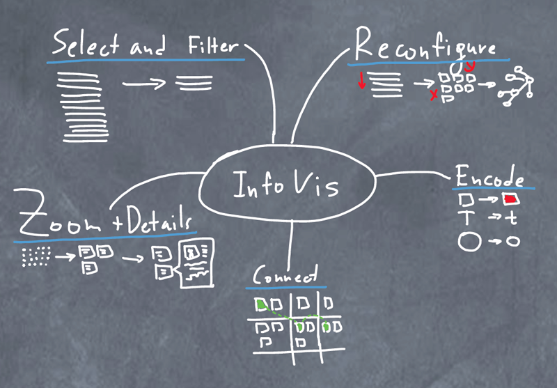
In the future, the mantra was finalized, and so looks like a more modern version:
And here we have the criteria by which we must do the visualization, as well as to check whether this visualization is good. A person should be able to
- Select and filter data . For example, we show stock quotes. It should be possible to see companies in a particular market segment, with a capitalization above $ 1 billion, and so on.
- Change the presentation of data . Sometimes I want to see a simple list, sometimes more complex views like a matrix or a scatter chart.
- Change the encoding of the data . For example, I want capitalization to be expressed in size. Big companies are a big circle, small ones are small. Or technology companies want to see red, and the energy sector - gray.
- See connections (if that makes sense). If the data is somehow related to each other (for example, people), then I should be able to see or not see these connections.
- Increase areas of interest and see details . For example, I'm wondering, what is this big green circle on the diagram? And this, it turns out, the company Apple.
As you can see, modern visualization is very interactive. And this is a fairly new and poorly studied area.
So:
Information visualization = presentation + interaction
3. Visualization patterns
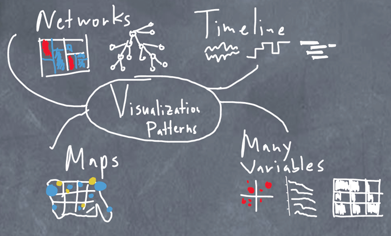
In general, there are only 4 patterns.
- Maps . Geographical, cartograms, and so on. They are all familiar from school by geography lessons. Thanks to the maps, many of you will remember that diamonds are mined in Africa, and there is a gold deposit in Bodaibo
- Timeline (Russian purists are free to offer a good translation - two letters "p" are used intentionally). Used to visualize everything related to time, say, the schedule of work (everyone's favorite Gantt Chart) or the lunar cycle.
- Many variables . A fairly extensive class of patterns that is used to visualize data that has many variables. Say, people by sex, weight, height and consumption of Coca-Cola per year.
- Network . To visualize dependencies, relationships, and hierarchies.
Refer to the examples.
Cards
The most uninteresting for me personally is the pattern, because in my work the cards are useless. The most understandable and interesting pattern for a wide audience, because everyone is interested to know what is happening in the United States (and in this country ).
A good example of an interactive map created by wizards from the New York Times. In general, this edition is notable for its love of visualization, and many excellent examples were created on which to learn.
Immigration Explorer successfully exploits all five principles of good visualization, partly because it is so interesting to use them, exploring various aspects of immigration in the United States.
You can filter data by country and year. Change the presentation of information on the percentage of the population and the number of residents. Increase the map area, as well as change the size of the circles.
With an interactive map, playing is much more fun than just looking at a static picture. You see how the structure of immigration has changed in different periods, connect it with your knowledge of history and feel that you have found something new, interesting for yourself. By the way, immigrants from the USSR chose Los Angeles and New York.
With a clear conscience, I would call this an almost perfect example of visualization.
Timeline
There are a lot of timelines. I will give a couple of examples. Schedule of commuter trains from San Francisco. On the X axis we have the departure time of the train. Along the Y axis - cities on the way.
We immediately notice that on this schedule are visible distances between cities. We also notice where trains stop and where not. Well, in addition to everything, the slope of the line shows the speed of the train. We have high-speed trains as well as regular trains (black). Some trains, with a later departure time, overtake slower trains.
Unfortunately, schedule interactivity is rather limited. It is possible only to filter trains by speed, direction and days of the week. You can also watch the exact time of arrival, if you hover the cursor on the point. And I would like to increase individual time intervals or regions, select types of trains, change the schedule view to a more usual timeline.
Here I cannot resist, and I will show a second example from the TargetProcess project management system that we are doing (this is a shameless advertisement, you can skip). Below we see the progress of developing one feature. Namely, in what states it was and how many days, who worked on it, when new tasks and bugs appeared, when they were closed.
We work on kanban and the feature goes through several states. It can be seen that, on the whole, everything was smooth, except that a week hung in the pre-release state.
There are no filters here, nothing can be changed and it is even difficult to see the big picture when the development of a feature takes more than a few weeks. So there is something to refine. However, the timeline itself shows a lot of information on one screen.
Many variables
When there are a lot of variables, you have to think. Is it possible to decently visualize 6 variables? Why not? In the picture below, we can see that the risk of cardiovascular disease is at risk for 10 years depending on gender, age, blood pressure, cholesterol level and smoking.
Let's not pay attention to the style that leaves much to be desired. This picture can be investigated for quite a long time, noting that women have an average risk 2 times lower; young people can sleep well; smoking, it turns out, begins to affect after 40 in a pretty decent way. Very successful solution to a complex problem.
And back to the New York Times. How to distinguish market leaders from outsiders? Who in the market begins to return to the correct rails, and who on the contrary begins to lose ground? Below is a great example of answers to such questions. Visualization is quite complicated at first glance, but when you figure out how it works, you will like it.
The chart shows how companies feel compared to the market in two time variables: for the year (Y-axis), and for your chosen interval (day, week, month, quarter - X-axis). Thus, there are 4 groups of companies:
- Leaders: grew for the year as a whole, and for the last month
- Outsiders: fell for the year and last month
- Catching up: fell over the year, but grow over the month
- Laggards: they grew for a year, but they fell for a month
You can filter data by industry, view details of an individual company, and also change the scale. And yes, the big green circle on the right is Apple.
Network
We still have networks. A typical and simple example of tree visualization is the mind map of this article.
A more detailed version with links to other interesting examples is also available.
Visualization of structures such as trees, etc., is usually quite complicated, because the monitor screens are small. Here on posters in polsteny it looks great.
Conclusion
My goal was to convey to you the importance of visualizing information and show with real examples how it can help people make decisions and work with data.
If I succeed, I am immensely happy. And thanks for scrolling to the end of the article (sorry, it was a joke).
Mikhail Dubakov
@mdubakov
Source: https://habr.com/ru/post/139187/
All Articles