Show item by face
 In this article, using the example of the redesign of the main page of cplaza.ru, I will talk about one of the principles of website development: “show goods face”.
In general terms, this principle can be formulated as follows: "We must immediately make it clear to the visitor where he got and what interesting things can be found here." In the case of an online store, the principle will turn into something like: “Show your product and why you should buy it from you”. But despite the simplicity of this principle, it is often unreasonably violated.
Under the cat you will find bad advice about site design, analysis of the existing design of the main page cplaza.ru, a story about which blocks may be more useful for this page, and in the end I will show an example of the reworked main one.
')
Introduction
Cplaza is an online store that sells Apple appliances. He was often advertised on Habré, so I think many people know him.
The main message of all their advertising banners has always been something like: “We have Apple equipment at incredibly low prices”. But, going through the banner to the main page of the site, the visitor saw anything, but only not what was said in the advertisement.
At the same time, digging into the site, you can find out that they still have the claimed equipment, and that it is cheaper than in many places. That is, the site owners simply hide the information that the visitor was talking about in the advertisement and which he rightly expects to see. And this can lead to lightning fast refusal to visit.
Let's try to reshape the main page and, following the principle of “product face”, show on it the merits of this online store.
But before you get a scalpel and begin plastic surgery, you need to decide on the wishes of the patient. I will proceed from the assumption that the main task of the site owners is to sell as much of the main product as possible - Apple equipment and accessories. Perhaps there are some other goals, or in general my assumption is wrong. But in order to reveal all this, you need to communicate directly with the owners.

What is wrong with the existing main
In a nutshell, it does not make it clear that this is a site about the Apple technique, and that it costs less on it. When you go to the site, it seems that I got on some kind of flea market from disparate goods. That is, the visitor does not immediately show the goods face (Apple technology at low prices), and offer to see the news, a catalog of any gadgets, promotions, etc.
In this section I will criticize the different blocks that make up the main page of the current site. Anyone can criticize, so if you don’t care, go straight to the next section.
Some of the comments I expressed in the captions to the screenshot of the site with the help of harmful tips. They turned out somewhat stinging, but not so dry as a simple analysis of errors. :)
Cap
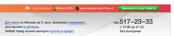
In a hat, rather, all the nagging little things.
The phone is somehow broken in a non-standard way to show three identical numbers at the end. Such a move (and indeed a beautiful phone) may be relevant for taxis, pizzerias, support services and other establishments whose phone is often required, but it is not always recorded in a notebook.

In the case of this store, I can hardly imagine a situation where a person suddenly decides for no reason: “Oh! I urgently need to buy an iMac! ”- and, without going to the site, decides to immediately call the store.
At the same time, the non-standard breakdown of the phone into groups of numbers worsens its mnemonic short-term memorization, useful for dialing from the screen (well, I already find fault with it at all). In addition, they made the phone a picture for nothing, since any dialers (Skype plug-ins, communicator browsers) will not be able to automatically recognize it.
For some reason, the time of work was transferred in small print under the logo, although the place itself is under the phone, as it is needed only when I decided to call the store and you think if it still works.

The basket was made so small that you will find its fig. Next to it, they put some sort of “deferred” block, which, I am sure, does not work in this context.
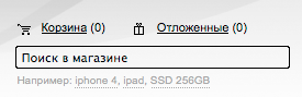
What products lie in the basket can be found only by going into it - this is one of the types of violation of the principle of "product face", which is often found in stores.
The search is also made barely visible frame. The user must be observant to find it.
For some reason, the main menu is faded gray on a gray background and consists of items that are of little interest to the main one.
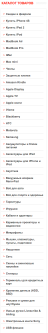
Products catalog →
The list of categories is made by a long, shapeless footcloth, in which something can be found only with due diligence, lucky circumstances, or through Ctrl / + F.
There are no pictures in the list. To understand what it is - you need to read it. Among other things, for the sake of SEOs, a battery of the words “buy” has formed on the list, which even more prevents the eye from catching on the desired product name.
Registration block
Registration is hidden at the bottom of the page for several scrolling screens. About the fact that it is not needed at all - this is a separate topic .
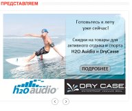
Introducing
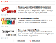
Promotions are a useful tool. But this listalka is no good. No one will wait 30 seconds to view all the frames in turn, and even more so to take some action in order to view them quickly. So this is a waste of valuable space.
news
This is another block with stocks, but this time with a gray on a white and small pin. Who will read them is not clear.

New items
A messy set of products that recently went on sale at this store. Moreover, not the fact that the product is really new. Simply, he could recently appear in the range (for example, iPhone 4, which is difficult to call a novelty).
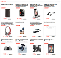
I have nothing against product listings - impulse sales and all that. But it seems to me strange to show them on the principle of the recent appearance in the assortment of the store. As if the visitor regularly monitors the main one, then we already know a lot of things about him, and we can offer something at this place taking into account his interests.
Promotions
Those who overcame the wrapper from the novelties receive a prize - one more block with shares (in addition to “We represent” and “News”). Of course, only very corrosive visitors will reach them. But why not show them something more useful?
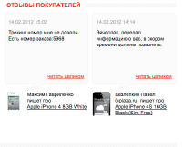
Customer Reviews
Next to the block of shares is a block of reviews. It translates correspondence from orders. Why - I do not understand. If the review is positive - it seems like a cheat; if it is negative, then it only scares off buyers.
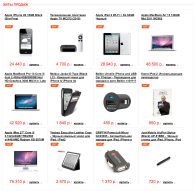
Bestsellers
Another footcloth from randomly selected products. Only the most zealous will get to her, and what useful information she will tell them is not clear.
You can continue to list the shortcomings, but to criticize is a simple matter. So let's move on to how things can be improved.
Let us consider what role the main page should play in the life of an online store. In fact, it is far from the most important. Since all stock banners, contextual advertising and links from search engines should lead to the pages of specific products and categories, and visitors will be sent to the main page only from generalized banners, from a link from a friend, or by typing a domain from memory.
Possible ways to call home
Consider some of the ways in which the user can get to the main page. What can he expect to find there and what would be nice for him to show.
Here are the main scenarios I see:
- The first time I went to the site (advertising, link from a friend);
- Regularly comes to gape;
- Returning customer;
- Looking for a gift to a friend;
Go from search engines when searching for something specific.
Consider each scenario in more detail.
First time went to the site
The first time a visitor can get to the home of curiosity by clicking on the banner, contextual advertising of a general nature (for example, the word "Apple") or by receiving a link from a friend. Or he may want to buy something specific, and that is why the banner interested him.
This scenario is characterized by the fact that we still do not know anything about the user except that he is probably interested in the Apple technique and he does not mind saving in case of her purchase.
Therefore, the first things you need to show such a visitor product face - the entire range of equipment Apple, which sells the company and at the same time prove that the prices are lower than those of competitors.
The usual long list of products from all the available positions will not be the best option here - as long as the visitor searches for what interests him among countless similar options, he may get bored and leave. It can only be worse to show one more banner with meaningless advertising or a list of random items after entering the banner.
Therefore, in this case, the best compressed catalog with prices, combined with the most beautiful best offers.
Such a list can be quickly glanced around, find the product of interest, see the tempting price and go into the category of goods for a more detailed study.
Also on this list are shelter accessories, cases, bags and gifts. Since, even if the visitor does not intend to buy anything serious now, he can make an impulse purchase on trivia. But the main struggle for impulse purchases unfolds, of course, not on the main one, but when placing an order.
Idle curiosity
Out of curiosity, a visitor can sometimes enter the site (through a bookmark, history of visits or simply by typing a domain in the address bar from memory) just to look at the technique and its prices - a kind of virtual shopping.
The advantage of this scenario, unlike the previous one, is that we already know a lot of interesting things about the user in order to hit the target exactly. For example, we may know that he has already visited the page with aIMakami 5 times and looked mainly at the configuration with a screen of 27 ".
Therefore, in the block with large beautiful offers, we will show him first of all these particular goods. In the block with recommendations, you can show some more related products that may be of interest to the visitor.
Moreover, if aiMacks are now available for sale at a lower price than usual - we can show him in the special offer block, as this may push him to buy (this may or may not be a special offer, but the stars just agreed).
You can also show him in the recommendation block all sorts of personal belongings for aiMakov, in case he has already managed since the last visit to buy an aiMak elsewhere.
Returned buyer
Once having bought something in a store, a visitor can return. This case is similar to the previous one, except for the fact that we now know for sure that the visitor has some kind of equipment and the visitor to us is already loyal (if the store works well). In no case should this information be overlooked and one should immediately offer the visitor to his cow to buy a stall.
For example, if he bought an iPhone, then you need to offer him covers and other gadgets. For this, again, we need a block of recommendations.
Gift Search
If the visitor is looking for a gift for a friend of the eplofil, then you need to help him in this quest. Therefore, a block with gifts should be provided in the cataloger.
Moreover, it is necessary to divide the gifts “in trifles” (covers, etc.) and “dear ones”, since there are different groups of visitors and, moreover, a person can search for which gift to charm in with friends.
Search for something specific in search engines
It is unlikely that a user typing in the search bar "MacBook Pro 15" should get to the main. In this case, it would be much more correct to send it immediately to the page of a particular product or category. So this case I do not consider in this article.
Blocks
As a result, in order to arouse the interest of the largest possible number of users acting under the described scenarios, the following blocks will be required:
- A simple and understandable cataloger that allows you to understand where the visitor is and find the product that interests him;
- Best deals;
- The block of recommendations for those users about whom something is already known from the history of visits;
- Blocks of "shares" and "special offers" as a general lure and a way to promote promoted goods;
- Basket (where without it);
In each block we will try to show the goods face, in a winning light.
Catalogizer technology Apple
Since the Apple product line is well structured on its own, it only remains to comb it a little, taking into account the items available in the assortment of the store.
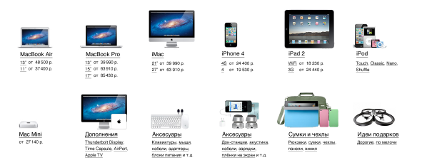
Visitors who are looking for something specific will be able to go directly from the cataloger to the desired section (for example, all MacBooks Pro will look with a 15 ″ display). And those who came just to be curious will be able to see that this store is clearly about the Apple technique and will get acquainted with the prices for it.
Best deals
This block is seen by visitors immediately. In it beautiful beautiful photos shows the best deals. Like the previous block, it performs the function to show the goods face. But unlike him, it focuses on specific products, rather than on their categories.
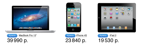
Adaptive block: the wider the browser window - the more goods can be shown. In addition, if a user has accumulated some information, then it can be used to sort the goods inside this block. For example, a user who has already watched an iPhone for 2 times can be the first to show it.
Recommendations
In this section, goods that may be of the most interest to the visitor are shown, taking into account his visiting history. Covers for iPhone, protective films, gloves for capacitive dislpeya, etc.
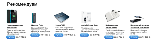
If nothing is known about the visitor - only the best-selling products are shown or a random assumption is made that the user is interested in some category of goods (the chance to guess is not great, but since there is no data to analyze, then this option will fit).
Promotions and special offers
In the block of shares, you can show promoted goods or just interesting new items.
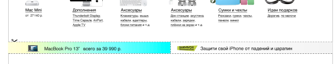
The block is adaptive. It can fit from 1 to 6 ads. The more ads - the less space is allocated for each of them, and the more concise should be the information in it.
The block can be both large and small in height. It would be very interesting to see the difference in the statistics of clicks on this block, depending on its size.
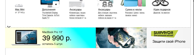
Block special offers designed for a detailed description of one very attractive product. If there is a possibility - the block adjusts to the wishes of the visitor and shows him exactly the product that he is looking for.

Basket
While the basket is not needed - it is hidden. But as soon as the goods appear in it - it occupies a prominent place at the top of the screen.
If there are more goods than can fit in one line, it stretches by several.
If the page is scrolled so that the basket is not visible, then when a new product is added to it, it floats up from the top of the screen, the product is added to it, and then the basket returns to its place at the top of the page.
It would be possible to make it simply stuck to the upper edge of the screen (position: fixed), but I am not sure about this decision - it may turn out too intrusive.
Basement
In the basement, all the contact information and answers to questions that might arise after viewing the main page are summarized.
It also has a “blog” section, where you can write useful articles like “How to clean up MacBook Pro”, as well as the bulk of seo-texts, if it is impossible to get rid of them.
Total
As a result of the redesign of the main page of cplaza.ru, this is the layout:

The resulting page meets the slogan "Apple Technology at incredibly low prices" and, going to it, the user will immediately understand where he got and can easily find the product of interest to him.
In this article, I reviewed the principle of website design: "show product face." The basic meaning of this principle is that the visitor needs to be immediately given to understand where he is, what can be found here and what advantages to gain.
This principle applies not only to stores, but also to any other sites. And if you do not know exactly why this principle is better to be abandoned in your particular case (and this can be), then it is better to use it by default.
I hope you were interested in reading this article. I will try to answer comments and questions through updating the post, as this reduces the likelihood of duplicates of the same questions and the loss of valuable ideas among them.
UPD: Responses to comments
Now how can I quickly find smartphones from HTCAs I wrote at the beginning of the article, I proceeded from the assumption that this store is aimed specifically at the sale of Apple equipment. My assumption is based on their advertising and that the range of models from other manufacturers is very weak. Therefore, I did not set before the main page the task of selling HTC smartphones. Since you are unlikely to even get on it, if you are interested in these smartphones.
Is this an exercise or a finished project?I wrote this article to talk about the principle of “product face”. I took the site cplaza.ru as an illustration, as I visit it periodically myself.
Naturally, if we were talking about combat design, then the assumptions would be too expensive a luxury, and instead they would have statistics, field observations and other real data taken from the customer's experience.
True, the customers would hardly have allowed me to share such data on Habré . :)
And, since we are talking about statistics, it should be noted that with her, too, you need to be careful and not blindly believe the numbers. For example, according to the results of a sales analysis, it may turn out that some product (or category) does not fit well. This is not a reason to immediately remove it to the far corner, as it is possible that it doesn’t sell out well because of the mistakes in how it is sold. And then get a vicious circle.
Pro cart
Many comments about the device basket, I will try to answer most of them in this update. Let me remind you that it is visible only when there is a product in it.
Why does she have so much attention, why is she so bright?Because as soon as you decide to complete the purchase, you should be able to instantly find the basket. You know that it is above, because when you made a purchase, the goods flew into it (if the basket was behind the screen, then it swam to the visible area, took the goods and flew back). Scroll the same page up, you will immediately find where it is.
Why show items in the basket?I'll start from afar. Why did the well-known basket appear in real supermarkets? Not for the convenience of visitors, but because if you have nowhere to put the goods, then you buy only what you can carry in your hands, and this will adversely affect sales.
Similarly, in the online store, but instead of the number of hands, the limitation was a short-term memory. You do not need to remember what you have already bought and what is not, you can always look at it without going anywhere. If necessary, remove the goods directly from the basket. This will overcome the fear of adding there something extra.
Why are the prices in the cart and total amount not shownIn order not to embarrass ahead of time the buyer. If in ordinary supermarkets the cart automatically counted the amount of the purchase, sales would have fallen sharply.
The cart will take the whole screenEven if you decide to buy 10 different products in the store, the basket will not grow by more than 2 lines. If you want to buy more - I think that you should call the personal manager and suggest to send a limousine for you. :)
In addition, the basket is shown only when there is a product in it, lives neatly at the top of the page, annoying you only then do you add something to it. At the same time, even if it is 10-line, it may not appear on the screen completely, but on 1-2 lines.
I will see that I scored too muchIn order to avoid such a feeling, prices and the total amount of the purchase are not shown in the basket.
Source: https://habr.com/ru/post/138951/
All Articles