Golden rules of a successful button
Hello, dear habradrug! Today there are over a thousand ways to create a button; to understand their essence, you only need to spend a little time looking at the work on the site dribbble.com . Most of these examples are very similar to each other, but from time to time there are buttons like these that were spent on creating a little more attention, time and effort.
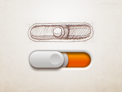
Using the excellent CSS3 options, we can create elegant and stylish buttons effortlessly (given the old browsers, of course). Whether you create a button directly in CSS or use special tools to create it, you should always carefully think about how your button will look in the context of a website.
You can always download a ready-made set of buttons that some very kind person has posted on the network. But why not sit and think that you can create something of your own, more original. I present to your attention 10 simple points that I always consider when creating a button. I'm not going to share ideas about which layer styles to use in Photoshop, but I’ll tell you about the basic principles that will help you in your projects.
It is important that your buttons match your context. This can mean both a thoughtful choice of colors and graphic style, as well as the use of logo design when creating a button. Perhaps your logo has a form that can be used effectively.
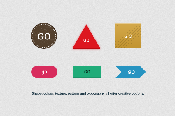
If the interface uses mostly flat colors, then large shiny buttons a la Apple are not the best option. If possible, use the logo design when creating the interface, use the appropriate shapes, colors and other forms of decoration.
Remember that you need to make a start not only from the logo, but also from the interface as a whole. It happens that buttons can be buttons, for example, only on smartphones or web applications, but it is possible on the website they can come up with a replacement.
With such a huge number of interface designs, inspired by the style of Apple, the buttons can be lost among the rest of the UI elements, losing their purpose. Try experimenting with colors, sizes, indents and fonts to make the buttons stand out in the interface.
If there are too many buttons with rounded corners in the interface, you may need to change their shape, make them, for example, round. This will give a contrast that will attract the attention of users and call them to press a button.
You should always remember that non-essential elements should not stand out from the whole interface. For example, menu items, controllers, or different sliders may be with the same angles (of the same radius), but with different shadows, borders, gradients, etc.
')
Most buttons have something like a border or stroke. If the button is darker than the background, the stroke color should be darker than the button. If, on the contrary, i.e. the background is dark, the stroke should be darker than the background. In my opinion, this rule is the most important when it comes to borders and strokes.
For a long time I have been guided by the “Law of Shadows”. This law states that any shadows work best when an element is lighter than its background. If the element is darker than its background, then the shadows should be used carefully.
Using small icons (for example, arrows) will help the user to predict what will happen after pressing a button.
For example, the arrow to the right can mean that the user moves forward a page or leaves it altogether. Down arrow - a popup menu will appear.
If you are creating an interface with many different functions, then it is important to establish some kind of visual language, defining the primary, secondary and tertiary styles.
Keep behind the primary buttons the strongest colors, and as the buttons diminish, use the weaker ones. In addition, do not forget about reducing the size of the button, empty space, text size and embossing level to reduce the visual weight of the buttons.
For some, it will seem obvious, but it is desirable to always indicate the current state of the button. The user prefers to have an idea of what stage the button is at the moment. This can be accomplished using CSS parameters such as shadows, borders, and gradients.
There is nothing wrong with using ready-made UI elements, since it’s obvious that it saves a lot of time. It is even possible that you have found the perfect element that suits you 100% (and absolutely free). Nevertheless, I believe that it is worth remembering the basic rules for creating buttons, which will be the key to a successful and efficient interface.
PS
I am pleased to accept comments about the translation. Thank!
UPD The font used in the buttons is called DIN 1451
Using the excellent CSS3 options, we can create elegant and stylish buttons effortlessly (given the old browsers, of course). Whether you create a button directly in CSS or use special tools to create it, you should always carefully think about how your button will look in the context of a website.
You can always download a ready-made set of buttons that some very kind person has posted on the network. But why not sit and think that you can create something of your own, more original. I present to your attention 10 simple points that I always consider when creating a button. I'm not going to share ideas about which layer styles to use in Photoshop, but I’ll tell you about the basic principles that will help you in your projects.
1. Brand Compliance
It is important that your buttons match your context. This can mean both a thoughtful choice of colors and graphic style, as well as the use of logo design when creating a button. Perhaps your logo has a form that can be used effectively.
The shape, color, texture, patterns and font offer a large field for creativity.
If the interface uses mostly flat colors, then large shiny buttons a la Apple are not the best option. If possible, use the logo design when creating the interface, use the appropriate shapes, colors and other forms of decoration.
2. Compliance with the content
Remember that you need to make a start not only from the logo, but also from the interface as a whole. It happens that buttons can be buttons, for example, only on smartphones or web applications, but it is possible on the website they can come up with a replacement.
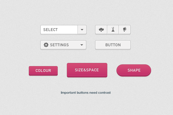
3. Is there enough contrast?
With such a huge number of interface designs, inspired by the style of Apple, the buttons can be lost among the rest of the UI elements, losing their purpose. Try experimenting with colors, sizes, indents and fonts to make the buttons stand out in the interface.
Important buttons need contrast.
4. Rounded or shaped buttons?
If there are too many buttons with rounded corners in the interface, you may need to change their shape, make them, for example, round. This will give a contrast that will attract the attention of users and call them to press a button.
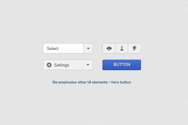
5. Hide the secondary elements.
You should always remember that non-essential elements should not stand out from the whole interface. For example, menu items, controllers, or different sliders may be with the same angles (of the same radius), but with different shadows, borders, gradients, etc.
')
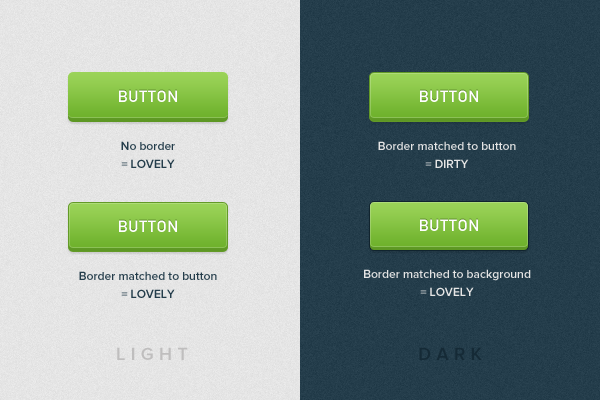
6. Stroke and Border
Most buttons have something like a border or stroke. If the button is darker than the background, the stroke color should be darker than the button. If, on the contrary, i.e. the background is dark, the stroke should be darker than the background. In my opinion, this rule is the most important when it comes to borders and strokes.
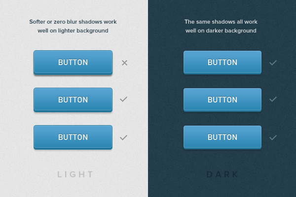
7. Be careful with blurry shadows.
For a long time I have been guided by the “Law of Shadows”. This law states that any shadows work best when an element is lighter than its background. If the element is darker than its background, then the shadows should be used carefully.
8. Icons to help you.
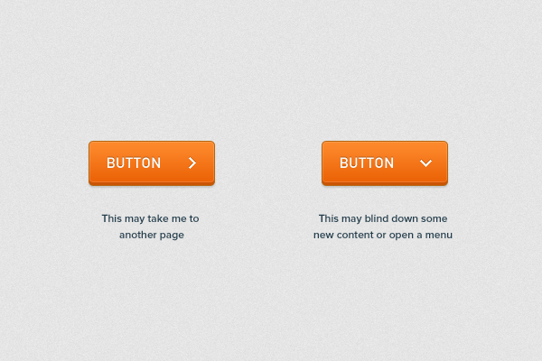
Using small icons (for example, arrows) will help the user to predict what will happen after pressing a button.
For example, the arrow to the right can mean that the user moves forward a page or leaves it altogether. Down arrow - a popup menu will appear.
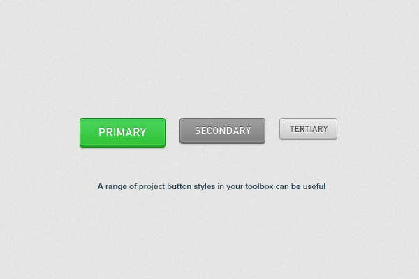
9. Remember primary, secondary and tertiary elements.
If you are creating an interface with many different functions, then it is important to establish some kind of visual language, defining the primary, secondary and tertiary styles.
Keep behind the primary buttons the strongest colors, and as the buttons diminish, use the weaker ones. In addition, do not forget about reducing the size of the button, empty space, text size and embossing level to reduce the visual weight of the buttons.
A variety of button styles can play into your hands.
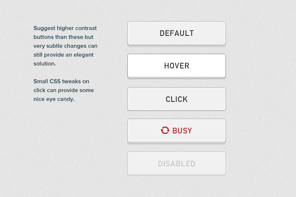
10. Indicate the state of the button.
For some, it will seem obvious, but it is desirable to always indicate the current state of the button. The user prefers to have an idea of what stage the button is at the moment. This can be accomplished using CSS parameters such as shadows, borders, and gradients.
Conclusion
There is nothing wrong with using ready-made UI elements, since it’s obvious that it saves a lot of time. It is even possible that you have found the perfect element that suits you 100% (and absolutely free). Nevertheless, I believe that it is worth remembering the basic rules for creating buttons, which will be the key to a successful and efficient interface.
PS
I am pleased to accept comments about the translation. Thank!
UPD The font used in the buttons is called DIN 1451
Source: https://habr.com/ru/post/138828/
All Articles