24 Weeks Metro-Design for Windows Phone | # 2 Windows Phone Application Design Process
Today I will talk about the process of designing Windows Phone applications, which I use. Although much of this represents the usual steps for the design process, I will try to explain them precisely in terms of the design of applications for Windows Phone. Email me on Twitter if you have any comments, questions, or leave a comment on the blog.
This article covers the process from the beginning to the end, so I will talk about high-level concepts , and in the next articles we will begin a more detailed study of each of the stages. In the next article, for example, we begin with inventing ideas and concepts — everything related to stories, sketches, storyboards, and rough (paper) prototypes. A description of this process is the basis for subsequent articles. I have no doubt that based on your feedback we will be able to improve some stages and add more examples (as soon as we complete them).
The scheme is read from the bottom up ... :-)

')
The design process for Windows Phone is no different from other design methods used in the development of websites, mobile applications and other objects from similar areas of design. Designers around the world use some design process, but give it individuality, adjust, improve and modify it for each project. There are no identical projects, so try to consider the design process more as a set of recommendations than as a set of fixed rules. Be guided by them flexibly.
It is important to understand that “design” is not a “one-time” activity - you have many visits. You are not obliged to fix the design immediately after the first attempt, on the contrary - it is an iterative process, just like the sculptors when creating works of art. When they take a piece of marble, they do not begin at the very beginning with such details as eyebrows, fingernails or hair. Instead, they take a block of marble and, on the first pass, begin to give it general forms, set the correct volume and distribution of masses. Then there is a second pass, and they begin to give more specific outlines for the arms, chest, head and legs. Then the third pass, the fourth and fifth. Many iterations take place before that point is reached when you can start working on small details.
User interface design is similar. You cannot start working out the details at the very beginning - and if you try to do so, then the beast (that is, your application) will surely sneak up and eat you: 0. For example, an application flow must be defined before you proceed to visual design. I came across this many times: we try to skip some steps in order to be ahead and finish everything quickly, but we will pay later for not exploring the possibilities of design in the early stages as the project progresses. Bryan Agnetta / Bryan Agnetta / explains it this way in his session from the BUILD conference (see, starting at 25:49).
We begin our process with the theme of the application. Wait! This is the first point where everything can fall apart! - But we are just starting, Arturo! I know, I know, but the theme of the application is extremely important for success in the next few stages. The thing that I noticed over and over again is that when we start the process of designing our application, we either 1) have a super clear idea of what we want, or 2) we base our goal on existing APIs and available web sites. services. Both approaches, in my opinion are wrong.
If you have a super clear idea of what you want, then you limit yourself and your team with a solution that you haven’t even allowed yourself to investigate. If you decide to create an application based on an existing API or web service, you will end up with another Twitter client, Yelp! or Foursquare or another security market application that retrieves data from Yahoo! Finance, or another RSS aggregator that receives news from CNN ... Look for the word CNN in the Marketplace and you will understand what I'm talking about.
Although these applications can be a good example for learning, believe me, they will not lead to a breakthrough and will not contribute to a large number of users. Do not think about the API, or RSS feeds at this stage. Think of the user experience. So instead of thinking: “RSS feed is available for CNN, cool!” - think: “What contribution can I make to the ability to get the latest and most relevant news for users?”. As soon as you begin to think about it, then you immediately open up a huge world of research for you and your team. This is no longer an RSS aggregator, now you have a higher goal: the heroic task is to help users get access to the most relevant news for them.
Since the goal is broader, solutions are less specific and this is exactly what you need at the moment. It is necessary to keep the goal open in order to be able to explore and come up with innovative ideas. Instead of thinking in terms of the API, think in terms of the user experience, such as running, dining, navigation, and then ask yourself and your team how you can enhance this experience for your users. Note that this does not necessarily mean solving the problem for the entire user process ... This may mean improving only parts of the X or Y experience in which users tend to find difficulties, or where you see the opportunity to help users realize their full potential. Later in the development process of the application, you will decide whether you want to use an API or RSS feed from any source, but the starting point should not be a technical solution. The most popular client applications for Twitter (Seesmic) and Foursquare (4th and Mayor) are successful precisely because they think first of all about experience - and not the API.
However, if you create an application for a client that has a specific product or service, or you transfer applications from iPhone or Android to Windows Phone, then of course the topic (and other details) will already be defined. In most of these cases (depending on the budget and needs of the client), you may have to go directly to the information architecture phase. I would be frank, I would like to tell you that you can still devote time to working out ideas and concepts, but in the real world, as everyone knows, if you have a client who hires you to port an iPhone / Android application to Windows Phone, rather everything, the topic, the concept and even the information architecture will already be defined.
This is not bad news :-) In fact, as soon as you reach the stages of information architecture and interactive design, the best comes from the Metro-design language: pivot pages, panoramas, application panels, lists, typography, layout and movement . When migrating applications from other platforms, your work becomes an exercise in: 1) understanding the current information architecture and then 2) translating to the correct screens, content views and navigation metaphors in Metro.
It is fundamental to understand that when migrating from iPhone and Android, you should not migrate the user interface. You are migrating an information architecture. By thinking and acting in this way, you will prevent improper conversion processes ... such as when some people try to transfer the back button from the iPhone (usually on the screen from the top left) as an on-screen button in Windows Phone ... and you know what ?. You do not need to create an on-screen “back” button in Windows Phone, because we have a hardware “Back” button. So it’s better to think in terms of “migration of information architecture” than in terms of “migration of user interface”.
Formation of ideas and concepts
Now that you have a theme (or mission) for the application, it's time to start generating ideas for it. Formation of ideas and concepts is a fun stage! - it's almost like playing games. Brainstorming, sketching and storytelling games. There are three main stages in the phase of the formation of ideas and concepts: 1) brainstorming, 2) research and 3) consolidation. In a nutshell, at the brainstorming stage, you create tons of ideas, at the research stage, you dissect and study many of these ideas (but not all), and at the consolidation stage, you decide which ideas will go forward to become part of your application. Only some of them make him alive.
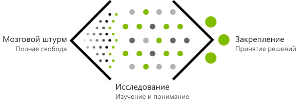
Brainstorming - complete freedom
This stage, the purpose of which is to create a huge number of ideas that relate to your mission, for example, such as "improving the experience of booking a hotel room." Imagination, inventing delusional and even crazy ideas - these are good skills that will be useful at this moment. Play and do not constrain yourself with any framework. There are special brainstorming exercises, such as “subjects + verbs + objects” and various ways to enhance the thinking process, for example, alternative worlds, impossible scripts and other people's images. We will discuss all these methods in the next article.
You can play these games with your team or even friends if you are an independent developer. The goal at this stage is not to find out "how this or that will be built or programmed." And not even in how something will look. The idea is to generate ideas and the crazier the better. In the next few stages, these ideas will be lowered to the ground and will find their embodiment. In the end, as we all know, somewhere around there are a million beautiful ideas, but only one or two, properly implemented, succeed.
Research - Criticism / study / verification
At the research stage, you will take some (not all) of the ideas from those that left the brainstorming stage, and try to find out more about them. You will understand them better by analyzing, testing and testing. Ideas were only born at this moment, they are still babies and have not reached full development or maturity. Some of them, perhaps crazy ideas created during a brainstorming session, will collapse, but others will go further. You will undoubtedly notice that you yourself or other members of your team will extol, adapt and be disappointed in some ideas - your children. I would like to say that this is not good, but at the same time, you must choose and love certain ideas so that you can really push them forward.
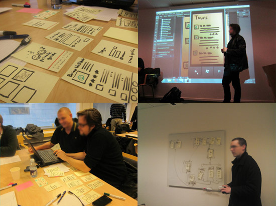
Sometimes ideas need to be developed to fully express themselves. If you give up on the idea too quickly, you can miss a good opportunity. Fortunately, at this stage we have 4 very useful tools that allow us to explore our ideas and find a few good ones: sketches, storyboards, prototypes (paper) and storytelling . These tools help developers and designers test their ideas.
Despite initial expectations, sketching can be learned, and usually smaller drawing skills can even help you stay more abstract at this point. Storyboarding will help you tell stories in much the same way that Pixar or Dreamworks animators do. Here you use drawings and a board with scenes with users that help to show ideas that improve the user experience through applications. This is a visual tool.
Prototypes are a whole world for separate study, but at this stage we will focus on paper prototypes. There are several ways to make them: one of them is literally the creation of analog prototypes made of paper, stickers, cardboard and adhesive tape. You can test scripts manually by overlaying some screens on top of others to transfer interaction. This type of paper prototyping requires guidance and a special person testing user responses.
I know it sounds like a completely stupid activity! :-) But seriously, this is not so ... this is a very serious thing. It's amazing how much feedback you can get by investing $ 0 and only 15-60 minutes to make a paper prototype. I will not advise you to make paper prototypes in the later stages of the design process, but at the moment it is your best tool.
Another way is to make "paper" prototypes using Expression Blend (or Powerpoint or any other "interactive tool"). This is a mixed analog-digital technology, which was first shown to me by Jared Potter / Jared Potter / - Sr. Design Integrator in design studio. In a nutshell, you make sketches of screens on paper, take photos of them, insert these photos into Expression Blend, add transparent buttons on top of the “clickable” areas and connect navigation. Done! He calls it 15-minute paper prototyping, and we'll talk more about that in the next article.
Consolidation - decision making
You started the process with a bunch of ideas during a brainstorming session. You allowed yourself and your team to explore many of these ideas ... but here, at the consolidation stage, only a few ideas, the best ones, will remain alive. This is the stage when you make decisions about what to implement in the application and what is not. There are various exercises to help your team narrow down the list and sort the list of ideas by priority. The goal here is to remove uncertainty as much as possible. At this point, ideas have evolved into something more than just concepts, and, in most cases, have become user scenarios (or information scenarios). The list of priority scenarios is what you need to move to the next stage.
The goal of the information architecture is to define information, tasks and relationships between them. This is what the user receives in digital form: information and the ability to do something with this information - whether it is the consumption of information to help in making decisions or gaining knowledge about something, or to create information.
Information architecture (IA) is a whole separate discipline (there is even an Institute for Information Architecture ). The purpose of the information architecture is to organize information.
At the stage of forming ideas and concepts, you created some great ideas. These user scenarios are associated with shapeless clusters of information, such as names, dates, prices, images, temperature ranges — at the information architecture stage you take this shapeless piece and form the structure of information. Make it the first time is impossible. This requires many passes.
We have two very useful tools that help us identify our AI: application flowchart (s) (application flow diagrams) and coarse prototyping .

So you apply the first idea to your information architecture and test it by creating application flow diagrams. They have different levels of maturity: they usually start with a task flow and then go on to detailed screens + content views + navigation charts .
Remember the good old flowcharts for software development (or any other process)? These are the same application flow diagrams, only the visual presentation that we use is focused on the user flow and the design tasks of user experience and interactions. As soon as you make an application flow diagram, you can try to tell the story of the corresponding custom script. As a result, you will get feedback and ideas for processing the information architecture, and you can return to its description in order to do polishing.
Then you come back and check again, creating a more accurate application flow diagram, and so on and so forth. Little by little, the flow diagrams of an application become more detailed, moving from simple task flows to screens that show the idea of presenting content and even navigation. I would not call high-quality application flow diagrams as screen layouts (wireframe), but many people would. Low accuracy schemes, of course.
Another tool we have is coarse (low quality) prototypes . At this point, paper prototypes may continue to be useful because of their low cost (in monetary terms and time-consuming), however, the flow diagrams of the application will become more and more accurate step by step, and you can start using these diagrams to build a prototype . You can print an application flow diagram and build an analog prototype (instead of sketches using printed materials) or use Jared's technique for prototyping in Expression Blend, but instead of taking thumbnail photos, you take screens from the application flow.
In the end, you will have a solid information architecture document with structured information, a solid set of application flow diagrams, and even some rough prototypes based on these schemes.
After creating the schema of the process of designing applications for Windows Phone, I noticed one thing: the information architecture represents almost 35% of the total height, almost as much as the interactive design (the next step). Although my diagram does not necessarily reflect the scale of the stages within the project, I must say that this is a fairly accurate assessment — the information architecture deserves all this time. If you figure out the IA, everything else becomes much easier.
We will have a special article on information architecture for Windows Phone applications in a few weeks.
We have defined the structure of the information, as well as the tasks that users can perform with this information. Now we have to start developing the user interface for all these things in order to revive them.
The essence of interaction design is as follows: to create a set of user interface elements and interaction experience that will allow our well-structured information to emerge, and our users to successfully complete their tasks related to this information. What we want to achieve at this stage is to provide information and tasks with the highest chances for implementation. Although our information architecture may simply be perfect, if the interactive design is not fully developed, this will result in our information not being fully manifested in our application and / or users will not be able to perform the desired tasks.
In my opinion, by default, interactive design (interaction design) is a filter to information and tasks. This is a filter, because, by definition, it is neither information nor tasks , it is only a means. The interaction design (or user interfaces) is between the user and the information. In other words, the user interface (what is the result of an interactive design) must be guilty until proven otherwise. :-)
I think this concept is in good agreement with what Metro-design principles are talking about: the main acting player of the virtual scene is information, not the user interface. The user interface is only to post information and make it possible to complete tasks. It is already a question of good (or bad) design execution, whether the user interface layer is a thin, almost invisible veil or a thick and heavy membrane . And I’m not even talking about visual design yet - only about interaction design: how the user interacts with the information and tasks that are possible with respect to this connection.
If there were no Metro-design language for Windows Phone, then we would have to work out the interaction metaphors from scratch. , , Metro, , , Metro-, Windows Phone .
. Metro. , (pivot) (panorama) . . , ( ). Windows Phone. , , , : .

, : , Windows Phone , , , , «». , , , .
, 3 , : 1) Windows Phone 2) 3) Metro. , , , . Windows Phone .
, , Windows Phone ? Yes! :-) Metro- Windows Phone! , , Metro , Metro- Windows Phone . , , , , ( - Metro- ).
Photoshop (ListView_PSD.psd), (Panorama_PSD.psd), . .
, , , . ! – … :-) , , — . : - Windows Phone Windows Phone. , . 200 Windows Phone Design Day , 90% , .
- Metro- , , , . . :-) - ? Yes! — 6 , Windows Phone (pivot) . , Windows Phone , .
Windows Phone , (pivot) (panorama). . . 3 . ( ). . Windows Phone, Metro- . , « , », . Windows Phone «Core77» .
: Photoshop, Illustrator, Expression Design XAML. , , , . , , . ! :-)
, , (wireframes). . ! ( )… ! , , Expression Design, Visio, Photoshop Illustrator ( , Visio … ).
: . , . , — , .
, , , (, — turnstyle) (, — continuum). Windows Phone, , .
( ), , , , . , A, B C . … ?
, , . . : !
(, , ) : , , ? — . , (-) . , Expression Design ( , , Photoshop Illustrator) :-) – . , , ! – ( , Visual Studio !).
, , . , - , , , , , , – . , , , . , ( , ), " ".
, , - 1000 . Windows Phone , , , :-) . , , , , , , , .
, , , , , . , , . , , .
, , , , , , , .
, , ? , , . — , . , , .
, , . ; , , .
, , , -, / . , istockphoto.com – , . , , , , .
« » (redlines)? « » (greenlines)? . . , , , , , , , , , , , , , .. ..… , , « ». , , … , … , , — , .
« » , . , , , Windows Phone. « »? — , Expression Blend ! :-) Expression Blend . , , Windows Phone .
, , « » , — XAML. ( ), , XAML Blend, . , , , . .
XAML — « » . « » (, ): 30 150 , 24 427 , . Point. . , « », - JPG ( JPG , PNG! – ) - HTML CSS. . « » «», , ! « » .
« »? - Windows Phone , . , 10 , 20 ( ). « » , – , , , . « » « ».
« », « », , . , , . Windows Phone XAML. Windows 8 HTML/CSS. , , , , (panoramas) (pivots) , .
, , … . , , , . / – . , , , , .
That's all. . , .
| #3
| #1 Metro- Metro-
: (Arturo Toledo)
: Petrishko , kichik
: kichik
PS Metro MSDN « metro- »
This article covers the process from the beginning to the end, so I will talk about high-level concepts , and in the next articles we will begin a more detailed study of each of the stages. In the next article, for example, we begin with inventing ideas and concepts — everything related to stories, sketches, storyboards, and rough (paper) prototypes. A description of this process is the basis for subsequent articles. I have no doubt that based on your feedback we will be able to improve some stages and add more examples (as soon as we complete them).
The scheme is read from the bottom up ... :-)
')
The design process for Windows Phone is no different from other design methods used in the development of websites, mobile applications and other objects from similar areas of design. Designers around the world use some design process, but give it individuality, adjust, improve and modify it for each project. There are no identical projects, so try to consider the design process more as a set of recommendations than as a set of fixed rules. Be guided by them flexibly.
It is important to understand that “design” is not a “one-time” activity - you have many visits. You are not obliged to fix the design immediately after the first attempt, on the contrary - it is an iterative process, just like the sculptors when creating works of art. When they take a piece of marble, they do not begin at the very beginning with such details as eyebrows, fingernails or hair. Instead, they take a block of marble and, on the first pass, begin to give it general forms, set the correct volume and distribution of masses. Then there is a second pass, and they begin to give more specific outlines for the arms, chest, head and legs. Then the third pass, the fourth and fifth. Many iterations take place before that point is reached when you can start working on small details.
User interface design is similar. You cannot start working out the details at the very beginning - and if you try to do so, then the beast (that is, your application) will surely sneak up and eat you: 0. For example, an application flow must be defined before you proceed to visual design. I came across this many times: we try to skip some steps in order to be ahead and finish everything quickly, but we will pay later for not exploring the possibilities of design in the early stages as the project progresses. Bryan Agnetta / Bryan Agnetta / explains it this way in his session from the BUILD conference (see, starting at 25:49).
Theme of the application
We begin our process with the theme of the application. Wait! This is the first point where everything can fall apart! - But we are just starting, Arturo! I know, I know, but the theme of the application is extremely important for success in the next few stages. The thing that I noticed over and over again is that when we start the process of designing our application, we either 1) have a super clear idea of what we want, or 2) we base our goal on existing APIs and available web sites. services. Both approaches, in my opinion are wrong.
If you have a super clear idea of what you want, then you limit yourself and your team with a solution that you haven’t even allowed yourself to investigate. If you decide to create an application based on an existing API or web service, you will end up with another Twitter client, Yelp! or Foursquare or another security market application that retrieves data from Yahoo! Finance, or another RSS aggregator that receives news from CNN ... Look for the word CNN in the Marketplace and you will understand what I'm talking about.
Although these applications can be a good example for learning, believe me, they will not lead to a breakthrough and will not contribute to a large number of users. Do not think about the API, or RSS feeds at this stage. Think of the user experience. So instead of thinking: “RSS feed is available for CNN, cool!” - think: “What contribution can I make to the ability to get the latest and most relevant news for users?”. As soon as you begin to think about it, then you immediately open up a huge world of research for you and your team. This is no longer an RSS aggregator, now you have a higher goal: the heroic task is to help users get access to the most relevant news for them.
Since the goal is broader, solutions are less specific and this is exactly what you need at the moment. It is necessary to keep the goal open in order to be able to explore and come up with innovative ideas. Instead of thinking in terms of the API, think in terms of the user experience, such as running, dining, navigation, and then ask yourself and your team how you can enhance this experience for your users. Note that this does not necessarily mean solving the problem for the entire user process ... This may mean improving only parts of the X or Y experience in which users tend to find difficulties, or where you see the opportunity to help users realize their full potential. Later in the development process of the application, you will decide whether you want to use an API or RSS feed from any source, but the starting point should not be a technical solution. The most popular client applications for Twitter (Seesmic) and Foursquare (4th and Mayor) are successful precisely because they think first of all about experience - and not the API.
However, if you create an application for a client that has a specific product or service, or you transfer applications from iPhone or Android to Windows Phone, then of course the topic (and other details) will already be defined. In most of these cases (depending on the budget and needs of the client), you may have to go directly to the information architecture phase. I would be frank, I would like to tell you that you can still devote time to working out ideas and concepts, but in the real world, as everyone knows, if you have a client who hires you to port an iPhone / Android application to Windows Phone, rather everything, the topic, the concept and even the information architecture will already be defined.
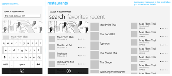
This is not bad news :-) In fact, as soon as you reach the stages of information architecture and interactive design, the best comes from the Metro-design language: pivot pages, panoramas, application panels, lists, typography, layout and movement . When migrating applications from other platforms, your work becomes an exercise in: 1) understanding the current information architecture and then 2) translating to the correct screens, content views and navigation metaphors in Metro.
It is fundamental to understand that when migrating from iPhone and Android, you should not migrate the user interface. You are migrating an information architecture. By thinking and acting in this way, you will prevent improper conversion processes ... such as when some people try to transfer the back button from the iPhone (usually on the screen from the top left) as an on-screen button in Windows Phone ... and you know what ?. You do not need to create an on-screen “back” button in Windows Phone, because we have a hardware “Back” button. So it’s better to think in terms of “migration of information architecture” than in terms of “migration of user interface”.
Formation of ideas and concepts
Now that you have a theme (or mission) for the application, it's time to start generating ideas for it. Formation of ideas and concepts is a fun stage! - it's almost like playing games. Brainstorming, sketching and storytelling games. There are three main stages in the phase of the formation of ideas and concepts: 1) brainstorming, 2) research and 3) consolidation. In a nutshell, at the brainstorming stage, you create tons of ideas, at the research stage, you dissect and study many of these ideas (but not all), and at the consolidation stage, you decide which ideas will go forward to become part of your application. Only some of them make him alive.
Brainstorming - complete freedom
This stage, the purpose of which is to create a huge number of ideas that relate to your mission, for example, such as "improving the experience of booking a hotel room." Imagination, inventing delusional and even crazy ideas - these are good skills that will be useful at this moment. Play and do not constrain yourself with any framework. There are special brainstorming exercises, such as “subjects + verbs + objects” and various ways to enhance the thinking process, for example, alternative worlds, impossible scripts and other people's images. We will discuss all these methods in the next article.
You can play these games with your team or even friends if you are an independent developer. The goal at this stage is not to find out "how this or that will be built or programmed." And not even in how something will look. The idea is to generate ideas and the crazier the better. In the next few stages, these ideas will be lowered to the ground and will find their embodiment. In the end, as we all know, somewhere around there are a million beautiful ideas, but only one or two, properly implemented, succeed.
Research - Criticism / study / verification
At the research stage, you will take some (not all) of the ideas from those that left the brainstorming stage, and try to find out more about them. You will understand them better by analyzing, testing and testing. Ideas were only born at this moment, they are still babies and have not reached full development or maturity. Some of them, perhaps crazy ideas created during a brainstorming session, will collapse, but others will go further. You will undoubtedly notice that you yourself or other members of your team will extol, adapt and be disappointed in some ideas - your children. I would like to say that this is not good, but at the same time, you must choose and love certain ideas so that you can really push them forward.
Sometimes ideas need to be developed to fully express themselves. If you give up on the idea too quickly, you can miss a good opportunity. Fortunately, at this stage we have 4 very useful tools that allow us to explore our ideas and find a few good ones: sketches, storyboards, prototypes (paper) and storytelling . These tools help developers and designers test their ideas.
Despite initial expectations, sketching can be learned, and usually smaller drawing skills can even help you stay more abstract at this point. Storyboarding will help you tell stories in much the same way that Pixar or Dreamworks animators do. Here you use drawings and a board with scenes with users that help to show ideas that improve the user experience through applications. This is a visual tool.
Prototypes are a whole world for separate study, but at this stage we will focus on paper prototypes. There are several ways to make them: one of them is literally the creation of analog prototypes made of paper, stickers, cardboard and adhesive tape. You can test scripts manually by overlaying some screens on top of others to transfer interaction. This type of paper prototyping requires guidance and a special person testing user responses.
I know it sounds like a completely stupid activity! :-) But seriously, this is not so ... this is a very serious thing. It's amazing how much feedback you can get by investing $ 0 and only 15-60 minutes to make a paper prototype. I will not advise you to make paper prototypes in the later stages of the design process, but at the moment it is your best tool.
Another way is to make "paper" prototypes using Expression Blend (or Powerpoint or any other "interactive tool"). This is a mixed analog-digital technology, which was first shown to me by Jared Potter / Jared Potter / - Sr. Design Integrator in design studio. In a nutshell, you make sketches of screens on paper, take photos of them, insert these photos into Expression Blend, add transparent buttons on top of the “clickable” areas and connect navigation. Done! He calls it 15-minute paper prototyping, and we'll talk more about that in the next article.
Consolidation - decision making
You started the process with a bunch of ideas during a brainstorming session. You allowed yourself and your team to explore many of these ideas ... but here, at the consolidation stage, only a few ideas, the best ones, will remain alive. This is the stage when you make decisions about what to implement in the application and what is not. There are various exercises to help your team narrow down the list and sort the list of ideas by priority. The goal here is to remove uncertainty as much as possible. At this point, ideas have evolved into something more than just concepts, and, in most cases, have become user scenarios (or information scenarios). The list of priority scenarios is what you need to move to the next stage.
Information architecture
The goal of the information architecture is to define information, tasks and relationships between them. This is what the user receives in digital form: information and the ability to do something with this information - whether it is the consumption of information to help in making decisions or gaining knowledge about something, or to create information.
Information architecture (IA) is a whole separate discipline (there is even an Institute for Information Architecture ). The purpose of the information architecture is to organize information.
At the stage of forming ideas and concepts, you created some great ideas. These user scenarios are associated with shapeless clusters of information, such as names, dates, prices, images, temperature ranges — at the information architecture stage you take this shapeless piece and form the structure of information. Make it the first time is impossible. This requires many passes.
We have two very useful tools that help us identify our AI: application flowchart (s) (application flow diagrams) and coarse prototyping .
So you apply the first idea to your information architecture and test it by creating application flow diagrams. They have different levels of maturity: they usually start with a task flow and then go on to detailed screens + content views + navigation charts .
Remember the good old flowcharts for software development (or any other process)? These are the same application flow diagrams, only the visual presentation that we use is focused on the user flow and the design tasks of user experience and interactions. As soon as you make an application flow diagram, you can try to tell the story of the corresponding custom script. As a result, you will get feedback and ideas for processing the information architecture, and you can return to its description in order to do polishing.
Then you come back and check again, creating a more accurate application flow diagram, and so on and so forth. Little by little, the flow diagrams of an application become more detailed, moving from simple task flows to screens that show the idea of presenting content and even navigation. I would not call high-quality application flow diagrams as screen layouts (wireframe), but many people would. Low accuracy schemes, of course.
Another tool we have is coarse (low quality) prototypes . At this point, paper prototypes may continue to be useful because of their low cost (in monetary terms and time-consuming), however, the flow diagrams of the application will become more and more accurate step by step, and you can start using these diagrams to build a prototype . You can print an application flow diagram and build an analog prototype (instead of sketches using printed materials) or use Jared's technique for prototyping in Expression Blend, but instead of taking thumbnail photos, you take screens from the application flow.
In the end, you will have a solid information architecture document with structured information, a solid set of application flow diagrams, and even some rough prototypes based on these schemes.
After creating the schema of the process of designing applications for Windows Phone, I noticed one thing: the information architecture represents almost 35% of the total height, almost as much as the interactive design (the next step). Although my diagram does not necessarily reflect the scale of the stages within the project, I must say that this is a fairly accurate assessment — the information architecture deserves all this time. If you figure out the IA, everything else becomes much easier.
We will have a special article on information architecture for Windows Phone applications in a few weeks.
Interaction design
We have defined the structure of the information, as well as the tasks that users can perform with this information. Now we have to start developing the user interface for all these things in order to revive them.
The essence of interaction design is as follows: to create a set of user interface elements and interaction experience that will allow our well-structured information to emerge, and our users to successfully complete their tasks related to this information. What we want to achieve at this stage is to provide information and tasks with the highest chances for implementation. Although our information architecture may simply be perfect, if the interactive design is not fully developed, this will result in our information not being fully manifested in our application and / or users will not be able to perform the desired tasks.
In my opinion, by default, interactive design (interaction design) is a filter to information and tasks. This is a filter, because, by definition, it is neither information nor tasks , it is only a means. The interaction design (or user interfaces) is between the user and the information. In other words, the user interface (what is the result of an interactive design) must be guilty until proven otherwise. :-)
I think this concept is in good agreement with what Metro-design principles are talking about: the main acting player of the virtual scene is information, not the user interface. The user interface is only to post information and make it possible to complete tasks. It is already a question of good (or bad) design execution, whether the user interface layer is a thin, almost invisible veil or a thick and heavy membrane . And I’m not even talking about visual design yet - only about interaction design: how the user interacts with the information and tasks that are possible with respect to this connection.
If there were no Metro-design language for Windows Phone, then we would have to work out the interaction metaphors from scratch. , , Metro, , , Metro-, Windows Phone .
. Metro. , (pivot) (panorama) . . , ( ). Windows Phone. , , , : .
, : , Windows Phone , , , , «». , , , .
, 3 , : 1) Windows Phone 2) 3) Metro. , , , . Windows Phone .
, , Windows Phone ? Yes! :-) Metro- Windows Phone! , , Metro , Metro- Windows Phone . , , , , ( - Metro- ).
Photoshop (ListView_PSD.psd), (Panorama_PSD.psd), . .
, , , . ! – … :-) , , — . : - Windows Phone Windows Phone. , . 200 Windows Phone Design Day , 90% , .
- Metro- , , , . . :-) - ? Yes! — 6 , Windows Phone (pivot) . , Windows Phone , .
Windows Phone , (pivot) (panorama). . . 3 . ( ). . Windows Phone, Metro- . , « , », . Windows Phone «Core77» .
: Photoshop, Illustrator, Expression Design XAML. , , , . , , . ! :-)
, , (wireframes). . ! ( )… ! , , Expression Design, Visio, Photoshop Illustrator ( , Visio … ).
: . , . , — , .
, , , (, — turnstyle) (, — continuum). Windows Phone, , .
( ), , , , . , A, B C . … ?
, , . . : !
(, , ) : , , ? — . , (-) . , Expression Design ( , , Photoshop Illustrator) :-) – . , , ! – ( , Visual Studio !).
, , . , - , , , , , , – . , , , . , ( , ), " ".
, , - 1000 . Windows Phone , , , :-) . , , , , , , , .
, , , , , . , , . , , .
, , , , , , , .
, , ? , , . — , . , , .
, , . ; , , .
, , , -, / . , istockphoto.com – , . , , , , .
« » (redlines)? « » (greenlines)? . . , , , , , , , , , , , , , .. ..… , , « ». , , … , … , , — , .
« » , . , , , Windows Phone. « »? — , Expression Blend ! :-) Expression Blend . , , Windows Phone .
, , « » , — XAML. ( ), , XAML Blend, . , , , . .
XAML — « » . « » (, ): 30 150 , 24 427 , . Point. . , « », - JPG ( JPG , PNG! – ) - HTML CSS. . « » «», , ! « » .
« »? - Windows Phone , . , 10 , 20 ( ). « » , – , , , . « » « ».
« », « », , . , , . Windows Phone XAML. Windows 8 HTML/CSS. , , , , (panoramas) (pivots) , .
, , … . , , , . / – . , , , , .
That's all. . , .
| #3
| #1 Metro- Metro-
: (Arturo Toledo)
: Petrishko , kichik
: kichik
PS Metro MSDN « metro- »
Source: https://habr.com/ru/post/138065/
All Articles