Customize the appearance of the UIPopoverController
UIPopoverController or pop-up window (hereinafter simply “popover”) element is not new. On Habré there is one introductory article on this topic and several mentions in other topics. Most often, poppers are used “as is” and do not require any modifications, but in some projects there is a need to change the appearance of this element. Just about how to do it and this article will be.The article is not just a translation or retelling of Apple documentation. I ran into a problem in a real project, skipped the material through myself (in a good sense of the word), prepared a thoroughly chewed explanation and, finally, spiced it all up with a concrete implementation that could be useful to you.
Why do you need it?
As I wrote above, I was faced with such a need on the example of a specific project. Initially, the application was written under the iPhone and “completed” in red, namely, the
appearance method of the UINavigationBar class was used')
[[UINavigationBar appearance] setTintColor: [UIColor colorWithRed:0.481 green:0.065 blue:0.081 alpha:1.000]]; [[UINavigationBar appearance] setBackgroundImage:[UIImage imageNamed:@"navbar"] forBarMetrics:UIBarMetricsDefault]; The result was something like this:

When, on the basis of an existing application, they began to make a version for iPad, it was necessary to place the
UINavigationController inside the popover.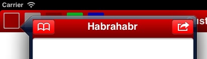
You can, of course, return the default appearance to the
UINavigationBar class, if it is displayed inside the popover [[UINavigationBar appearanceWhenContainedIn:[UIPopoverController class], nil] setBackgroundImage:nil forBarMetrics:UIBarMetricsDefault]; [[UINavigationBar appearanceWhenContainedIn:[UIPopoverController class], nil] setTintColor:[UIColor clearColor]]; 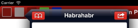
In principle, it is not deadly, but, let's say, the customer (and he is always right) said that this will not work and “repaint the popovers!”. This is
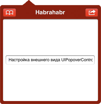
popoverBackgroundViewClass property of the popoverBackgroundViewClass class UIPopoverController . Our task is to inherit the UIPopoverBackgroundView class, strictly following the documentation.Inheritance of UIPopoverBackgroundView
Documentation, of course, describes in detail what and how to do, which methods to override and for what. In addition, practical recommendations are given - it is better to use images and the
UIImageView class for drawing the background and arrows. All this is “in words,” I personally find it easier to read the text if it includes illustrations, so I will try to fill this “gap”. In parallel, we will start writing the implementation of our specific subclass UIPopoverBackgroundView . The first thing we will do is simply inherit it and leave it so far without implementation. #import <UIKit/UIPopoverBackgroundView.h> @interface MBPopoverBackgroundView : UIPopoverBackgroundView @end Anatomy of a UIPopoverController
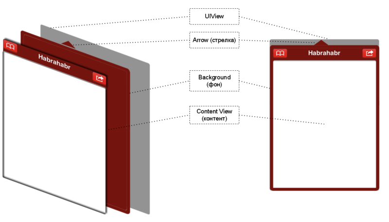
UIPopoverController consists of an arrow (Arrow), a background (Background), content or content (Content View), and a UIView in which all this stuff is contained and drawn.Arrow
 In essence, the “arrow” in this context is a purely figurative term. We are limited only by our own imagination and common sense choosing the look of the arrow. This can be a dotted line, a curve, an arbitrary picture. We can just use a
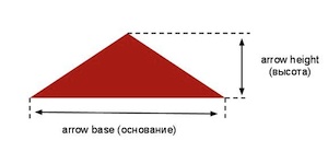
 UIView with an overridden draw method and draw with gl*** functions, we can use an animated UIImageView , etc. The only thing to remember is the width of the base of the arrow ( arrowBase ) and its height ( arrowHeight ) remain unchanged for all instances of our class. Although this limitation can be bypassed to some extent, this will be discussed later.Now choose
UIImageView to represent the arrow, following Apple's advice. Also pay attention to the class +(CGFloat)arrowBase and +(CGFloat)arrowHeight . By default, they both throw an exception, so we have to override them in our subclass.For simplicity, just agree that the image of the arrow we have and it is stored in the file "popover-arrow.png". Now you can safely code it all
@interface MBPopoverBackgroundView () // image view @property (nonatomic, strong) UIImageView *arrowImageView; @end @implementation MBPopoverBackgroundView @synthesize arrowImageView = _arrowImageView; // (arrow base) + (CGFloat)arrowBase { // return [UIImage imageNamed:@"popover-arrow.png"].size.width; } // (arrow height) + (CGFloat)arrowHeight { // return [UIImage imageNamed:@"popover-arrow.png"].size.height; } // - (id)initWithFrame:(CGRect)frame { self = [super initWithFrame:frame]; if (!self) return nil; // image view self.arrowImageView = [[UIImageView alloc] initWithImage:@"popover-arrow.png"]; [self addSubview:_arrowImageView]; return self; } @end But this is not all about the arrow. Our responsibilities also include redefining two properties.
@property (nonatomic, readwrite) UIPopoverArrowDirection arrowDirection; @property (nonatomic, readwrite) CGFloat arrowOffset; otherwise, we will catch the same exception if we try to call a setter or getter for any of them.
The direction of the arrow (
arrowDirection ) tells us where the arrow points (up, down, left, right) and where it is actually located. The offset of the arrow ( arrowOffset ) is the distance from the center of our view to the line passing through the center of the arrow, in general, look at the illustration, everything is clearly shown there, the displacements are marked in blue. The up and left offsets are negative.
The documentation recommends implementing setter and getter for these properties. But I found out in practice that it is possible to declare these properties and synthesize the necessary methods.
@interface MBPopoverBackgroundView () // @property (nonatomic, readwrite) UIPopoverArrowDirection arrowDirection; @property (nonatomic, readwrite) CGFloat arrowOffset; @end @implementation MBPopoverBackgroundView @synthesize arrowDirection = _arrowDirection; @synthesize arrowOffset = _arrowOffset; @end Changing any of these properties is a signal that you need to change the size and location of the arrow and the background. We will use the Key-Value Observing mechanism for this purpose. As soon as the property has changed, we
MBPopoverBackgroundView let our MBPopoverBackgroundView that it’s time to put things in order and place the children (subviews) in places, i.e. call setNeedsLayout . This, in turn, will lead to a call to layoutSubviews at the next right moment (when the operating system solves). About the implementation of layoutSubviews will be discussed in detail a little later. - (id)initWithFrame:(CGRect)frame { // *** *** [self addObserver:self forKeyPath:@"arrowDirection" options:0 context:nil]; [self addObserver:self forKeyPath:@"arrowOffset" options:0 context:nil]; return self; } - (void)observeValueForKeyPath:(NSString *)keyPath ofObject:(id)object change:(NSDictionary *)change context:(void *)context { // // setNeedsLayout [self setNeedsLayout]; } - (void)dealloc { [self removeObserver:self forKeyPath:@"arrowDirection"]; [self removeObserver:self forKeyPath:@"arrowOffset"]; // *** "" *** [super dealloc]; } Background
Much of what has been said about the arrow applies to the background. We will also select a
UIImageView for a specific implementation. But, while the arrow does not change its size, the background behaves completely differently. In your application, you will use popovers for a variety of purposes and stuff contents of various sizes inside. The background should look equally good both for a small tooltip and an unimaginable popover on the floor of the screen. Apple recommends using stretchable images; the UIImageView class provides the resizableImageWithCapInsets:(UIEdgeInsets)capInsets method for these purposes resizableImageWithCapInsets:(UIEdgeInsets)capInsets . For example, I created a simple background, a rectangle of size 128x128 with rounded corners and filled with one color without gradients, shadows and other effects. Name the file "popover-background.png". @property (nonatomic, strong) UIImageView *backgroundImageView; // *** @synthesize backgroundImageView = _backgroundImageView; - (id)initWithFrame:(CGRect)frame { // *** UIEdgeInsets bgCapInsets = UIEdgeInsetsMake(12, 12, 12, 12); UIImage *bgImage = [[UIImage imageNamed:@"popover-backgroung.png"] resizableImageWithCapInsets:bgCapInsets]; self.backgroundImageView = [[UIImageView alloc] initWithImage:bgImage]; [self addSubview:_backgroundImageView]; // *** } UIEdgeInsets options are specified using indents ( UIEdgeInsets ). Specific values depend on the selected image. In my case, for example, the radius of the rounding of corners is 10, so, in theory, the indent could be taken equal to 10 from all borders, but this is not significant.
Content
Content or content is what is displayed inside the popover. In the context of
UIPopoverBackgroundView we have no influence on the content and its size, on the contrary, it is the size of the content that determines the size of the popover, and hence the size of the UIPopoverBackgroundView .This is how it happens. When the
UIPopoverController ready to render the popover, it knows exactly the content size and position from which to draw the popover, it only remains to find out how much more to add along the edges to fit the arrow and the background, in other words, to calculate the frame property for our MBPopoverBackgroundView .It is for these purposes that the
+(CGFloat)arrowHeight and +(UIEdgeInsets)contentViewInsets . The first tells the height of the arrow, the second tells how much background is more content, returning indents from the edges of the content to the edges of the background. Using all this information, UIPopoverController chooses the direction for the arrow and initializes an object of the UIPopoverBackgroundView class (or rather our particular subclass), setting it with specific dimensions, after which we should place our arrow and background as it should.Redefine
contentViewInsets . For example, we indent 10 at all edges. You can also set negative indents, I don’t think that something good will turn out, but you can ... + (UIEdgeInsets)contentViewInsets { // return UIEdgeInsetsMake(10, 10, 10, 10); } Now around our content will be a frame of the background thickness of 10 pixels.

Layout
Finally, the last stage is to correctly position the arrow and the background, taking into account the direction of the arrow, its offset, and the specific dimensions of our
UIPopoverBackgroundView .To do this, we implement the
layoutSubviews method. #pragma mark - Subviews Layout // , setNeedsLayout - (void)layoutSubviews { // // CGRect bgRect = self.bounds; // , "" // , / , BOOL cutWidth = (_arrowDirection == UIPopoverArrowDirectionLeft || _arrowDirection == UIPopoverArrowDirectionRight); // , bgRect.size.width -= cutWidth * [self.class arrowHeight]; BOOL cutHeight = (_arrowDirection == UIPopoverArrowDirectionUp || _arrowDirection == UIPopoverArrowDirectionDown); // , bgRect.size.height -= cutHeight * [self.class arrowHeight]; // , origin point ( ) // ( ) ( ) if (_arrowDirection == UIPopoverArrowDirectionUp) { bgRect.origin.y += [self.class arrowHeight]; } else if (_arrowDirection == UIPopoverArrowDirectionLeft) { bgRect.origin.x += [self.class arrowHeight]; } // _backgroundImageView.frame = bgRect; // - (arrowDirection) (arrowOffset) // , image view // ( transformations), // : CGRect arrowRect = CGRectZero; UIEdgeInsets bgCapInsets = UIEdgeInsetsMake(12, 12, 12, 12); // switch (_arrowDirection) { case UIPopoverArrowDirectionUp: _arrowImageView.transform = CGAffineTransformMakeScale(1, 1); // - // : frame, bounds, bounds arrowRect = _arrowImageView.frame; // origin arrowRect.origin.x = self.bounds.size.width / 2 + _arrowOffset - arrowRect.size.width / 2; arrowRect.origin.y = 0; break; case UIPopoverArrowDirectionDown: _arrowImageView.transform = CGAffineTransformMakeScale(1, -1); // () arrowRect = _arrowImageView.frame; // origin arrowRect.origin.x = self.bounds.size.width / 2 + _arrowOffset - arrowRect.size.width / 2; arrowRect.origin.y = self.bounds.size.height - arrowRect.size.height; break; case UIPopoverArrowDirectionLeft: _arrowImageView.transform = CGAffineTransformMakeRotation(-M_PI_2); // 90 arrowRect = _arrowImageView.frame; // origin arrowRect.origin.x = 0; arrowRect.origin.y = self.bounds.size.height / 2 + _arrowOffset - arrowRect.size.height / 2; // - // , // , bgCapInsets.bottom, // arrowRect.origin.y = fminf(self.bounds.size.height - arrowRect.size.height - bgCapInsets.bottom, arrowRect.origin.y); // arrowRect.origin.y = fmaxf(bgCapInsets.top, arrowRect.origin.y); break; case UIPopoverArrowDirectionRight: _arrowImageView.transform = CGAffineTransformMakeRotation(M_PI_2); // 90 arrowRect = _arrowImageView.frame; arrowRect.origin.x = self.bounds.size.width - arrowRect.size.width; arrowRect.origin.y = self.bounds.size.height / 2 + _arrowOffset - arrowRect.size.height / 2; // UIPopoverArrowDirectionLeft arrowRect.origin.y = fminf(self.bounds.size.height - arrowRect.size.height - bgCapInsets.bottom, arrowRect.origin.y); arrowRect.origin.y = fmaxf(bgCapInsets.top, arrowRect.origin.y); break; default: break; } // _arrowImageView.frame = arrowRect; } Finishing touches
All the above code copes with the task, namely, it allows you to create an alternative appearance for popovers. However, in this code there are a number of drawbacks, for example, the file names for the arrow and the background are tightly written in the code. To use green popover instead of red, you will have to create another subclass and override methods that depend on specific file names. The same applies to the parameters used to stretch the background and indents from the edges of the content.
I would like to have more flexibility, which I tried to do.
I added several class methods, with speaking names.
@interface MBPopoverBackgroundView : UIPopoverBackgroundView // + (void)initialize; // ( ) + (void)cleanup; // ( ) + (void)setArrowImageName:(NSString *)imageName; // + (void)setBackgroundImageName:(NSString *)imageName; // + (void)setBackgroundImageCapInsets:(UIEdgeInsets)capInsets; // + (void)setContentViewInsets:(UIEdgeInsets)insets; // @end Of course, all objects of this class will draw the same arrow and background, but you have the opportunity to use the same code in different projects without changing it. If, within the framework of one application, you need popovers of different colors and shades, simply inherit
MBPopoverBackgroundView , one heir for each appearance, or call set*** for MBPopoverBackgroundView each time before creating a popover different from the previous one. In short, flexibility ... // @interface MBPopoverBackgroundViewBlue : MBPopoverBackgroundView @end // - (BOOL)application:(UIApplication *)application didFinishLaunchingWithOptions:(NSDictionary *)launchOptions { // [MBPopoverBackgroundView initialize]; // [MBPopoverBackgroundView setArrowImageName:@"popover-arrow-red.png"]; [MBPopoverBackgroundView setBackgroundImageName:@"popover-background-red.png"]; [MBPopoverBackgroundView setBackgroundImageCapInsets:UIEdgeInsetsMake(12, 12, 12, 12)]; [MBPopoverBackgroundView setContentViewInsets:UIEdgeInsetsMake(10, 10, 10, 10)]; // "" [MBPopoverBackgroundViewBlue setArrowImageName:@"popover-callout-dotted-blue.png"]; [MBPopoverBackgroundViewBlue setBackgroundImageName:@"popover-background-blue.png"]; [MBPopoverBackgroundViewBlue setBackgroundImageCapInsets:UIEdgeInsetsMake(15, 15, 15, 15)]; [MBPopoverBackgroundViewBlue setContentViewInsets:UIEdgeInsetsMake(20, 20, 20, 20)]; // *** } // { UIPopoverController *popoverCtl = ...; popoverCtl.popoverBackgroundViewClass = [MBPopoverBackgroundView class]; // popoverCtl.popoverBackgroundViewClass = [MBPopoverBackgroundViewBlue class]; // // *** } Visual result
MBPopoverBackgroundView sources and usage examples are on github .The implementation does not use ARC, so do not forget to hang the
-fno-objc-arc flag if you use it in a project with ARC enabled, or remove those multiple autorelease , retain , release and dealloc calls that are in the code. In the latter case, I have no idea how long the s_customValuesDic static dictionary will live because the retain is not explicitly sent to it, although according to the ARC logic it will not touch the static object until the application is completed. And I don’t even think that storing values in this way is the best solution, even though it works stably and reliably.Used materials
Source: https://habr.com/ru/post/137851/
All Articles