Psychological aspects of human-machine interaction
I bring to your attention the translation and adaptation of the article by Susan Weinshenk - " The Psychologist's View of UX Design ".
I warn you that the article may contain many "banal" statements. However, I think that this does not detract from its general educational value.
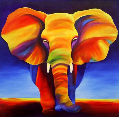
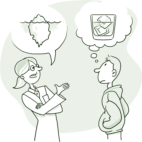
... All of you probably heard the parable of the blind and the elephant :
Six Indian sages, a scholarship stronghold,
They decided to achieve greater heights in studies of the Elephant
(Forgetting the ridiculous thing was that everyone was blind as a mole).
')
Here First came to the Elephant, but suddenly stumbled, he
Stumbled upon a broad side, and, by this surprised,
He exclaimed: “I dare to say: it looks like an Elephant wall!”.
Groping tusk, shouted the Second: "Oh, I know
The answer that gave me the end of a large tip:
Of course, this wonderful Elephant is like a spear! ”
And the third, coming up to the creature, and boldly taking in hand
Elephant trunk, flexible as a fire hose,
He exclaimed loudly: “This Elephant is about like a boa!”
The fourth one hit one of the legs with a firm hand,
And, having understood, declared to all wise men: “My God!
It is obvious to me: the elephant is like a young oak! ”
And the Fifth, the one who was lucky to grope part of the ear,
He said: “The blind of the blind know this tackle!
Looks like an elephant fan I swear to abyss! ”
The sixth fumbled here and there, but somehow out of place
On the tail stumbled. He was very happy about that.
“Well, clearly,” he shouted, “your Elephant is most likely a rope!”
So the Hindustan sages argued altogether,
And each with his thesis on each population.
Let everyone was partially right, but they were wrong - that's all!
(translation by Pavel Lukshi )
The story about the elephant reminds me of the difference in views on the design of people who are in different conditions, with different education and experience. The graphic designer approaches the design of interaction from one point of view, the designer from the other, the programmer from the third. Therefore, it is very useful to touch and comprehend the part of the elephant that others feel.
By education I am a psychologist. Therefore, that part of the elephant that I touch has to do with what we know about people and how we apply this knowledge in interaction design. I studied the brain, vision, memory and motivation, which allowed me to draw certain conclusions regarding the principles of designing human-computer interaction.
This article is a brief overview of the psychologist’s point of view on the elephant.
Ways to achieve goals by users

People do not want to do more than is required to achieve the goal.
Actually, this obvious statement contains all the mechanics of the development of human nature. Energy efficiency is an evolutionary feature of any complex system, including humans. The less work you need to do in order to get a result, the better the system. Any, even the most complex system should, of course, strive to minimize the energy consumption of the operator.
Information should be exactly as required to complete the task.
This statement concerns many aspects. First, attention should be paid to the fact that the information should be relevant and relevant in all, without exception, cases. Repeatedly confirm the already obvious things do not need. But also to be silent, at that time when intervention of the operator is required, is also impossible. Moreover, redundancy is almost more harmful than failure. Secondly - although this is more relevant for information systems than for functional ones - attention should be paid to the amount of information issued. In the overwhelming majority of cases, it is more efficient to give information in chunks - from a smaller volume to a larger one - rather than all at once, as a whole. This is due, primarily, to the fact that in most cases, users need substance , not details , to achieve the goal. In the case when the user is interested in details , he, of course, should be able to get all the comprehensive information. A great way is progressive disclosure . (See also Progressive disclousure controls. )
Not only tell, but also show
Any new or complex interaction should be described with examples. Learning by example is much more effective than any other.
The appearance of the control must assume a model of interaction with it.
Behind such a florid formulation lies a simple, in essence, statement: how an element looks, determines how it “works”. Even simpler - the button should always look like being pressed, and the checkbox (checkbox) should be raised. This rule is one of the strictest and requires strict compliance. Any discrepancy in the interpretation of the alleged behavior and the process of user interaction with the system will be destroyed. That is why it is highly recommended to check the developed systems for compliance with the standards of operating systems that regulate both the principles of interaction and the appearance of controls. (See also affordance )
The number of functions should not exceed the number of tasks
Redundant functions are a real scourge of modern software. The developers of any system strive to foresee any, even the most ridiculous desire of users, and add another opener of triangular cans to the Swiss-sized knife with a house. This is a vicious practice that is very detrimental to the process of user interaction with the system. Similar researches of developers and designers need to be stopped. It should be implemented exactly those functions that are really necessary to solve the problem. And best of all, when only they.
Do not rely on your own opinion about what users want. Examine the audience to know for sure.
Initial settings = best settings
The initial settings should be close to optimal for the vast majority of users, because they help to achieve the desired result with less effort. "I sat down and went" - this is the behavior of the system always leaves the best impression among users. In general, the ability to minimize energy costs is directly related to a sense of product quality . Quality is not only an objective, but also a subjective characteristic. The product will not seem to be of high quality if it is required to spend a lot of effort to launch it, even though objectively, all functions are performed flawlessly. As long as people use the products that are being developed, this will be important.
Restrictions

It will focus on the psycho-physiological limitations that the organism imposes on the principles of interaction.
Nothing extra on the screen
Each screen should contain only the necessary information. People read while they are interested. And if this rule is not applicable for console applications, it is more than for sites. Information should be exactly as needed to solve the problem. Not more. (Also see Progressive Disclosure )
Text should be easy to read.
Literally. Although it is more correct to use the word "read". Of course, when typing, one should not forget about the linguistic traditions and rules of typing the country in whose language the text is typed.
Formatting
Texts should contain headings, explicitly, and short paragraphs. In this case, reading even the most extensive texts is not so time consuming for users.
No multitasking
Not for the operator. People are not multitasking. Studies on this topic show completely unambiguous results. Therefore, all actions must be sequential, not parallel.
Relative length of string
This is very curious, and, in places, even strange, but studies unequivocally confirm the following fact: people prefer to read short lines of text, but they better perceive long lines. Therefore, decide for yourself what is more important for you, in this or that case: “speed” or “performance”. Just do not forget that people do not ask about what is optimal for them.
Errors
People are wrong. Constantly and in everything. It is inevitable and not controlled in any way. Whatever developers come up with, no matter how limited users are, erroneous actions will still be taken. To this must be prepared.
The system should anticipate erroneous user actions.
And if this is not possible, then, at a minimum, correctly handle errors and help the user not to allow them to continue.
Confirmations
If the error leads to serious consequences, ask the user to confirm the action before you start doing something.
Step back
You need to be able to easily undo any action. It is very important. The system can not be considered good if all the results of its work are irreversible.
Preventive behavior correction
It is much, much better not to give a mistake at all, than to help correct an already committed mistake. The best error message is missing.
Iteration
The more complex and responsible the operation is, the more likely it is to make a mistake. It is better when complex operations are divided into many small, successive iterations, since each of them, individually, is safer.
Learning
If the system can correct a mistake made by the user, it should do so. But, in addition to this, it must show the result of the correction in an explicit form. The user will remember, and next time will not be mistaken.
You need to check everything
Not only users are mistaken. Those who design the interface, and those who implement it, make the same mistakes. Recheck need for all. You have to be sure that you have enough time and energy to listen to users, conduct testing and redo everything.
Memory
Memory is a very complex mechanism. This must be remembered.
Memory can not be relied upon
The system can not rely only on the fact that people have it. As you know, memories are constantly changing, overgrown with non-existent details. Frankly, human memories are only partly true. A memory is not a reproduction, it is a reconstruction based on a complex mechanism that remotely resembles a facet classifier. Therefore, it is much better if the system reminds the user about an action than a word. The word essence is just a reference to a concept that is stored in memory in an incredibly complex form. Recreating the action based on the word is much more difficult.
It is not necessary to remember
Memory is a fragile design. Memories go away quickly. Do not force the user to constantly remember something, from action to action. It, at least, is useless. I still do not remember. And if he remembers, then mechanically, without realizing the essence of the processes performed. In turn, this is fraught with the appearance of erroneous interaction with any, even minimal change in the pattern of behavior.
3-4
Contrary to the popular myth that a person can keep 7 ± 2 objects in memory at a time, practical studies show that the actual number of objects is 3-4. (See also 7 ± 2 is an urban legend, .pdf )
Sociality
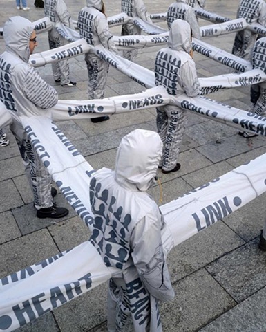
Communication skills, information sharing, building relationships between individuals and groups have evolved over thousands of years of human history. Obviously, they can not be neglected.
Share and Share
Information or results of work or something else. People have always done this. And they will continue to do this even if the system you are developing does not allow you to do this directly. The method will still be found. Much better if there are regular tools, proven and reliable. Users will be grateful.
Hall assistance
When the user does not know what to do, he asks others. This is called "social affirmation." This is, in general, the reason why ratings and reviews are so popular.
Shoulder to shoulder
If users do something at the same time (synchronously), it unites them, literally, at the level of similar chemical reactions in the brain. Actually, like any kind of fun. :)
Debt payment ...
If you do something for me, I will feel obliged. Such is the principle of reciprocity. Studies show that this also applies to system interfaces. If you want, for example, that users fill out a form, first give, or at least promise them something, and only after that ask them to fill out the form. Not the other way around!
Repetition - the mother of learning
Again, literally. When you see someone doing something, anything, a part of your brain works as if you are doing the same thing. (see Mirror Neurons ) Imitation is a reflex. Want users to do something in a certain way? Show them.
150 friends
Social use of the system can be based, at most, on 150 stable social connections, but should support thousands of weak ones. Stable connections are usually casual acquaintances, more often close ones. But thousands of Facebook friends are not a legend. The system must scale to such sizes. (see Facebook )
Attention

I am increasingly convinced that adequate work with attention is the key to creating attractive interfaces. I will write a few articles about it. The key themes are capturing attention and holding it without distracting.
Do not distract
In order for the task to be performed effectively, the user must focus on its implementation. If the user is focused, do not distract him for nothing. (See Flow State )
Distract
If you want the user to pay attention to something - make this object unusual, not like the others. He will definitely notice
Change carefully
You can not rely on the fact that the user will pay attention to minor changes in the interface. And even significant. There are lots of funny examples when people are stopped on the street to ask for directions, and they don’t notice how they are replacing the person who stopped them. (see Change blindness )
Red whistle
To attract attention, use bright colors, large fonts or sounds. It definitely works.
Do not distract, part 2
People get distracted the easiest. But focus reluctantly. If you do not want people to be distracted, do not use sparkling animation or automatic playback of videos on the pages, or vice versa - use if you want to attract this attention.
Needs

If we are talking about information systems, we will pay attention to the human need for information and control.
Dopamine
Dopamine is a hormone that serves as an important part of the brain's internal reward system, since causes a feeling of satisfaction. Dopamine makes us want food, sex, information . Training is one of the dopamine-stimulated processes. People always want more information. (See Dopamine )
More info
Most often, people want more information than they can handle. A large amount of information creates the illusion of unlimited choice. Unlimited choice creates the illusion of control over the situation - there is always an alternative, a way out. The illusion of control allows people to feel more secure.
Feedback
The importance of feedback is difficult to overestimate. However, not all so simple. The system should not tell the user that, for example, it copies the file. A person must understand what is happening. Without implementation details.
Unconscious interaction

The thought process cannot be stopped. Few people manage to achieve this by being alive. Therefore it is impossible to disregard the fact that most of the thought processes occur unconsciously.
From small to large
It is much easier for people to act on an incremental basis. Do you want the user to do some great action - let him do a little first. For example, first register to get the free version. Then we update free to paid.
P-complex
The “reticular brain” (P-complex) affects the majority of our decisions. He is responsible for basic instincts: survival and reproduction. Those. for food, sex and security. That is why these three topics attract so much attention. (See CNS Physiology )
People and their stories
The limbic system of the brain, which plays a very significant role in decision-making, actively responds to images, especially images of people, and to stories. (See Limbic system )
Unconscious activity
In principle, unknowable processes can be influenced. Studies show that words like “retirement”, “beach”, “fatigue” can make even a young person walk slower. That is why you need to carefully monitor what and as stated in the system. (See Framing effect )
Rationality
Brain systems work fine without conscious knowledge. At the same time, a person can always attribute a rational explanation to any of his actions. However, this explanation is never exhaustive. Most often this is not even part of the reason. This fact must be taken into account. It is possible that the actions of users can be only partly conscious.
Conscious modeling
As mentioned above, people are constantly thinking about something. One of the most important aspects of thinking is modeling. The model of intended behavior is one of the foundations of conscious activity.
Model fit
Before any conscious action, people always imagine how they will do it. The action in this case can be any: from reading a book to controlling a spacecraft. Modeling occurs regardless of the complexity of the process. It is important that this circumstance is always taken into account. (See Compliance Model )
Compliance model Part 2
Compliance or inconsistency of the algorithm of the task (especially rare) model, which is in the head of the operator, can make the interface both simple and impossible to use.
Compliance with model Part 3
On the other hand, humans are extremely trained beings. If you can not figure out how they imagine this or that process, teach them to perform it according to your algorithm. The model will develop by itself.
Metaphors
Metaphors are a very convenient way to help users create a conceptual model of the system. For example: "Very similar to reading a book." There is enough information in this statement for the user to imagine how the system works.
Explore users
The most important reason for conducting research among users is the need to obtain information about the conceptual models that they create.
Visual limitations

A well-known fact: people get 70% of all information through vision. Obviously, this is the most important sensory organ for us. We can not ignore the features of his work.
Fragmentation and focus
In order for users to easily find the information through their eyes, group it. The fragmentation of objects in the interface significantly complicates perception.
Connectivity of objects
If objects are connected, they should be close to each other. The peculiarity of visual perception is that the objects that are nearby are perceived by parts of the same system. (See Prägnanz , see Constants of Perception in Gestalt Psychology )
Font size
The larger and clearer the font style, the easier it is to read. Never the other way round. Therefore, one should avoid small and decorative lettering.
Peripheral vision
Studies show that peripheral vision is used to identify the essence of a phenomenon or object that a person is looking at. Actually, this circumstance must necessarily be taken into account. The interface element and its environment are always connected. (On the other hand, studies of eye movement are very interesting only because it is clear who is looking at what. But looking does not mean seeing.) (See Eyetracking )
Contrast
The hardest thing for a person is to perceive red and blue colors together. Red text on a blue background or vice versa is something that should be avoided. On the other hand, the more contrast the text, the better it is perceived. But even here there are limitations, since the most contrasting combination is inversion, which must be used very carefully and in limited quantities. The set of inversion must be larger than usual and not more than two thousand characters with spaces. A permanent set of inversion is used only for people with impaired vision. (See Flip )
Perspective
Images or objects are perceived better if they are slightly rotated, elevated above an imaginary surface, or depicted in a straight linear perspective. (See Perspective )
Color and text
If color coding is used for visual grouping, make sure that there is a duplicate way to show the same thing. Do not forget that many people do not distinguish colors. (See Color Blindness )
Source: https://habr.com/ru/post/137603/
All Articles