Create a datepicker similar to the standard in Harmattan

 Some time ago, as part of a contest for the best article on Qt , I developed the TimePicker component and wrote an article about it. Moreover, in the comments, I said that the next component will be the DatePicker . A few days ago I finished it.
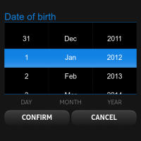
For those who have not read the previous article, I explain: not all components used by Nokia in their Harmattan applications are free, some of them are not included in Qt Components for MeeGo , and some are replaced by surrogates, the picture on the left is the original, the picture on the right is the DatePicker component offered to developers .
Requirements
The first thing that is needed is to determine the requirements for the component, since I was going to implement an analogue of an already existing component, it is simple.
So, the DatePicker should look like a calendar for a specified month, and capture the extreme days of the previous and next month. Navigation between months is done by clicking on the arrows, by the shift gesture and by tapping on the number of the previous / next month. The current selected day should be framed and switch by tap. Today should also stand out a special frame.
By the second requirement, I determined that the component should be implemented independently of the MeeGo Qt Components , which will ensure its portability to any platforms that support Qt Quick .
Component
Lyrical digression
Initially, you should lay a flexible configuration of the appearance of the component. And since it is rather complicated, it will have relatively many settings. I went the same way as the authors of the original Qt Components , namely, I created a simple style component that is populated with properties set by default.
')
QtObject { id: style property string orientationString: "portrait" property string backgroundImage: "image://theme/meegotouch-calendar-monthgrid-background-" + orientationString property string currentDayImage: "image://theme/meegotouch-monthgrid-daycell-current-day-" + orientationString property string selectedDayImage: "image://theme/meegotouch-monthgrid-daycell-selected-day-" + orientationString property string currentSelectedDayImage: "image://theme/meegotouch-monthgrid-daycell-selected-day-current-" + orientationString property string leftArrowImage: "image://theme/meegotouch-calendar-monthgrid-previousbutton" property string leftArrowPressedImage: "image://theme/meegotouch-calendar-monthgrid-previousbutton-pressed" property string rightArrowImage: "image://theme/meegotouch-calendar-monthgrid-nextbutton" property string rightArrowPressedImage: "image://theme/meegotouch-calendar-monthgrid-nextbutton-pressed" property string eventImage: "image://theme/meegotouch-monthgrid-daycell-regular-day-eventindicator" property string weekEndEventImage: "image://theme/meegotouch-monthgrid-daycell-regular-weekend-day-eventindicator" property string currentDayEventImage: "image://theme/meegotouch-monthgrid-daycell-current-day-eventindicator" property string selectedDayEventImage: "image://theme/meegotouch-monthgrid-daycell-selected-day-eventindicator" property string otherMonthEventImage: "image://theme/meegotouch-monthgrid-daycell-othermonth-day-eventindicator" property color weekEndColor: "#EF5500" property color weekDayColor: "#8C8C8C" property color otherMonthDayColor: "#8C8C8C" property color dayColor: "#000000" property color monthColor: "#000000" property color currentDayColor: "#EF5500" property color selectedDayColor: "#FFFFFF" property int monthFontSize: 32 property int dayNameFontSize: 18 property int dayFontSize: 26 } In the future, any DatePicker user can change the settings by defining his style from the default. As you can see, defaults are configured on the Harmattan platform and, when used on a great platform, must be redefined.
The main thing
First of all, it is necessary to determine the structure of our component, in general, it consists of three elements:
- Hat with the name of the month and arrows
- Row with days of the week
- Grate with the dates of the month
Consider them separately.
Hat with the name of the month and arrows
Item { id: header anchors { left: parent.left right: parent.right top: parent.top } height: 65 Item { id: leftArrow anchors { left: parent.left top: parent.top bottom: parent.bottom } width: 100 height: 65 Image { id: leftArrowImage anchors { left: parent.left leftMargin: (header.width / 7) / 2 - (width / 2) verticalCenter: parent.verticalCenter } width: height source: root.platformStyle.leftArrowImage } MouseArea { anchors.fill: parent onPressed: { leftArrowImage.source = root.platformStyle.leftArrowPressedImage } onReleased: { leftArrowImage.source = root.platformStyle.leftArrowImage previousMonthAnimation.start() dateModel.showPrevious() } } } Text { id: monthLabel anchors.centerIn: parent font.pixelSize: root.platformStyle.monthFontSize font.weight: Font.Light color: root.platformStyle.monthColor } Item { id: rightArrow anchors { right: parent.right top: parent.top bottom: parent.bottom } width: 100 height: 70 Image { id: rightArrowImage anchors { right: parent.right rightMargin: (header.width / 7) / 2 - (width / 2) verticalCenter: parent.verticalCenter } width: height source: root.platformStyle.rightArrowImage } MouseArea { anchors.fill: parent onPressed: { rightArrowImage.source = root.platformStyle.rightArrowPressedImage } onReleased: { rightArrowImage.source = root.platformStyle.rightArrowImage nextMonthAnimation.start() dateModel.showNext() } } } } Here, everything is quite simple and clear at first glance: in the middle is a text field, and along the edges are two pictures with arrows that change when you click, and start the month change procedures, as well as the animation.
Row with days of the week
Row { id: weekDaysGrid anchors { left: parent.left right: parent.right top: header.bottom bottomMargin: 10 } width: parent.width WeekCell { text: qsTr("Mon") platformStyle: datePicker.platformStyle } WeekCell { text: qsTr("Tue") platformStyle: datePicker.platformStyle } WeekCell { text: qsTr("Wed") platformStyle: datePicker.platformStyle } WeekCell { text: qsTr("Thu") platformStyle: datePicker.platformStyle } WeekCell { text: qsTr("Fri") platformStyle: datePicker.platformStyle } WeekCell { isWeekEnd: true text: qsTr("Sat") platformStyle: datePicker.platformStyle } WeekCell { isWeekEnd: true text: qsTr("Sun") platformStyle: datePicker.platformStyle } } The Row component builds its children in one line, in the order in which they are declared.
As can be seen from the code, own components are used as children, which, however, are quite simple:
Item { id: weekCell property alias text: label.text property QtObject platformStyle: DatePickerStyle {} property bool isWeekEnd: false height: label.height width: parent.width / 7 Text { id: label anchors.centerIn: parent font.pixelSize: weekCell.platformStyle.dayNameFontSize color: weekCell.isWeekEnd ? weekCell.platformStyle.weekEndColor : weekCell.platformStyle.weekDayColor font.bold: true } } Particular attention should be paid to the transfer of the style object to these components from the DatePicker , so we save the user from additional worries - in fact, he doesn’t have to know about the existence of the WeekCell component at all .
Grate with the dates of the month
For the grid with numbers, I used a GridView:
GridView { id: daysGrid anchors { top: weekDaysGrid.bottom left: parent.left right: parent.right bottom: parent.bottom } cellWidth: width / 7 - 1 cellHeight: height / 6 interactive: false delegate: DayCell { platformStyle: datePicker.platformStyle width: daysGrid.cellWidth; height: daysGrid.cellHeight isCurrentDay: model.isCurrentDay isOtherMonthDay: model.isOtherMonthDay hasEventDay: model.hasEventDay dateOfDay: model.dateOfDay } model: DateModel { id: dateModel currentDate: new Date() onMonthChanged: { monthLabel.text = getMonthYearString() daysGrid.currentIndex = dateModel.firstDayOffset + selectedDate.getDate() - 1 } onSelectedDateChanged: { root.selectedDateChanged(selectedDate) } } MouseArea { anchors.fill: parent property int pressedPosition: 0 onPressed: { pressedPosition = mouseX } onReleased: { var delta = mouseX - pressedPosition; if (Math.abs(delta) > 100) { if (delta < 0) { nextMonthAnimation.start() dateModel.showNext() } else { previousMonthAnimation.start() dateModel.showPrevious() } } pressedPosition = 0 if (Math.abs(delta) < 20) { var index = daysGrid.indexAt(mouseX, mouseY) daysGrid.currentIndex = index dateModel.selectedDate = daysGrid.currentItem.dateOfDay if (daysGrid.currentItem.isOtherMonthDay) { if (daysGrid.currentItem.dateOfDay.getMonth() < dateModel.selectedDate.getMonth()) previousMonthAnimation.start() else nextMonthAnimation.start() dateModel.changeModel(daysGrid.currentItem.dateOfDay) } } } } } Here we should pay special attention to the fact that View has the interactive mode disabled and the only MouseArea completely closes it , it solves the problem with shift gestures, we simply process the length of the path traversed by the finger, and if it exceeds the specified number, we switch to the new month. If the path is not great at all, then the user simply clicked on a certain day. We can determine the position of the required cell by the remarkable indexAt method, which returns the cell index by pixel coordinates.
The cell delegate itself is very simple:
Item { id: dayCell property QtObject platformStyle: DatePickerStyle {} property bool isOtherMonthDay: false property bool isCurrentDay: false property bool isSelectedDay: false property bool hasEventDay: false property date dateOfDay function color() { if (GridView.isCurrentItem) return platformStyle.selectedDayColor else if (isCurrentDay) return platformStyle.currentDayColor else if (isOtherMonthDay) return platformStyle.otherMonthDayColor return platformStyle.dayColor } function background() { if (GridView.isCurrentItem) { if (isCurrentDay) return platformStyle.currentSelectedDayImage return platformStyle.selectedDayImage } else if (isCurrentDay) return platformStyle.currentDayImage return "" } function eventImage() { if (GridView.isCurrentItem) return platformStyle.selectedDayEventImage else if (dateOfDay.getDay() === 0 || dateOfDay.getDay() === 6) return platformStyle.weekEndEventImage else if (isCurrentDay) return platformStyle.currentDayEventImage else if (isOtherMonthDay) return platformStyle.otherMonthEventImage return platformStyle.eventImage } Image { id: background anchors.centerIn: parent source: dayCell.background() Text { id: label anchors.centerIn: parent font.pixelSize: dayCell.platformStyle.dayFontSize color: dayCell.color() font.weight: (dayCell.isCurrentDay || dayCell.GridView.isCurrentItem) ? Font.Bold : Font.Light text: dayCell.dateOfDay.getDate() } Image { anchors { top: label.bottom topMargin: -5 horizontalCenter: parent.horizontalCenter } visible: hasEventDay source: dayCell.eventImage() } } } These are just a couple of pictures and text, the main picture serves to highlight the current and today's element, and an additional one is displayed if an event is scheduled for this day. Auxiliary functions are concerned with deciding what the appearance of an element should be depending on the state of its flags.
Model
The most difficult, dreary and ambiguous part of the component. The fact is that I wanted to make the model exclusively on Qml / ECMAScript , although the C ++ solution would be both more beautiful and simpler, but this would create additional difficulties with the implementation, because the user would have to carry a Cml plug-in with C ++ code
So, the difficulty lies in the fact that in ECMAScript there is a disgusting built-in class for working with a date, it is terrible, it can do almost nothing, for example, it cannot tell if there is a leap year on the current date, or how many days in the current month. Or, for example, on what day of the week is the first day of the current month. All this had to create yourself.
Auxiliary parts of the model
I am neither a guru nor a fan of ECMAScript / Javascript, so I am absolutely not sure that these methods are made as optimally as possible. They perform their function, but in my opinion they are ugly.
I will not give their implementation here, I will give only names.
function isLeapYear(year); function getValidDayByMonthAndDay(month, day, leapYear); The first one returns the truth if the year is a leap year, and the second one returns the correct number in the month according to the expected date, month and leap year, in other words, it corrects the boundary values during the transition between months.
Interface methods of the model
//public: function setEvent(eventDate, enable) { if (eventDate.getMonth() !== selectedDate.getMonth() && eventDate.getFullYear() !== selectedDate.getFullYear()) return setProperty(eventDate.getDate() + firstDayOffset, "hasEventDay", enable) } function getMonthYearString() { return Qt.formatDate(selectedDate, "MMMM yyyy") } function showNext() { showOtherMonth(selectedDate.getMonth() + 1) } function showPrevious() { showOtherMonth(selectedDate.getMonth() - 1) } function changeModel(_selectedDate) { clear() selectedDate = _selectedDate fillModel() monthChanged() } The setEvent method sets or clears the event flag on a given date, as can be seen from the code, now only events of the current month are processed, which forces users using events to track date changes and set events every time they change again. In the future, I plan to resolve this issue by creating an array of events inside the model.
The getMonthYearString method simply returns a date in the “month year” format, as you might guess, this is necessary for the DatePicker header.
The showNext and showPrevious methods simply switch the model to the next or previous month, respectively.
Well, the changeModel method allows me to change the current selected date to an arbitrary one.
Private model methods
Unfortunately, Qml does not yet know how to make methods private, but the methods that MUST be private will be presented below .
function showOtherMonth(month) { var newDate = selectedDate var currentDay = selectedDate.getDate() currentDay = getValidDayByMonthAndDay(month, currentDay, isLeapYear(selectedDate.getFullYear())); newDate.setMonth(month, currentDay) changeModel(newDate) } function fillModel() { var tmpDate = selectedDate tmpDate.setDate(selectedDate.getDate() - (selectedDate.getDate() - 1)) var firstDayWeekDay = tmpDate.getDay() if (firstDayWeekDay === 0) firstDayWeekDay = 6 else firstDayWeekDay-- firstDayOffset = firstDayWeekDay for(var i = 0; i < 6 * 7; ++i) { var objectDate = selectedDate; objectDate.setDate(selectedDate.getDate() - (selectedDate.getDate() - 1 + firstDayOffset - i)) appendDayObject(objectDate) } } function appendDayObject(dateOfDay) { append({ "dateOfDay" : dateOfDay, "isCurrentDay" : dateOfDay.getDate() === currentDate.getDate() && dateOfDay.getMonth() === currentDate.getMonth() && dateOfDay.getFullYear() === currentDate.getFullYear(), "isOtherMonthDay" : dateOfDay.getMonth() !== selectedDate.getMonth(), "hasEventDay" : false }) } The showOtherMonth method moves the model to another month, leaving the number unchanged (with adjustments to the boundaries, of course).
The fillModel method Fills the model with the numbers of the month. To do this, it first finds out from which day of the week the month begins.
The appendDayObject method simply adds a new entry to the model using the specified template.
Conclusion
That's all. Comments, suggestions, suggestions, bug reports, patches - you are welcome.
The component code is available on Gitorius . It is distributed as a TimePicker, under the BSD License. A quick usage guide can be found on my blog.
Source: https://habr.com/ru/post/137584/
All Articles