Mysterious indents between inline elements
Everyone, even the “youngest” typesetter, knows troubles (problems) with an interval between elements, spaces that are inserted between words. These spaces often interfere with the layout of this or that block. It is not so easy to get rid of them, and often these interword distances put us before a choice, a choice of a way to solve this problem.
In this article we will try to understand what these mysterious "Indents" are, what kind of animals they are and what they eat with. We will also consider what an inline-block is , and why it puts these incomprehensible intervals after it. Well, and, most importantly, we will see several universal solutions to this issue and, of course, we will discuss all their sides.
To begin with, I would like to clarify what an inline-block is and why we will discuss all solutions with it.
')
The inline-block , as the name implies, manages to combine the properties of the inline (inline) and block elements: inside it is block (it can contain other blocks, keeps the specified dimensions, displayed as a solid rectangle, etc.), and outside it is lowercase, occupying space line along with the surrounding text and pictures, vertically aligned with them, etc. More strictly: he himself participates in the context of formatting strings, but inside it there is a formatting context for blocks.
The inline-block string behavior allows it to remain on the same line with other lower-case elements, for example < span>, or merge with ordinary letters, i.e. behave like text in a string. Well, thanks to its block abilities, inline-block, you can safely set any properties that are inherent to block elements ... width, height, upper and lower margins , for example, will already act like blocks.
Well, etc., in general, a kind of "block line"

Living example
As you can see from the example, the inline-block feels the height and width that we have prescribed for it. You can also notice one interesting thing, our ward leveled vertically, leveled like most inline elements in html should align, i.e. baseline, i.e. our block is aligned with its text that is in it. Add text to the block and see the result.

The unit is aligned to the baseline. What should be expected.
Immediately I will give several different examples of inline-block behavior with different vertical alignment.
Different alignment
Here I demonstrated three different alignments, but in fact there are a lot more of them, if it’s interesting, here all possible options are described. This article does not make sense to describe them all. Just consider this when working with inline-block .
One of the main things you need to know is that ourmatchbox inline-block - is essentially an ordinary letter - a symbol, i.e. our entire line block is only one letter per line, one unit. Even despite the fact that it contains a bunch of other characters or elements. It is for this reason that the inline-block is not "broken", as line elements, and transferred to the next line in its entirety . Well, accordingly, if there are no spaces next to the inline-block , then the distance between it and the neighboring letters will be the usual letter-spacing ( tracking ) that can be controlled ( kerning ). If there are spaces - to the next letter there will be the same interval plus the width of the space.
Digest this information and go further ...
In fact, the “Problem” of spaces for inline-block and ordinary inline elements is common. Those. and with those and others identical things happen. Hateful indents, appear in those and others. The simple fact is that:
First, the inline-block has more features, such as specifying the width or height, etc.
Secondly, I still wanted to explain a little to you what an inline-block is and what they are, yet they relate to strings, after all.
And thirdly , there are certain problems with the inline-block , in the Safari browser, of which I would like you to know.
So I think that acquaintance with this behavior of a line block element will be a useful thing for you and will certainly broaden your horizons.
Having got acquainted closer with the line-block element, we can safely move on to the demonstration and answers to the question: "Where do the indents after the inline elements come from?". In order to understand what is being said, I will give the code and a screenshot of the problem.

The picture clearly shows the gaps between the menu items. Where do they come from? The reason lies in the fact that, as we have already found out, the inline-block behaves like a normal letter, which means that, like simple text, it has spaces between words. These spaces can be clearly observed in various web inspectors, such as "IE WebDeveloper" for Internet Explorer.
As a result, we see the very "trouble", because of which we are all here and gathered.

As we can see, the browser creates an empty text node, which, in fact, can be a newline, a space or, for example, a tab. All and these listed things turn into one single space and are described by the following entity: & # x0020; . It should also be borne in mind that since a space is an ordinary character, then this very character will change accordingly depending on the size or font family, i.e., in fact, it will behave in the same way as an ordinary letter in a string. All this must be taken into account during layout.
We are faced with the task of somehow getting rid of this hated distance. Remove, make it zero width, flatten, hide, anything ... in general, come up with some kind of way that will save us from this word gap and connect our points closely.
Let's think about what can help us to solve this problem.
Plus, let's make a test element <div> Width = 510px </ div> , which will be our auxiliary ruler. The width of our items in total is 510px . These are the lateral borders + their width + the number of points themselves ((1 + 100 + 1) * 5) = 510 .
It seems nothing is forgotten, so we turn to the consideration of all the above options.
The first in our turn is the left negative margin. Let's see how he can help us.
CSS code for clarity:
From the code it is clear that for the general list I set the Verdana font and the font size at 14px (in our examples I will push off from these values). And, of course, the left negative margin , equal to -.36em . As you can see, for our purpose, I chose the scalable unit of length (em), because, as we already know, our space is dancing on the font size, which means it can scale depending on it. Long fiddling with the values, I determined that -.36em ) is best suited for our typeface (for other it is necessary to select other values), so let's leave, perhaps, precisely this scale. Let's look at the result:

As we can see from the screenshot, our points left the left border, which is in principle and obvious, because we essentially moved all the points to the left, which means that the first point also went to the left. To resolve this "misunderstanding", we can zero out margin-left just at the first menu item, adding the following entry to our code ul li: first-child {margin-left: 0;} .
* It is worth noting that for IE6-7 we generally zeroed margin-left , and why ... we will find out a little later.
And between times we look at the result:

Yes, indeed, at the moment in all browsers everything is great and looks the same. Hmm ... have we really achieved our goal? Let's check it out by making the font size, for example, twice as large.

As you can see, we have achieved our goal, but this is until we change the font, for example, to Arial (after adjusting the left, negative margin )


By setting the background to our list, we can see that now the results differ slightly in the browsers Chrome, Opera 11.53, IE6-8 and Firefox 8, IE 9 . In the first, everything remained in its place, but in the latter you can see a slight indent on the right, which suggests that there is still the risk of getting a little different from the picture that we originally intended. As an option, of course, you can customize the spec. the values for Firefox 8 and IE 9 are separate, but, again, this is not a very good solution, because, firstly, it is essentially a crutch, and secondly, it does not give full versatility, because you never know at what size and how other browsers will behave.
In general, I, personally, concluded that this is quite a normal and viable option, in a fixed situation you can fit the size and everything will be all right. Of course, there are a number of drawbacks too, in the form of zeroing margin-left at the first item + fitting values for different browsers, well ... there is of course some risk, due to which there may be, although not large, some differences with indents, with different fonts and their sizes.
Result with margin-left
As you already know, font-size affects the font size of an element, making it larger or smaller, depending on its value. A space is a character that comes from this very font size, which means that with the help of font-size we can try to influence it, for example, by setting its value to zero and thus, it is possible to completely “hide” our hateful space. Let's check it out.

What happened to the characters? Where are they all gone? In fact, everything is simple. font-size is an inherited property, which means that by setting the parent (in our case, UL ) a value other than the default, we must return the font-size to its previous state, in descendants (in our case, for LI ).

Fine! Now everything works! But is it everywhere? Checking ... oops ... unfortunately almost ...


As you can see from the screenshots, Safari let us down, completely refusing to nullify our interword character :(. Why did this happen? Not finding the answer to this question, I ventured to assume that after all this is nothing but the real bug of the Safari browser and therefore, we need to either look for the sane cure for this bug, or abandon this method completely, we don’t really want to exclude this method from the list, because, firstly, this option does not work only in Safari, and secondly, my intuition told me that there was a solution. As a result, sport an explicit interest picked up and the decision all the same there was a Yes, and what it turned out to be a pleasant surprise for me answer lies in the property display:!.. table, which hung on the container points (UL in our case) to check.
Here is a screenshot from Safari:
Super! It worked! But how is this so? Perhaps when display: table, the engine perceives the block line inside as " something like a table-cell", i.e. table cells, in some FF to 3.6, if I do not confuse anything, there was a similar bug .
How can this threaten us?
There are a couple of minor flaws that should be known.
1. In all browsers, except Firefox, the starting point of positioned elements is the closest ancestor with relative, i.e. it may be the same cell ( TD ). But we don’t have TD here, but LI , so in this respect we’ll definitely have no problems. But there will be problems if we want to position LI ourselves, inside UL , and since UL is, in fact, a table for us, Firefox will refuse to position items relative to it. But there is no need to worry, as in this case the usual wrapper (for example, a div ) for the UL element will come to our aid.
* By the way, after a few years, I still found a solution to this problem.
2. The second nuance is the width. display: table does not stretch to the available space by default, so you may need to set the width of the container (and if there are border / padding, box-sizing: border-box with the necessary prefixes in addition).
As for the display: table itself, what about the font-size itself? Does he have cons? Yes, there is perhaps one unpleasant flaw. Because of the parent's font-size zero, we cannot apply scalable length units to descendants, since they are repelled from the inherited font size and, accordingly, from zero in our case. Well, plus to everything, this is something that you always need to be alert and look, so that the descendants will be reassigned font size.
Well, as a whole way, quite a worker, except for the nuances. So look at the example in action and go ahead.
Font-size solution
The third number we have letter-spacing. Earlier we found out that this property affects the spacing between characters, and since our inline-block is in fact one big symbol, letter-spacing should still help in solving our problem. Like last time, I fiddled with the scale and found out that the -.36em will be exactly what Verdana needs.
* Yes, and it is also worth considering that letter-spacing, like font-size, is an inherited property, so we will have to do the same operation with zeroing descendants, as in the second version.

Great, the items themselves seem to be docked as we need. “It seems to be” - I said not by chance, but why, you will understand from the following screenshots.


In all browsers, except Opera, we can see quite a great picture for ourselves, but unfortunately, Opera itself is the opposite. As it turned out, the Norwegians believe that letter-spacing can affect everything except the space. Apparently due to the fact that the space character means the end of a word, and therefore letter-spacing finishes its work on this, since it is intended for shifting / expanding letters, precisely inside the word (including for kerning manually). And here it does not matter that the inline-block is also essentially a letter, after it there is a space, which means that in any case, the word in fact has ended.
Is this a Opera bug? Well, I don’t know, the situation is twofold, both are right in their own way, so I suggest leaving it on Opera’s own conscience, and go on our own to find a solution to this problem.
In general, having fiddled with pretty decent time looking for a cure for this case, I could not come to anything worthwhile, except to use the previous solution with font-size and add it to our styles.
Yes, now everything is fine, font-size really could help us. From this I concluded that in fact you can use both options equally: font-size + display-table or letter-spacing + font-size . Those. both in the first and in the second case, we need auxiliary tools in the form of additional properties.
Upd: By the way, while writing the article, I found a strange bug in Safari. When you expose a parent font-size: 0 and letter-spacing to any em value, for example letter-spacing: -.36em, then everything immediately collapses in Safari ((. I could not identify the reason for this strange Safari behavior. I will I'm glad to hear the answer to this question in the comments. The solution for me is to set letter-spacing values, for example, in pixels.
Result with letter-spacing
Immediately I want to note that word-spacing and letter-spacing are similar to each other and differ only in the fact that the first works with the distance between characters, and the second - between words. At the same time, word-spacing also has its drawbacks, but unlike letter-spacing, you can cope with the drawbacks of word-spacing, which is good news.
* It is also worth noting that word-spacing is also an inherited property, therefore, in general, the code will resemble code with letter-spacing. So pick up the value and go.
By code, everything seems to be clear, go to the screenshots:


And of course, again, not without incident. But now both webkit-a (Chrome and Safari) have shown us their flaws. As we can see, word-spacing in these browsers did not work at all, as if we hadn’t assigned it. The behavior of webkits in this situation, most likely, can be called a bug, since the property that we used here is intended specifically for the inter-word spacing. The proof in favor of the bug is that for ordinary inline elements, word-spacing just works in webkit as it should, but unfortunately for inline-blockes.
The first question you ask is: "Is there a solution to this problem?". I am happy to tell you that YES! And, oddly enough, this solution is again our good old display: table, which helped us with problems in Safari, in the second version with font-size. So feel free to add this rule and see the result.

Yes, you are not mistaken. display: table really helped us solve the webkit bug. The disadvantages of this treatment are exactly the same as I mentioned in the second version, i.e. this is positioning and setting widths in the container. Otherwise, I personally consider this method more appropriate than all previous predecessors, because, firstly, we still solve problems with the word spacing ( word-spacing is just created for this), secondly, the solution for the webkit problem is quite harmless, except for a couple of nuances, and thirdly, I tested this method with different font sizes and didn’t even notice anything terrible here. So I give a working example, we look and we go further ...
Result with word-spacing
These two solutions, I decided to merge into one, because they are similar in nature and do almost the same thing, i.e. dock the elements, removing spaces between them.
HTML first option :
Well, the second, respectively:
And the CSS for both options will be:
And of course, screenshots:

As can be seen from the code, in the first version we simply docked the elements closely, moving the closing tags close to the opening ones. And in the second, comments were placed between the borders of the elements, replacing our spaces with them. Those. in fact, we deliberately deprived the elements of any indentation between them, specifically combining them in various ways. At the same time, as you can replace, these options have a good plus, they do not require any specials. properties and crutches in CSS, they work by themselves, and in all browsers, starting with IE6 +.
But meanwhile, these solutions carry a number of problems that are connected, firstly, with the readability of the code, secondly, with the accidental discarding of one element under another or removing one comment near an item, which immediately affects the display of your site. far from the best. For example, your site may simply fall apart or some item will jump to another line, etc.
In general, it can be concluded that these options clearly have the right to life, but they can be used only when you know exactly and are sure of what you are doing.
So while we are looking at a working example and smoothly proceed to the final method, the most practical and interesting, in my opinion
Result
As it turned out, there is an even simpler, and most importantly, absolutely legal decision in the world that I want to share. The fact is that any HTML specification (but not XHTML) allows us to omit the closing tags of some elements, i.e. allows their absence. There are as many as 18 such elements in the HTML5 specification. This means that we can legitimately enjoy this advantage. After all, no one forbids us to do it, is not it?)
In our case, the < li> elements fall into this list, so let's use this.
Those.as a matter of fact, I simply dropped the closing tags < / li> , and since the opening tag of the second immediately follows the contents of the first element, there should be no interval between them either. What is clearly shown in the screenshot.
* It is worth noting that in IE6-7, for example, optional closing tags in lists are still ignored, so there this method turns out to be “automatic”. It is because of this, in the first version with negative left margin , that we, separately, reset the margin-left for these browsers.
This method seems to me the most successful, at the same time easy and convenient than all the others that we considered in this article. The only drawback is the fact that any XML parsers do not accept such a structure.
The conclusion is that this method is not suitable for “fanatics of validity for the sake of validity”, who choose XHTML doctype, but for practitioners who are guided by modern specifications and real results, there is no need to refuse such a solution =)
Result
Summing up, I want to say that in this article we figured out what browser inserts between inline elements for strange indents, as well as looked at many different solutions to this problem, and finally found out that they are not as scary as they seem first glance. As it turned out, this problem can be dealt with (and not in one way) and overcome it.
1. Result with margin-left (Almost working solution)
2. Solution with font-size (Working solution)
3. Result with letter-spacing (Working solution)
4. Result with word-spacing (Working solution)
5. Option with intentionally pressed elements (Working solution)
6. Solution with unclosed tags (Working solution)
And, separately, I want to say a big thank you to my friend SelenIT2 for help in searching for the material and writing the article.
Upd: Post this article in my blog.
In this article we will try to understand what these mysterious "Indents" are, what kind of animals they are and what they eat with. We will also consider what an inline-block is , and why it puts these incomprehensible intervals after it. Well, and, most importantly, we will see several universal solutions to this issue and, of course, we will discuss all their sides.
To begin with, I would like to clarify what an inline-block is and why we will discuss all solutions with it.
')
inline-block
The inline-block , as the name implies, manages to combine the properties of the inline (inline) and block elements: inside it is block (it can contain other blocks, keeps the specified dimensions, displayed as a solid rectangle, etc.), and outside it is lowercase, occupying space line along with the surrounding text and pictures, vertically aligned with them, etc. More strictly: he himself participates in the context of formatting strings, but inside it there is a formatting context for blocks.
The inline-block string behavior allows it to remain on the same line with other lower-case elements, for example < span>, or merge with ordinary letters, i.e. behave like text in a string. Well, thanks to its block abilities, inline-block, you can safely set any properties that are inherent to block elements ... width, height, upper and lower margins , for example, will already act like blocks.
Well, etc., in general, a kind of "block line"
Living example
As you can see from the example, the inline-block feels the height and width that we have prescribed for it. You can also notice one interesting thing, our ward leveled vertically, leveled like most inline elements in html should align, i.e. baseline, i.e. our block is aligned with its text that is in it. Add text to the block and see the result.
The unit is aligned to the baseline. What should be expected.
Immediately I will give several different examples of inline-block behavior with different vertical alignment.
Different alignment
Here I demonstrated three different alignments, but in fact there are a lot more of them, if it’s interesting, here all possible options are described. This article does not make sense to describe them all. Just consider this when working with inline-block .
inline-block - like a letter
One of the main things you need to know is that our
Digest this information and go further ...
Why in the article I use exactly inline-block?
In fact, the “Problem” of spaces for inline-block and ordinary inline elements is common. Those. and with those and others identical things happen. Hateful indents, appear in those and others. The simple fact is that:
First, the inline-block has more features, such as specifying the width or height, etc.
Secondly, I still wanted to explain a little to you what an inline-block is and what they are, yet they relate to strings, after all.
And thirdly , there are certain problems with the inline-block , in the Safari browser, of which I would like you to know.
So I think that acquaintance with this behavior of a line block element will be a useful thing for you and will certainly broaden your horizons.
Mysterious indents
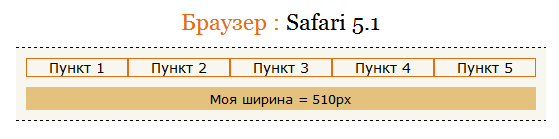
Having got acquainted closer with the line-block element, we can safely move on to the demonstration and answers to the question: "Where do the indents after the inline elements come from?". In order to understand what is being said, I will give the code and a screenshot of the problem.
<ul> <li> 1</li> <li> 2</li> <li> 3</li> <li> 4</li> <li> 5</li> </ul> ul { font: 14px Verdana,sans-serif; } ul li { display : inline-block ; width : 100px; border : 1px solid #E76D13; /* inline-block IE6-7*/ //display : inline; //zoom : 1; } The picture clearly shows the gaps between the menu items. Where do they come from? The reason lies in the fact that, as we have already found out, the inline-block behaves like a normal letter, which means that, like simple text, it has spaces between words. These spaces can be clearly observed in various web inspectors, such as "IE WebDeveloper" for Internet Explorer.
As a result, we see the very "trouble", because of which we are all here and gathered.
As we can see, the browser creates an empty text node, which, in fact, can be a newline, a space or, for example, a tab. All and these listed things turn into one single space and are described by the following entity: & # x0020; . It should also be borne in mind that since a space is an ordinary character, then this very character will change accordingly depending on the size or font family, i.e., in fact, it will behave in the same way as an ordinary letter in a string. All this must be taken into account during layout.
Our task
We are faced with the task of somehow getting rid of this hated distance. Remove, make it zero width, flatten, hide, anything ... in general, come up with some kind of way that will save us from this word gap and connect our points closely.
Material for work
Let's think about what can help us to solve this problem.
- 1. margin-left (negative) - a property with the help of which you can move points to the left, as if to each other, “getting rid” of the hated gap between them.
- 2. font-size is a property that sets the font size, with which our space (character) can be set to a font size equal to zero, and thus make it so small that it will not be visible.
- 3. letter-spacing - a property that defines the spacing between characters . By default (normal) sets the normal interval, based on the size and type of the font.
- 4. word-spacing - a property that defines the spacing between words . By default, as well as letter-spacing, it sets it depending on the font size and type.
- 5. Press the elements together, i.e. close, tag to the tag, and thus remove the interword interval.
- 6. Put comments between elements, and thereby removing indents between them.
- 7. The most, in my opinion, an interesting decision of all ... perhaps leave it for a snack ... intrigue ...
Plus, let's make a test element <div> Width = 510px </ div> , which will be our auxiliary ruler. The width of our items in total is 510px . These are the lateral borders + their width + the number of points themselves ((1 + 100 + 1) * 5) = 510 .
It seems nothing is forgotten, so we turn to the consideration of all the above options.
Option 1 - margin-left
The first in our turn is the left negative margin. Let's see how he can help us.
CSS code for clarity:
ul { font: 14px Verdana,sans-serif; } ul li { display : inline-block; width : 100px; border : 1px solid #E76D13; margin-left: -.36em; /* inline-block IE6-7*/ //display : inline; //zoom : 1; /* margin-left IE6-7 */ //margin-left: 0; } From the code it is clear that for the general list I set the Verdana font and the font size at 14px (in our examples I will push off from these values). And, of course, the left negative margin , equal to -.36em . As you can see, for our purpose, I chose the scalable unit of length (em), because, as we already know, our space is dancing on the font size, which means it can scale depending on it. Long fiddling with the values, I determined that -.36em ) is best suited for our typeface (for other it is necessary to select other values), so let's leave, perhaps, precisely this scale. Let's look at the result:
As we can see from the screenshot, our points left the left border, which is in principle and obvious, because we essentially moved all the points to the left, which means that the first point also went to the left. To resolve this "misunderstanding", we can zero out margin-left just at the first menu item, adding the following entry to our code ul li: first-child {margin-left: 0;} .
* It is worth noting that for IE6-7 we generally zeroed margin-left , and why ... we will find out a little later.
And between times we look at the result:
Yes, indeed, at the moment in all browsers everything is great and looks the same. Hmm ... have we really achieved our goal? Let's check it out by making the font size, for example, twice as large.
ul { font: 28px Verdana,sans-serif; } ul li { display : inline-block; width : 100px; border : 1px solid #E76D13; margin-left: -.36em; /* inline-block IE6-7*/ //display : inline; //zoom : 1; /* margin-left IE6-7 */ //margin-left: 0; } ul li:first-child { margin-left: 0;}. As you can see, we have achieved our goal, but this is until we change the font, for example, to Arial (after adjusting the left, negative margin )
By setting the background to our list, we can see that now the results differ slightly in the browsers Chrome, Opera 11.53, IE6-8 and Firefox 8, IE 9 . In the first, everything remained in its place, but in the latter you can see a slight indent on the right, which suggests that there is still the risk of getting a little different from the picture that we originally intended. As an option, of course, you can customize the spec. the values for Firefox 8 and IE 9 are separate, but, again, this is not a very good solution, because, firstly, it is essentially a crutch, and secondly, it does not give full versatility, because you never know at what size and how other browsers will behave.
In general, I, personally, concluded that this is quite a normal and viable option, in a fixed situation you can fit the size and everything will be all right. Of course, there are a number of drawbacks too, in the form of zeroing margin-left at the first item + fitting values for different browsers, well ... there is of course some risk, due to which there may be, although not large, some differences with indents, with different fonts and their sizes.
Result with margin-left
Option 2 - font-size
As you already know, font-size affects the font size of an element, making it larger or smaller, depending on its value. A space is a character that comes from this very font size, which means that with the help of font-size we can try to influence it, for example, by setting its value to zero and thus, it is possible to completely “hide” our hateful space. Let's check it out.
ul { font: 14px Verdana, Geneva, sans-serif; /* */ font-size: 0; } ul li { display : inline-block; width : 100px; border : 1px solid #E76D13; /* inline-block IE6-7*/ //display : inline; //zoom : 1; } What happened to the characters? Where are they all gone? In fact, everything is simple. font-size is an inherited property, which means that by setting the parent (in our case, UL ) a value other than the default, we must return the font-size to its previous state, in descendants (in our case, for LI ).
ul { font: 14px Verdana, Geneva, sans-serif; /* */ font-size: 0; } ul li { display : inline-block; width : 100px; border : 1px solid #E76D13; /* */ font-size: 14px; /* inline-block IE6-7*/ //display : inline; //zoom : 1; } Fine! Now everything works! But is it everywhere? Checking ... oops ... unfortunately almost ...
As you can see from the screenshots, Safari let us down, completely refusing to nullify our interword character :(. Why did this happen? Not finding the answer to this question, I ventured to assume that after all this is nothing but the real bug of the Safari browser and therefore, we need to either look for the sane cure for this bug, or abandon this method completely, we don’t really want to exclude this method from the list, because, firstly, this option does not work only in Safari, and secondly, my intuition told me that there was a solution. As a result, sport an explicit interest picked up and the decision all the same there was a Yes, and what it turned out to be a pleasant surprise for me answer lies in the property display:!.. table, which hung on the container points (UL in our case) to check.
ul { font: 14px Verdana, Geneva, sans-serif; /* */ font-size: 0; /* Safari */ display: table; } ul li { display : inline-block; width : 100px; border : 1px solid #E76D13; /* */ font-size: 14px; /* inline-block IE6-7*/ //display : inline; //zoom : 1; } Here is a screenshot from Safari:
Super! It worked! But how is this so? Perhaps when display: table, the engine perceives the block line inside as " something like a table-cell", i.e. table cells, in some FF to 3.6, if I do not confuse anything, there was a similar bug .
How can this threaten us?
There are a couple of minor flaws that should be known.
1. In all browsers, except Firefox, the starting point of positioned elements is the closest ancestor with relative, i.e. it may be the same cell ( TD ). But we don’t have TD here, but LI , so in this respect we’ll definitely have no problems. But there will be problems if we want to position LI ourselves, inside UL , and since UL is, in fact, a table for us, Firefox will refuse to position items relative to it. But there is no need to worry, as in this case the usual wrapper (for example, a div ) for the UL element will come to our aid.
* By the way, after a few years, I still found a solution to this problem.
2. The second nuance is the width. display: table does not stretch to the available space by default, so you may need to set the width of the container (and if there are border / padding, box-sizing: border-box with the necessary prefixes in addition).
As for the display: table itself, what about the font-size itself? Does he have cons? Yes, there is perhaps one unpleasant flaw. Because of the parent's font-size zero, we cannot apply scalable length units to descendants, since they are repelled from the inherited font size and, accordingly, from zero in our case. Well, plus to everything, this is something that you always need to be alert and look, so that the descendants will be reassigned font size.
Well, as a whole way, quite a worker, except for the nuances. So look at the example in action and go ahead.
Font-size solution
Option 3 - letter-spacing
The third number we have letter-spacing. Earlier we found out that this property affects the spacing between characters, and since our inline-block is in fact one big symbol, letter-spacing should still help in solving our problem. Like last time, I fiddled with the scale and found out that the -.36em will be exactly what Verdana needs.
* Yes, and it is also worth considering that letter-spacing, like font-size, is an inherited property, so we will have to do the same operation with zeroing descendants, as in the second version.
ul { font: 14px Verdana, Geneva, sans-serif; /* -.36em */ letter-spacing : -.36em; } ul li { display : inline-block; width : 100px; border : 1px solid #E76D13; /* */ letter-spacing: normal; /* inline-block IE6-7*/ //display : inline; //zoom : 1; } Great, the items themselves seem to be docked as we need. “It seems to be” - I said not by chance, but why, you will understand from the following screenshots.
In all browsers, except Opera, we can see quite a great picture for ourselves, but unfortunately, Opera itself is the opposite. As it turned out, the Norwegians believe that letter-spacing can affect everything except the space. Apparently due to the fact that the space character means the end of a word, and therefore letter-spacing finishes its work on this, since it is intended for shifting / expanding letters, precisely inside the word (including for kerning manually). And here it does not matter that the inline-block is also essentially a letter, after it there is a space, which means that in any case, the word in fact has ended.
Is this a Opera bug? Well, I don’t know, the situation is twofold, both are right in their own way, so I suggest leaving it on Opera’s own conscience, and go on our own to find a solution to this problem.
In general, having fiddled with pretty decent time looking for a cure for this case, I could not come to anything worthwhile, except to use the previous solution with font-size and add it to our styles.
ul { font: 14px Verdana, Geneva, sans-serif; /* -.36em */ letter-spacing : -.36em; font-size : 0; } ul li { display : inline-block; width : 100px; border : 1px solid #E76D13; /* */ letter-spacing: normal; font-size : 14px; /* inline-block IE6-7*/ //display : inline; //zoom : 1; } Yes, now everything is fine, font-size really could help us. From this I concluded that in fact you can use both options equally: font-size + display-table or letter-spacing + font-size . Those. both in the first and in the second case, we need auxiliary tools in the form of additional properties.
Upd: By the way, while writing the article, I found a strange bug in Safari. When you expose a parent font-size: 0 and letter-spacing to any em value, for example letter-spacing: -.36em, then everything immediately collapses in Safari ((. I could not identify the reason for this strange Safari behavior. I will I'm glad to hear the answer to this question in the comments. The solution for me is to set letter-spacing values, for example, in pixels.
Result with letter-spacing
Option 4 - word-spacing
Immediately I want to note that word-spacing and letter-spacing are similar to each other and differ only in the fact that the first works with the distance between characters, and the second - between words. At the same time, word-spacing also has its drawbacks, but unlike letter-spacing, you can cope with the drawbacks of word-spacing, which is good news.
* It is also worth noting that word-spacing is also an inherited property, therefore, in general, the code will resemble code with letter-spacing. So pick up the value and go.
ul { font: 14px Verdana, Geneva, sans-serif; /* -.36em */ word-spacing: -.36em; } ul li { display : inline-block; width : 100px; border : 1px solid #E76D13; /* */ word-spacing: normal; /* inline-block IE6-7*/ //display : inline; //zoom : 1; } By code, everything seems to be clear, go to the screenshots:
And of course, again, not without incident. But now both webkit-a (Chrome and Safari) have shown us their flaws. As we can see, word-spacing in these browsers did not work at all, as if we hadn’t assigned it. The behavior of webkits in this situation, most likely, can be called a bug, since the property that we used here is intended specifically for the inter-word spacing. The proof in favor of the bug is that for ordinary inline elements, word-spacing just works in webkit as it should, but unfortunately for inline-blockes.
The first question you ask is: "Is there a solution to this problem?". I am happy to tell you that YES! And, oddly enough, this solution is again our good old display: table, which helped us with problems in Safari, in the second version with font-size. So feel free to add this rule and see the result.
ul { font: 14px Verdana, Geneva, sans-serif; /* -.36em */ word-spacing: -.36em; /* webkit */ display: table; } ul li { display : inline-block; width : 100px; border : 1px solid #E76D13; /* */ word-spacing: normal; /* inline-block IE6-7*/ //display : inline; //zoom : 1; } Yes, you are not mistaken. display: table really helped us solve the webkit bug. The disadvantages of this treatment are exactly the same as I mentioned in the second version, i.e. this is positioning and setting widths in the container. Otherwise, I personally consider this method more appropriate than all previous predecessors, because, firstly, we still solve problems with the word spacing ( word-spacing is just created for this), secondly, the solution for the webkit problem is quite harmless, except for a couple of nuances, and thirdly, I tested this method with different font sizes and didn’t even notice anything terrible here. So I give a working example, we look and we go further ...
Result with word-spacing
Option 5, 6 - Connection of elements
These two solutions, I decided to merge into one, because they are similar in nature and do almost the same thing, i.e. dock the elements, removing spaces between them.
HTML first option :
<ul><li> 1</li><li> 2</li><li> 3</li><li> 4</li><li> 5</li></ul> Well, the second, respectively:
<ul><!-- --><li> 1</li><!-- --><li> 2</li><!-- --><li> 3</li><!-- --><li> 4</li><!-- --><li> 5</li><!-- --></ul> And the CSS for both options will be:
ul { font: 14px Verdana, Geneva, sans-serif; } ul li { display : inline-block; width : 100px; border : 1px solid #E76D13; /* inline-block IE6-7*/ //display : inline; //zoom : 1; } And of course, screenshots:
As can be seen from the code, in the first version we simply docked the elements closely, moving the closing tags close to the opening ones. And in the second, comments were placed between the borders of the elements, replacing our spaces with them. Those. in fact, we deliberately deprived the elements of any indentation between them, specifically combining them in various ways. At the same time, as you can replace, these options have a good plus, they do not require any specials. properties and crutches in CSS, they work by themselves, and in all browsers, starting with IE6 +.
But meanwhile, these solutions carry a number of problems that are connected, firstly, with the readability of the code, secondly, with the accidental discarding of one element under another or removing one comment near an item, which immediately affects the display of your site. far from the best. For example, your site may simply fall apart or some item will jump to another line, etc.
In general, it can be concluded that these options clearly have the right to life, but they can be used only when you know exactly and are sure of what you are doing.
So while we are looking at a working example and smoothly proceed to the final method, the most practical and interesting, in my opinion
Result
Option 7
As it turned out, there is an even simpler, and most importantly, absolutely legal decision in the world that I want to share. The fact is that any HTML specification (but not XHTML) allows us to omit the closing tags of some elements, i.e. allows their absence. There are as many as 18 such elements in the HTML5 specification. This means that we can legitimately enjoy this advantage. After all, no one forbids us to do it, is not it?)
In our case, the < li> elements fall into this list, so let's use this.
<ul> <li> 1 <li> 2 <li> 3 <li> 4 <li> 5 </ul> ul { font: 14px Verdana, Geneva, sans-serif; } ul li { display : inline-block; width : 100px; border : 1px solid #E76D13; /* inline-block IE6-7*/ //display : inline; //zoom : 1; } Those.as a matter of fact, I simply dropped the closing tags < / li> , and since the opening tag of the second immediately follows the contents of the first element, there should be no interval between them either. What is clearly shown in the screenshot.
* It is worth noting that in IE6-7, for example, optional closing tags in lists are still ignored, so there this method turns out to be “automatic”. It is because of this, in the first version with negative left margin , that we, separately, reset the margin-left for these browsers.
This method seems to me the most successful, at the same time easy and convenient than all the others that we considered in this article. The only drawback is the fact that any XML parsers do not accept such a structure.
The conclusion is that this method is not suitable for “fanatics of validity for the sake of validity”, who choose XHTML doctype, but for practitioners who are guided by modern specifications and real results, there is no need to refuse such a solution =)
Result
Summary:
Summing up, I want to say that in this article we figured out what browser inserts between inline elements for strange indents, as well as looked at many different solutions to this problem, and finally found out that they are not as scary as they seem first glance. As it turned out, this problem can be dealt with (and not in one way) and overcome it.
All options together:
1. Result with margin-left (Almost working solution)
2. Solution with font-size (Working solution)
3. Result with letter-spacing (Working solution)
4. Result with word-spacing (Working solution)
5. Option with intentionally pressed elements (Working solution)
6. Solution with unclosed tags (Working solution)
And, separately, I want to say a big thank you to my friend SelenIT2 for help in searching for the material and writing the article.
Upd: Post this article in my blog.
Source: https://habr.com/ru/post/137582/
All Articles