Image design on CSS3. Part 2
In the previous article about the design of images, the theme of creating ideally rounded corners, strict shadows and other graphic “chips” with the help of the box-shadow , border-radius and transition properties was touched upon. Because These properties are handled incorrectly by some browsers, the cross-browser compatibility problem was solved by wrapping the image in a container, where it (the image) is used as a background.
Today I prepared a translation of the second part, where another problem of this method is solved, namely the impossibility of resizing the background image and, as a result, the inability to use this method when designing a scalable (adaptive) design.
Fortunately, a workaround was successfully found. About him and will be discussed in the article.
')
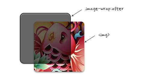
When searching for a solution to the described problem, a more interesting option was found than using a background image. It consists in adding a pseudo-element after to the container that "wraps" the image. The very same container is superimposed on the image of a certain film. This is better because we keep the image and its size in its original form.
Again, to wrap an image, use jQuery:
As a result, we get the following code:
To which the following CSS applies:
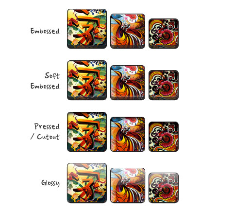
On the demo page you will find examples with different effects and styles (embossed, embedded, glossy and others).
Examples work in almost all modern browsers, namely in Chrome, Firefox, Opera, Safari, IE9.
Today I prepared a translation of the second part, where another problem of this method is solved, namely the impossibility of resizing the background image and, as a result, the inability to use this method when designing a scalable (adaptive) design.
Fortunately, a workaround was successfully found. About him and will be discussed in the article.
')
Solution (watch demo )
When searching for a solution to the described problem, a more interesting option was found than using a background image. It consists in adding a pseudo-element after to the container that "wraps" the image. The very same container is superimposed on the image of a certain film. This is better because we keep the image and its size in its original form.
Again, to wrap an image, use jQuery:
<script type="text/javascript"> $(document).ready(function(){ $('#demo img').each(function() { var imgClass = $(this).attr('class'); $(this).wrap('<span class="image-wrap ' + imgClass + '" style="width: auto; height: auto;"/>'); $(this).removeAttr('class'); }); }); </script> As a result, we get the following code:
<span class="image-wrap" style="width: auto; height: auto;"> <img src="image.jpg" /> </span> To which the following CSS applies:
.image-wrap { position: relative; display: inline-block; max-width: 100%; vertical-align: bottom; } .image-wrap:after { content: ' '; width: 100%; height: 100%; position: absolute; top: -1px; left: -1px; border: solid 1px #1b1b1b; -wekbit-box-shadow: inset 0 0 1px rgba(255,255,255,.4), inset 0 1px 0 rgba(255,255,255,.4), 0 1px 2px rgba(0,0,0,.3); -moz-box-shadow: inset 0 0 1px rgba(255,255,255,.4), inset 0 1px 0 rgba(255,255,255,.4), 0 1px 2px rgba(0,0,0,.3); box-shadow: inset 0 0 1px rgba(255,255,255,.4), inset 0 1px 0 rgba(255,255,255,.4), 0 1px 2px rgba(0,0,0,.3); -webkit-border-radius: 7px; -moz-border-radius: 7px; border-radius: 7px; } .image-wrap img { vertical-align: bottom; max-width: 100%; -webkit-box-shadow: 0 1px 2px rgba(0,0,0,.4); -moz-box-shadow: 0 1px 2px rgba(0,0,0,.4); box-shadow: 0 1px 2px rgba(0,0,0,.4); -webkit-border-radius: 6px; -moz-border-radius: 6px; border-radius: 6px; } Design examples (see demo )
On the demo page you will find examples with different effects and styles (embossed, embedded, glossy and others).
Examples work in almost all modern browsers, namely in Chrome, Firefox, Opera, Safari, IE9.
Source: https://habr.com/ru/post/137569/
All Articles