Create transitions for pages using CSS3
I’m sure that you’ve often seen unusual effects on different websites when switching between pages, most of which were created using JavaScript. In this tutorial, I’ll show how you can create your own transition effect, but instead of JavaScript, I’ll use the CSS Transition and the: target property.
HTML will consist of five main sections: the title and content of the four sections. Each of the sections of the content will have its own ID and class panel. In addition, we will add another section, which will be inside the main four sections, and will have the content class. The first section with ID #home will have only the content class, and will not contain an additional block inside:
')
In the #header section, we will have the main header and navigation:
Now, the basic idea is to use the: target pseudo-class to add a transition to the current section. In this example, we will “turn” our pages first up and then down (see the first demo example).
First of all, we will style our title and navigation. We want them to be in the same place, at any time, even if everything else moves.
All sections, except #home, have a class panel. Here we will use the transition whenever an element with this class is called in the menu. The trick is to use negative indent in the panel class in the “normal” state and the absence of this indent in this class when using the: target pseudo-class. The transition creates the effect of leaving the page above:
Next, we set styles for the content class, which is in all of our sections:
In order to change the color of the current item in the navigation, we will use the pseudo-class: target with a generalized relative combinator (the general sibling selector) to “find” the corresponding navigation item:
That's all you need. Check out the demo examples to see what we got.
Demo>
A source
HTML markup
HTML will consist of five main sections: the title and content of the four sections. Each of the sections of the content will have its own ID and class panel. In addition, we will add another section, which will be inside the main four sections, and will have the content class. The first section with ID #home will have only the content class, and will not contain an additional block inside:
')
<!-- Home --> <div id="home" class="content"> <h2>Home</h2> <p>Some content</p> <!-- ... --> </div> <!-- /Home --> <!-- Portfolio --> <div id="portfolio" class="panel"> <div class="content"> <h2>Portfolio</h2> <p>Some content</p> <!-- ... --> </div> </div> <!-- /Portfolio --> <!-- About --> <div id="about" class="panel"> <div class="content"> <h2>About</h2> <p>Some content</p> <!-- ... --> </div> </div> <!-- /About --> <!-- Contact --> <div id="contact" class="panel"> <div class="content"> <h2>Contact</h2> <p>Some content</p> <!-- ... --> </div> </div> <!-- /Contact --> In the #header section, we will have the main header and navigation:
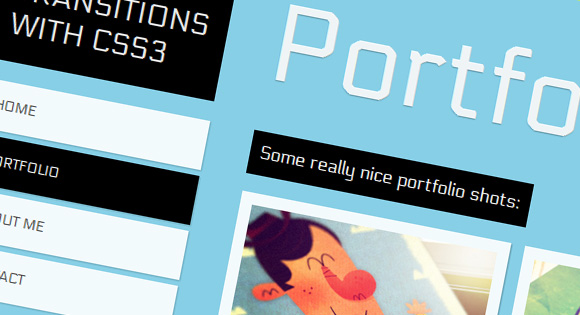
<!-- Header with Navigation --> <div id="header"> <h1>Page Transitions with CSS3</h1> <ul id="navigation"> <li><a id="link-home" href="#home">Home</a></li> <li><a id="link-portfolio" href="#portfolio">Portfolio</a></li> <li><a id="link-about" href="#about">About Me</a></li> <li><a id="link-contact" href="#contact">Contact</a></li> </ul> </div> Now, the basic idea is to use the: target pseudo-class to add a transition to the current section. In this example, we will “turn” our pages first up and then down (see the first demo example).
CSS
First of all, we will style our title and navigation. We want them to be in the same place, at any time, even if everything else moves.
#header{ position: absolute; z-index: 2000; width: 235px; top: 50px; } #header h1{ font-size: 30px; font-weight: 400; text-transform: uppercase; color: rgba(255,255,255,0.9); text-shadow: 0px 1px 1px rgba(0,0,0,0.3); padding: 20px; background: #000; } #navigation { margin-top: 20px; width: 235px; display:block; list-style:none; z-index:3; } #navigation a{ color: #444; display: block; background: #fff; background: rgba(255,255,255,0.9); line-height: 50px; padding: 0px 20px; text-transform: uppercase; margin-bottom: 6px; box-shadow: 1px 1px 2px rgba(0,0,0,0.2); font-size: 14px; } #navigation a:hover { background: #ddd; } All sections, except #home, have a class panel. Here we will use the transition whenever an element with this class is called in the menu. The trick is to use negative indent in the panel class in the “normal” state and the absence of this indent in this class when using the: target pseudo-class. The transition creates the effect of leaving the page above:
.panel{ min-width: 100%; height: 98%; overflow-y: auto; overflow-x: hidden; margin-top: -150%; position: absolute; background: #000; box-shadow: 0px 4px 7px rgba(0,0,0,0.6); z-index: 2; -webkit-transition: all .8s ease-in-out; -moz-transition: all .8s ease-in-out; -o-transition: all .8s ease-in-out; transition: all .8s ease-in-out; } .panel:target{ margin-top: 0%; background-color: #ffcb00; } Next, we set styles for the content class, which is in all of our sections:
.content{ right: 40px; left: 280px; top: 0px; position: absolute; padding-bottom: 30px; } .content h2{ font-size: 110px; padding: 10px 0px 20px 0px; margin-top: 52px; color: #fff; color: rgba(255,255,255,0.9); text-shadow: 0px 1px 1px rgba(0,0,0,0.3); } .content p{ font-size: 18px; padding: 10px; line-height: 24px; color: #fff; display: inline-block; background: black; padding: 10px; margin: 3px 0px; } In order to change the color of the current item in the navigation, we will use the pseudo-class: target with a generalized relative combinator (the general sibling selector) to “find” the corresponding navigation item:
#home:target ~ #header #navigation #link-home, #portfolio:target ~ #header #navigation #link-portfolio, #about:target ~ #header #navigation #link-about, #contact:target ~ #header #navigation #link-contact{ background: #000; color: #fff; } That's all you need. Check out the demo examples to see what we got.
Demo>
A source
Source: https://habr.com/ru/post/137421/
All Articles