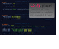
Immersive CSS3
CSS3 was seen and tried by everyone he could be interested in. And we can already generate rounded corners and falling shadows without too much labor.
But this is only a superficial level. I had to deal with new features of browsers in more detail in order to answer the emerging questions of the type: how cross-browser gradients are with a lot of color transitions, where and how several shadows can be applied to the block, for which particular browsers properties prefixes are applied, etc.
In addition, I was interested in CSS3 support on mobile platforms, unexplored CSS3 capabilities, as well as generators that create cross-browser code. I tried to fill in some of the gaps and collect useful information for those who are still preparing to dive.
')
Browsers that support properties are listed as CSS comments. Generators and tools most often can perform several functions at once, so in such cases I indicated them only where they, in my opinion, cope best.
In fact, there are several types of CSS3 gradients. This is the easiest gradient.

In addition to specifying the initial and final colors, gradients allow you to change the angle of inclination, the position of the beginning and end of the color transition, the number of colors and the direction of the gradient.
Allows you to repeat the gradient, allows you to create background patterns.
Circular gradient. You can also have several color transitions, you can determine the point of the beginning of the gradient (not necessarily from the center of the circle).

This is the ability to assign multiple background images to one element at once.
Rounded corners at the block. It's simple, if you need the same radius of rounding.

But if different angles should have a different radius, then you need to list the radii for each angle.

An interesting possibility is the transfer of pairs of radius values for each angle. So you can achieve more complex shapes than just rounding:

If all are the same:


Drop shadows from the blocks.

Shadows can be directed to the inside of the element.

You can apply multiple shadows to one element at once.

Another little-used value is spread-radius, to change which you just need to add it immediately after the shadow blur value. A positive value increases the shadow, a negative value will make the size of the shadow smaller than the size of the block from which the shadow falls.


This is the ability to use alpha transparency for colors. Unlike the opacity property, you can apply both to the font and to the borders and to the background of the block without changing the transparency of the block contents.

hex2rgba.devoth.com turns HEX into RGBA
Generating content in CSS via: before /: after. It is used both to add symbols and whole words to the document, and to create new blocks that can be used for decoration.
It turned out to find out the situation with support for CSS3 different browsers. I managed to find a lot of tools. There was no generator for rounding with pairs of values for the angle, a generator that can create several shadows at once on the block, as well as a generator that would combine all the necessary functions, but it would be simple and have a good interface.
Of course, there are many more properties, for example, border-image or transition, but they are not so widely used, or they require even deeper study, so they are not included in this review. But you can try to find tools or information for almost any occasion.
caniuse.com
www.css3files.com
css3please.com
upd For those who want to automate the process of creating prefixes, another article has been written.
This article is in English .
But this is only a superficial level. I had to deal with new features of browsers in more detail in order to answer the emerging questions of the type: how cross-browser gradients are with a lot of color transitions, where and how several shadows can be applied to the block, for which particular browsers properties prefixes are applied, etc.
In addition, I was interested in CSS3 support on mobile platforms, unexplored CSS3 capabilities, as well as generators that create cross-browser code. I tried to fill in some of the gaps and collect useful information for those who are still preparing to dive.
')
Browsers that support properties are listed as CSS comments. Generators and tools most often can perform several functions at once, so in such cases I indicated them only where they, in my opinion, cope best.
Linear-gradient
In fact, there are several types of CSS3 gradients. This is the easiest gradient.
div {
background-color: #444444;
background-image: -webkit-gradient (linear, left top, left bottom, from(#444444), to(#999999)); /* Safari 4-5, Chrome 1-10, iOS 3.2-4.3, Android 2.1-3.0 */
background-image: -webkit-linear-gradient (top, #444444, #999999); /* Chrome 10+, Safari 5.1+, iOS 5+, Android 4+ */
background-image: -moz-linear-gradient (top, #444444, #999999); /* Firefox 3.6+ */
background-image: -ms-linear-gradient (top, #444444, #999999); /* IE 10+ */
background-image: -o-linear-gradient (top, #444444, #999999); /* Opera 11.10+ */
background-image: linear-gradient (to bottom, #444444, #999999);
}
In addition to specifying the initial and final colors, gradients allow you to change the angle of inclination, the position of the beginning and end of the color transition, the number of colors and the direction of the gradient.
Safari up to version 5 and Chrome up to version 10 had its own syntax, and IE 10 with Opera add their own prefixes, increasing the amount of code.
All gradient features are supported by those browsers that can display CSS3 gradients, even if some generators offer us only a transition between two colors.
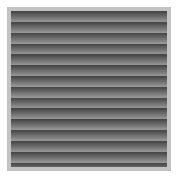
Repeating-linear-gradient
Allows you to repeat the gradient, allows you to create background patterns.
div {
background-color: #444444;
background-image: -webkit-repeating-linear-gradient (top, #444444 18%, #999999 25%); /* Chrome 10+, Safari 5.1+, iOS 5+, Android 4+ */
background-image: -moz-repeating-linear-gradient (top, #444444 18%, #999999 25%); /* Firefox 3.6+ */
background-image: -ms-repeating-linear-gradient (top, #444444 18%, #999999 25%); /* IE 10+ */
background-image: -o-repeating-linear-gradient (top, #444444 18%, #999999 25%); /* Opera 11.10+ */
background-image: repeating-linear-gradient (top, #444444 18%, #999999 25%);
}
Radial-gradient
Circular gradient. You can also have several color transitions, you can determine the point of the beginning of the gradient (not necessarily from the center of the circle).
div {
background: #444444;
background: -webkit-gradient (radial, center center, 0px, center center, 100%, color-stop(0%,#444444), color-stop(100%,#999999)); /* Chrome 1-10, Safari 4+, iOS 3.2-4.3, Android 2.1-3.0 */
background: -webkit-radial-gradient (center, ellipse cover, #444444 0%,#999999 100%); /* Chrome 10+, Safari 5.1+, iOS 5+, Android 4+ */
background: -moz-radial-gradient (center, ellipse cover, #444444 0%, #999999 100%); /* Firefox 3.6+ */
background: -o-radial-gradient (center, ellipse cover, #444444 0%,#999999 100%); /* Opera 11.6+ */
background: -ms-radial-gradient (center, ellipse cover, #444444 0%,#999999 100%); /* IE 10+ */
background: radial-gradient (center, ellipse cover, #444444 0%,#999999 100%);
}
Opera did not support the circular gradient to version 11.6. The rest of the situation is the same as with a linear gradient.
Instruments:
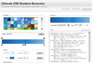
- gradients.glrzad.com produces a cross-browser code, you can create many color transitions
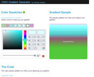
- www.colorzilla.com/gradient-editor the most sophisticated generator. You can create linear and circular gradients, you can choose the format for recording colors, many ready-made gradients.
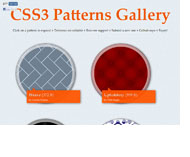
- lea.verou.me/css3patterns gallery CSS3 patterns. You can see the code of each pattern.
Multiple Backgrounds
This is the ability to assign multiple background images to one element at once.
div {
background: url(fallback.png) no-repeat 0 0;
background: url(foreground.png) no-repeat 0 0, url(middle-ground.png) no-repeat 0 0, url(background.png) no-repeat 0 0 ; /* Firefox 3.6+, Safari 1.3+, Chrome 2+, IE 9+, Opera 10.5+, iOS 3.2+, Android 2.1+ */
}
Do not forget about browsers that do not support multiple backgrounds.
The order of the backgrounds is as follows: from the top to the bottom, that is, the bottommost background should be set at the end. Instead of background images, you can also write CSS3 gradients.
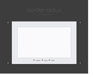
Border-radius
Rounded corners at the block. It's simple, if you need the same radius of rounding.
div {
-webkit-border-radius : 12px; /* Safari 3-4, iOS 1-3.2, Android ≤1.6 */
-moz-border-radius : 12px; /* Firefox 1-3.6 */
border-radius : 12px; /* Opera 10.5+, IE 9+, Safari 5, Chrome , Firefox 4+, iOS 4+, Android 2.1+ */
}
All manufacturers have already abandoned vendor prefixes in the latest versions of browsers.
But if different angles should have a different radius, then you need to list the radii for each angle.
In Firefox, there is a feature associated with the fact that the enumeration of corners is done using a different syntax from the standard. But the solution could be to use abbreviated syntax, which browsers have the same.
div {
-moz-border-radius : 15px 30px 45px 60px;
-webkit-border-radius : 15px 30px 45px 60px;
border-radius : 15px 30px 45px 60px;
}
An interesting possibility is the transfer of pairs of radius values for each angle. So you can achieve more complex shapes than just rounding:
div {
border-top-left-radius : 5px 30px;
border-top-right-radius : 30px 60px;
border-bottom-left-radius : 80px 40px;
border-bottom-right-radius : 40px 100px;
}
If all are the same:
div {
border-radius : 8px / 13px;
}
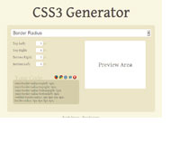
Instruments:
- css3please.com generates a lot of things.
- border-radius.com is a specialized generator of rounded corners. It is convenient to do the corners of different razius.
- css3generator.com generates a lot of things. For corners, it allows you to choose between the same radius and different ones.
- layerstyles.org/builder.html simulates the Photoshop interface. It is convenient to generate not only corners.
Box-shadow
Drop shadows from the blocks.
div {
-webkit-box-shadow : 0px 0px 4px #000000; /* Safari 3-4, iOS 4.0.2-4.2, Android 2.3+ */
-moz-box-shadow : 0px 0px 4px #000000; /* Firefox 3.5-3.6 */
box-shadow : 0px 0px 4px #000000; /* Opera 10.5+, IE 9+, Firefox 4+, Chrome 6+, iOS 5+ */
}
Shadows can be directed to the inside of the element.
div {
-webkit-box-shadow : inset 6px 6px 12px #000000;
-moz-box-shadow : inset 6px 6px 12px #000000;
box-shadow : inset 6px 6px 12px #000000;
}
You can apply multiple shadows to one element at once.
div {
-webkit-box-shadow : inset 6px 6px 12px #000000, 4px 6px 3px #dddddd;
-moz-box-shadow : inset 6px 6px 12px #000000, 4px 6px 3px #dddddd;
box-shadow : inset 6px 6px 12px #000000, 4px 6px 3px #dddddd;
}
Another little-used value is spread-radius, to change which you just need to add it immediately after the shadow blur value. A positive value increases the shadow, a negative value will make the size of the shadow smaller than the size of the block from which the shadow falls.
div {
-webkit-box-shadow : 0 5px 5px -6px #000000;
-moz-box-shadow : 0 5px 5px -6px #000000;
box-shadow : inset 0 5px 5px -6px #000000;
}
Inner shadows, multiple shadows and spread-radius can be applied in all browsers that support simple CSS3 shadows.
Almost all manufacturers have already abandoned vendor prefixes in the latest versions of browsers.
Instruments:
- css3maker.com multifunction generator. You can make internal shadows, change colors.
- www.css3.me all settings can be expanded as needed
- css3generator.com can immediately adjust the color of the shadow in RGBA
RGBA
This is the ability to use alpha transparency for colors. Unlike the opacity property, you can apply both to the font and to the borders and to the background of the block without changing the transparency of the block contents.
div {
background: rgb(200, 54, 54);
background: rgba(200, 54, 54, 0.5) ; /* Firefox 3+, Chrome , Safari 3+, Opera 10.10+, IE 9+, iOS 3.2+, Android 2.1+ */
}
For cross-browser compatibility, specify a color without alpha transparency, or a path to a transparent PHG.
The existing HSLA recording format can be used in the same browser versions that support RGBA.
Instruments:
hex2rgba.devoth.com turns HEX into RGBA
Pseudo-elements
Generating content in CSS via: before /: after. It is used both to add symbols and whole words to the document, and to create new blocks that can be used for decoration.
div :before ,
div :after { /* Firefox 3.5+, Chrome , Safari 1.3+, Opera 6+, IE 8+, iOS 3.2+, Android 2.1+ */
content:"";
display:block;
}
Support is already very good, even on mobile platforms work without problems.
Interestingly, CSS3 requires two-colon syntax (:: before / :: after), but IE8 requires the use of single-colon pseudo-elements.
Conclusion
It turned out to find out the situation with support for CSS3 different browsers. I managed to find a lot of tools. There was no generator for rounding with pairs of values for the angle, a generator that can create several shadows at once on the block, as well as a generator that would combine all the necessary functions, but it would be simple and have a good interface.
Of course, there are many more properties, for example, border-image or transition, but they are not so widely used, or they require even deeper study, so they are not included in this review. But you can try to find tools or information for almost any occasion.
Sources of information about the support of properties by browsers
caniuse.com
www.css3files.com
css3please.com
upd For those who want to automate the process of creating prefixes, another article has been written.
This article is in English .
Source: https://habr.com/ru/post/137348/
All Articles